Intensive Coloring and Saturated Gradients are a Fresh Trend
There is no denying that Flat Style and Material design rule the roost this year, channeling projects in one direction.
They encourage developers to build a harmonious alliance of neat, tidy and polished UI and great and well-thought-out UX. While we speculate about their principles and recommendations, there was one factor which wasn’t appreciated previously.
This dark horse has finally exceeded our expectations and has a power to show its paces. Today we are going to talk about the upcoming trend of intensive coloring and saturated gradients that have already made their presence felt in the Web.
To be honest, the tendency did not come as a bolt from the blue, as it may seem at first. Take a look at the majority of mobile interfaces that are crafted according to the Material design doctrine or recent iOS design standards: all of them boast of gorgeous palettes, combos of deep hues and smooth transitions between shades. They feature a professionally curbed riot of color that substantially benefits the design aesthetics, making it breathe with freshness and sophistication.
It was just matter of time before the approach hit the ground running and won over the website design industry. So that today we can show you 20 magnificent examples of website design with gorgeous saturated gradients and intensive coloring.
Intensive Coloring and Saturated Gradients in Web Design
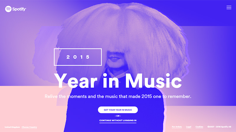
Year in Music by Spotify
The homepage is bursting with energy and a musical vibe that is inherent to the platform. The team utilizes several outstanding gradients from cold purple to hot orange. The logotype, white lettering, ghost buttons and hamburger menu icon play nicely with such a backdrop.
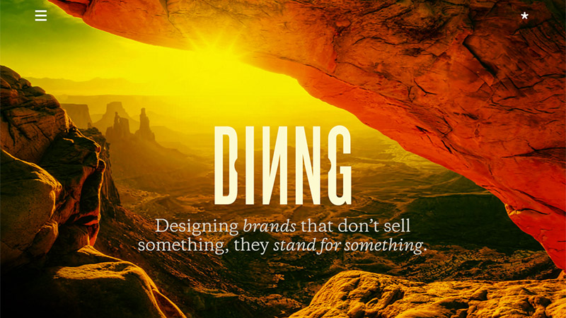
Dinng
Dinng depicts a spectacular natural gradient that is skillfully intensified by several filters. The picture is simply mesmerizing; it gives the overall aesthetics a cutting edge and produces an overwhelming first impression.
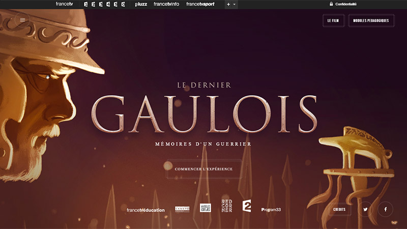
Le Dernier Gaulois
Unlike the previous two examples, Le Dernier Gaulois utilizes a subtle, elegant and polished gradient with a golden tint and marvelous purple tone. Such choice laconically strengthens the illustration on the backdrop as well as contributes to the theme.
BBFAW
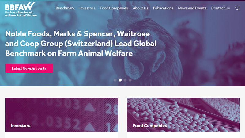
The gradient is used to overlay numerous images on the homepage. It serves two roles. Firstly, it provides foreground elements with a stark contrast and solid foundation; and secondly, with its bluish coloring it reinforces the general feeling on the project and sets up a serious tone more effectively.
Prevention R3 Summit
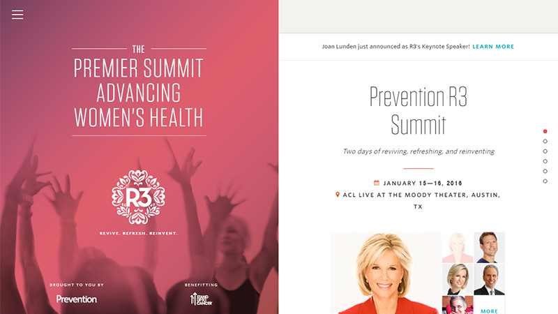
Prevention R3 Summit employs a charming saturated gradient that is suitable for the female audience. It nicely interacts with a solid block on the right as well as laconically supports the elegant ultra-narrow typeface and ornamental logotype on the left.
Axiom Retail Energy
The website is defined by two fresh trends: dynamic abstract background and intensive coloring that all together make the UI break away from the others and look hip and modern. Green-based gradient perfectly matches the mood of the project, unobtrusively instilling such traits as purity, naturalness, and energy.
Impossible Bureau
Impossible Bureau shows how to revive gradients that were considered to be dead and old-fashioned. From dark slate blue to violet red – I thought we left them in the past; no such luck. Nevertheless, in this particular case, it looks fresh, visually appealing and eye pleasing.
Happy New Year
Happy New Year by EVS goes for a beautiful linear gradient with a left-to-right direction. It plays the role of a charming yet firm foundation that makes the lettering in a quirky typeface stand out. It naturally focuses users’ attention on the message, slightly overshadowing the visuals.
 
  whets your appetite for creativity. The homepage owes its beauty to two main factors: a polygonal background that adds a subtle geometric feel, and an almost hot intensive gradient that creates the whole buzz. It is another example in our collection that features a revamped gradient from the good old days.
Fiber Sensing
Here the gradient creates an impressive depth and perfectly complements the abstract backdrop that is set in motion. Thanks to a smooth transition from violet to blue, the homepage evokes positive feelings as well as impacts on the user’s a sense of trust, integrity and reliability.
Zample Me
Zample Me is seemingly brightened by the energy that comes from the splendid gradients used throughout the site. It creates a powerful contrast that sets the graphics and text apart from the others. Flat style and white used for the content fit quite well with such a vibrant and elegant choice.
Hadar’s Portfolio
The artist leverages a number of fantastic gradients. They are used as backdrops for portfolio pieces. These trendy little islands of smooth and polished transitions between two matching colors add to the traditional layout piquancy.
Sustain Asia
Sustain Asia greets online visitors with a splendid and dramatic video. The frozen stream exhibits an incredible natural gradient that is difficult to resist. It strengthens the overall effect.
Moutakusanda Magazine
Although the project does not feature a common digital gradient, instead the team employs a real-life scene to produce the same effect; however, this trick makes the homepage excel over the others.
Coline Game
The old-timey linear gradient that shifts from orange to green is what gives the site a unique look and elegant appeal. It naturally directs users’ attention towards the product. Flat device mockups, bold, soft logotype, and white lettering ideally blend in.
Bloomberg Politics
It’s kind of surprising to see in our collection such a content-intensive and serious news portal as Bloomberg. Nevertheless, it is on here for some reason. The website is a representative example of how to follow trends and at the same time remain faithful to traditions. While it leverages the classic modular system to line up the content, each area is enriched with a beautiful subtle and fancy gradient that adds a particular zest to each post.
3 Minute Inc
3 Minute Inc employs energetic, warm and a slightly outdated gradient in tandem with a video background thereby resulting in an outstanding effect. Together they tell a story and set the stage for the rest of the content.
Merry Christmas
The team opts for classic colors (blue and white) to establish a proper atmosphere in the website and make the aesthetics capture the spirit of the holidays. The gradient is soft, subtle and just refined. As befits, everything is carefully planned: white lettering, CTAs, and sharp typeface contribute to the idea.
Fliplab
The gradient maintains the user’s focus on the tagline. It serves as a supporting device that hides from the online visitors the beauty of the image backdrop and at the same time keeps the intrigue. It also helps to create a spacious feeling without sacrificing the content and visual impact.
Green Pig
The artist utilizes a bright and vivid gradient to make the header section with the logotype look visually weighty and attention-grabbing. It goes well with the rest of the layout, giving off a little charm and expressing the charismatic personality of the man behind the scene.
Conclusion
Although gradients seem to be trivial, they have the potential to get back on a horse and tune up with new colors. As the above listed examples show, the solution radiates freshness, originality as well as adds a visual interest. What’s more, it works particularly well with modern flat style, subtle line style graphics and oversimplified typefaces.
Which example do you find the most impressive?
