Inspired Design Decisions: Pressing Matters
Inspired Design Decisions: Pressing Matters
Andrew Clarke
As I’d always been at the top of my class during high school, I headed to art college full of confidence that one day I’d be an accomplished painter. This over-confidence didn’t last long though, because when I arrived, I found myself surrounded by conceptual artists, filmmakers, painters, performance artists, printmakers, and sculptors, who all seemed much more talented than I was.
This was especially true of my friend Ben, a gifted painter who went to his studio late every night to work on several large canvases. Ben’s paintings had incredible depth because he built up hundreds of subtle layers of paint over several months.
I didn’t have any of Ben’s patience. I needed to see results quickly, so my paintings were anything but deep or subtle. Compared to Ben’s, mine looked like paintings by numbers. It didn’t take me long to realise that painting just wasn’t the right medium for me.
Luckily, the course I’d chosen wasn’t structured, and it didn’t have a formal curriculum. This allowed students free movement between disciplines, so I moved from the painting studio to printmaking and spent the next few years happily making prints.
I found the printmaking process incredibly satisfying. I loved making prints from linocuts, and in much the same way that I’m often entirely absorbed by writing code today, I regularly lost myself carving thousands of tiny marks until the floor was covered in sharp shards of lino.
Printmaking and writing code have plenty in common. Both can quickly transform a blank canvas into finished work, without waiting weeks watching paint dry. Both benefit from regular iteration and testing. In fact, there’s very little difference—except inky hands — between running a test print and refreshing a browser window.
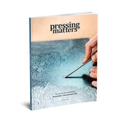
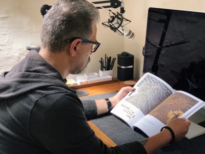
I haven’t cut lino for thirty years, but I still appreciate the art of printmaking. On a recent trip to London, I popped into Magma and picked up a copy of Pressing Matters. It’s an independently published magazine which “hones in on the people, passion and processes behind the art form of printmaking.” Its publishers hope to inspire newcomers to printmaking, but as I thumbed through its pages, I found there is plenty about the design of Pressing Matters which can inspire web designers too.
Andy Clarke
May 2019

Pressing Matters: The Passion And Process Behind Printmaking
I may not have made any prints for thirty years, but I’m still fascinated by the process of printmaking as much as I appreciate the end results. Picking up a copy of Pressing Matters (pressingmattersmag.com) on a recent trip to my favourite magazine shop and flicking through its pages, I was immediately transported back to art school where my fingers were almost always covered in cuts from lino cutting tools, and I smelled like ink and turpentine.
Pressing Matters has a distinctive, but simple style. It uses a limited palette and often connects the colour of headlines and other typographic elements with colours found in nearby photographs and prints. The result is a design which feels connected.
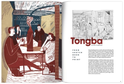
Pressing Matters’ Creative Director John Coe uses layout patterns which produce a rhythm which flows throughout the magazine. Differently sized modules speed you past pages packed with prints, then the pace slows to allow you to linger on larger artwork reproductions. These layouts frame the magazine’s content perfectly, and while they’re original, they’re also discreet enough not to detract from the subject matter.
What struck me about Pressing Matters initially was how the magazine includes a variety of layout styles but allowed for various types of content, but still maintains a high degree of consistency throughout.
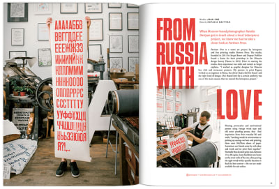
When I looked closer at how its pages were constructed, I discovered a layered compound grid comprised of two and three columns running through the magazine. Using a compound grid makes perfect sense for a magazine devoted to printmaking, which itself often involves multiple layers of ink to form something deeper and richer than can be achieved with a single layer.
“
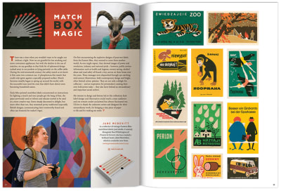
While many of Pressing Matters’ pages rely on symmetrical two or three- column layouts, it’s when the two and three-column grids are combined that the magazine really comes to life.
Not only is this grid adaptable to accommodate various types of content, the variety of possible layout permutations also allow for changes in visual pacing throughout the magazine.
I’ll teach you all about Karl Gerstner and his mobile grid later in this issue, but just like Gerstner’s iconic work for Capital magazine, Pressing Matters uses large facing images to slow reading down.
Whitespace opens up around running copy to allow for easy reading. Text wraps around the fluid shapes in images. Pages packed with prints are arranged masonry-style. Text split across two columns runs alongside images which are arranged on a three-column grid, and these techniques combine to create an engaging and enjoyable reading experience.
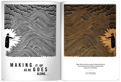
Pressing Matters proves that compound grids can have a profound effect on the experience of reading a magazine. The same layout principles which make Pressing Matters so appealing can also be applied to products and websites, despite them being very different media.
These principles are not new and they have guided art direction and design for decades. They matter just as much on the web as they do in the pages of a glossy magazine. Whether your readers are offline or on, grids are fundamental to their understanding of your stories, and you can use them for more than aligning content.
Next time you’re passing your nearest magazine store, pop in and pick up a copy of Pressing Matters. You won’t get inky fingers, but you will get your hands on inspiration for your next project.
Making Sense Of Compound Grids
Grids have a long and varied history in design, from the earliest books, through movements like constructivism and the International Typographic Style, right up to the present-day popularity of grids in frameworks like Bootstrap and material design.
A generation of product and website designers have grown up with grids from Bootstrap, the 960 Grid System before it, and even the Blueprint framework before that. In frameworks like these — and in plenty of work built on them — grids are used mostly for aligning content to columns.
When you use grids imaginatively, they do much, much more than align content. A grid brings cohesion to a composition. It helps people understand the stories you’re telling by suggesting hierarchies. Grids inform people what to read first, then next, and how much attention to give it.
They define the position of valuable information or a call to action. A thoughtfully chosen grid leads to a wealth of possibilities and any number of exciting designs.
The use of grids for web design has improved consistency, legibility, and usability, but using grids included with frameworks including Bootstrap has also led to a generation of homogenous layouts and uninspiring designs.
When I teach design classes, I often ask my students to draw what a grid means to them. Nine out of ten sketches twelve symmetrical columns. Symmetrical multi-column grids have become a staple mainly because twelve columns can be easily divided into halves, thirds, quarters, and eighths. Because they’re so easy to learn, grids like the ones included with Bootstrap have become a staple.
In fact, they’re now so ubiquitous that starting a new design without sketching three or four columns can be incredibly difficult as it involves changing your mental model and the way you think about grids. It’s important to know that symmetrical column-based grids are only one of several options. Compound grids are one of those options but despite the enormous flexibility they offer — something incredibly important for today’s multi-device designs — they’re rarely spoken of with product and website design.
Way back in July 2009, Diogo Terror wrote “Lessons From Swiss Style Graphic Design” for Smashing Magazine which mentions Karl Gerstner and includes many fabulous examples of Swiss Style Graphic Design.
Capital Magazine
In the 1940s and ’50s, designers including Josef Müller-Brockmann made using grids to create consistent and creative layouts one of the defining aspects in what became known as the International Typographic Style or Swiss Design.

Swiss artist and typographer Karl Gerstner was one of the first designers to exploit the creative flexibility of using grids, and it’s the compound grid which Gerstner designed in 1962 for Capital magazine that has become one of his best-known creations.
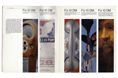
The concept behind Capital was to provide “a human view of economics, an economic view of humanity” and so its content and Gerstner’s design had to be accessible, clear, and engaging. Given the potential variety and unpredictability of Capital’s content, Gerstner also needed a grid which would help him to lay out any content consistently and without restrictions.
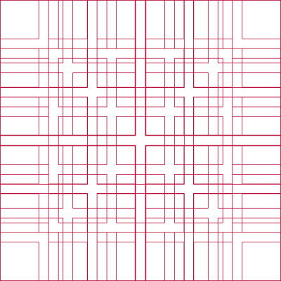
Gerstner designed what he called a “mobile grid,” although it’s not the type of mobile you and I are used to. This grid is the one most likely to be found when searching for compound grids, but it’s also the one most likely to baffle on first look.
The compound grid Gerstner designed for Capital looks incredibly complex when seen as it does above, so to explain how he created it — and how you can use it — I’m going to break Gerstner’s grid down into its constituent parts.
There are 58 columns and rows in Gerstner’s mobile grid, but he started with just one. Content in this single module fills the full width of the page.
Then Gerstner divided his single module into two columns and rows. Using two columns in this way results in a reassuring symmetrical design.
That large module can also be sub-divided into three columns and rows. Have you noticed how the gutters between the divisions in Gerstner’s grid are always the same size?
By splitting the large module into four, these columns of content feel formal, and the overall impression is that this design is a serious one.
When the full-page module is divided into five columns and separated into two spacial zones by a flowline, this design feels more technical. With Gerstner’s mobile grid, you can use each set of columns and rows separately. You can also turn them into a compound grid by either overlaying or stacking them.
Dividing the page into six columns and six rows of modules, enables an incredible variety of layout options. The flexibility of a compound grid comes from the interplay of two or more grids and how that affects the position and size of elements. This often makes a compound layout far more interesting than one grid in isolation.
Say Hello To Compound Grids
A compound grid is two or more grids of any type — column, modular, symmetrical, and asymmetrical — on one page. They can occupy separate areas or overlap.
If you’re still unsure about using modular grids as Karl Gerstner did, you can start by making a compound by overlapping two column grids; one with two columns, the other with three.
It’s the interplay of the two grids which makes this compound layout more interesting than a single grid. The flexibility of a compound grid becomes apparent when I make the grid lines visible.
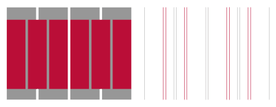
If you’re watching closely, you should notice how compound grids will take your design in a different direction than twelve symmetrical columns.
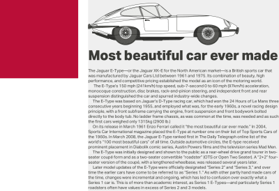
By laying a three-column grid over one with two columns, you create four columns where the outer two are twice the width of those on the inside. I like to think of this as a rhythmic pattern; 2|1|1|2.
Rhythmic patterns
By using any number of equally-sized columns or rows, your layouts form a consistent pattern and an even rhythm which does not change across the page. Think of each column as a beat and tap twelve of them on your desk. It doesn’t sound very inspiring, does it?

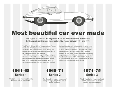
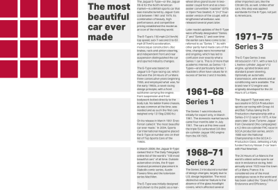
Compare that with the rhythm from a 2|1|1|2 pattern and you should understand how using compound grids can change both your mental model and the layouts you create. Using this 2|1|1|2 pattern for my first layout. I place the main body of content — including the headline, standfirst paragraph, and running text, into the first column in my two-column grid. I use a single column from my three-column grid to place supporting information about the Jaguar E-Type series, without question the most beautiful car ever made.
A blueprint image of that astounding automobile crosses the remaining space, creating a visual connection between the two areas of content.
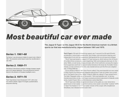
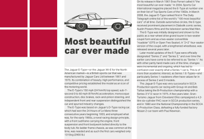
For an altogether different design (above) — one which uses both layout and italic type to suggest the movement and speed of the E-Type — I stagger my standfirst paragraph and running text using grid lines from both the two-column and three-column grids.
Changing the compound formation to combine three-column and four-column grids (3+4) creates an altogether different rhythmic pattern of 3|1|2|2|1|3.
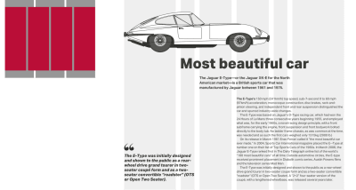
With a compound of two grids (above,) you might use widths from one or the other. Or you could combine widths from both to form columns which don’t conform to either. You can use these new widths to inform the sizes of images and text. While the standfirst paragraph starts on the three-column grid, the running text which follows begins on the four-column grid.
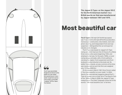
That same combination of grids (above) can make a very different impression by combining columns widths from both grids to inform the width of my column of running text. This column matches the width of my large vertical image to balance both sides of this design.
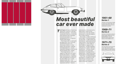
This time, I set the main block of running text across two columns and derived their widths by combining column units of 4 and 3.
As for those very narrow columns, whose width is only 1 unit, they’re perfect for informing the size of typographic elements including this bold drop cap.
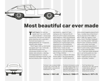
Overlaying four columns with five (above) leads to a highly unusual rhythmic pattern of 6|1|4|3|3|4|1|6.
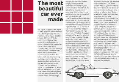
For this alternative design, I use that same pattern in a different way by running my text over three columns. I use the widths from the five-column grid to inform the width of my supporting information and the image of this E-Type’s curvy rear end.
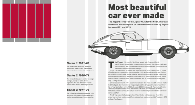
In this version of the design (above,) a large image shows off the iconic shape of E-Type’s body and fills almost all the width of my page.
A solid block of running text sits directly under the Jaguar’s wheels and derives its width from both the four-column and six-column grids.
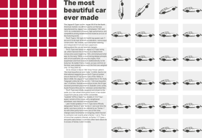
My next design (below) literally places the E-Type at the centre of the action and text wraps around it on both sides. Remember, it’s not necessary to fill every grid module with content. By limiting the width of my standfirst paragraph and leaving space elsewhere in the layout empty, I create a dynamic diagonal which adds energy and movement to this design.

Of all the possible grid combinations, the combination of four and six-column grids is the one I use most often in my work. It’s flexible enough to handle many different types of content and makes an incredible variety of compositions possible.
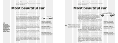
While the overall feeling from this final design feels balanced — largely due to a centred block of running text, the pull quote feels disconnected from the story as it occupies only the width from one column in the six-column grid. I can improve this design by aligning the edge of this quote to lines in the six-column grid, so it feels part of the story.
… (Box)
Setting the pace

Rhythm is an essential factor, not just within the page, but also across the pages of an entire product or website. Compound grids are not only flexible enough to accommodate a wide variety of content types, but they also allow you to vary this visual pacing. Magazine designs often use differently sized areas to vary this pace. Repeating smaller modules speeds up the movement, while larger ones slow it down. People naturally spend longer looking at larger spacial zones, and we can use the same technique at particular moments in someone’s journey to slow them down and make them take notice.
Stacking Grids
You can combine column grids with hierarchical and even modular grids. When pages contain two separate subjects or different types of content, stacking grids can be a great way to make that difference more obvious.
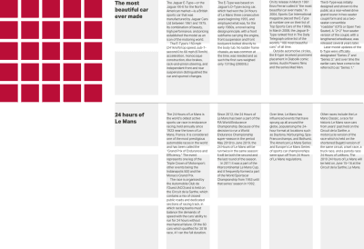
At the top of this next page is a story about the Jaguar E-Type. Underneath there’s an altogether different story about the famous Le Mans 24 hour race. To leave someone in little doubt these stories are separate, use a different grid for each. I base the top story on a four-column grid, the bottom on a six.
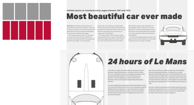
Above, I make the difference between these two stories obvious by placing the second against a grey background. I also use paragraph spacing instead of first-line indentations.
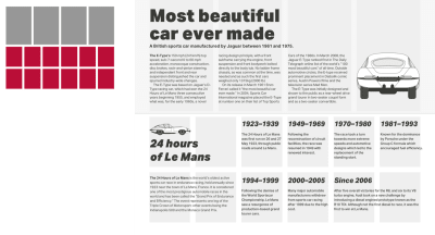
I make the difference between these two stories obvious by placing the first against a grey background. In the second story I also use bolder type and paragraph spacing instead of indenting the first line.
Karl Gerstner
Karl Gerstner (1930–2017) was a Swiss artist and one of the most influential typographers. He began work when he was only 19, studied under Fritz Büler, and then went on to co-found GGK, one of the most successful Swiss creative agencies of the ’70s.
Books about Gerstner’s work have been out of print for decades, and copies often run to hundreds of Pounds so I wouldn’t be surprised if you haven’t seen his designs first-hand. But, you’ll have seen plenty of other peoples’ work which was inspired by it.
Gerstner made unjustified, ragged-right text famous as up until then, columns of type were usually justified. He also developed the idea of using typefaces and typographic design to create connections between words on a page and their meaning. While this concept might seem obvious to us today, this idea seemed revolutionary in the 1960s.
Karl Gerstner’s probably best known for his iconic work on the quarterly Capital Magazine, starting in 1962. In fact, it’s through my research into Capital, and the compound grid Gerstner created for it that I first became aware of him and his work.
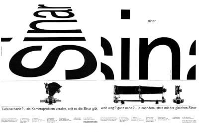
By a strange coincidence, I recently discovered that Gerstner’s agency also created advertisements for Sinar, the Swiss large format camera maker I worked with during the early 1990s. In these advertisements, the shape of the word “Sinar” resembles the results of using the swing and tilt movements on a large format camera.
Developing Compound Grids
When you first see Karl Gerstner’s mobile grid, you might think compound grids are challenging to implement. Whereas developing compound grid would’ve been a complicated process using traditional methods, today’s layout tools, including CSS Grid, now make it simple.
Designing layouts using compound grids requires a shift in your mental model, and developing them is no different. However, CSS Grid line numbers combined with new flexible length units (fr) will make that shift smoother.
Following the order I used earlier, I’ll start with a compound of two-column and three-column grids (2+3) which has a rhythmic pattern of 2|1|1|2.
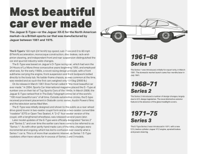
Translating that pattern into values for grid-template-columns couldn’t be easier, but first I need to apply CSS Grid to the body element of my page, then set a gap between columns which is relative to the width of my viewport. As I don’t want these styles applied at smaller screen sizes, I enclose them within a media query:
@media screen and (min-width : 48em) { body { display: grid; grid-column-gap: 2vw; } } Now, I use fr units to specify the pattern for my compound grid. The result is four columns where the width of the outer columns occupy twice the space of the inner two:
body { grid-template-columns: 2fr 1fr 1fr 2fr; } 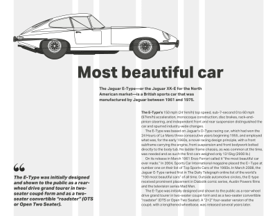
A combination of three-column and four-column grids (3+4) will result in six columns and a rhythmic pattern of 3|1|2|2|1|3. My flexible length units will be:
body { grid-template-columns: 3fr 1fr 2fr 2fr 1fr 3fr; } 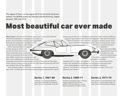
Finally, combining four-column and six-column grids (4+6) creates eight columns, two of them much narrower than the rest. To create a rhythmic pattern of 2|1|1|2|2|1|1|2 my flexible length units will be:
body { grid-template-columns: 2fr 1fr 1fr 2fr 2fr 1fr 1fr 2fr; } With these Grid properties applied, all direct descendants of a grid-container become grid-items, which I can place using areas, line numbers, or names.
The design I’m developing requires only the most basic structural elements to implement it, and my markup looks like this:
<body> <h1>….</h1> <p>…</p> <img> <main>…</main> <aside>…</aside> </body> I use the eight columns from the 4+6 compound grid above. Here are the styles to implement that:
@media screen and (min-width : 48em) { body { display: grid; grid-template-columns: 2fr 1fr 1fr 2fr 2fr 1fr 1fr 2fr; grid-column-gap: 2vw; grid-row-gap: 2vh; align-content: start; } } The elements above are direct descendants of the body. I place them on the grid by using line numbers. First the headline, the paragraph which immediately follows it, and finally my main element. These elements all start on grid line 4 and end on line 8:
h1, h1 + p, main { grid-column: 4 / 8; } The blueprint image of my beautiful Jaguar E-Type should be wider than other elements in this design, so I place it using different line numbers. It starts at line 2 and extends the full width of my page:
img { grid-column: 2 / -1; } Now, I place the aside element which contains my supporting information about the three series of E-Type. As I want this element to align to the bottom of my layout, I add the align-self property with a value of end:
aside { grid-column: 1 / 3; align-self: end; } 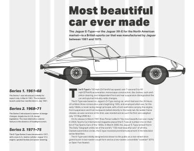
Finally, as I want both main and aside elements to appear next to each other on the same row, I give them identical row number values:
main, aside { grid-row: 4; } All that’s left is for me to add some small typographic touches to improve my design. I don’t need a presentational class attribute value to style the paragraph, which immediately follows my headline. I can use an adjacent sibling selector instead:
h1 + p { font-weight: 700; } To style the first line of the first paragraph in my main element, I use a combination of descendant, pseudo-element, and pseudo-class selectors:
main p:first-of-type::first-line { font-weight: 700; } Finally, to indent every following paragraph which is does not immediately follow my headline, I use both a :not() negation pseudo-class selector and two adjacent sibling selectors:
p:not(h1 + p) + p { text-indent: 2ch; } NB: Smashing members have access to a beautifully designed PDF of Andy’s Inspired Design Decisions magazine and full code examples from this article.
 (ra, yk, il)
Articles on Smashing Magazine — For Web Designers And Developers
