Improve Call To Action With These 20 Code Snippets
Buttons are one of the most important elements of any interface. They give prominence to links and functions providing viewers with obvious visual cues. They play a significant role in increasing conversion rates, to say nothing about their ability to enhance the user experience, making it more intuitive and understandable.
They are not just simple rectangles with captions; they serve lots of purposes and benefit projects from various sides.
Like any other core element of design, they are influenced by the trends. While skeuomorphism held the reins, buttons with glossy surfaces and shadows were popular. Nowadays, they have given way to flat solid color buttons and nifty fragile ghost buttons.
What’s more, there is another trend – buttons with dynamic behavior that it is believed will replace static components in near future. There are so many to choose from, yet not so much time.
Considering this, we have gathered twenty outstanding resources to help you in this matter. The list covers generators, libraries and simple code snippets that let you quickly improve and enrich buttons.
CTA Buttons Code Snippets
Hover.css
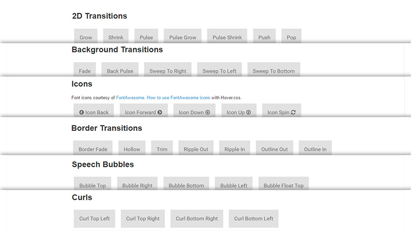
Hover.css is a small personal project dedicated to CSS3-powered effects that are triggered by hover events. They are fully compatible with SASS, LESS and CSS. The range includes 2D transitions, background transitions and some others. What’s more, you can apply the solution not only to buttons but also to links, logos and SVGs.
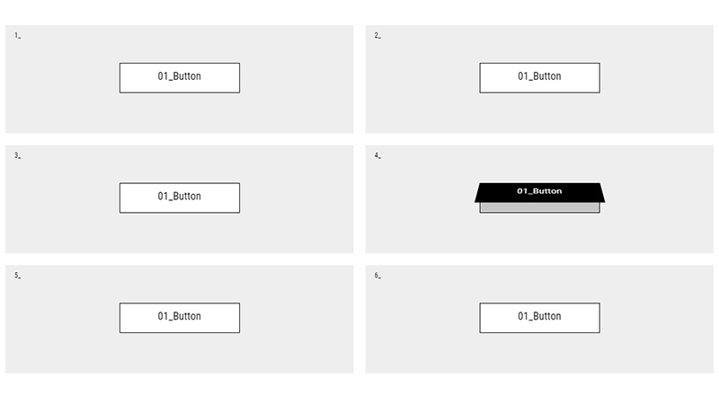
Imperfect Buttons By Tiffany Rayside
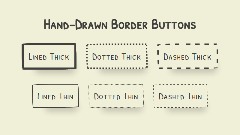
Tiffany Rayside shares with us a small code snippet that embraces six refreshing takes on a button. Each one distinguishes from the others in border style. The author spruces up elements with the help of lined thick border, dotted thick border, dashed thick border and others. What’s more, each object has a subtle shadow that gently separates it from the background.
Creative Button Styles
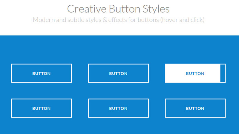
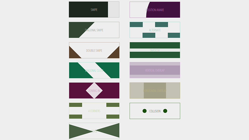
The author gets the most out of modern CSS3 features. The collection consists of a ton of styles and effects that give buttons a lovely zest. Each solution can be applied in tandem with hover or a click event.
Collection of Button Hover Effects by David Conner
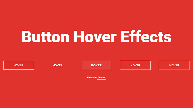
David Conner has created a selection of five different button hover effects that are pretty amazing. They look sleek, crisp and elegant, going perfectly well with any modern composition.
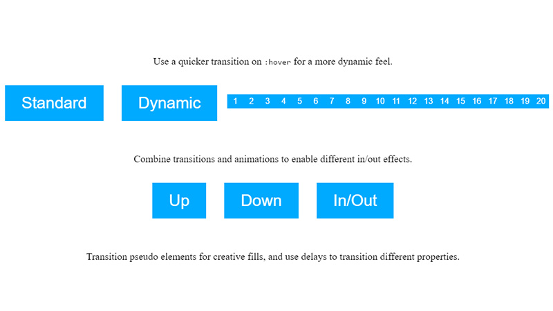
CSS: hover Tips by Scott Polhemus
Scott Polhemus mixes transitions and animations that are available in CSS3 resulting in a small set of lightweight and eye-catching in/out effects. They add to the graphics a subtle dynamic touch. The technique is applicable not only for buttons but also for basic linear pagination and controls.
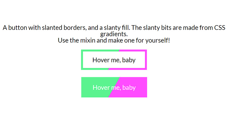
Slanty Button Mixin By Eli Fitch
Eli Fitch shares with others a CSS-driven button mixin that transforms any boring rectangular-shaped object into a sweet and stylish component with a dynamic behavior, splendid appearance and slanty feeling. The approach is created with the assistance of gradients and borders.
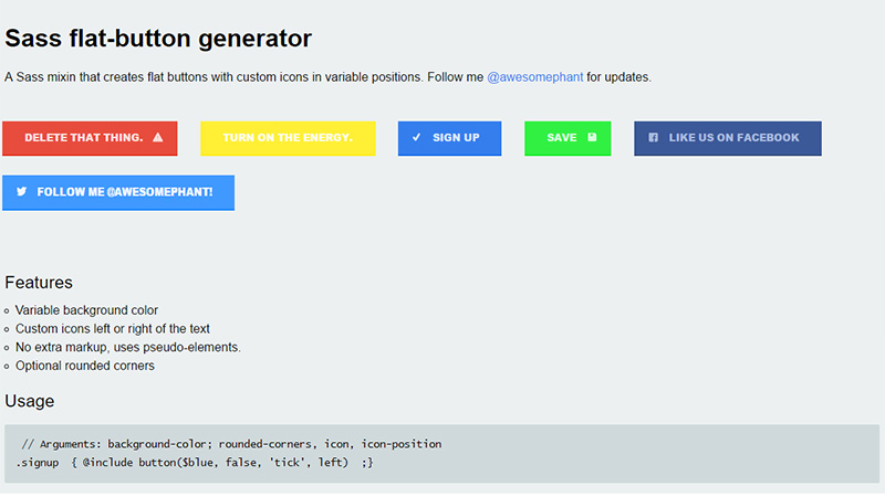
Sass Flat-Button Generator
Sass flat-button generator is a SASS mixin that takes advantage of pseudo-classes to produce nifty flat style buttons with a bright look, neat structure and custom icon. The latter can be placed either on the left or the right side. You can also choose between sharp and rounded corners.
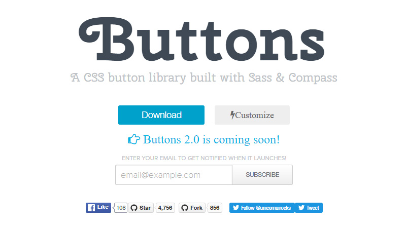
Buttons
Buttons is a library built with the help of SASS and Compass. It aims to give you some freedom when it comes to generating CTAs for an interface. The panel on the left allows you to manipulate with such factors as border, glow, rounded corners, drop down, icons and others.
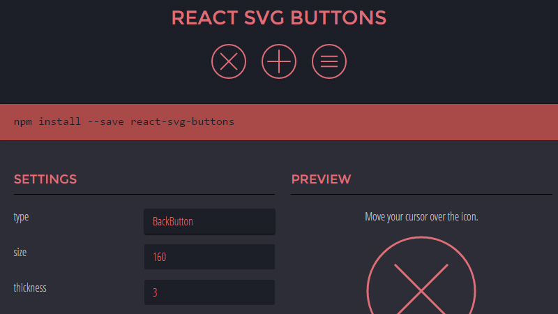
React SVG Buttons
React SVG Buttons is another composer with a handy visual interface that lets you create buttons depending on selected criteria. Adjust all the settings and copy the result code in a window to the right to proceed with the work.
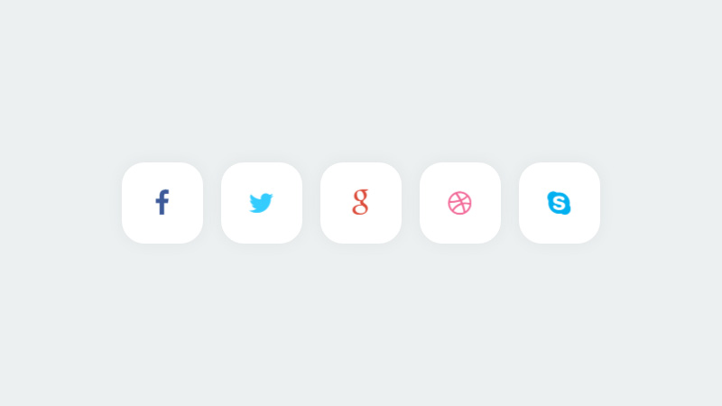
Stylish Social Buttons By Chris Deacy
They are crisp, elegant and flat. Each one has a smooth shape, spacious feeling and solid symbol in the center. The key feature of the package lies in its accompanying effect that gives a certain spice to each item.
12 fancy buttons by bartekd
Although the set looks a bit primitive and oversimplified, the supporting rollover effects are what really matters. Everything is built on the top of CSS so that the material is lightweight and fast. Note, it suffers some browser compatibility issues.
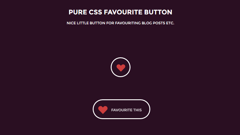
CSS Favourite Button
CSS Favourite Button by Jamie Coulter is a successful experiment that shows a brilliant metamorphosis of a regular ‘favorite’ button. The latter boasts of a lovely, sweet and refined appearance. The artist leverages just CSS, ditching all the images in favor of productivity. There are two states and a fancy animation between them.
Button Hover Effects By Kyle Brumm
Kyle Brumm presents a compilation of standard ghost buttons that are spiced up with some tiny effects. You are welcome to change the color, caption and default design. There are lots of variations that work well with any device, including those that are based on touch screens.
Quttons
Quttons is a project that was created with Quantum Paper in mind, one of the principles of Google’s Material design language. The product should accommodate new content and fit various screens without too much effort. It wisely changes its size and shape. There are just three objects. However, you can generate as many as you wish.
Progress Buttons
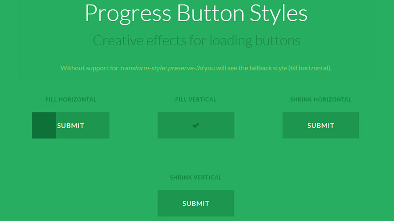
Progress Buttons are functional and practical solutions, where each item combines two functions. First of all, they are buttons that draw the attention and make the links look visually weighty. And secondly, they are supplied with a progress bar to demonstrate current status of a process. The team has created almost twenty variants that shrink, expand, rotate, flip and slide.
Slide Social Buttons
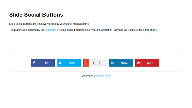
The artist has added playfulness to the buttons, making them look more friendly and welcoming. He utilizes transforms and transitions that are available in CSS3, icon font that is ideal for retina displays, and responsive foundation to create a stunning transformation for each element. They also gracefully degrade in IE8 and 9 and touch screen gadgets.
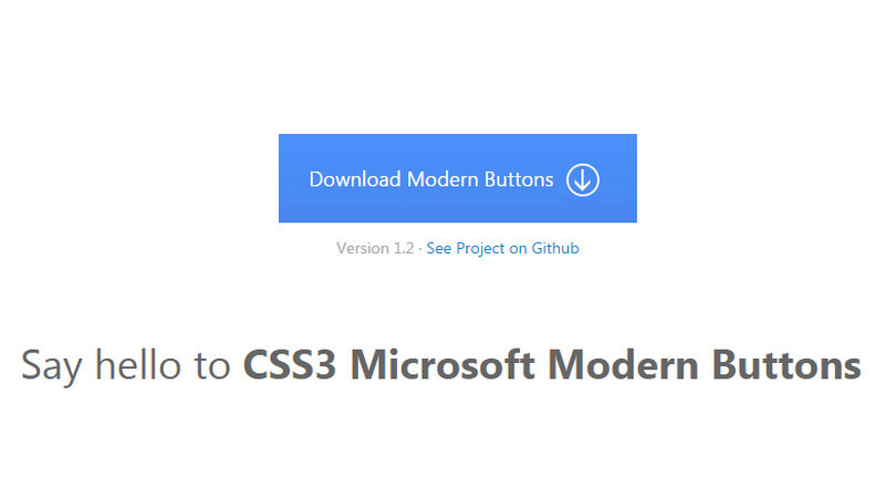
CSS3 Microsoft Modern Buttons
CSS3 Microsoft Modern Buttons look grand and imposing. The artist has tried to mimic graphics inherent to Microsoft’s Metro designs. As a result, you can grab a lightweight library that is full of helpful stuff. Each item is cross browser compatible and collaborates with Bootstrap-powered interfaces.
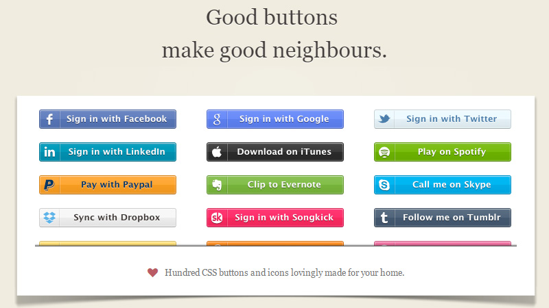
Zocial
How about a dose of old-school material? Zocial is a time-proven way of adding social media to your project: it has already enhanced numerous websites. Of course, buttons look a bit outdated with glossy surfaces and boring structure. Nevertheless, they are viable and reliable. There are one hundred CSS3 font-face and vector buttons.
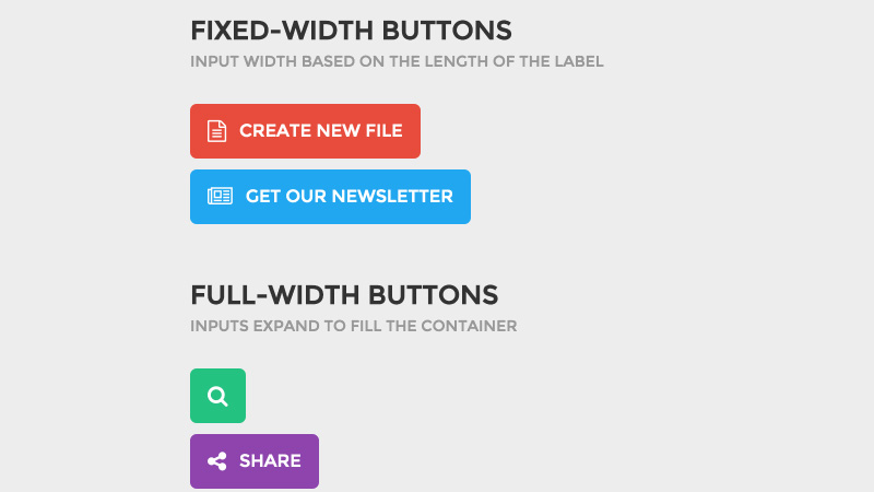
Forms within buttons
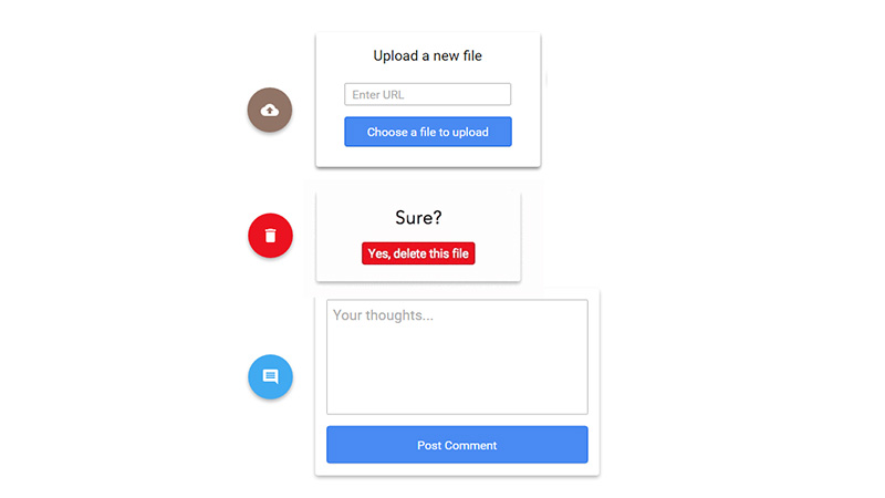
The artist presents buttons with a twist. Each component is improved with extra functionality. For example, the search icon changes from a small square to a relatively big search field, while others transform into text inputs. The solution is applicable for projects that follow the doctrine of Material Design.
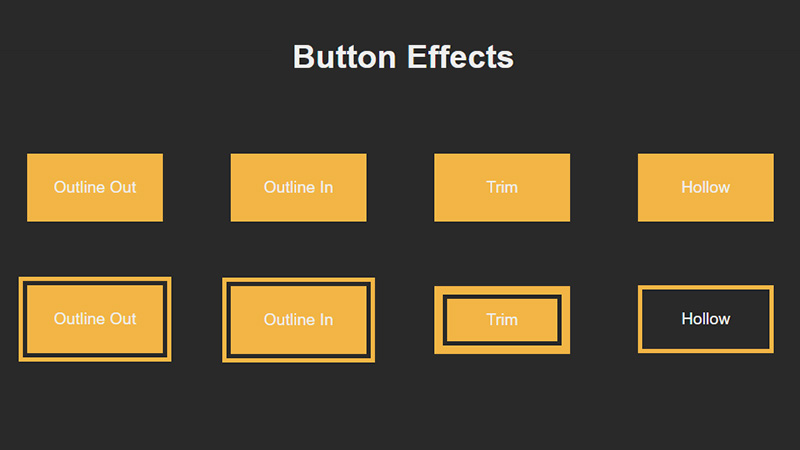
Button Effects by ChouWenKwei
The pen includes five tiny yet elegant effects for buttons. The artist manipulates with borders to achieve the visually interesting result. Although the technique is rather simple, several versions are not supported by touch screen devices.
Conclusion
Notice how little effects can make a big difference. Buttons with dynamic behavior always strike the eye and look more clickable and alluring. The great thing is that in the majority of cases the solutions are created with the assistance of CSS3. Of course, this is fraught with a lack of full browser compatibility, however, it just a matter of time until this problem falls into oblivion.
What sort of buttons do you prefer to implement in interfaces? Are they sleek, flat, or dynamic? Do they have accompanying effects?

