How To Succeed In Wireframe Design
How To Succeed In Wireframe Design
Anton Suprunenko
For the most part, we tend to underestimate things that are familiar to us. It is also very likely that we will underestimate those things that though new, seem very simple to process. And that is correct to some degree. But, when we are faced with complex cases and all measures are taken, a good and solid understanding of the basics could help us to find the right solutions.
In this article, we will take a deeper look at one of the most simple, thus, quite often underrated activities in web development that is the design of wireframes. We will find out what are wireframes, why we need to design them, how to get the most out of the wireframes design, and how to take it to the next level.
According to The Top 20 Reasons Startups Fail report by CB Insights, 17% of startups reported lack of user-friendliness as the reason for their failure. Designing a user-friendly interface is not a trivial task, especially for large and complex products where there are many entities, dependencies, and elements to be organized. To design such complex products you should follow a top-down approach and wireframes design is the best technique that could help you with that.
First, Let’s Define Terms
Wireframe — also known as a page schematic or screen blueprint, and it is a visual guide that represents the skeletal framework of a website or an application.
Additional definition we will look at is wireframing — a process of designing a wireframe, and commonly used to lay out content and functionality on a page which takes into account user needs and user journeys. Wireframes are used early in the development process to establish the basic structure of a page before visual design and content is added.
At first glance, wireframing seems simple. And herein lies the major problem: that we tend not to pay enough attention to simple things. One way to help us get the most benefits from wireframing is to define the goals of the product or service.
The main goal of wireframing, that we could get is to show the team and stakeholders which entities, pages, and components the application is going to have and how these elements of the digital product will interact with each other.
From the goal definition we can see how big the impact of wireframing is for both the development process and the final product.
When we keep in mind the goals of the wireframing process, we still need to pay attention to what are the common pitfalls to avoid during wireframes design.
Wireframing Mistakes We Want To Avoid
- Creating wireframes for the sake of ‘box-checking’;
- Skipping wireframes stage at all;
- Preparing wireframes after the visual designs;
- Not understanding why to use wireframes.
Wireframes should precede the stage of visual design, not vice versa. It’s like deciding on the technology stack for your application after having the code written.
Wireframe design lays the foundation for the quality of the design, and the better we understand the goal of this phase the more benefits we could get. So let’s dive deeper and find out why we need to design wireframes and what values this technique brings.
Businesses that lack knowledge of the product design may welcome the practice of skipping wireframe design as it allows them to cut the project costs, but this decision may lead to potential failure in the long run. And you, as the designer, should explain why we are doing it, how it will help the final product, and how it could even save future expenses.
Next, let’s check some points that could help you better understand why we need wireframes and see how wireframes help to get feedback from your developers, clients and future users of your product.
Why You Should Design Wireframes
Help Your Team Estimate And Refine The Scope Of Work
Wireframes allow designers to quickly create a visual representation of the future product and demonstrate it to the team for the needed revisions. Wireframes also help you show your team which screens the application is going to have, which elements and controls will be on each screen, and how all the elements will interact with each other. In addition, looking through wireframes is way faster than reading specifications. Also, it helps us avoid discrepancies in scope between the initial estimates and the final ones.
Involve All Team Members In The Product Design Stage
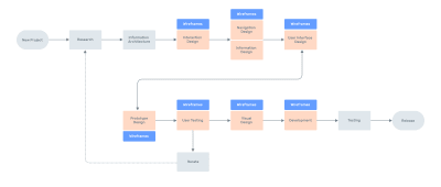
We all have been in the position of having created a top-notch design, only to be faced with development constraints. The use of wireframes allows us to involve developers in discussing designs at the early stages, enabling them to provide feedback and suggest changes before you start working on visual design. This way, you can speed up the design process and avoid wasting time and money.
Hold A Demo For Clients
Getting rapid feedback from your clients and stakeholders is an important component of the design process. Also, we all have experienced multiple change-requests from our stakeholders and that is normal. With wireframes, we could make this process more efficient. Making changes to prototypes requires more time and effort than making changes to wireframes, it will let you be more agile and don’t waste extra time on rework.
Carry Out User Testing
According to Eric Ries, author of Lean Startup, the sooner you carry out user testing, the better — no one wants to roll out an application and find out that users don’t get how to use it right. Wireframes can help designers get valuable feedback from potential users and don’t spend time on developing complex interactive prototypes when they are not needed.
The fact that UI/UX designers use wireframes does not necessarily mean that they do it right. For that, you should remember and follow the best practices.
Wireframing Best Practices
To bring the best results and serve a solid foundation for further UI, you need to follow several simple rules:
1. Minimize The Use Of Color In Wireframes
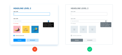
If you’re using rich color palettes in your wireframes, remind yourself of the goal of wireframing (to show which elements the product is going to have, and how they should interact with each other) and think if extra colors help you to achieve it.

In some cases, they could. But in general, adding colors to your wireframes might distract the viewer’s attention and will surely make any updates more difficult. Moreover, there’s another important issue to consider — not all clients have a good understanding of UX techniques and might take colored wireframes for final designs.
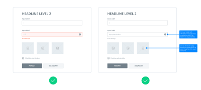
However, this doesn’t mean you should never use color on wireframes and strictly stick with the black and white palette. Sometimes using color to highlight specific components is justified. For example, you can use red for error states or blue for notes, etc.
2. Use Simple Design Of Components
When you add components to your wireframes, go for basic designs. Wireframes aren’t intended to contain thoroughly designed and detailed components. Instead, they should be easily recognized by your team members and stakeholders. Adding detailed components will cost you a lot of time and effort without being particularly useful.
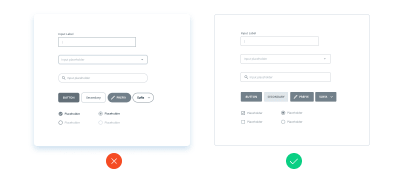
3. Maintain Consistency
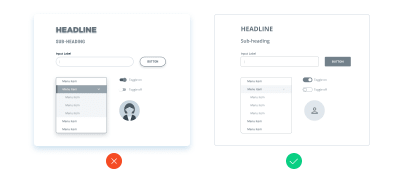
Similar components must look the same on all your wireframes. If the same components look different, developers are likely to question if they are actually the same and even add extra time to the estimates because of different designs. When working on wireframes, remember a simple rule: be consistent and try not to create confusion.
4. Use Real Content
From time to time we could see that UI/UX designers don’t add real content on the wireframes and use lorem ipsum instead. That’s a common mistake that few designers even realize they make. You may object and say that the content isn’t available at the stage of design. Well, it’s enough to use the draft version of the content.
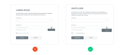
Content impacts the design you’ll create, and the draft content will help you make the right decisions and deliver the superb design. If you use lorem ipsum, however, you won’t see the full picture and will likely need to make a lot of adjustments to the UI or even worse — you will create a design that doesn’t work. Also, the real content will add value to your wireframes, explain the context better and maybe indicate that you need to start gathering the real content already.
5. Use Annotations
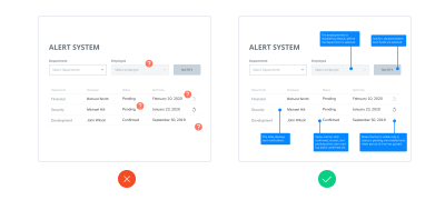
It may happen that some design solutions can’t be visually illustrated, so stakeholders or developers might have questions about them. For example, the logic behind some controls. In such cases, you can provide on-screen annotations to explain the logic behind that. This way, your team will understand your solutions, and you won’t need to spend time discussing them.
6. Low To High-Fidelity
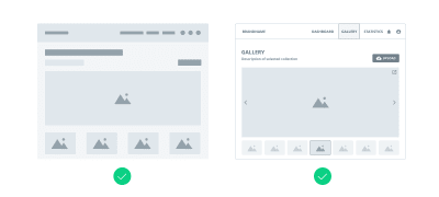
There’s no strict rule. Sometimes you should go for low-fidelity wireframes, while some projects might require high-fidelity ones. It depends on the project, so if you feel like adding more details to the wireframes — don’t hesitate to do it. But according to Eric Ries, don’t do extra work when this doesn’t bring value, start from the basics and then add details as long as they are needed. For instance, if you need to draw the developers’ attention to some custom solution, then add more details to illustrate it in your wireframes.
7. Extend Wireframes To Prototypes
As designers we work with different products, some of them have simple and common interactions, and some of them have quite advanced ones. Sometimes wireframes are not enough to illustrate the interaction of complex and uncommon interfaces, but instead of writing long notes and spending hours on explanations, you could extend your wireframes to interactive prototypes.
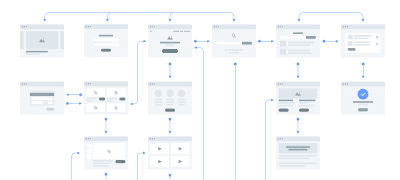
The good news is that today we have a wide range of simple but very powerful tools like Figma, Invision, Adobe XD, UXPin, Axure, Moqups, etc. and we definitely need to review them and choose the best tool for designing the wireframes and developing simple prototypes.
Wireframe Design Tools
Now it’s time to choose a superb wireframing tool that will help you create amazing designs and streamline your workflow. There are a lot of different options you can use for wireframing, and you might have used some of them before. I’d like to give you a basic understanding of how different they are.
Most wireframe tools are tailored to:
- Simplicity
They have a low barrier to entry and are perfect for people who take their first steps in UI/UX design and lack experience using more sophisticated software. - Collaboration
These are packed with a rich functionality for teamwork. Collaboration is a backbone of modern software development, so the best wireframing tools not only provide lots of features but allow for efficient and easy collaboration between all team members involved in the design process.
Here are the most widely used wireframe tools tailored to collaboration:
- Figma
A powerful cloud-based tool that comes in a web version and desktop applications for Windows and macOS. Figma comes with a lot of powerful features for building wireframes, prototypes, UIs, and more (see table below). - Sketch
This tool is extremely popular with UI/UX designers. If you need to go beyond the default Sketch toolset, you can use dozens of plugins to get extra functions. Unlike many of its competitors, Sketch is available only on macOS and you will need a 3rd-party solution for collaboration.
There are plenty of applications you can use to design wireframes. You shouldn’t make a choice based solely on the features provided in the application. Instead, I would advise you to try and explore all of them and decide which works for you best. Below you can find a list of some of the most popular tools to start with.
| Tool | Pros | Cons |
|---|---|---|
| Sketch |
|
|
| Figma |
|
|
| Invision Studio |
|
|
| Adobe XD |
|
|
| Principle |
|
|
| Framer X |
|
|
| UXPin |
|
|
| Balsamiq |
|
|
| Axure |
|
|
| Moqups |
|
|
| Adobe Photoshop |
|
|
| Adobe Illustrator |
|
|
As an example of the power of modern design tools, I’d like to share my own experience and show you how we set up an effective wireframing design process with one of the tools above.
Case Study: How We Set Up A Wireframing Process Across Multiple Teams
Context
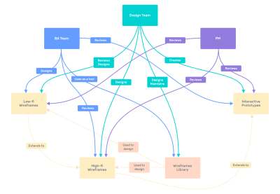
The company I worked at was building complex fintech digital products. Apart from the design team, there was a professional team of business analysts (BAs). They prepared the requirements and created low-fidelity wireframes that they passed on to our design team.
Picking The Tool
We needed to choose an all-in-one tool for the BA and design teams. Since most business analysts have fairly low design skills, we wanted to find a tool that would be simple enough for BAs and — at the same time — powerful enough for designers. Also, easy collaboration was our team’s priority. Based on these criteria, we opted for Figma.
Creating The Library Of Components
To streamline the product design process, we created a custom library of components that the BA team could use. This allowed us to speed up the wireframing, as the business analysts could quickly use ready-made blocks instead of drawing their own.
Training The Team
To show how to use Figma and the library of components, we held a workshop for our BA team. We also found it important to teach them some extra features, such as prototyping.
Result
In our case Figma proved to be efficient for wireframing and collaboration, even though the team members were located in Ukraine, Australia, and the Philippines. We currently use Figma for the communication channel — it proved to be more convenient to collaborate on the wireframes by mail or in messengers.
Summing Up
Being a simple practice, wireframes design usually doesn’t get enough awareness from us, designers, when we face them for the first time.
As a result, lack of attention for this technique leads to a number of flaws, when we either add a lot of decoration to wireframes, or create low-fi wireframes for the sake of box-checking when the project rather requires a more detailed solution, or even skip this stage and go straight to visual UI design.
Usually, all of these mistakes are the result of poor understanding of both wireframes design objectives (that is to show which elements the product is going to have, and how they should interact with each other), as well as poor understanding of when wireframes could help us, like:
- Wireframes could help the team to get more precise estimates of the project.
- Wireframes could help to involve all team members to design processes and avoid engineering mistakes that will affect the development process.
- Wireframes could help us to make early presentations to clients, stakeholders and conduct user testing sessions to get feedback as soon as possible, and save time on the development of poor solutions.
Today, as designers, we are lucky as never before because there are dozens of tools available for us to design wireframes and also smoothly integrate this activity in our general design process.
The only thing that we need to do is to spend some time to incorporate both the technique and tools in our own design process, and find a way how to make them work for us to take our product design process to the next level. That they certainly can.
 (ah, yk, il)
Articles on Smashing Magazine — For Web Designers And Developers
