How To Get To Know Your Users
How To Get To Know Your Users
Lyndon Cerejo
(This article is kindly sponsored by Adobe.) Users are at the heart of User-Centered Design (UCD), with designers focusing on actual users and their needs throughout the design process. The goal is to design interfaces and products that work for those users.
As much as we would like to think that our users are like us, they are not. Anyone involved in the creation of a product or an interactive experience, be it a site, system, or an app, is not a typical user — and that includes all the business stakeholders, designers, and developers. As advocates of users, we often have to remind ourselves and others of one of the primary UCD commandments:
“Know thy user, and YOU are not thy user.”
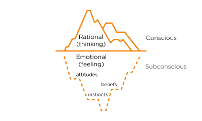
How well do we really know our users? Traditional UX research focuses on user needs, expectations, and goals, most of what is visible and observable, like the tip of an iceberg. That works well for designing user experiences that meet user needs, allowing them to complete tasks and achieve their goals. But if the design needs to persuade users to take some action, we need first to identify what motivates or inhibits them.

This article will look at how going below the surface during user research helps us really understand what triggers our users, and how those deeper insights will help us design for persuasion.
Traditional UX Research
One of the first steps in design is identifying and researching who we are designing for so that we can focus on the groups of users that matter the most, and ensure that the design meets or beats their expectations.
User research is a great way for us to get a deep understanding of the people we are designing for. User interviews and contextual inquiries, focus groups, and surveys are commonly used research techniques to understand actual users, along with their needs, expectations, and goals. Sometimes, during user interviews, feelings or emotions may be mentioned in the conversation, but are not usually the central focus of the research.
User interviews that are based on task analysis usually focus on:
- Who they are (profile);
- What they do, when and where (context);
- Why they do it (needs, goals, tasks) ;
- How they do it (experience);
- What they like or dislike (frustrations).
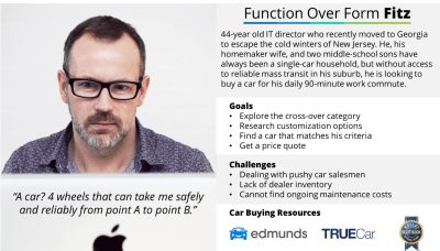
This research is valuable; it gives the entire team a shared understanding of actual users and builds empathy during the design process. One way to bring these users to life and make it easy for everyone to visualize the actual end users of the product or service is by creating user personas. A persona is a fictional, yet realistic description of a typical user from a key user group. There are many variations and formats, but the description usually includes personal, professional and technical information about the user, along with their knowledge, experience, goals, and frustrations related to the product or service. Give them a name, and put a face to that name, and you get to meet “Soccer Mom Sue” or “Function Over Form Fitz” (shown below).

One way to keep these users top of mind is to put up posters of personas in the work area to remind us of who we are ultimately designing for, during all stages of the project –from defining requirements through design and development.
When prioritizing new features and enhancements, the deciding factor is no longer subjective, or based on personal preferences and likes of HiPPOs (Highest Paid Person’s Opinion), but focused on the user: “Will this new feature entice Fitz to use our site to configure a car?” or “Will this make it easier for Susan to compare our car models?”. Fitz and Susan also serve as constant reminders to designers who try to create “bleeding edge” designs (“Would Fitz find this interface intuitive?”), and to developers tempted to incorporate the latest technology (“Will Susan’s computer support this new technology?”). In time, Fitz and Susan become entrenched in the project, helping us build for them, not us, resulting in a solution that is useful, usable and meets their needs.
This works well to create products and interfaces that are functional, efficient and usable, allowing users to complete their tasks and achieve their goals.
Behavioral Research For Persuasive Design
Usability or task-oriented user research mainly focus on the cognitive level, how and why our users think, reason and act the way they do. We may sometime scratch the surface and get some feelings from these users, but we don’t usually don’t probe deep into their emotional experiences.
Behavioral research builds on traditional research approaches since persuasive design is aimed at changing behavior. Some examples of behavior changing actions in design include persuading users to try or buy a product or service (get a quote, schedule a test-drive), start or stop a behavior (start exercising, stop smoking), or convincing them to act on a belief or information (donate, vote).
If you are already using persuasive design techniques, quantitative data can identify which tactics are working for your users. But there is a wealth of information that you can get from qualitative methods like user interviews. One-on-one interviews allow researchers to dig below the cognitive level, and reach the emotional level to get to users’ feelings and beliefs. Advertisers and marketers have been doing this for years and you can see the results in the campaigns you are bombarded with daily.
During behavioral research, researchers focus on the users’ feelings, emotions, motivations, and barriers related to the action that is being triggered. For a common behavior target of getting the user to buy something, look for how users feel during the purchase journey. As an extreme example, while probing the purchase of “stigmatized products” (tobacco, alcohol, or personal enhancement products), users may have feelings of embarrassment, shame, over even guilt associated with the purchasing experience.
How do you get the user to discuss their emotions? Psychotherapists go through years of education and training before they master the art of unearthing mental, emotional, and behavioral issues to help their clients. Since our user interviews do not have the same life-changing impact or consequences, we do not require the same level of rigor. However, this is not something you can learn overnight, but you can learn more through courses like HFI’s PET Design. This article will not attempt to teach you how to do it, but introduce how these user interviews differ.
User interviews that focus on emotions, beliefs, and feelings focus on the intended action and:
- How users feel (about the intended action);
- What emotions are evoked in the process;
- What are their emotional motivations to complete the intended action;
- What are their barriers that may prevent them from taking the intended action;
- Their values and beliefs related to the intended action;
- Social or cultural factors that may impact the experience.
In a nutshell, the user interviews still start off by building rapport and learning about the user. After that, the interview focuses on the desired action by using a scenario and stimulus (e.g. buying a car), and a few closed-ended questions to get the participant on a topic (e.g. “When was the last time you bought a car?” and “Did you research your car online?”). Once the user is in the frame of mind of the scenario, the questions transition to open-ended questions that probe for emotions (“Can you describe that experience?” “What did that feel like?” “Why did you feel that way?”). The key is to guide the user from thinking to feeling, from facts and reason to emotions, and probing the subconscious, looking for motivators and barriers to them taking the desired action in the scenario. Interviewing techniques of active listening, not leading the user, and not being judgmental, all hold true.
Car Shopping Example
Let’s use an example of buying a car and see how we can really get to know the users. For the sake of simplicity, let’s focus on one persona (shown previously): Function Over Form Fitz, created based on the persona development questions from usability.gov. We’ll follow Fitz as he contemplates buying a car.
Fitz Grant is a 44-year old IT director who recently moved to Georgia to escape the cold winters of New Jersey. He, his homemaker wife, and two middle-school sons have always been a single-car household, but without access to reliable mass transit in his suburb, he is looking to buy a car for his daily 90-minute work commute.
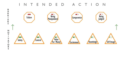
The persona and scenario above are common for task analysis oriented user research, including their needs and frustrations. However, if you focus on probing the emotional aspect of buying a car, user interviews may uncover the following themes for barriers and motivations:

Barriers (strongest to weakest, strength shown using a battery indicator):
- Fear of failure
- ‘I’m scared of making the wrong choice with such a high price tag and letting down my family’
- Fear of being manipulated
- ‘I detest the thought of having to deal with aggressive sales tactics or being pressured into unnecessary upgrades or warranties’
- Fear of compromise
- ‘I will be disappointed if I have to compromise on features I need because of dealer inventory or cost’
- Fear of being judged
- ‘I don’t like being thought of a cheapskate; I am just looking for value and a good deal.’
Motivators (strongest to weakest):
- Safety
- ‘I need to be safe and secure in my car, especially with all the distracted driving around me’
- Control
- ‘I would like to be able to customize options that are important to me; I don’t want the “technology package”, I only need the safety features and Bluetooth connectivity for my calls’
- Value for Money
- ‘For the price I will be paying, I should get some ongoing service benefits like free oil changes from the dealer.’
- Excitement
- ‘I get a high when I can combine incentives, rebates, and discounts to get a great deal!’
- Knowledge
- ‘I like to be prepared and research on my own, so I can be confident with my choices’
- Self-Image
- ‘I’m technology savvy to be able to do everything online, except the test drive!’
Armed with this additional information, we can orchestrate the experience to weaken the barriers and strengthen the motivators to get users like Fitz to take the intended action, like requesting a quote on a car currently in stock in the dealer lot. To weaken Fitz’s “Fear of Failure” barrier, a site could highlight that they offer a 24-hour test drive, which allows him to drive it home, see how it fits in his garage, and sleep over the decision.
Given that safety is such a strong motivator, the site could frame the conversation around safety through a combination of color, imagery, content, third-party award badges (IIHS Top Safety Pick+), user testimonials, and interactive simulations. Function Over Form Fitz may even change to Safety Minded Fitz.
This was a hypothetical example of how understanding your users’ barriers and motivations can help you preemptively address them through design, and make it easier for your user to take the intended action. It is important that we do this in an ethical manner, without resorting to pressure, or deceit.
Conclusion
Traditional user research helps us design meet users’ transactional and usability needs to make sure they can use a design. Research for persuasive design digs below the surface thinking level to the feeling level, and moves beyond the rational to the emotional level, to influence users to want to use the design. Getting to know your users at a deeper level will help you use psychology in design to get users to engage in behaviors they were already considering — with you instead of a competitor.
Further Reading
- “Interviewing Users: How To Uncover Compelling Insights,” Steve Portigal
- “A Closer Look At Personas: A Guide To Developing The Right Ones (Part 1 | Part 2),” Smashing Magazine
This article is part of the UX design series sponsored by Adobe. Adobe XD tool is made for a fast and fluid UX design process, as it lets you go from idea to prototype faster. Design, prototype and share — all in one app. You can check out more inspiring projects created with Adobe XD on Behance, and also sign up for the Adobe experience design newsletter to stay updated and informed on the latest trends and insights for UX/UI design.
 (ms, ra, il)
Articles on Smashing Magazine — For Web Designers And Developers
