How To Ensure Your Design System Helps To Achieve The Purpose Of Your Product
How To Ensure Your Design System Helps To Achieve The Purpose Of Your Product
Nick Babich
(This is a sponsored post.) Design systems help product teams to approach design with a system in mind. But not all design systems are equally effective. Some design system help product teams create coherent experience; others produce confusing designs.
The effectiveness of a design system can be measured by how well it works to help achieve the purpose of the product. In this article, we’ll try to find the qualities that make a design system good for your product development.
Do You Clearly Understand Why You Need A Design System?
All too often, product teams attempt to create a solution for a problem they don’t have. And when it comes to creating a design system, some teams attempt to create a system just because other teams are doing it.
Product And Company Maturity
Companies have different levels of design maturity. Some companies have a product with thousands of users, while others are just beginning to implement their product.
Creating a design system from scratch is a time-consuming activity. Small fast-moving teams likely don’t need a design system because it would slow them down. A three-to-five–person startup that is trying to find a product-market fit would probably spend a significant amount of time creating a system. And if resources are being spent on building a design system, they aren’t being spent on building the product. Until the company establishes a clear direction with its product, investing time in creating a design system risks producing a lot of waste.
A design system should come from the need to increase efficiency at scale. And it happens only when a team has real problems with the efficiency that prevent it from moving quickly. Let your team hit scale first and reach a point where inefficiencies such as in the technical and design departments become significant factors in design decisions.
Interface Audit And Technology Stack
Many companies tend to build a design system on top of the current interface, but this approach is not very good for many reasons. Imagine that your company has been building a product for a long time without a system; it’s likely that the product has some level of inconsistency in design.
That’s why if you plan to introduce a design system, start with an audit: Explore existing interactions, and collect all of the UI elements in your product. Collect all elements that make up the interface, and file them for review. The reviews should help you to understand the reason for inconsistency and the changes you’ll need to introduce in the design process in order to avoid such problems in the future.
Does The Design System Set A Clear Direction For Designers And Developers?
A design system is valuable only if the people who are working on the product adopt it. Shared understanding plays a vital role in adoption of the system.
Before starting to design a product, it’s essential to align teams around a clear set of shared goals. Build a vision, and ensure that everyone is looking in the same direction. A design system should give teams a guided way to build solutions for their product problems.
Mapping Out User’s Needs, Goals, And Motivations
One of the first things we need to do when starting to work on a product is to understand who our users are and what are their goals, needs, and motivations. This information should be the foundation of the design system you want to create.
Tools like user-journey mapping and the Jobs to be Done framework will help you to understand how people interact with your product. The product team should keep this information in mind when working on the design system.
Express The Purpose Of The Product
The purpose is the core of the product, and it should inform design and development decisions. The purpose of a product should be expressed in one sentence. For instance, if we were designing a meditation app for quick relaxation, our goal would be to help people who use our app to relax. If we expressed this purpose in a single sentence, it would be something like, “Help people relax in no time.”
Note that the purpose should be natural, not forced; otherwise, the team won’t believe in it.
Establish Clear Design Principles
Solid design principles are the foundation of any well-functioning system. They should capture the essence of what good design means for the company and provide practical recommendations for product teams on how to achieve it.

Below are just a few guidelines for design principles.
Design Principles Should Be Authentic And Genuine
Many of us hear principles like “simple and useful”. But qualities like these should be a given. Knowing that your product should be simple and useful is not going to be helpful in guiding your design decisions. Imagine that a new member joins your team, and you need to share the three guiding principles that are most important when designing a product. You might say something like, “We like simple things — strive to create simple things.” This doesn’t say much to the person. It’s hard to imagine that anyone would intentionally create a complex and useless product.
That’s why principles should offer practical guidance on how to solve a design problem within the context of the particular product. One of the design principles of Medium, a popular blogging platform, is “Direction over choice.” Thanks to this principle, instead of designing a text editor with endless visual styles, Medium’s design team decided to limit the number of visual styles. In doing so, they make the writer focus on what’s really important: the content they are producing.

Design Principles Should Be Memorable
Ask the people in your company what your design principles are. If no one can remember them, chances are they are not working.
Design Principles Should Provide Practical Examples
Even the best principles can be interpreted in different ways. Nothing makes a principle clearer that being paired with a real-life example, showing how it can be applied in context.
Tip: Sometimes you need to provide counter-examples to help people understand what not to do.
How Effective Is The Design Language Of The Interface?
A design language emerges as a team works on a product. The design language of the interface has a significant impact on how users interact with the product. If a product created with a design system is confusing and doesn’t help users achieve their goals, then the design system is not effective.
How Design Patterns Are Executed And Applied
A pattern is a reusable solution that can be applied to solve a design problem. Design patterns are shaped by the core idea of how a product works, and they form the foundation of the language that the team uses to communicate with users.
There are two types of patterns: functional and perceptual.
Functional Patterns
Functional patterns are the tangible building blocks of an interface. Buttons, icons, text fields and so on all come together to form what we call a product.
Many factors influence the choice of design patterns, and most of them come from the domain that the product belongs to and from its core functionality. Let’s take a finance product as an example. A finance product might need to prioritize multitasking and quick scanning (which require greater information density). In Bloomberg’s interface, shown below, density is achieved through tight spacing, compact controls, and good typography choices.

Perceptual Patterns
In his book _The Timeless Way of Building_, Christopher Alexander asks why some places feel so great to be in, while others feel dull and lifeless. According to him, the way places and buildings make us feel is the result of specific patterns: perceptual patterns.
Perceptual patterns focus on what users feel. Colors, typography, iconography, shapes, and animation come together to form the identity of a product. Without perceptual patterns, you wouldn’t sense much difference between products in the same domain.
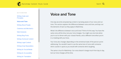
The aesthetics and voice and tone in a product should capture the personality and ethos we want to convey through the interface:
- How do we want our product to be perceived?
- Is our product serious or playful?
- Should it be utilitarian or emotional?

It’s also important to understand that perception is influenced not only by individual elements (text, colors, typefaces, white space, etc.), but also by the relationships between those elements. In other words, it’s not enough to use colors and fonts consistently; we should also be aware of the “just right” combinations that make a product feel a certain way.
Tip: When working on a perceptual pattern, you can use the technique of moodboarding. Collect all elements with relevant visual styles, and define their core visual brand elements. Moodboards are an excellent tool to explore different visual themes. To make one, you can use a digital tool like Pinterest or assemble printed pages on a large board.
Measure Your Progress
Implementing a design system is a process. And it’s crucial to ensure along the way that the system is helpful. No matter how good you are at predicting things, in many cases, it will be hard to predict how a particular change will affect the user experience. That’s why it’s important to define metrics and to track them along the way. After every release, measure how your product performs. Measure the qualitative and quantitative results, and make sure your metrics are going in the right direction.
How Effective Are The Practices Of The Team?
How Fast Does The Internal Design Team Work?
Can the people working on the product ship changes more quickly?
An effective design system allows a business to meet its goals faster and at a lower cost. A design system should reduce implementation decisions, because team members would have all elements of a product ready for use, along with information on how to use them. As the process of building products accelerates, designers will gain time, which they can invest in other areas, such as user research.
Here are a few areas to monitor:
- Efficiency
Measure how fast new patterns are integrated and how fast changes to existing patterns are introduced. If designers often have to introduce a new component to solve a problem, that could be a strong sign that the design system is not flexible. - Consistency
How hard is to create consistent experiences across different platforms.
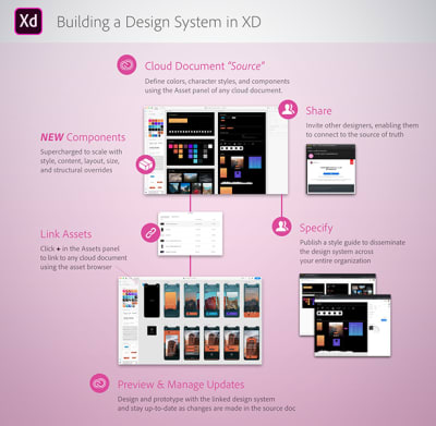
When it comes to design efficiency, investment in tools and technology is essential. A good toolbox will help to eliminate manual operations from your design process. Adobe XD offers two excellent features that can improve design efficiency: components and shared assets panel.
Using XD, you can create a master component to define a reusable UI element, such as a button. Create instances of any component in your UI, and customize them. The components are designed to resize responsively, so you can take any instance and adjust the size of the component, and XD will automatically manage the placement and scaling of the elements within the component for you.
You can use the Assets panel to curate a collection of reusable elements that you want to make available to other designers on your team. To enable others to use the visual styles and components you’ve defined, invite them to the document using “Share” → “Invite to Edit”. The great news is that everyone will leverage the latest assets; whenever the design is updated, team members who have been invited to the collection will be notified about the changes. Team members will be able to update at their own discretion.
How Easily Can Developers Code The UI?
It’s well known that developers and designers must work hand in hand. And when it comes to communication between designers and developers, design specifications play a key role. The most important aspect of the design specification is clarity: If developers don’t understand the specification, they might implement something different from the original idea. A good design specification reduces false interpretation of design decisions.
With Adobe XD, creating an unambiguous specification is a relatively simple process. You can use “Share” → “Share for Development” to publish your design system on the web. The resource will contain information about color values, style attributes, and downloadable assets.

How Good Are The Naming Conventions?
Does the design system allow team members to communicate more efficiently? Language is fundamental to collaboration. Every element in a design system should have a name that is known and that makes sense to the people on your team. Proper naming conventions are especially important for products that will scale — as the number of patterns in a library increases, good naming conventions can help team members quickly find what they’re looking for.
Here are a few tips on naming elements:
- The distinguishing aspect of a design system’s language is its stickiness. Similar to any other language, we need to use the language if it is to survive. It needs to be a part of our daily routine.
- Naming an element can be hard when the team hasn’t fully understood its purpose. If you have a hard time finding the right name, chances are that something isn’t quite right. Maybe an element’s purpose is unclear.
- Name components from the user’s perspective. Speak to users and potential users of the product, and name components according to how their refer to them. This will help engineers to think from the user’s perspective and to always have users in mind.
- Test your language with users. This ensures that the modules you’ve defined are aligned with your user’s potential behaviors and mental models.
How Easy Is It To Maintain The System?
A design systems is not a static tool, but rather a living organism in your company. It should grow and evolve together with your product. The time required to keep the system up to date plays a key role in its success or failure. If keeping the design system updated becomes difficult, it will quickly become outdated.
Here are two important moments to consider:
- Depending on the size of a company, a design system could be either static or dynamic. It’s always better to have a dynamic design system, one that will be updated in real time with the product. Also, a static design system would not fit a company that has large-scale products, because the time required to introduce changes would be significant.
- A design system should have a roadmap and backlog. As with any other product, creating a design system is an iterative process, constantly ongoing.
Does The Design System Extend Creative Directions?
Creative experimentation is an integral part of the design process. Sometimes, effective design decisions are based on intuition. That’s why one of the main goals of a design system is to extend creative direction. A design system should encourage the people who work on the product to be creative and spontaneous.
Invite Everyone To Contribute To The System
Everyone in the company should be not only allowed but encouraged to contribute to the system. Give people enough freedom to contribute, yet make sure the system stays managed and curated.
Tip: Follow a process of peer-to-peer reviews. This will increase awareness of the design system.
Achieve A Balance Between A Sticky And Loose System
Some users of design systems fixate on perfect consistency. But perfect consistency doesn’t guarantee a great product. If the process you’re following is restrictive, you risk ending up with a generic design. That’s why it’s vital to find a balance between consistency and creative expression in the design.
When it comes to creative exploration, it’s always better to experiment on a small scale first. If some elements work well (such as a new style for a call-to-action button), then the design system should make it easy to integrate the changes into other parts of the interface.
Conclusion
A well-crafted design system serves as a North Star of your product development. A design system amplifies design-driven culture — it encourages people who work on the product to look beyond the building blocks and to think of the purpose of their design. The big picture that a design system imparts will lead to a better understanding of your users and, ultimately, a better user experience.
Recommended Reading
- “Design Systems,” Alla Kholmatova
- “Eight Shapes,” Nathan Curtis
This article is part of the UX design series sponsored by Adobe. Adobe XD tool is made for a fast and fluid UX design process, as it lets you go from idea to prototype faster. Design, prototype and share — all in one app. You can check out more inspiring projects created with Adobe XD on Behance, and also sign up for the Adobe experience design newsletter to stay updated and informed on the latest trends and insights for UX/UI design.
 (ms, yk, il)
Articles on Smashing Magazine — For Web Designers And Developers
