How To Create And Deploy Angular Material Application
How To Create And Deploy Angular Material Application
Shubham
Angular is one of the popular choices while creating new web applications. Moreover, “Material Design” specs have become a go-to choice for creating minimal and engaging experience today. Thus, any new “Angular” project mostly uses the “Angular Material Design Library” to use the components which follow the material design specifications. From smooth animations to proper interaction feedback, all of this is already available as part of the official material design library for angular.
After the web application is developed, the next step is to deploy it. That is where “Netlify” comes into the picture. With its very easy to use interface, automatic deployment, traffic splitting for A/B testing and various other features, Netlify is surely a great tool.
The article will be a walkthrough of creating an Angular 8 web application using the official Angular Material Design library. We will be creating a QR Code generator web application completely based on Angular while hosted on Netlify.
Files for this tutorial can be found on GitHub and a demo version is deployed here.
Getting Started
Note: I will be using VSCode and Microsoft Windows as the preferred IDE and OS, though the steps would be similar for any other IDE on any other OS.
After the above prerequisites are complete, let’s begin!
Mocks & Planning
Before we begin creating the project, it would be beneficial to plan ahead: What kind of UI would we want in our application? Will there be any reusable pieces? How will the application interact with external services?
First, check the UI mocks.
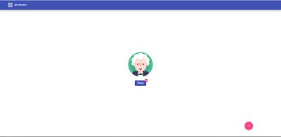

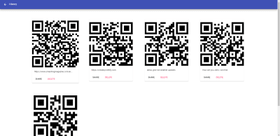
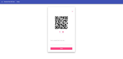
These are the three different pages which will be contained in the application. The homepage will be the starting point of our application. Creating a QR page should deal with the creation of a new QR code. The History page will show all the saved QR codes.
The mockups not only provide an idea of the look and feel of the application, but they also segregate the responsibility of each page.
One observation (from the mocks) is that it seems that the top navigation bar is common across all the pages. Thus, the navigation bar can be created as a reusable component and reused.
Now that we have a fair bit of an idea as to how the application will look and what can be reused, let’s start.
Creating A New Angular Project
Launch VSCode, then open a terminal window in VSCode to generate a new Angular project.
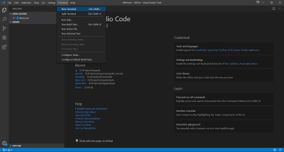
The terminal will open with a default path as shown in the prompt. You can change to a preferred directory before proceeding; in the case of Windows, I will use the cd command.
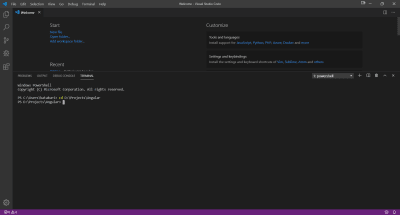
Moving forward, angular-cli has a command to generate new projects ng new <project-name>. Just use any fancy project name you like and press enter, e.g. ng new qr.
This will trigger the angular-cli magic; it will provide a few options to configure some aspects of the project, for instance, adding angular routing. Then, based on the selected options, it will generate the whole project skeleton which can be run without any modification.
For this tutorial, enter Yes for routing and select CSS for styling. This will generate a new Angular project:
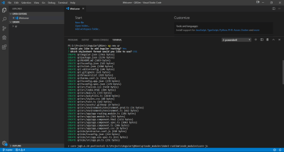
We now have got ourselves a fully working Angular project. In order to make sure everything is working properly, we can run the project by entering this command in the terminal: ng serve. Uh oh, but wait, this results in an error. What could have happened?
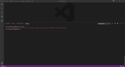
Don’t worry. Whenever you create a new project using angular-cli, it generates the whole skeleton inside a folder named after the project name specified in the command ng new qr. Here, we will have to change the current working directory to the one just created. In Windows, use the command cd qr to change directory.
Now, try running the project again with the help of ng serve:
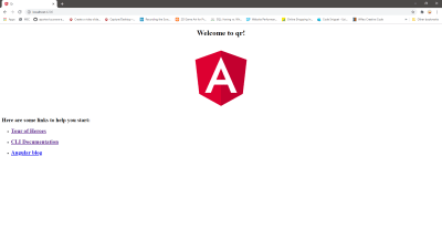
Open a web browser, go to the URL http://localhost:4200 to see the project running. The command ng serve runs the application on port 4200 by default.
TIP: To run it on a different port, we use the command ng serve --port <any-port> for instance, ng serve --port 3000.
This ensures that our basic Angular project is up and running. Let’s move on.
We need to add the project folder to VSCode. Go to the “File” menu and select “Open Folder” and select the project folder. The project folder will now be shown in the Explorer view on the left.
Adding Angular Material Library
To install the Angular material library, use the following command in the terminal window: ng add @angular/material. This will (again) ask some questions such as which theme you want, whether you want default animations, whether touch support is required, among others. We will just select the default Indigo/Pink theme, Yes to adding HammerJS library and browser animations.
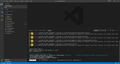
The above command also configures the whole project to enable support for the material components.
- It adds project dependencies to package.json,
- It adds the Roboto font to the index.html file,
- It adds the Material Design icon font to your index.html,
- It also adds a few global CSS styles to:
- Remove margins from the body,
- Set
height: 100%into the HTML and body, - Set Roboto as the default application font.
Just to be sure that everything is fine you can run the project again at this point, though you will not notice anything new.
Adding Home Page
Our project skeleton is now ready. Let’s start by adding the homepage.

We want to keep our homepage simple, just like the above picture. This home page uses a few angular material components. Let’s dissect.
- The top bar is a simple HTML
navelement which contains material style button,mat-button, with an image and a text as its child. The bar color is the same as the primary color which was selected while adding Angular material library; - A centered image;
- Another,
mat-button, with just a text as its child. This button will allow users to navigate to the history page; - A count badge,
matBadge, attached to the above button, showing the number of QR codes saved by the user; - A floating action button,
mat-fab, at the bottom right corner having the accent color from the selected theme.
Digressing a little, let’s add other required components and services first.
Adding Header
As planned previously, the navigation bar should be reused, let’s create it as a separate angular component. Open terminal in VSCode and type ng g c header (short for ng generate component header) and press Enter. This will create a new folder named “header” which will contain four files:
- header.component.css: used to provide styling for this component;
- header.component.html: for adding HTML elements;
- header.component.spec.ts: for writing test cases;
- header.component.ts: to add the Typescript-based logic.
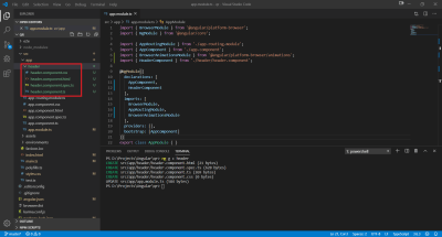
To make the header look like as it was in the mocks, add the below HTML in header.component.html:
<nav class="navbar" [class.mat-elevation-z8]=true> <div> <button *ngIf="showBackButton" aria-hidden=false mat-icon-button routerLink="/"> <mat-icon style="color: white;"> <i class="material-icons md-32">arrow_back</i> </mat-icon> </button> <span style="padding-left: 8px; color: white;">{{currentTitle}}</span> </div> <button *ngIf="!showBackButton" aria-hidden=false mat-button class="button"> <img src="../../assets/qr-icon-white.png" style="width: 40px;"> <span style="padding-left: 8px;">QR Generator</span> </button> <button *ngIf="showHistoryNav" aria-hidden=false mat-button class="button" routerLink="/history"> <span style="padding-left: 8px;">History</span> </button> </nav>TIP: To add elevation for any material component use [class.mat-elevation-z8]=true, the elevation value can be changed by changing z value, in this case it is z8. For instance, to change the elevation to 16, use [class.mat-elevation-z16]=true.
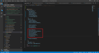
In the above HTML snippet, there are two Angular material elements being used: mat-icon and mat-button/mat-icon-button. Their usage is very simple; first, we need to add those two as modules in our app.module.ts as shown below:
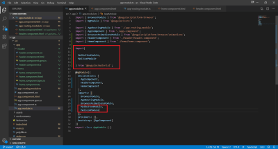
mat-icon and mat-button (Large preview) This will allow us to use these two Angular material elements anywhere in any component.
For adding material buttons, the following HTML snippet is used:
<button mat-button> Material Button </button>There are different types of material button elements available in the Angular material library such as mat-raised-button, mat-flat-button, mat-fab and others; just replace the mat-button in the above code snippet with any other type.
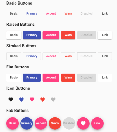
The other element is mat-icon which is used to show icons available in the material icon library. When the Angular material library was added in the beginning, then a reference to the material icon library was added as well, which enabled us to use icons from the vast array of icons.
The usage is as simple as:
<mat-icon style="color: white;"> <i class="material-icons md-32">arrow_back</i> </mat-icon>The nested <i> tag can be used to change the icon size (here it’s md-32) which will make the icon size 32px in height and width. This value can be md-24, md-48, and so on. The value of the nested <i> tag is the name of the icon. (The name can be found here for any other icon.)
Accessibility
Whenever icons or images are used, it is imperative that they provide sufficient information for accessibility purposes or for a screen-reader user. ARIA (Accessible Rich Internet Applications) defines a way to make web content and web applications more accessible to people with disabilities.
One point to note is that the HTML elements which do have their native semantics (e.g. nav) do not need ARIA attributes; the screenreader would already know that nav is a navigation element and read it as such.
The ARIA specs is split into three categories: roles, states and properties. Let’s say that a div is used to create a progress bar in the HTML code. It does not have any native semantics; ARIA role can describe this widget as a progress bar, ARIA property can denote its characteristic such as it can be dragged. ARIA state will describe its current state such as the current value of the progress bar. See the snippet below:
<div id="percent-loaded" role="progressbar" aria-valuenow="75" aria-valuemin="0" aria-valuemax="100"> </div>Similarly, a very commonly used aria attribute: aria-hidden=true/false is used. The value true makes that element invisible to screen-readers.
Since most of the UI elements used in this application have native semantic meaning, the only ARIA attributes used are to specify ARIA visibility states.For detailed information, refer to this.
The header.component.html does contain some logic to hide and show back button depending on the current page. Moreover, the Home button also contains an image/logo which should be added to the /assets folder. Download the image from here and save it in the /assets folder.
For styling of the navigation bar, add the below css in header.component.css:
.navbar { position: fixed; top: 0; left: 0; right: 0; z-index: 2; background: #3f51b5; display: flex; flex-wrap: wrap; align-items: center; padding: 12px 16px; } .button { color: white; margin: 0px 10px; }As we want to keep the header component reusable across other components, thus to decide what should be shown, we will require those as parameters from other components. This requires usage of @Input() decorator which will bind to the variables we used in header.component.html.
Add these lines in the header.component.ts file:
// Add these three lines above the constructor entry. @Input() showBackButton: boolean; @Input() currentTitle: string; @Input() showHistoryNav: boolean; constructor() { }The above three bindings will be passed as a parameter from other components which the header component will be using. Its usage will be more clear once we move forward.
Moving on, we need to create a homepage that can be represented by an Angular component. So let’s start by creating another component; type ng g c home in the terminal to auto-generate the home component. As previously, a new folder named “home” will be created containing four different files. Before proceeding to modify those files, let’s add some routing information to angular routing module.
Adding Routing
Angular provides a way to map URL to a specific component. Whenever some navigation happens, the Angular framework monitors the URL and based on the information present in the app-routing.module.ts file; it initializes the mapped component. This way different components are does not need to shoulder the responsibility of initializing other components. In our case, the application has three pages navigable by clicking on different buttons. We achieve this by leveraging the routing support provided by the Angular framework.
The home component should be the starting point of the application. Let’s add this information to the app-routing.module.ts file.
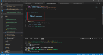
The path property is set as an empty string; this enables us to map the application URL to the homepage component, something like google.com which shows the Google homepage.
TIP: Path value never starts with a “/”, but instead uses an empty string even though path can be like search/coffee.
Moving back to the homepage component, replace the content of home.component.html with this:
<app-header [showBackButton]="false" [currentTitle]=""></app-header> <app-profile></app-profile> <!-- FAB Fixed --> <button mat-fab class="fab-bottom-right" routerLink="/create"> <mat-icon> <i class="material-icons md-48">add</i> </mat-icon> </button>There are three parts to the home component:
- The reusable header component
<app-header>here. - Profile component
<app-profile>here. - The floating action button at the bottom right.
The above HTML snippet shows how the reusable header component is used in other components, we just use the component selector and pass in the required parameters.
Profile component is created to be used as the body for the home page, we will create it soon.
The floating action button with + icon is a kind of Angular material button of type mat-fab on the bottom right of the screen. It has the routerLink attribute directive which uses the route information provided in the app-routing.module.ts for navigation. In this case, the button has the route value as /create which will be mapped to create component.
To make the create button float on bottom right, add the below CSS code in home.component.css:
.fab-bottom-right { position: fixed; left: auto; bottom: 5%; right: 10%; }Since profile component is supposed to manage home page body, we will leave home.component.ts intact.
Adding Profile Component
Open terminal, type ng g c profile and press enter to generate profile component. As planned earlier, this component will handle the main body of the home page. Open profile.component.html and replace its content with this:
<div class="center profile-child"> <img class="avatar" src="../../assets/avatar.png"> <div class="profile-actions"> <button mat-raised-button matBadge="{{historyCount}}" matBadgeOverlap="true" matBadgeSize="medium" matBadgeColor="accent" color="primary" routerLink="/history"> <span>History</span> </button> </div> </div>The above html snippet shows how to use the matBadge element of the material library. To be able to use it here, we need to follow the usual drill of adding MatBadgeModule to app.module.ts file. Badges are small pictorial status descriptor for UI elements such as buttons or icons or texts. In this case, it is used with a button to show count of QR saved by the user. Angular material library badge has various other properties such as setting the position of the badge with matBadgePosition, matBadgeSize to specify size, matBadgeColor to set the badge color.
One more image asset needs to be added to the assets folder. Download and save the same to the assets folder of the project.
Open profile.component.css and add this:
.center { top: 50%; left: 50%; position: absolute; transform: translate(-50%, -50%); } .profile-child { display: flex; flex-direction: column; align-items: center; } .profile-actions { padding-top: 20px; } .avatar { border-radius: 50%; width: 180px; height: 180px; }The above CSS will achieve the UI as planned.
Moving on, we need some kind of logic to update the history count value as it will reflect in the matBadge used earlier. Open profile.component.ts and add the highlighted snippet appropriately:
export class ProfileComponent implements OnInit { historyCount = 0; constructor(private storageUtilService: StorageutilService) { } ngOnInit() { this.updateHistoryCount(); } updateHistoryCount() { this.historyCount = this.storageUtilService.getHistoryCount(); } }We have added StorageutilService but we have not created such service till now. Ignoring the error, we have completed our profile component which also finishes off our home page component. We will revisit this profile component after creating our storage utility service. Okay then let’s do so.
Local Storage
HTML5 provides web storage feature which can be used to store data locally. This provides much more storage compared to cookies, at least 5MB vs 4KB. There are two types of web storage with different scope and lifetime: Local and Session. The former can store data permanently while the latter is temporary and for a single session. The decision to select the type can be based on the use case, in our scenario we want to save across sessions, so we will go with Local storage.
Each piece of data is stored in a key/value pair. We will use the text for which the QR is generated as the key and the QR image encoded as a base64 string as the value. Create an entity folder, inside the folder create a new qr-object.ts file and add the code snippet as shown:
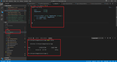
The content of the class:
export class QR { text: string; imageBase64: string; constructor(text: string, imageBase64: string) { this.imageBase64 = imageBase64; this.text = text; } }Whenever the user saves the generated QR, we will create an object of the above class and save that object using the storage utility service.
Create a new service folder, we will be creating many services, it’s better to group them together.
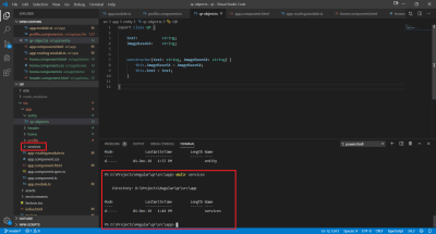
Change the current working directory to services, cd services, to create a new service use ng g s <any name> this is a shorthand to ng generate service <any name>, type ng g s storageutil and press enter. This will create two files: storageutil.service.ts and storageutil.service.spec.ts. The latter is for writing unit tests. Open storageutil.service.ts and add this:
private historyCount: number; constructor() { } saveHistory(key : string, item :string) { localStorage.setItem(key, item) this.historyCount = this.historyCount + 1; } readHistory(key : string) : string { return localStorage.getItem(key) } readAllHistory() : Array { const qrList = new Array(); for (let i = 0; i < localStorage.length; i++) { const key = localStorage.key(i); const value = localStorage.getItem(key); if (key && value) { const qr = new QR(key, value); qrList.push(qr); } } this.historyCount = qrList.length; return qrList; } getHistoryCount(): number { if (this.historyCount) { return this.historyCount; } this.readAllHistory(); return this.historyCount; } deleteHistory(key : string) { localStorage.removeItem(key) this.historyCount = this.historyCount - 1; } Import the qr-object class to correct any errors. To use the local storage feature, there is no need to import anything new just use the keyword localStorage to save or get value based on a key.
Now open profile.component.ts file again and import the StorageutilService class to properly finish off the profile component.
Running the project, we can see the home page is up as planned.
Adding Create QR Page
We have our homepage ready, though the create/add button does not do anything. Worry not, the actual logic was already written. We used a routerLink directive to change the base path of the URL to /create but there was no mapping added to the app-routing.module.ts file. Let’s create a component which will deal with the creation of new QR codes, type ng g c create-qr and press enter to generate a new component.
Open the app-routing.module.ts file and add the below entry to the routes array:
{ path: 'create', component: CreateQrComponent },This will map the CreateQRComponent with the URL /create.
Open create-qr.components.html and replace the contents with this:
<app-header [showBackButton]="showBackButton" [currentTitle]="title" [showHistoryNav]="showHistoryNav"></app-header> <mat-card class="qrCard" [class.mat-elevation-z12]=true> <div class="qrContent"> <!--Close button section--> <div class="closeBtn"> <button mat-icon-button color="accent" routerLink="/" matTooltip="Close"> <mat-icon> <i class="material-icons md-48">close</i> </mat-icon> </button> </div> <!--QR code image section--> <div class="qrImgDiv"> <img *ngIf="!showProgressSpinner" style="padding: 5px 5px;" src={{qrCodeImage}} width="200px" height="200px"> <mat-spinner *ngIf="showProgressSpinner"></mat-spinner> <div class="actionButtons" *ngIf="!showProgressSpinner"> <button mat-icon-button color="accent" matTooltip="Share this QR" style="margin: 0 5px;"> <mat-icon> <i class="material-icons md-48">share</i> </mat-icon> </button> <button mat-icon-button color="accent" (click)="saveQR()" matTooltip="Save this QR" style="margin: 0 5px;"> <mat-icon> <i class="material-icons md-48">save</i> </mat-icon> </button> </div> </div> <!--Textarea to write any text or link--> <div class="qrTextAreaDiv"> <mat-form-field style="width: 80%;"> <textarea matInput [(ngModel)]="qrText" cdkTextareaAutosize cdkAutosizeMinRows="4" cdkAutosizeMaxRows="4" placeholder="Enter a website link or any text..."></textarea> </mat-form-field> </div> <!--Create Button--> <div class="createBtnDiv"> <button class="createBtn" mat-raised-button color="accent" matTooltip="Create new QR code" matTooltipPosition="above" (click)="createQrCode()">Create</button> </div> </div> </mat-card>The above snippet uses many of the angular material library elements. As planned, it has one header component reference wherein the required parameters are passed. Next up is the main body of the create page, it consists of one angular material card or mat-card centered and elevated up to 12px as [class.mat-elevation-z12]=true is used. The material card is just another kind of container that can be used as any other div tag. Although the material library provides some properties to lay out well-defined information in a mat-card such as image placement, title, subtitle, description and action as can be seen below.
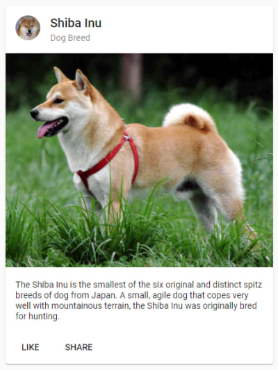
In the above html snippet, we have used mat-card just as any other container.
Another material library element used is matTooltip, it is just another tooltip with ease of use, displayed when the user hovers over or longpresses an element. Just use the snippet below to show tooltip:
matTooltip="Any text you want to show"It can be used with icon buttons or any other UI element to convey extra information. In application context, it is displaying information about the close icon button. To change the placement of the tooltip matTooltipPosition is used, e.g.
matTooltip="Any text you want to show" matTooltipPosition="above"Besides matTooltip, mat-spinner is used to show loading progress. When the user clicks on the create button, a network call is made, this is when the progress spinner is shown. When the network call returns with result, we just hide the spinner. It can be used simply like this:
<mat-spinner *ngIf="showProgressSpinner"></mat-spinner>showProgressSpinner is a boolean variable which is used to show/hide the progress spinner. The library also provides some other parameters like [color]=’accent’ to change color, [mode]=’indeterminate’ to change the progress spinner type. An indeterminate progress spinner will not show the progress of the task while a determinate one can have different values to reflect task progress. Here an indeterminate spinner is used as we do not know how long the network call will take.
The material library provides a variant of textarea conforming to the material guideline but it can only be used as a descendent of mat-form-field. Usage of material textarea is just as simple as the default HTML one, like below:
<mat-form-field> <textarea matInput placeholder="Hint text"></textarea> </mat-form-field>matInput is a directive which allows native input tag to work with mat-form-field. The placeholder property allows adding any hint text for the user.
TIP: Use cdkTextareaAutosize textarea property to make it auto-resizable. cdkAutosizeMinRows, cdkAutosizeMaxRows to set rows and columns and all three together to make textarea auto-resize till it reaches the max rows and columns limit set.
To use all these material library element, we need to add them in the app.module.ts file.
There is a placeholder image being used in the html, download and save it to the assets folder.
The above html also requires css styling, open create-qr.component.ts file and add:
.qrCard { display: flex; flex-direction: column; align-items: center; position: absolute; top: 50%; left: 50%; transform: translate(-50%, -50%); width: 20%; height: 65%; padding: 50px 20px; } .qrContent { display: flex; flex-direction: column; align-items: center; width: 100%; } .qrTextAreaDiv { width: 100%; display: flex; flex-direction: row; justify-content: center; padding: 0px 0px; position: absolute; bottom: 10%; } .createBtn { left: 50%; transform: translate(-50%, 0px); width: 80%; } .createBtnDiv { position: absolute; bottom: 5%; width: 100%; } .closeBtn { display: flex; flex-direction: row-reverse; align-items: flex-end; width: 100%; margin-bottom: 20px; } .closeBtnFont { font-size: 32px; color: rgba(0,0,0,0.75); } .qrImgDiv { top: 20%; position: absolute; display: flex; flex-direction: column; align-items: center; justify-content: center; width: 100%; } .actionButtons { display: flex; flex-direction: row; padding-top: 20px; }Let’s wire up the UI with logic, open create-qr.component.ts file and add the below code, leaving those lines which are already present:
export class CreateQrComponent implements OnInit { qrCodeImage = '../../../assets/download.png'; showProgressSpinner = false; qrText: string; currentQR; showBackButton = true; title = 'Generate New QR Code'; showHistoryNav = true; constructor(private snackBar: MatSnackBar, private restutil: RestutilService, private storageService: StorageutilService) { } ngOnInit() { } createQrCode() { //Check if any value is given for the qr code text if (!!this.qrText) { //Make the http call to load qr code this.loadQRCodeImage(this.qrText); } else { //Show snackbar this.showSnackbar('Enter some text first') } } public loadQRCodeImage(text: string) { // Show progress spinner as the request is being made this.showProgressSpinner = true; // Trigger the API call this.restutil.getQRCode(text).subscribe(image =>{ // Received the result - as an image blob - require parsing this.createImageBlob(image); }, error => { console.log('Cannot fetch QR code from the url', error) // Hide the spinner - show a proper error message this.showProgressSpinner = false; }); } private createImageBlob(image: Blob) { // Create a file reader to read the image blob const reader = new FileReader(); // Add event listener for "load" - invoked once the blob reading is complete reader.addEventListener('load', () => { this.qrCodeImage = reader.result.toString(); //Hide the progress spinner this.showProgressSpinner = false; this.currentQR = reader.result.toString(); }, false); // Read image blob if it is not null or undefined if (image) { reader.readAsDataURL(image); } } saveQR() { if (!!this.qrText) { this.storageService.saveHistory(this.qrText, this.currentQR); this.showSnackbar('QR saved') } else { //Show snackbar this.showSnackbar('Enter some text first') } } showSnackbar(msg: string) { //Show snackbar this.snackBar.open(msg, '', { duration: 2000, }); } }To provide users contextual information, we also use MatSnackBar from the material design library. This shows up as a popup from below the screen and stays for a few seconds before disappearing. This is not an element rather a service that can be invoked from the typescript code. The above snippet with method name showSnackbar shows how to open up a snackbar, but before it can be used, we need to add the MatSnackBar entry in app.module.ts file just like we did for other material library elements.
TIP: In recent angular material library versions, there is no straightforward way to change the snackbar styling, instead one has to make two additions to the code, first is to use the below CSS to alter background and foreground colors:
::ng-deep snack-bar-container.snackbarColor { background-color: rgba(63, 81, 181, 1); } ::ng-deep .snackbarColor .mat-simple-snackbar { color: white; }Second is to use a property called panelClass to set the style to the above CSS class:
this.snackBar.open(msg, '', { duration: 2000, panelClass: ['snackbarColor'] });The above two combinations will allow custom styling to the material design library snackbar component.
This completes the create qr page but there is one piece still missing. Checking the create-qr.component.ts file, it will show an error regarding the missing piece. The missing piece to this puzzle is the RestutilService which is responsible for fetching the qr code image from the third-party API.
In the terminal, change the current directory to services, type ng g s restutil and press enter. This will create the RestUtilService files, open the restutil.service.ts file and add this snippet:
private edgeSize = '300'; private BASE_URL = 'https://api.qrserver.com/v1/create-qr-code/?data={data}!&size={edge}x{edge}'; constructor(private httpClient: HttpClient) { } public getQRCode(text: string): Observable { // Create the url with the provided data and other options let url = this.BASE_URL; url = url.replace("{data}", text).replace(/{edge}/g, this.edgeSize); // Make the http api call to the url return this.httpClient.get(url, { responseType: 'blob' }); } The above service fetches the qr image from the third party API and since the response is not of json type, but an image, so we specify the responseType as ‘blob’ in the above snippet.
Angular provides HttpClient class to communicate with any HTTP supporting server. It provides many features like filtering the request before it is fired, getting back the response, enabling the processing of the response via callbacks and others. To use the same, add an entry for HttpClientModule in app.module.ts file.
Finally, import this service in the create-qr.component.ts file to complete the create.
There is a problem with the above create qr logic. If the user uses the same text to generate the QR again and again, it will result in a network call. One way to redress this is caching the request based, thus serving the response from the cache if the request text is same.
Caching Request
Angular provides a simplified way of making HTTP calls, HttpClient, along with HttpInterceptors to inspect and transform HTTP requests or responses to and from servers. It can be used for authentication or caching and many such things, multiple interceptors can be added and chained for further processing. In this case, we are intercepting requests and serving the response from the cache if the qr text is same.
Create an interceptor folder, then create a file cache-interceptor.ts:
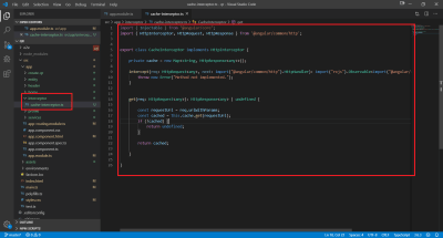
Add the below code snippet to the file:
import { Injectable } from '@angular/core'; import { HttpInterceptor, HttpResponse, HttpRequest, HttpHandler, HttpEvent } from '@angular/common/http'; import { tap } from 'rxjs/operators'; import { of, Observable } from 'rxjs'; @Injectable({ providedIn: 'root' }) export class RequestCachingService implements HttpInterceptor { private cacheMap = new Map<string, HttpResponse<any>>(); constructor() { } intercept(req: HttpRequest, next: HttpHandler): Observable<HttpEvent<any>> { const cachedResponse = this.cacheMap.get(req.urlWithParams); if (cachedResponse) { return of(cachedResponse); } return next.handle(req).pipe(tap(event => { if (event instanceof HttpResponse) { this.cacheMap.set(req.urlWithParams, event); } })) } } In the above code snippet, we have a map with the key being the request URL, and the response as the value. We check if the current URL is present in the map; if it is, then return the response (the rest is handled automatically). If the URL is not in the map, we add it.
We are not done yet, an entry to the app.module.ts is required for its proper functioning. Add below snippet:
import { HttpClientModule, HTTP_INTERCEPTORS } from '@angular/common/http'; import { CacheInterceptor } from './interceptor/cache-interceptor'; providers: [ { provide: HTTP_INTERCEPTORS, useClass: CacheInterceptor, multi: true } ],This adds the caching feature to our application. Let’s move on to the third page, History page.
Adding History Page
All the saved QR codes will be visible here. To create another component, open terminal type ng g c history and press enter.
Open history.component.css and add the below code:
.main-content { padding: 5% 10%; } .truncate { width: 90%; white-space: nowrap; overflow: hidden; text-overflow: ellipsis; } .center-img { position: absolute; top: 50%; left: 50%; transform: translate(-50%, -50%); display: flex; flex-direction: column; align-items: center; }Open history.component.html and replace the content with this:
<app-header [showBackButton]="showBackButton" [currentTitle]="title" [showHistoryNav]="showHistoryNav"></app-header> <div class="main-content"> <mat-grid-list cols="4" rowHeight="500px" *ngIf="historyList.length > 0"> <mat-grid-tile *ngFor="let qr of historyList"> <mat-card> <img mat-card-image style="margin-top: 5px;" src="{{qr.imageBase64}}"> <mat-card-content> <div class="truncate"> {{qr.text}} </div> </mat-card-content> <mat-card-actions> <button mat-button (click)="share(qr.text)">SHARE</button> <button mat-button color="accent" (click)="delete(qr.text)">DELETE</button> </mat-card-actions> </mat-card> </mat-grid-tile> </mat-grid-list> <div class="center-img" *ngIf="historyList.length == 0"> <img src="../../assets/no-see.png" width="256" height="256"> <span style="margin-top: 20px;">Nothing to see here</span> </div> </div>As usual, we have the header component at the top. Then the rest of the body is a grid list that will show all the saved QR codes as individual mat-card. For the grid view, we are using mat-grid-list from the angular material library. As per the drill, before we can use it, we have to first add it to the app.module.ts file.
Mat grid list acts as a container with multiple tile children called mat-grid-tile, in the above html snippet, each tile is created using mat-card using some of its properties for generic placement of other UI elements. We can provide the number of columns and rowHeight, which is used to calculate width automatically. In the above snippet we are providing both the number of columns and the rowHeight value.
We are using a placeholder image when the history is empty, download it and add to the assets folder.
To implement the logic for populating all these information, open history.component.ts file and add the below snippet in the HistoryComponent class:
showBackButton = true; title = 'History'; showHistoryNav = false; historyList; constructor(private storageService: StorageutilService, private snackbar: MatSnackBar ) { } ngOnInit() { this.populateHistory(); } private populateHistory() { this.historyList = this.storageService.readAllHistory(); } delete(text: string) { this.storageService.deleteHistory(text); this.populateHistory(); } share(text: string) { this.snackbar.open(text, '', {duration: 2000,}) }The above logic just fetches all the saved QR and populates the page with it. Users can delete the saved QR which will delete the entry from the local storage. This finishes off our history component or does it? We need to add the route mapping for this component, open app-routing.module.ts and add a mapping for the history page as well:
{ path: 'history', component: HistoryComponent },The whole route array should look like this by now:
const routes: Routes = [ { path: '', component: HomeComponent }, { path: 'create', component: CreateQrComponent }, { path: 'history', component: HistoryComponent }, ];It is a good time to run the application to check the complete flow, open terminal and type ng serve and press enter, go to localhost:4200 to verify the working of the application.
Add To Github
Before proceeding to the deployment step, it would be good to add the project to a Github repository.
- Open Github
- Create a new repository
- In VS Code use the terminal and follow the first set of commands mentioned in the quick start guide to push all the project files
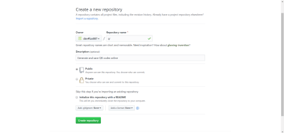
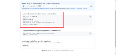
Just refresh the page to check if all the files are visible. From this point any git changes such as commit, pull/push will be reflected in this newly created repository.
Netlify & Deployment
Our application runs in our local machine, but to enable others to access it, we should deploy it on a cloud platform and register it to a domain name. This is where Netlify comes into play. It provides continuous deployment services, integration with Github and many more features to benefit from. Right now, we want to enable global access to our application, let’s get started.
- Sign-up on Netlify.
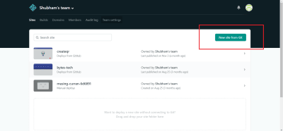
- From the dashboard, click on New site from Git button.
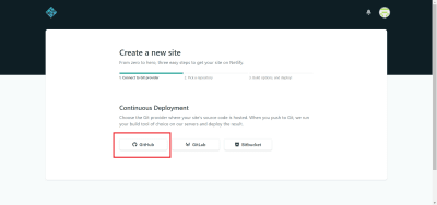
- Click on Github in the next screen.
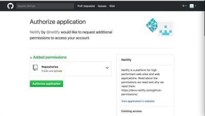
- Authorize Netlify to be able to access your Github repositories.
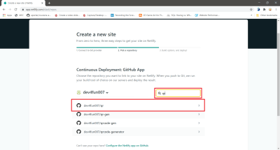
- Search for and select the newly created
qrrepository. - Netlify, in the next step, allows us to choose the Github repository branch for deployments. Normally one uses the
masterbranch but one can also have a separatereleasebranch which contains only release related and stable features.
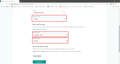
Since, this is an angular web application, add ng build --prod as the build command. Publish directory will be dist/qr as mentioned in the angular.json file.
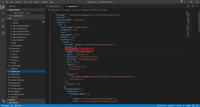
Now click on the Deploy site button which will trigger a project build with the command ng build --prod and will output the file to dist/qr.
Since we provided the path information to Netlify, it will automatically pick up the correct files for servicing the web application. Netlify adds a random domain to our application by default.
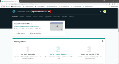
You can click on the link provided in the above page, to access our application from anywhere. Finally, our application is deployed.
Custom Domain
In the above image, the URL for our application is shown, the sub-domain is randomly generated. Let’s change it. Click on Domain settings button then in the custom domains section click on the 3-dot menu and select Edit site name.
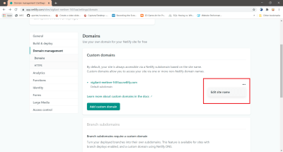
This will open a popup wherein a new site name can be entered, this name should be unique across the Netlify domain. Enter any site name, which is available and click save.
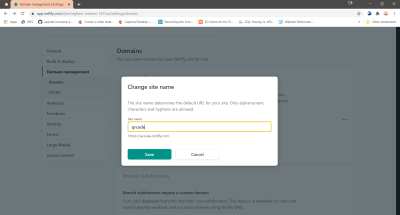
Now the link to our application will be updated with the new site name.
Split Testing
Another cool feature offered by Netlify is split testing, it enables traffic splitting so that different sets of users will interact with different application deployments. We can have new features added to a different branch and split the traffic to this branch deployment, analyze traffic and then merge the feature branch with the main deployment branch. Let’s configure it.
The prerequisite to enabling split testing is a Github repository with at least two branches. Head over to the app repository in Github, created earlier, create a new branch, a.
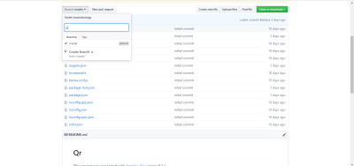
The repository will now have a master branch and a branch. Netlify needs to be configured to do branch deployments, open Netlify dashboard and click on Settings, on the left side click on Build & Deploy, then Continuous Deployment, then on the right side in the Deploy contexts section, click on Edit settings.
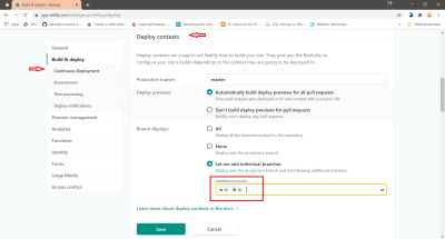
In the Branch deploys sub-section select the option Let me add individual branches, and enter the branch names and save it.
Branch deploy is another useful feature provided by Netlify, we can select which Github repository branches to deploy, we can also enable preview for every pull request to the master branch before merging. This is a neat feature enabling developers to actually test their changes out live before adding their code changes to the main deployment branch.
Now, click on Split Testing tab option at the top of the page, the split testing configurations will be presented here.
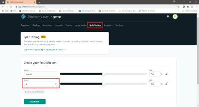
We can select the branch, other than the production branch, in this case a. We can also play around with the settings of splitting traffic, based on the traffic percentage each branch has been allotted, Netlify will re-route some users to the application deployed using a branch and others to the master branch. After configuring, click on Start test button to enable traffic splitting.
TIP: Netlify may not recognize that the connected Github repository has more than one branch and may give this error:
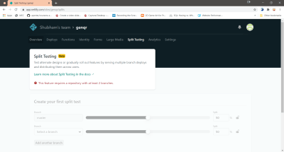
To resolve this, just reconnect to the repository from the Build & Deploy options.
Netlify provides a lot of other features as well, we just went through some of its useful features to demonstrate the ease of configuring different aspects of Netlify.
This brings us to the end of our journey, we have successfully created an Angular Material design based web application and deployed it on Netlify.
Conclusion
Angular is a great and popular framework for web application development, with the official Angular material design library it is much easier to create applications which adhere to the material design specs for a very natural interaction with the users. Moreover, the application developed with a great framework should use a great platform for deployment, Netlify is just that. With constant evolution, great support and with a plethora of features it surely is a great platform to bring web applications or static sites to the masses. Hopefully, this article will provide help in getting started with new Angular project from just a thought to deployment.
Next Steps
 (dm, yk, il)
Articles on Smashing Magazine — For Web Designers And Developers
