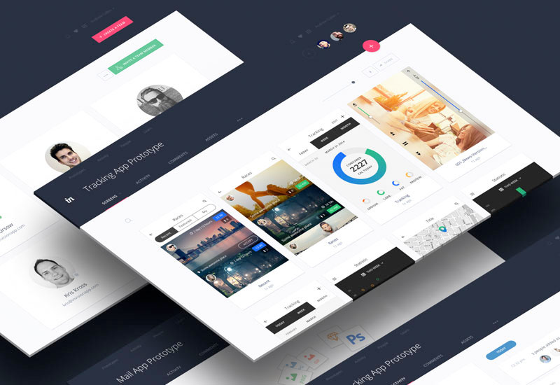
Getting Started With UI Kits Fast
I’ve got a secret. I cut corners a lot.
Nobody likes to admit that, but when you’re coming from a fast moving product background, speed is often the difference between a big launch and a big missed opportunity.
As a developer, I cut corners with ready-made libraries. Awesome chunks of code built ahead of time by folks much smarter and sturdier than me. As a designer, I use UI kits.
What is a UI kit?
If you’re not familiar, UI stands for user interface, which is what we call the visual pieces that make up an application or product. It’s the buttons, headers, dropdowns, layouts—things the user interacts with while using your product.
It’s also the thing that designers spend a lot of time designing. Those tiny nuts and bolts that make your product a delight to use or a total frustration.
A UI kit is a bundled collection of pre-designed matching interface elements, ready to use.
Where can you get one? Glad you asked!
- Make your own. Lots of teams design and maintain their own internal UI kit. Just like any other library, it grows and evolves as the product does, serving as a base for all future design decisions.
- Download one. A pre-made UI Kit is a great way to jumpstart a project without spending huge amounts of time on the design up front (especially handy when your project has no designers on staff to begin with).
- Today we’ll mostly be talking about that second option: what to do when using a downloaded kit. With a bit of elbow grease and some common sense, you can take a free UI kit to polished interface in no time.
Reasons to use a UI kit
While I don’t think anyone would argue that visual design is important (like, really important) to the success of a product, it always seems to have a certain way of derailing the early process.
Time that could be spent interviewing customers or doing research or starting to evaluate architecture is spent pushing pixels. To put it another way:
“Design matters. A great deal. But design doesn’t need to be complicated. It certainly shouldn’t be the thing preventing your startup from starting.”
–Matt Goldman, SmallHQ

Even with a killer designer on staff, there’s value to cutting some corners and getting started with a UI kit. Here’s a few of my main reasons for using them:
- Save time. Lots of it. The average UI kit includes dozens of screens and even more individual elements. A great UI kit comes with all the bells and whistles: multiple devices (or breakpoints), custom icons, font pairings, colorways—all little things that designers sink countless hours into.
- Perfect for testing an idea, without getting bogged down with the details of hi-fi design. Don’t get me wrong—I love designing my own visual system. It’s what I do for a living. But sometimes you just need to test the idea. Call it research or prototyping or validation or whatever you want, but just remember there is supreme value in testing your underlying idea separate from the design choices being made.
- Keep your developers sane. Lots of times during a large build, there are tiny bits we designers forget to mock up, or simply never even thought about. These “surprise” views are a source of real frustration for developers—it’s like being asked to drive somewhere with a clear map. With a UI kit, it’s so much easier to fill in the blanks without stopping development, sending things back to design, and waiting. It’s the reason things like Bootstrap and Material kits exist: so developers can keep doing what they do best—development.
- To learn from the pros. High-quality UI kits are a great learning tool for designers of all skill levels. It’s like taking a field trip into another designer’s brain. Dig around inside the kit and take note of the structure, layers, document setup, etc. It might not be as sexy as the visual design itself, but being able to crank out a clearly organized file is a skill that designers must have, especially when working with others.
The trick is to look at your fancy downloaded UI kit as a starting point for your project, not the end solution. To get the most out of a ready-made kit, there’s a few important steps you need to take.
Tips for getting the most out of a UI kit
So you’ve browsed around online, picked out a killer kit, downloaded it, and opened it in Photoshop. What’s next?
The jump from ready-made to ready-to-impress isn’t very far. Here’s how I do it:
- Insert your own brand, colors, and personality. While there aren’t usually rules against it, I’d advise against using a kit purely as-is. And not just because it might look lazy, but because your customizations can bring more value. Even for a temporary prototype, sometimes people can get hung up on little things like the fonts and colors not being correct (despite being told to ignore the little things, like the fonts and colors not being correct). Think of the fresh kit like lorem ipsum—remove the placeholder stuff and insert your real content.
- Pick and choose the bits you need. Lots of times, especially when your product already has wheels, you won’t need the complete visual system offered by a UI kit. Instead, cherry pick the parts you need and make them your own. That complex dropdown element that just popped up during the last meeting? Grab it from a kit!
- Check the licensing. Some UI kits come with license-restricted odds and ends, like icon sets, stock photos, and fonts. Heck, sometimes the kit itself comes with certain rules. Before you dive in and start building on top of the system, make sure it’s free and clear of any small print that might bite you down the road. If you can’t tell under what terms the kit is offered, ask! If they can’t tell you, avoid!
Your downloaded kit is a shortcut, not a complete road map. Use it when you’re stuck, use it when time is short, use it when you’ve got bigger fish to fry.
Use it to make sure that design isn’t what’s keeping your startup from starting.
Some of my favorite kits
- Chat UI, a minimal and bright UI kit focused on communication. Comes with things like conversation views, user profiles, and settings screens.
- Now, an editorial UI kit with cross-platform designs ready to go. Comes with things like article views, index listings, archives, and activity streams.
- DO, a versatile to-do focused UI kit for getting things done. Comes with things like item lists, calendar views, and onboarding walkthroughs.
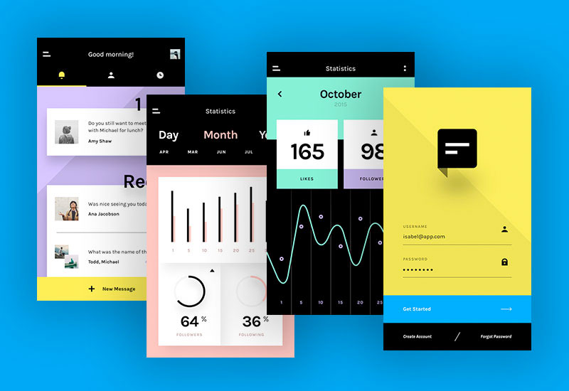
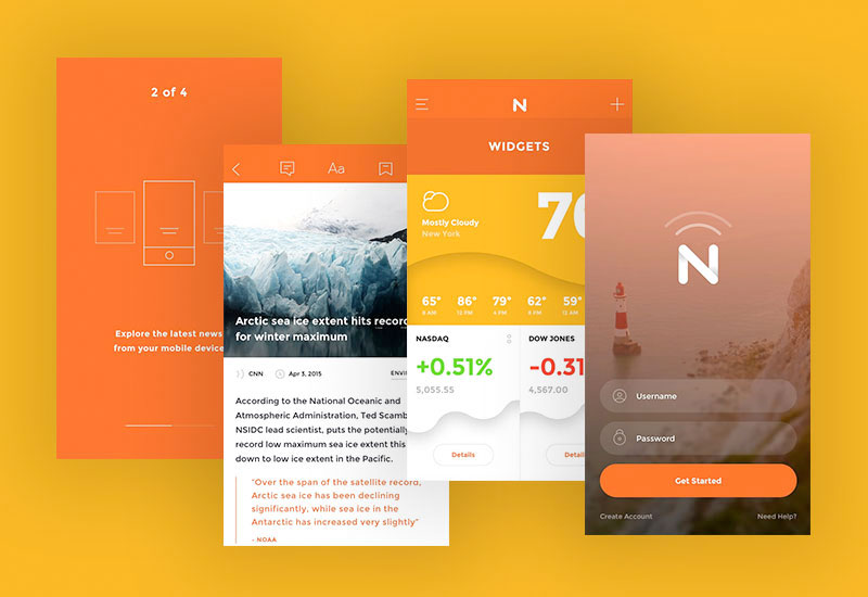
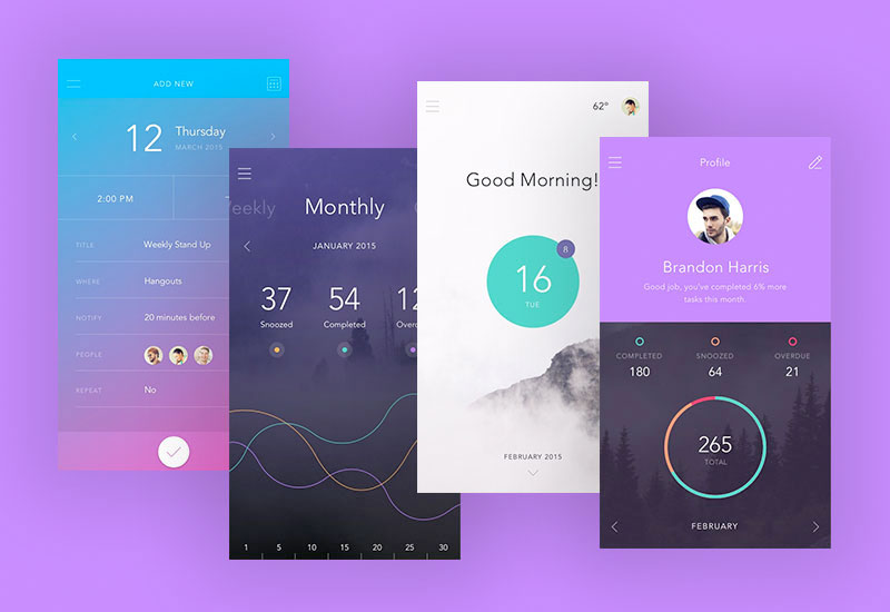
Let’s kit started!
I hope this post has shed some light on why I like cutting corners so much, and why I use UI kits. Getting a head start on your work isn’t cheating, it’s just making smart use of your time.
And the best part? Using a UI kit to save time early will come full circle when your product takes off, allowing you the chance to do custom design when it really matters.
Featured image credit: 123rf
