Get Inspired With These Popular Website Styles
There are hundreds of ways to create a beautiful, functional website. Every designer (and every company) has his or her own aesthetic. Sometimes, these aesthetics come together to create something truly unique. However, there are patterns in the web design world, and some design styles are more popular than others.
The days of flashy geocities websites cluttered with dozens of moving images, crazy backgrounds, and obnoxious music are gone. Current web design trends focus more on simplicity; a clean and easy user experience makes your website load faster, which increases your page rank. It also keeps visitors on your site longer. But just because a website is clean and simple doesn’t mean it has to be boring. There are plenty of themes and styles optimized for functionality that still look gorgeous.
Popular Web Design Styles
Dark and Edgy
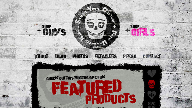
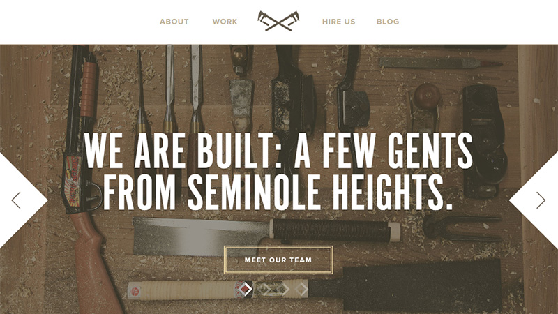
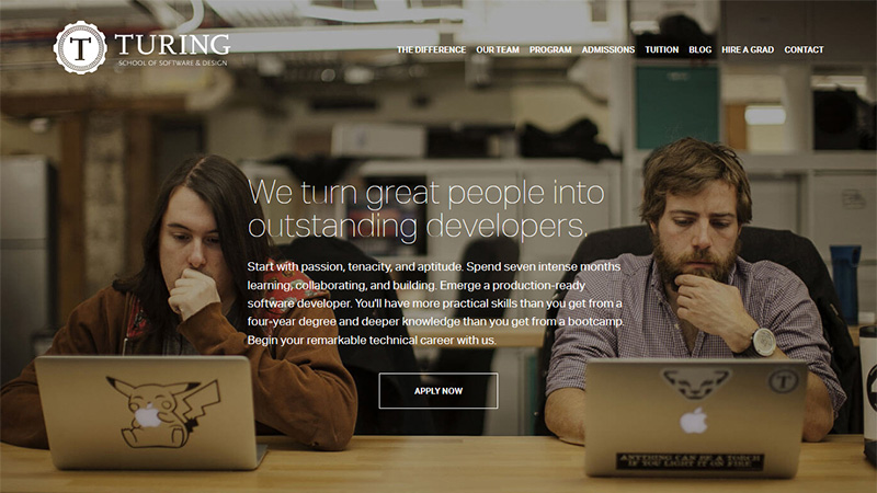
One of the biggest trending styles is the slightly grungy, edgy look. This style is versatile and offers a lot of options to customize for your brand personality. The look is less 90s grunge and more refined aesthetic. Grunge meets minimalism, if you will. Pull off the edgy look by using clean backgrounds with rough-around-the-edges elements – for example, raw-looking fonts or images.
Alternatively, you can go the opposite route and use an edgy, urban background with clean-cut fonts. The emphasis is on the real-life DIY feel of the page – virtual tape on the corners of images, font displayed on a rustic wooden signpost, or stamped logos for menu buttons. You can find some great abstract and edgy fonts here.
Minimalist
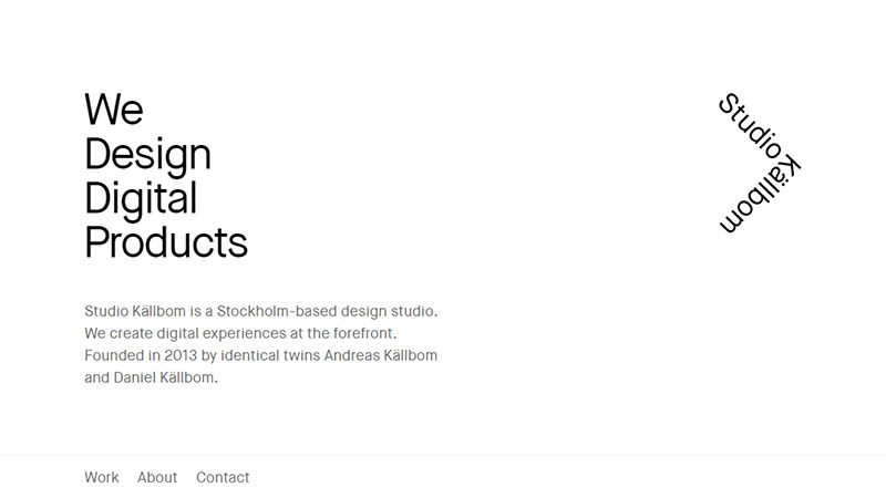
Minimalist websites have been all the rage for a few years now, and their popularity comes with good reason. Minimalist sites draw attention to their content instead of the design itself. The contrast of the images against a clean backdrop will show off your products and services, and a polished font is easy to read. Likewise, minimalist sites tend to load faster, which is always good for your page rank and your visitors.
This style has an undeniable air of sophistication and modernism. Minimalism hinges on contrast and layout; a good design will feature a few pops of color placed strategically to draw the eye around the page. The use of negative space and the type of font you use will help break up content and create visual interest. Here are a few examples of minimalist designs.
Grid or Card-Based Layouts
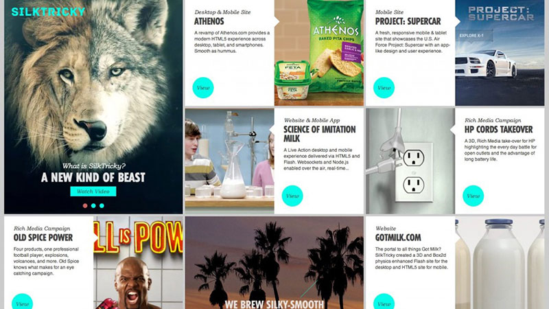
This style features information laid out neatly on a grid in squares or cards. It’s similar to the layout of the Windows 8 start menu in that it has separate tiles that display information. This kind of layout is useful for websites that need to deliver a lot of information in a digestible format. The individual tiles break up information and give your website an overall structure. Flat design themes such as this are [quickly becoming one of the more popular trends http://www.spinxdigital.com/blog/what-makes-flat-web-design-exotic/. It’s minimalistic by its very nature; it loads quickly and still offers a lot of room for creativity.
Interesting fonts and bright colors will take flat design from flat to fabulous. This style plays well across a variety of platforms and is optimized for updates in the future. Here are a few excellent WordPress flat design themes.
Emphasis on the Typography
As with all websites, the fonts you use are an important reflection of your brand image. You shouldn’t take typography lightly. Emphasis on the web font has been a rising trend for the past few years. Obviously, if your website has a lot of text-based content, the typography will determine how easy it is to read and the type of mood it conveys.
Many websites are built specifically to show off a beautiful typeface. Whether it’s the print-house look, a typewriter style, or something different altogether, keep other elements on the page to a minimum to showcase your font. Otherwise, you might end up with a site that looks too cluttered. Here are a few examples of gorgeous typography.
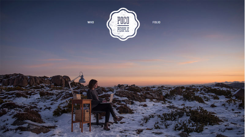
Big, Glossy Backgrounds
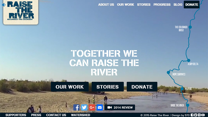
Image-centric websites, such as Zillow for example, grab a visitor’s attention with big background images. This works well for service-related businesses, such as home renovation and real estate websites. The background images show off your portfolio, while a simple, clean font and interface make your site user friendly. Likewise, a lot of websites now feature oversized videos as the background image. Videos portray the story of your brand more than any other media.
Visitors quickly get a sense of your brand image without having to read through pages of content. In fact, videos are one of the most effective (though also one of the most difficult) content marketing types. Incorporating a video into the background of your theme will give your site a definite boost. Just remember to keep the other features clean and simple to avoid confusion. For examples of how to pull off the background video trend, check out this page.
Designed for Mobile First
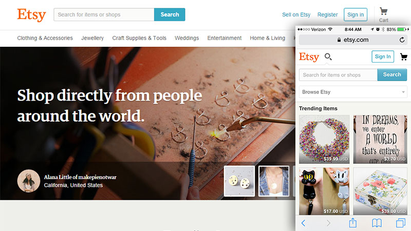
Sites optimized for mobile are a rising trend. Ever since Google began penalizing sites that didn’t have mobile versions, web designers have been working diligently on creating beautiful, responsive design themes. One of the trends we see here is that many designers are actually building a website for mobile first before creating a desktop version.
More than 51% of online searchers use their smartphones to browse the web, so it should come as no surprise that web design is heading in that direction, as well. A website not optimized for mobile will leave visitors feeling annoyed and may turn them off completely. So instead of creating a website theme for desktop first and then optimizing it for mobile, consider designing it for mobile right from the start.
Everything in One Place
Web designers are always looking for ways to make exploring their websites easier and more attractive. Lately, a vast number of sites have been designed to fit all on one page. Visitors seem to enjoy scrolling down one long page rather than clicking on separate page links. There are a number of reasons for this, but one of them is that most users are visiting websites on their phones. Vertical screens and long, scrolling pages go together naturally.
Another reason is that clicking on separate page links means visitors have to sit around and wait while the next page loads, which can be frustrating. One-page sites continue to rise in popularity, and it won’t be long until they top the charts. This type of fixed navigation, when the page scrolls with you, is much more intuitive and looks cleaner. It also allows you to display a lot of information in one place and keep everything within your brand theme. Here are some examples of expertly created one-page websites.
Two for One
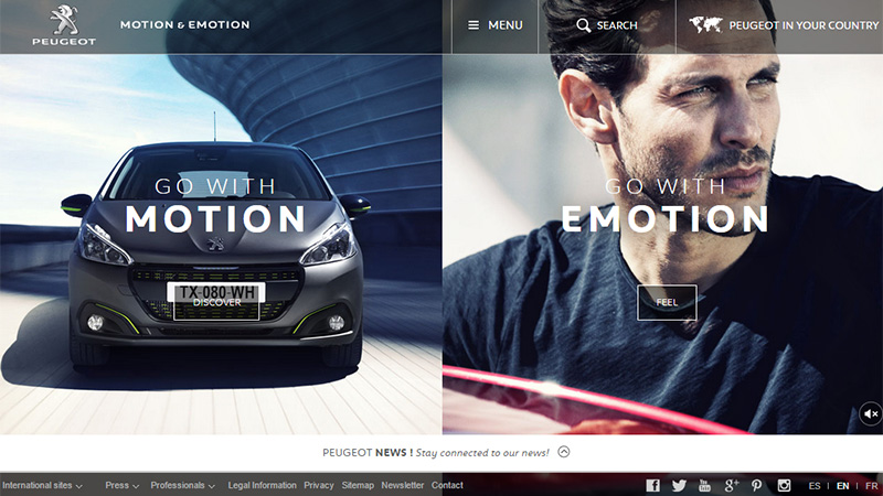
The two-for-one layout gives visitors two clean, functional websites on one page. It’s laid out like a split screen with a divider in the middle. It’s used when a business has two equally important messages to convey. Opportunities abound here: You can display your two most important services in this layout, or use one side to show off your portfolio, while the other side contains information about your company. Let your site visitors choose the content that interests them with the two-for-one layout.
Lots to Do (and See)
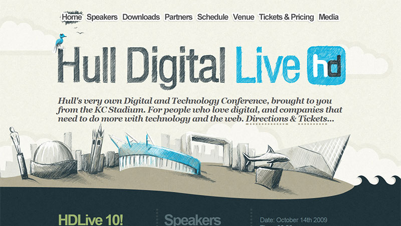
Multimedia web design has been a trendy concept for several years now. But the way we design these sites has changed for the better. What used to be created with Flash (which always needs updating), is now made using HTML5, which allows for more freedom and beautiful visual effects. Multimedia design combines music, video, images, and text on one page. It’s a great way to get your visitors to slow down and really experience your website. Many sites are designed for optimum usability these days, but multimedia design speaks to a visitor’s emotional side. It focuses on experience, not navigation.
Ghost Buttons
Ghost buttons have become a huge trend within the last few years, along with simple, transparent icons. This is largely due to the new Apple iOS, which introduced these features. The buttons and icons are transparent with thin outlines, customized to your site’s color palette. The design is clean, simple, and straightforward. The buttons and icons take a step back and let the other content shine. They integrate perfectly with large background images and photography, as their transparency and thin lines complement your images instead of cluttering them. Ghost buttons and icons play wonderfully with flat design, as well.
Conclusion
Whatever theme and trends you decide work best for your brand, the main consideration is keeping your site easy to use and consistent with your image. The key is moderation. If you have an image-heavy site, stick with simple font and navigation. If you want to focus on typography or grab attention with high contrast, keep other elements on the page to a minimum. Above all, consider form vs. function. Your website should be attractive, attention grabbing, and user-friendly.
Which popular website design styles suit you or which do you prefer the most?

