Finding Inspiration In Digital Influencers
Finding Inspiration In Digital Influencers
Suzanne Scacca
You want your client’s website to become the go-to destination for their target audience. So, you design them to look great, work perfectly and rank well in search. Is that enough? It could be, though I have a sneaking suspicion that the growing millennial and Gen Z consumer base are going to complicate that with their mobile-loving ways.
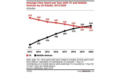
An eMarketer report from 2018 revealed that consumers’ time spent on mobile devices is about to surpass time spent watching TV:

And here’s why that matters so much:
TV is littered with celebrities. As consumers spend more time with their smartphones, there’s going to be a fundamental shift from trusting and admiring celebrities to trusting and admiring digital influencers.
In this post, I’m going to explain:
- What a digital influencer is (as opposed to a celebrity or lifestyle influencer).
- Why they’re so successful in building trust with their target audience.
- How to leverage certain influencer-like qualities to attract higher levels of consistent traffic (and business) for the websites you build.
To be clear, this post has nothing to do with turning your clients’ websites into sponsor-driven money-making machines. This is about giving your website the same kind of clout as a digital influencer — and using that perceived expert status to consistently maintain high levels of traffic, engagement and referrals.
What Is An Influencer?
In the past, celebrities were mainly the ones that companies turned to promote their products or services. While that still happens today, you’re more likely to see celebrity influencers pushing luxury products.
Thanks to the Internet and social media, businesses no longer have to pay top-dollar to get a celebrity endorsement. Instead, we’re now seeing the rise of digital influencer marketing.
A digital influencer is one that’s built a brand around their expertise or knowledge. There are different ways to be an influencer, too:
- Content creators
- Industry experts
- Micro-influencers (these are average joes who’ve amassed a following of more than 500)
- Thought leaders.
In reality, you’ll find that most digital influencers cover each one of these categories. For example, you have Neil Patel:
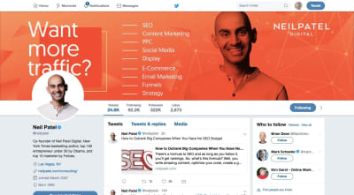
He’s an entrepreneur, content creator, thought leader, trusted expert in content marketing and has way more than 500 followers wherever you encounter him online.
That’s obviously an extreme example of a digital influencer though. How about we look at a web developer that’s established himself as an authority in his space?
This is Iain Poulson’s Twitter account:
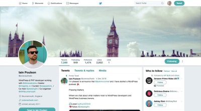
Although his follower count and engagement levels don’t reach that of macro-influencers like Patel, it doesn’t make his words any less impactful with his target audience (on or off Twitter). The point is that he creates high-quality and engage-worthy content that his audience recognizes as such.
Regardless of the size of the influencer and the space in which they work, their words command so much authority that consumers can’t help but trust them. This is the power of the digital influencer.
This is why businesses flock to influencers for help in getting the word out about their brand. If a business can leverage that built-in authority, it can grow its follower and customer base with a solid recommendation from that influencer. Influencer Marketing Hub reports that those who’ve used influencer marketing earn $ 7.65, on average, for every $ 1.00 paid to a digital influencer.
Needless to say, digital influencers are powerful and valuable entities in the world we live in. Now, we need to look at how you can imbue your websites with digital influencer-like qualities to increase their own value on the web.
How To Turn Websites Into Digital Stars
To turn a website into a digital influencer-like entity, you have to make it embody those qualities that make digital influencers so trustworthy and powerful in the first place.
For the purposes of demonstrating what these qualities are, I’m going to use websites that represent today’s top digital influencers and/or their businesses.
Whether you’re in the process of building a new site for a client or you’re looking for a way to rebrand or upgrade one that already exists, use these tips to up the influencer factor:
1. Let the Navigation Tell Your Story
In general, the navigation (and sitemap) of a website is a very powerful tool for both your visitors as well as search engines.
The only thing is, many websites use a similarly-structured and labeled navigation. That’s fine if the website’s offer is plain and simple:
- This is the product we sell (“Products” or “Services”).
- This is who we are (“About” or “Team”).
- Get in touch or buy the product (“Contact Us” or “Buy Now”).
What makes many digital influencers stand apart is that they’ve crafted a robust brand for themselves, which means they’re usually a double- or triple-threat. And they make sure the navigation highlights each of these strengths or offerings.
Social Media Examiner, for instance, demonstrates that it’s not just a blog containing posts related to social media. Social Media Examiner does it all:
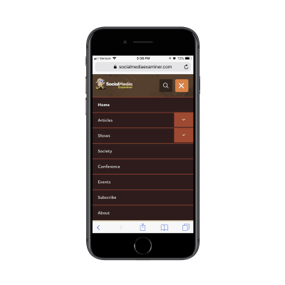
As you can see, the navigation shows you all of the different ventures Social Media Examiner has going on:
- Blogging
- Podcasting
- Membership
- A live conference.
It’s an impressive list and one that will instantly demonstrate to visitors that they are the authority on social media.
The Marketing Nutz takes a similar approach with its navigation:
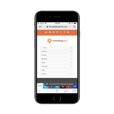
This navigation, however, is less focused on authority-building content. Instead, it highlights all of the ways in which it empowers its followers to get more out of their social media efforts with:
- Social media training
- Information on Pam Moore as a keynote speaker
- Free social media management tools and ebooks
- A regularly updated blog.
In sum, your navigation needs to be able to demonstrate the website’s/brand’s expertise and value within seconds. It should also be one that has visitors thinking, “Wow! They do all that?”
2. Lead with a Strong Visual
Another way to establish authority immediately is with a strong and unique visual. This sends the signal that this website isn’t just going to be a place to get information. It’s a place to actually experience something.
Take a look at the Youpreneur website:
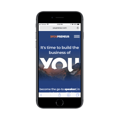
What you can’t see in the screenshot above is the animation directly below the image and tagline that definitely took some time to design.
See the cursor after the word “speaker”? This is a text animation that types out and deletes different entrepreneurial titles. Speaker. Blogger. Consultant. If the banner image didn’t capture their attention, this certainly will.
Jay Baer’s personal website is another beautiful example of making a strong impression with visuals.
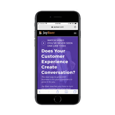
Not only does he include a uniquely personal photo of himself in the hero section of the home page, but he has also applied a powerful color filter atop it. Further, he leads with a call-to-action for visitors to watch his five-minute video.
Although the messaging puts the focus on the customer, these strong visuals simultaneously convey that Jay Baer is someone they need to stop and listen to.
You’ll want to strike the same balance with your own entry visuals and messaging. Make sure the text lets visitors know there’s something really valuable here to stick around for. But be savvy in how you design the visuals surrounding that message. There’s a lot you can to do to convince visitors that they’ve entered the website of authority instead of just a service provider or seller.
Recommended reading: Reasons Your Mobile App Retention Rate Might Be So Low
3. Be Ripe with Content
I touched on this point slightly in the navigation point, though I think it’s worth taking a closer look so you can see the ways influencer websites produce and disseminate a variety of content.
Here is the Single Grain blog:
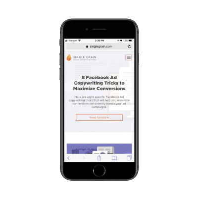
Single Grain’s blog is full of new and cutting-edge posts on the subject of digital marketing. As you scroll down the page, you’ll soon see that each of the featured images is designed in the same manner. All are customly illustrated and contain a mix of visuals and light text.
This not only gives the blog a consistent and easily recognizable look, but it also gives the content an edge up when it gets shared on social media. Imagine you’re looking through your social media feed and happen upon a short post with a descriptive image attached to it. In a sea of image-less posts or ones that use meaningless stock images, this kind of visual content is sure to stand out.
Now, what’s interesting about Single Grain is that its podcasts page has a different style from the blog:
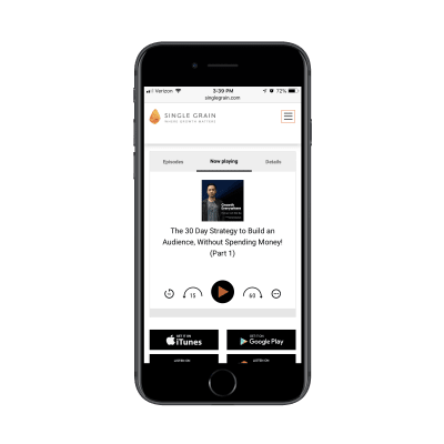
You can tell right away that the lightness in design and custom illustrations for the blog posts have no place here. Instead, Single Grain uses a more traditional design and layout for its Growth Everywhere podcast.
That doesn’t necessarily say anything about the kind of content covered here compared to the blog; it’s not more serious in nature nor is it created by someone with more traditional leanings. It’s simply a matter of designing for the channel. In this case, simpler and less customized makes more sense for a podcast.
As you bring together the pieces of your client’s website, don’t feel as though all of their content needs to be shoved under a single “Resources” tab and designed in the same manner.
Instead, give each content channel (e.g. blog posts, podcast episodes, video training, etc.) a separate tab and design it in a way that makes the most sense. For instance, you want visitors to spend a lot of time looking through a blog post, so you might design custom yet consistently styled graphics for each one. With something like an ebook, you’d keep it simple: show a picture of a bound book (even if it’s a digital-only book) and pair it with some intro text.
Influencers treat their different channels like sub-brands with unique identities. You should do the same.
Recommended reading: Designing For Micro-Moments
4. Confidently Collect Leads
Recently, I wrote about how to design lead gen landing pages for mobile. There were different examples included (a SaaS company, a digital magazine, a monthly subscription box company, etc.), which isn’t surprising considering how valuable lead generation is for online businesses.
That said, you’d be hard-pressed to find a digital influencer that doesn’t have a lead magnet offer on his or her website. It’s almost a guarantee.
The main difference between how some websites promote their lead gen offers and how digital influencers do it is the strength of the message and design.
This is the blog of Tim Ferriss:
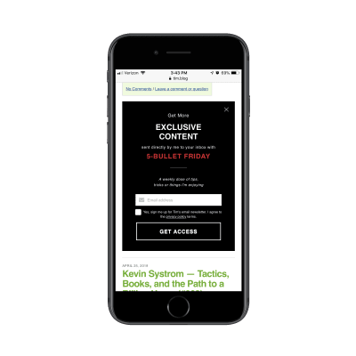
All this is is a promotional banner asking visitors to subscribe to the blog. Take note, however, that this isn’t posed as a request. This is an invitation to something special. And it’s intense. This is because of the special way in which the banner is designed:
- The solid black background;
- The words “EXCLUSIVE CONTENT”;
- The red all-capped letters;
- The call to “GET ACCESS”.
This is not at all the kind of thing you’d see on most websites and that’s because many of them just don’t exude the kind of in-your-face confidence and authority that digital influencers do.
Kim Garst is another influencer with an eye-catching lead gen banner:
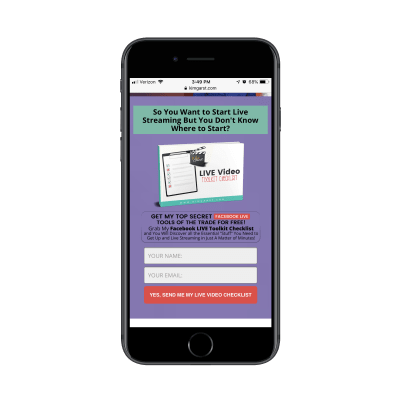
Clearly, the color palette is one you can’t help but stop and look at. The teal and purple colors are pretty safe choices, but it’s the contrast of the red callouts that gives this an edge.
Also, check out the wording she uses — it’s very similar to how Ferriss gave his lead gen an air of exclusivity. With Kim’s lead gen promo, she uses strong wording like “Top Secret”, “Discover” and “A Matter of Minutes”. If visitors weren’t feeling as though they had to read any more of the content on her website, this would surely get them to reconsider.
Bottom line: to demonstrate your authority, you can’t waiver nor can you provide a soft sell (e.g. “Subscribe here”) when promoting a lead magnet. Instead, your messaging and design both need to convey the confidence and authority that tell visitors:
“Don’t miss this special opportunity to peek inside my brain and gain more valuable knowledge and skills than you could ever ask for!”
Wrapping Up
Digital influencers are a special breed, that’s for sure. But that doesn’t mean you can’t draw lessons from how they’ve managed to convey and reinforce authority through their websites.
What’s nice about digital influencer websites is that they show you that obvious cash-grab features (like affiliate advertising and gated content) aren’t necessary in order to increase conversions. By designing your website as an authority, you’ll see an increase in traffic, be able to more easily collect leads, and establish long-term trust with an audience.
The revenue increase will come naturally as visitors are dying to share the news about what they discovered.
Further Reading on SmashingMag:
- A Designer’s Guide To Better Decisions
- Designing Experiences To Improve Mental Health
- Generic First CSS: New Thinking On Mobile First
- Dark Patterns And Other Design No-Nos For Mobile
 (ra, yk, il)
Articles on Smashing Magazine — For Web Designers And Developers
