Figma Tips To Kick-Start Your Design Workflow
Figma Tips To Kick-Start Your Design Workflow
Philippe Hong
I have made the switch to Figma almost two years ago and I have no regrets so far. In one of my previous blog posts on the topic, I made an in-depth review of Figma, and I’m glad I could help other designers make the switch. After two years of working with this tool, I got really familiar with it and now I’d like to share with you twenty tips that I use every day and which help me work a bit faster and be more effective.
Note About Shortcuts
Most shortcuts are written for both Windows and Mac, where the Ctrl key on Windows corresponds to the Cmd key on the Mac, and Alt is used for both Alt (Windows) and Option/Alt (Mac).
For example, Ctrl/Cmd + Alt + C is Ctrl + Alt + C on Windows and Cmd + Alt/Option + C on the Mac.
Note: This article is for designers who want to try Figma or already are exploring some of its features. To get the most from the article, some experience with Figma Design would be nice to have, but not required.
1. How To Import Multiple Images At The Same Time
We use pictures and images in our designs all the time, and it would be very useful if we could make the process of changing single and multiple images more easy and straightforward.
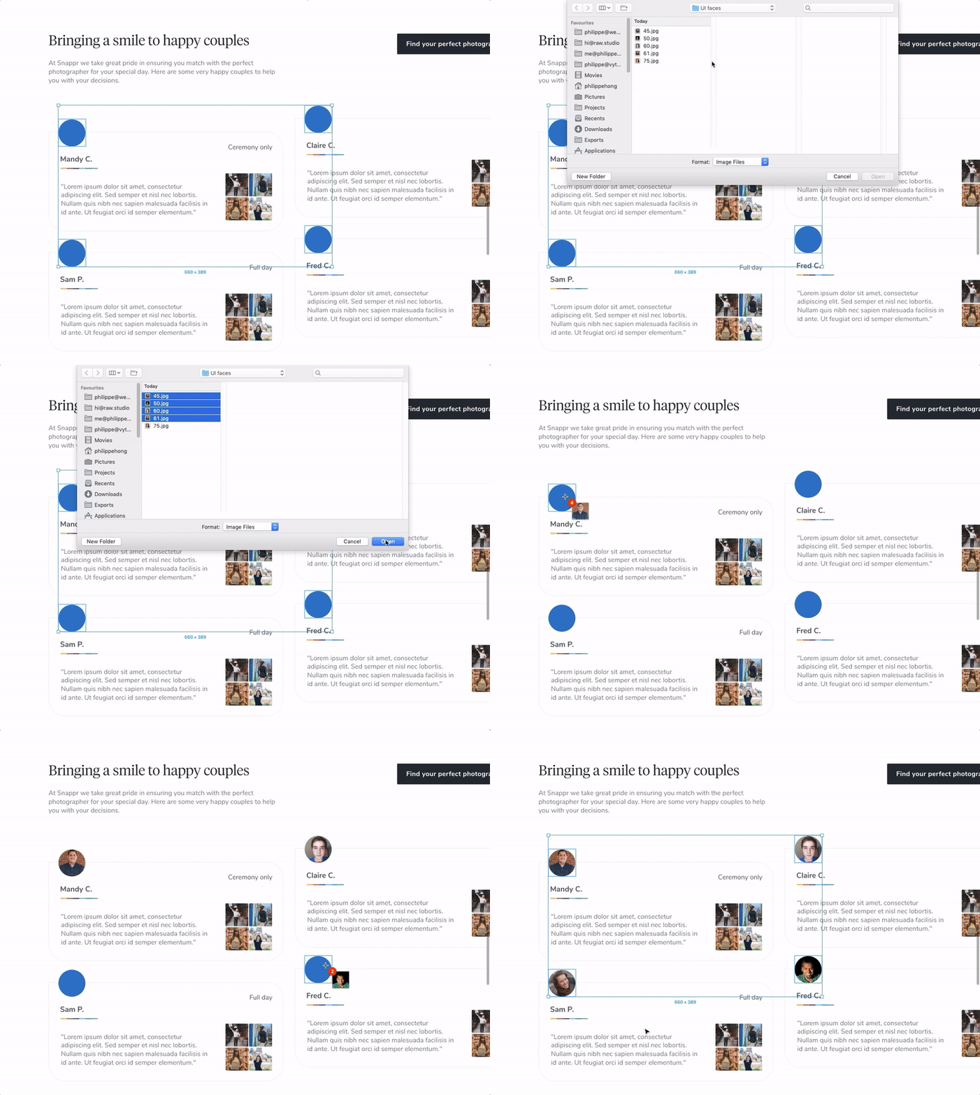
In Figma, you have the ability to import multiple images (using the shortcut Ctrl/Cmd + Shift + K) and then place them one by one in the layers (objects) in which you want them to appear. This is quite handy because you can see the images being imported and then placed in realtime.
2. Better Renaming Options By Using The Layers Batch Rename Feature
Sometimes (and I really mean many times!), we need to rename a group of layers when we need to prepare our design for export (export as icons, or as a set of images), or just when we need to perform a “deep clean” process inside a design file.
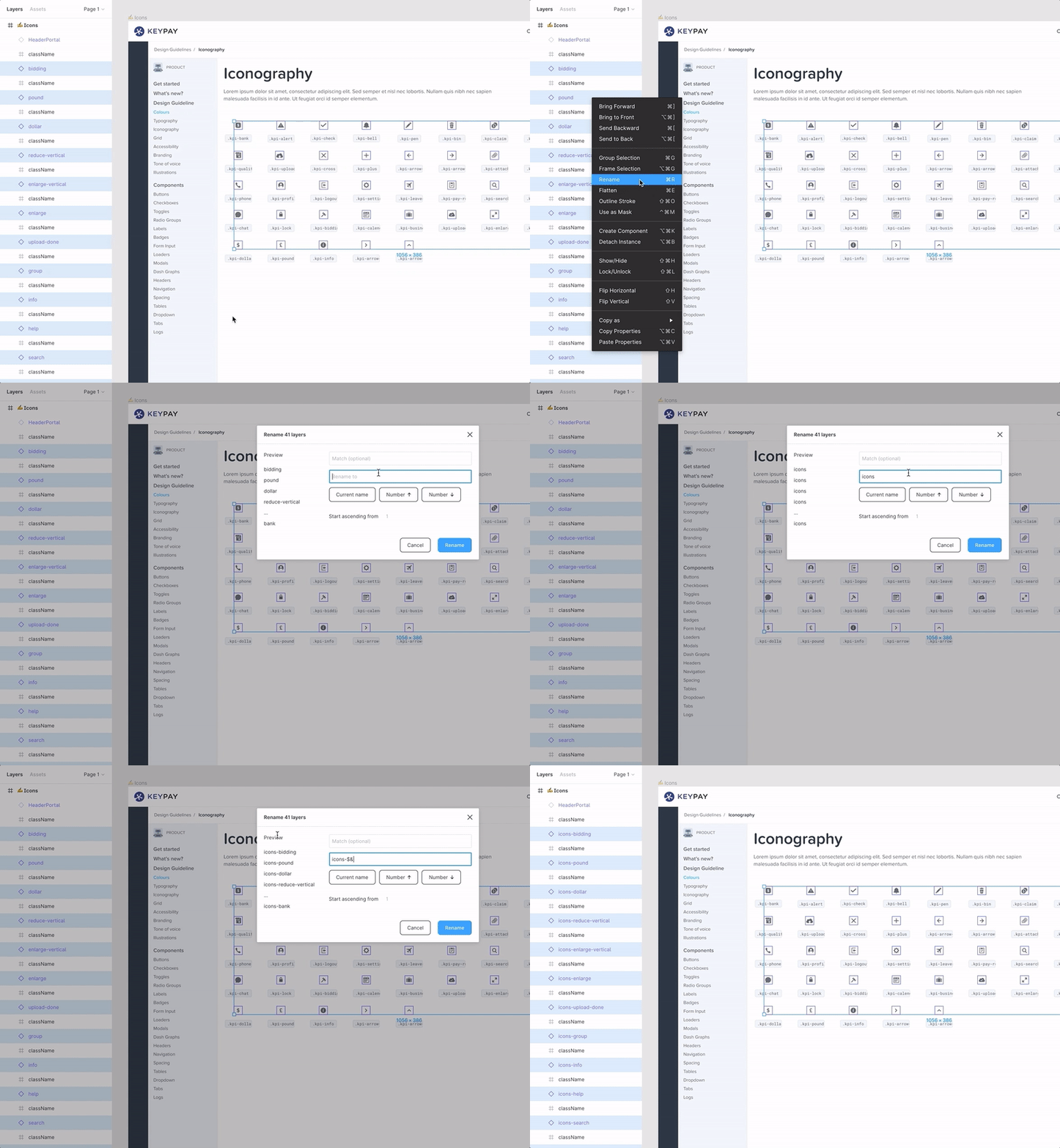
In Figma, you have the ability to batch rename layers (and frames) which is a really handy feature. You can rename the entire layer name or just a portion of it. You can also find and rename a specific character in a layer name, and you can add a different number to each layer that will be later exported as a separate file. You can also do a search and replace by just typing in the “Match” field.
I find this feature extremely useful.
Note about layers: If you’re relatively new to Figma, the following Figma help page will shed some light on layers, frames, objects, groups of objects, and more.
3. Using An Emoji In The Frame Name To Display Its Current Work State
Since we started using Figma in our design team, our workflow has been more collaborative, as we usually work on the same design files, and sometimes we even work on them simultaneously.
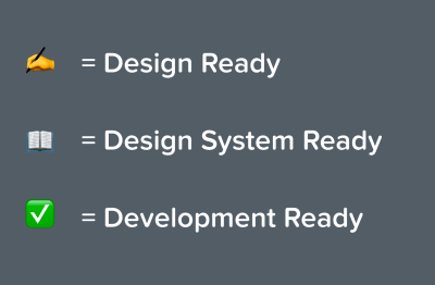
To know which Frame or screen is still work in progress, and which one is ready (final variant completed), we add an emoji (Windows shortcut: Win key + . or Win key + ; / Mac shortcut: Cmd + Ctrl + space) before the frame name so everyone can see at a glance the frame’s current state.
4. Re-Organizing Items
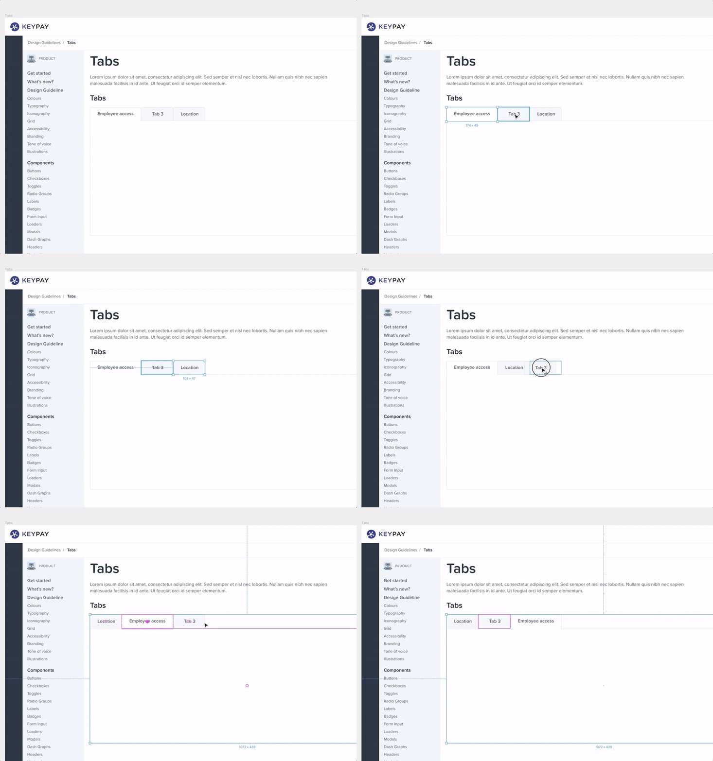
One of Figma’s great features is the ability to re-organize items inside a Frame. It’s very handy when used on icons, lists or tabs as shown below:
Use Proper Naming To Organize Your Styles (Texts, Colors, Effects)
Local Styles is one of the best features in Figma. It allows you to create a design system or guideline for all components so you can reuse them easily. And if you change the Master Style, it changes all the components linked to it. Super powerful! However, you can get lost with all your styles if you don’t name and categorize them the right way. I’ll share with you how I structured my styles in Figma — read on!
5. Text Styles Naming
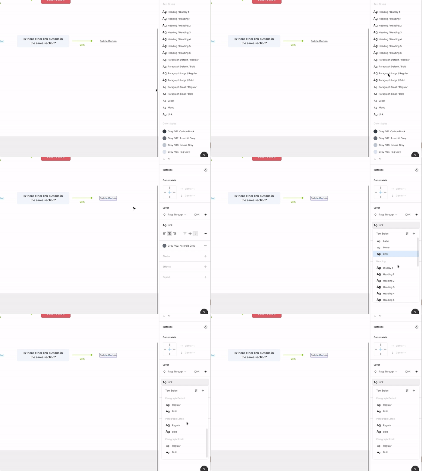
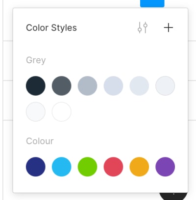
You can organize your text styles in subcategories by adding a “/”. For example, I would add a “Heading” and “/” so I’ll have all my headings inside the category “Heading.” Sounds fancy but it’s easier to navigate when you have a lot of different font sizes. Works for Texts and also Colors.
6. Adding A Description For Each Style As A Guide
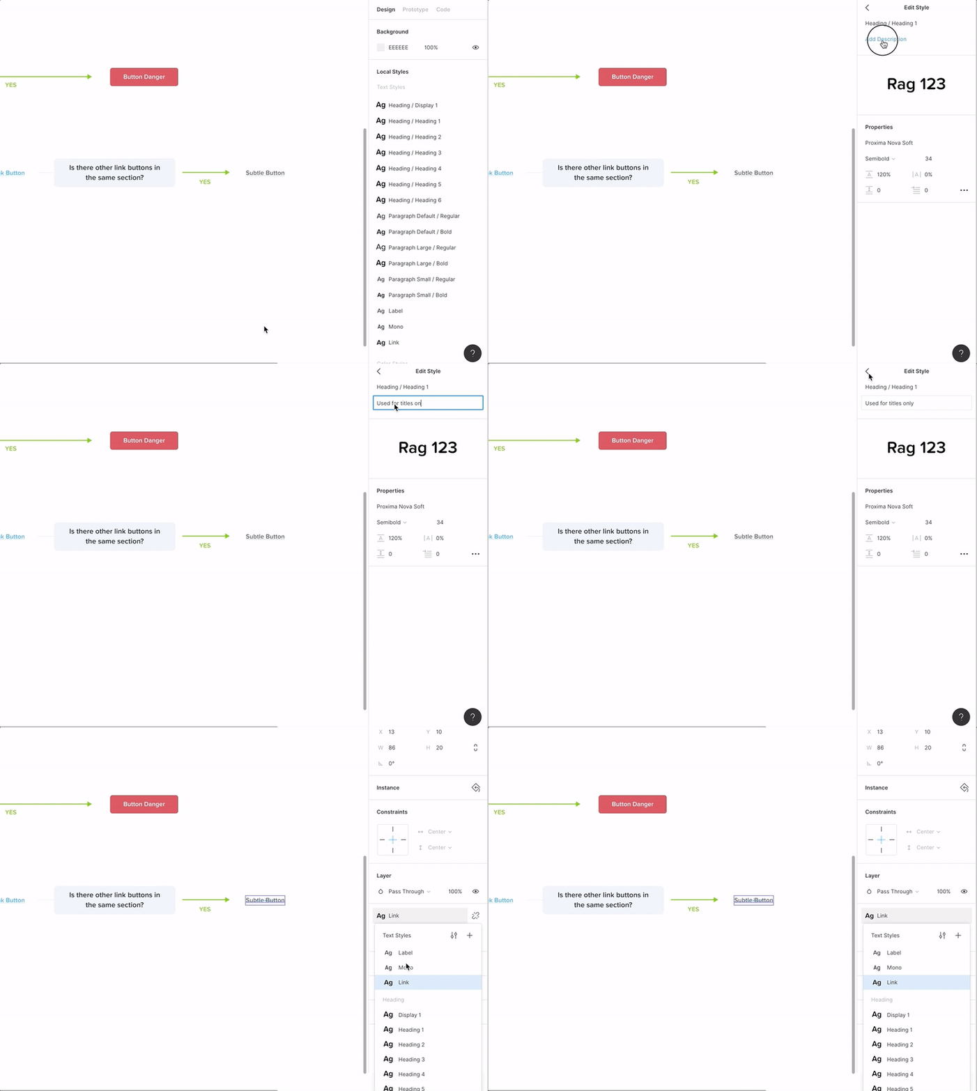
It can be handy to know where to use different components by adding a quick description of how to use the style and where, especially when you have a team of designers. You can add a description when editing the text style, color style or any components.
7. How To Switch Instance From The Sidebar
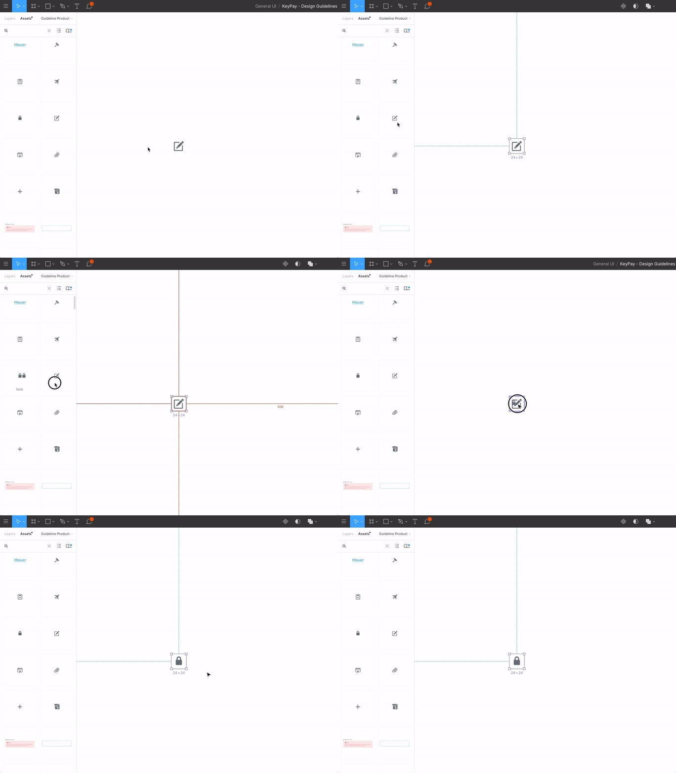
A lot of times, we end up with a lot of components, icons, etc., so the dropdown menu to switch instance is probably not the best way to do this. The little trick is that you can, from the sidebar, drag the component by holding Alt + Ctrl/Cmd to the component you want to switch. Easier and faster!
8. How To Copy/Paste All Properties
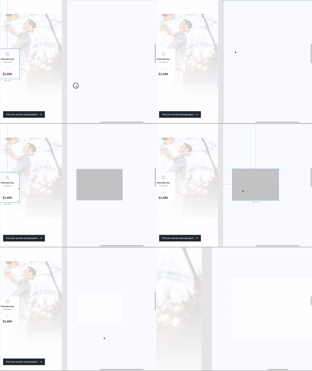
When duplicating an element or when I just want to copy the style of an element, I can quickly copy the element’s properties (Ctrl/Cmd + Alt + C) and paste them (Ctrl/Cmd + V) on a new element. It’s quite handy for images and styling elements with multiple properties, e.g., fill and stroke, etc.
9. How To Copy/Paste A Single Property
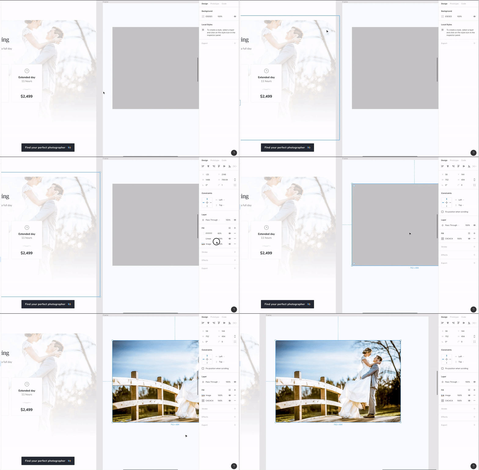
Another shortcut that I found very useful is the ability to copy a single property — and you can select which property to copy! Select the property from the right panel (like shown in the video) and with a simple Ctrl/Cmd + C and then Ctrl/Cmd + V paste it on another object. I found this to be very useful for images.
10. Search For Elements With The Same Properties, Instance, Style, And So On
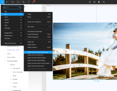
When you have a complex design file, or you just want to tidy up your design system, it’s quite handy to be able to search for elements with the same property (a specific color, for example), and then change the color to a Color Style. Super-useful after you’re settled with the design system and need to better organize all the components!
11. Use The Scale Tool To Resize Objects And Their Properties
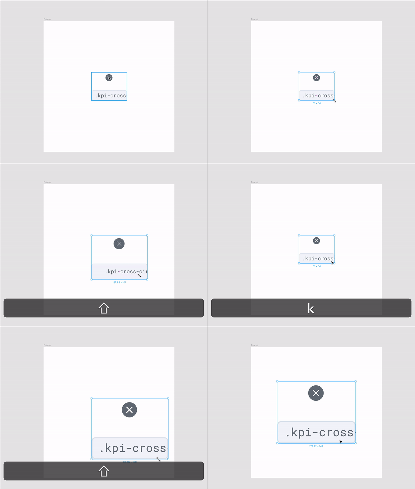
I found it useful to be able to scale an element and its properties (stroke, effects applied to the object, etc.) all at the same time with the Scale tool (K). I found Figma a bit easier than Sketch in this regard, as you don’t have to select the size of the object. When you scale the object, both the object’s dimensions and its properties will resize proportionally. And by holding Shift, you’ll also keep the ratio while expanding or downsizing the object.
Note: If you need to change the size of an object without changing its properties (stroke, effects, etc.), use the Select tool to select the object, then resize it by using the Properties panel. If you use the Scale tool and resize the object, then both the object’s size and its properties will resize.
12. Resize A Frame Without Resizing The Layers Inside It
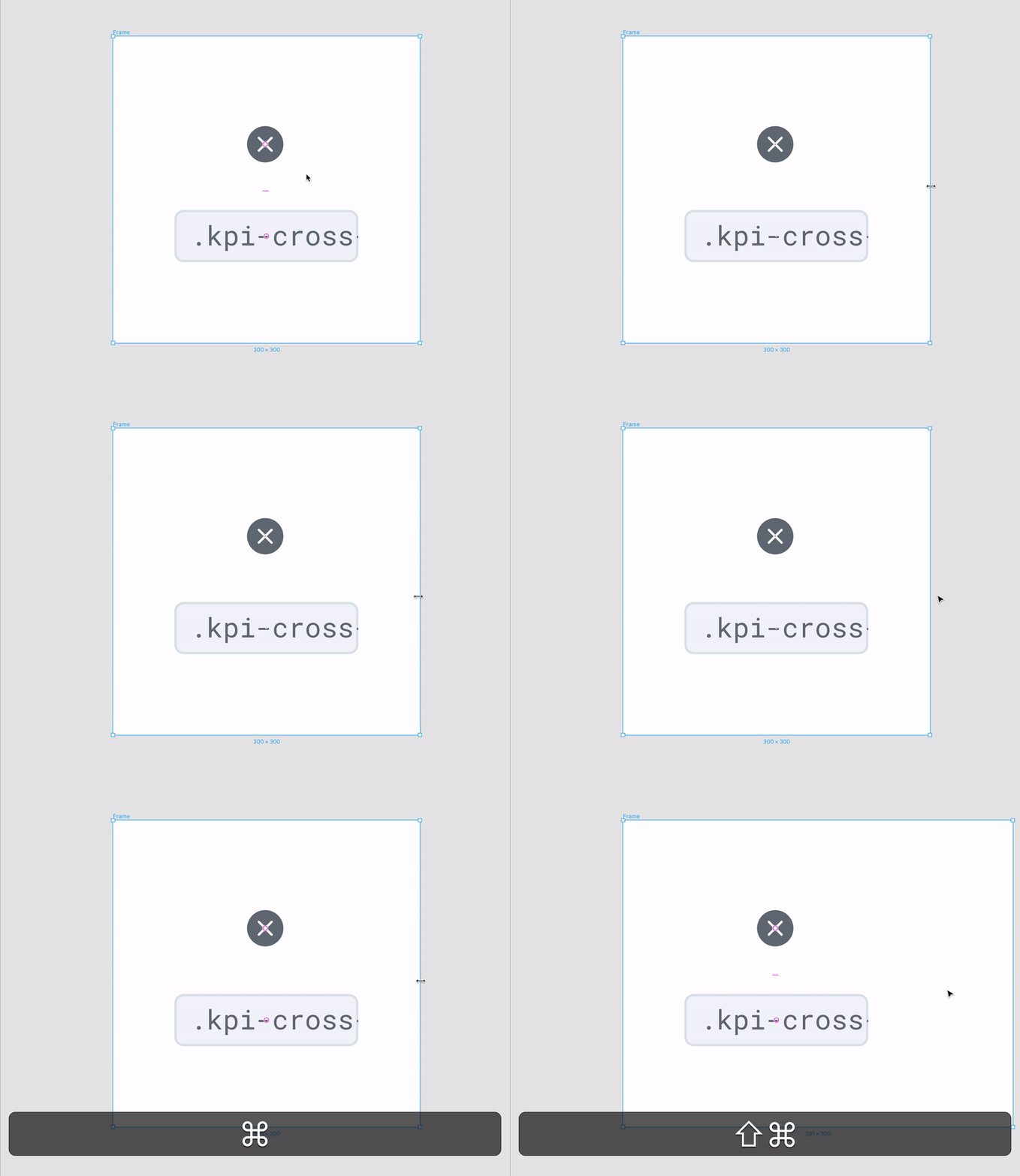
When designing for different screen resolutions, you want to be able to resize the screen frame without having to resize all the elements inside the frame. In order to do that, hold Ctrl/Cmd while you perform the resize operation. Magic!
13. Create Graphs/Arc In Seconds
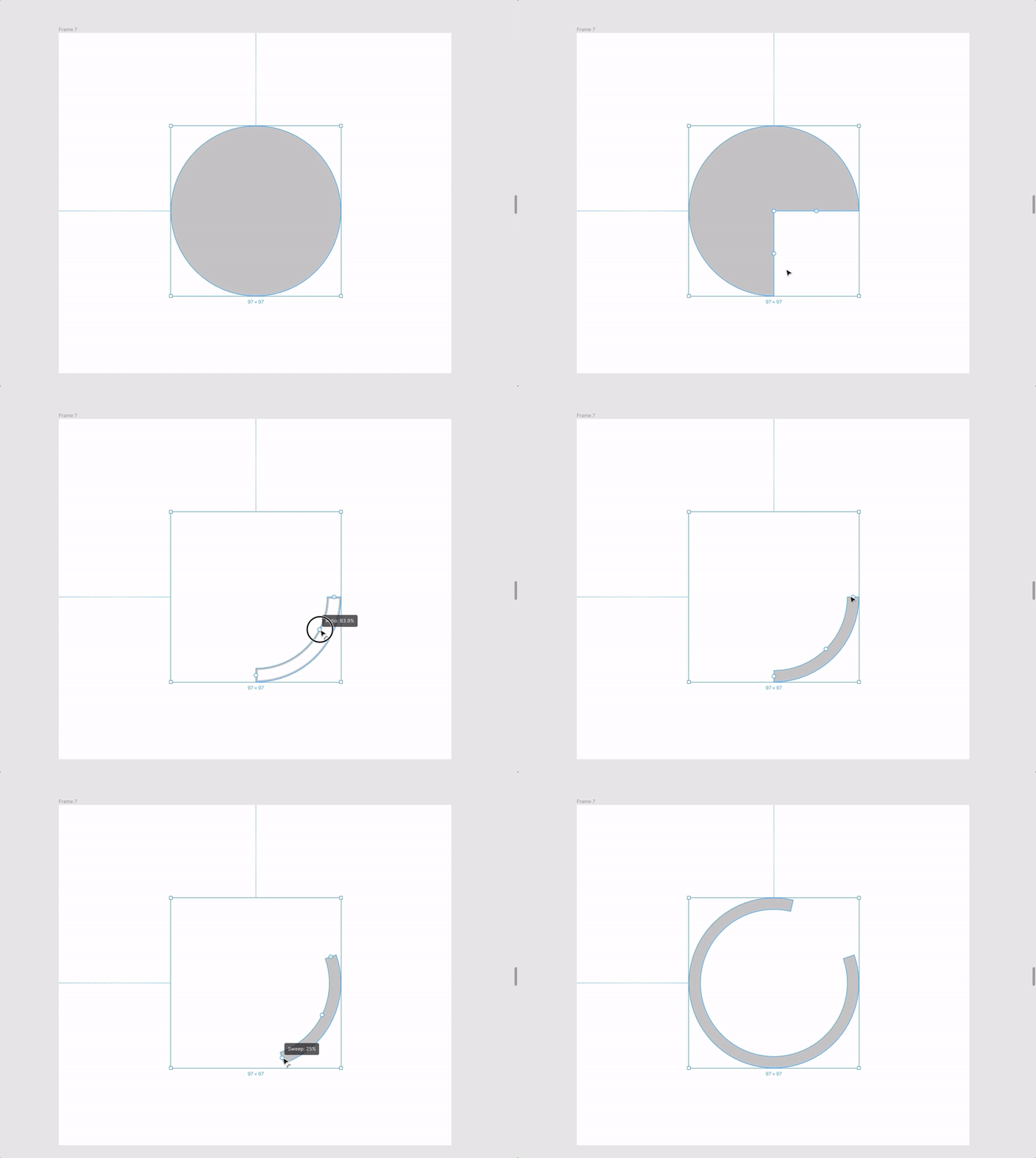
With Figma, you can create graphs/arc in literally seconds! No more cutting paths on a circle to create a custom graph. Here’s how you create a loading arc — and all those values can be precisely controlled from the Properties panel on the right.
14. Change Spacing On The Go
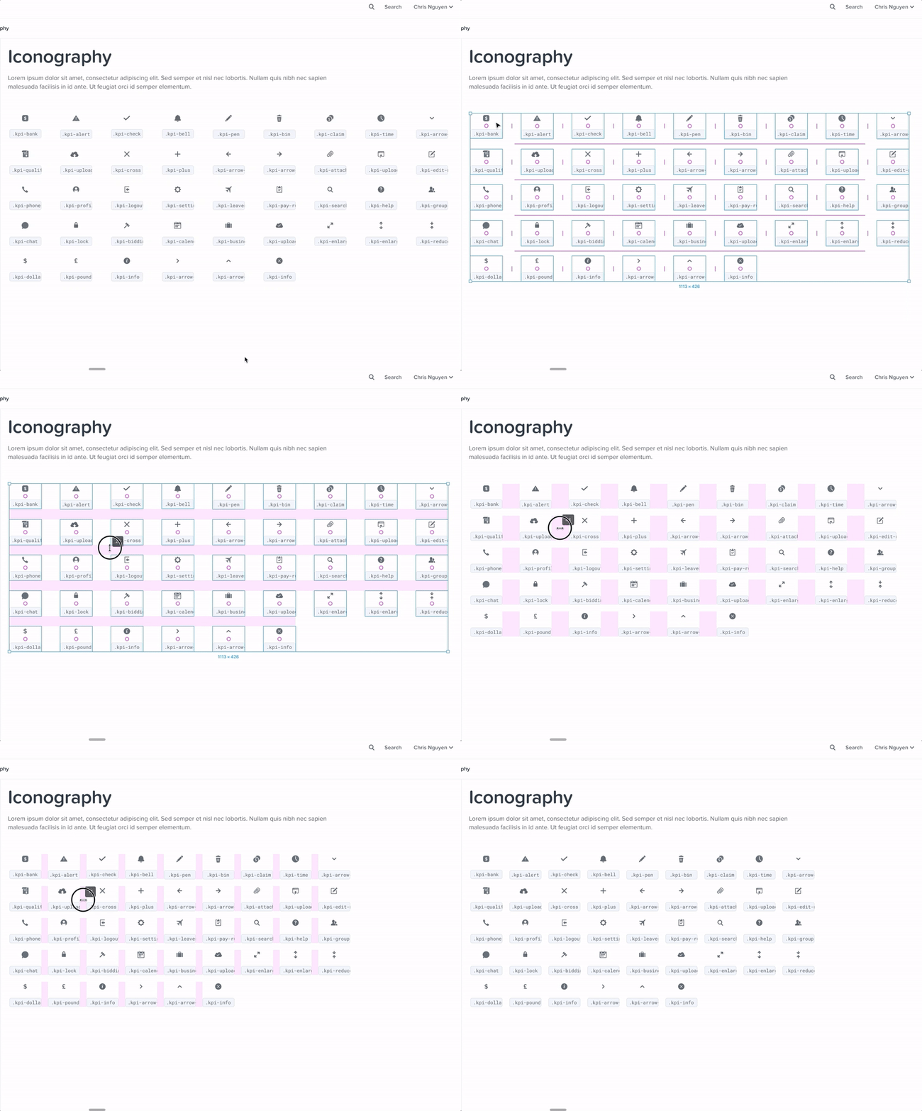
I love Figma’s feature that allows you to change the spacing for a group of elements. It makes it super easy to lay out a group of elements around your screen. I use this feature for multiple elements but also for single elements as well.
15. Component Keywords For Easy Search
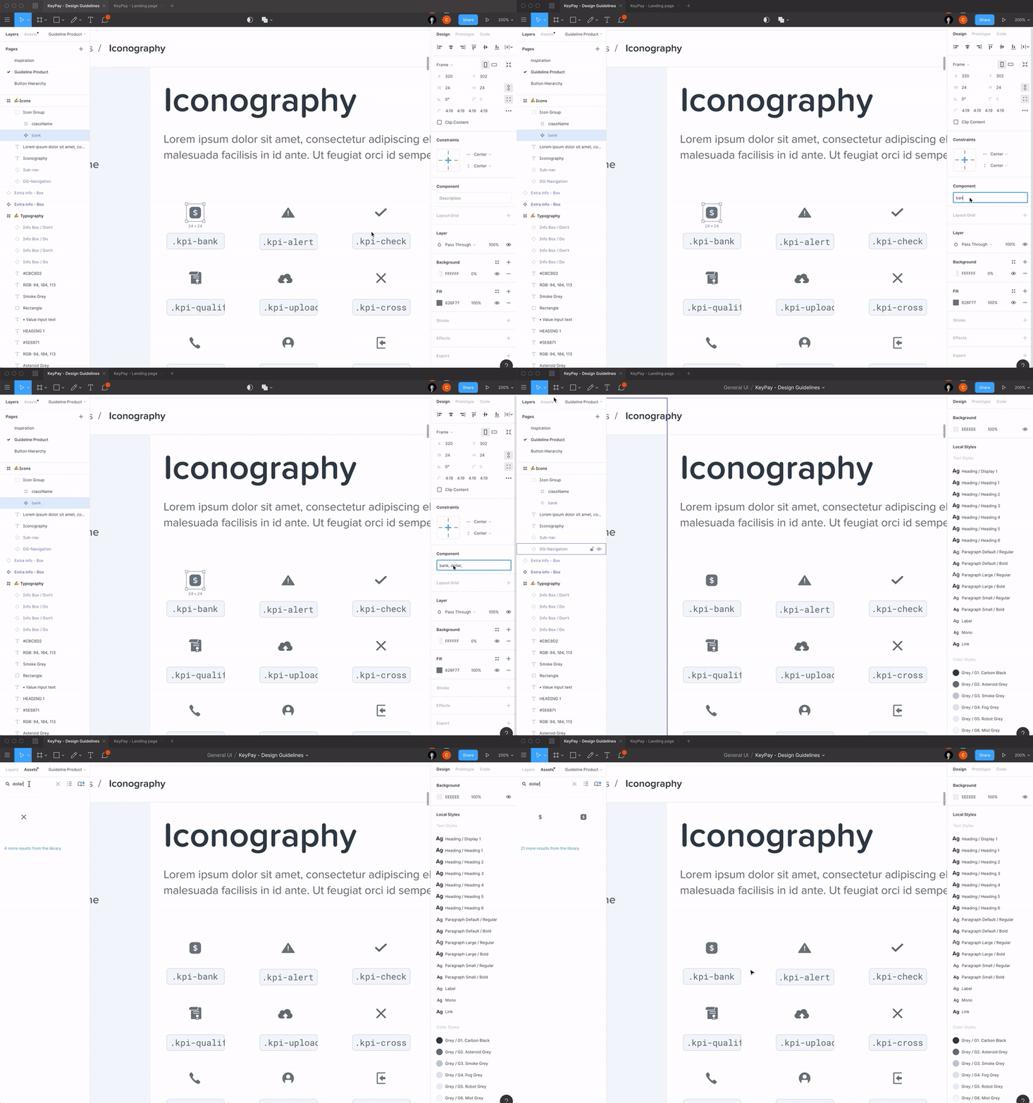
When you’re starting to have lots of components, it becomes difficult sometimes to find a specific component in your library. That’s when the component keywords come in handy. You can add keywords to any component so even though the component’s name is different, you’ll have the keywords which will allow to find it more easily. You’ll find an example below:
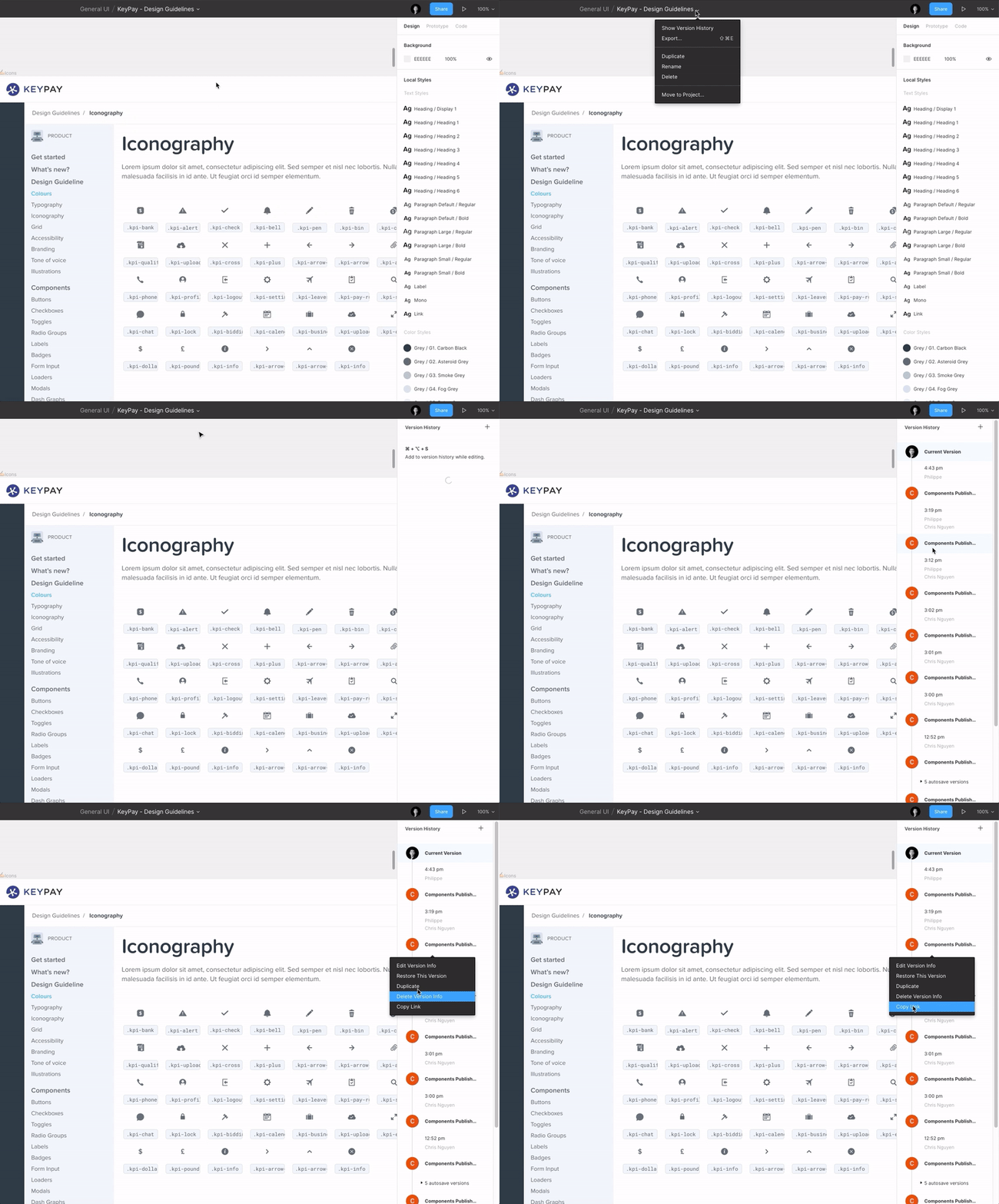
16. Restore An Earlier Version Of A Design File Or Share The Link To An Earlier Version
I love the feature to be able to go back to a previous version of the file I am currently working on.
No matter the reason (you made a mistake, or a client asks you to switch to an earlier version, etc.), it is really handy to be able to go back in time to a previous version. And not only that, but Figma also lets you copy the link to the previous version so you don’t have to delete the most recent version of the file. Smart!
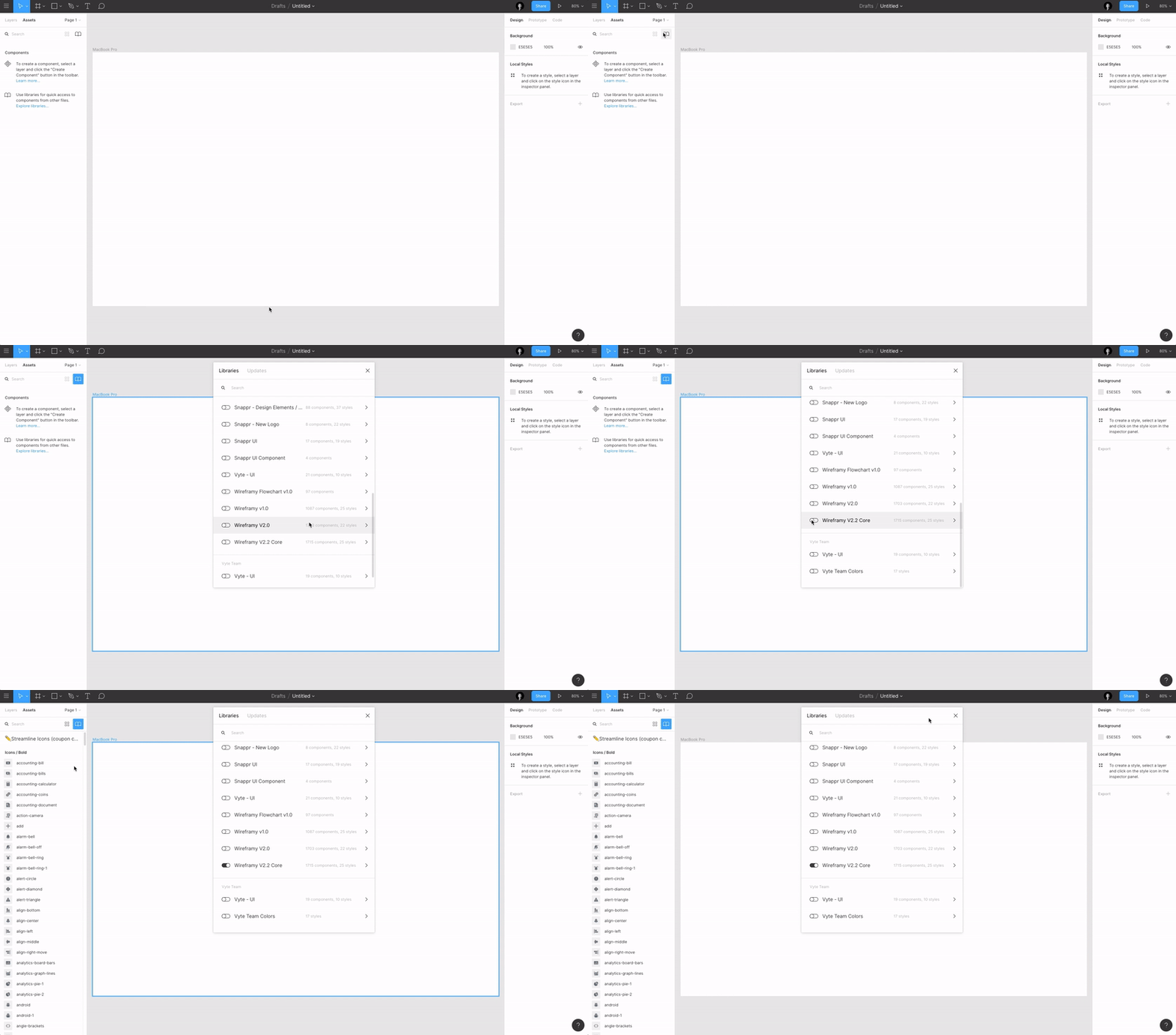
17. UI Kit Libraries To Kick-Start Your Projects
I often use the UI kit libraries to kick-start my projects. For example, I use the Wireframy Kit whenever I need to design some wireframes. I just need to activate the library, and I’m ready to go! I also often use Bootstrap Grid and Figma Redlines. (There’s a ton of free assets available — check them out and pick the ones you need.)
18. Use GIFs In Prototypes
Figma just added the ability to add GIF files to your prototypes, thus adding the possibility to add user interaction animations within your prototypes. Here’s a preview of it from Aris Acoba:
It does work 😍 @figmadesign pic.twitter.com/G40FiBcsg2
— Aris Acoba (@aris_acoba) July 9, 2019
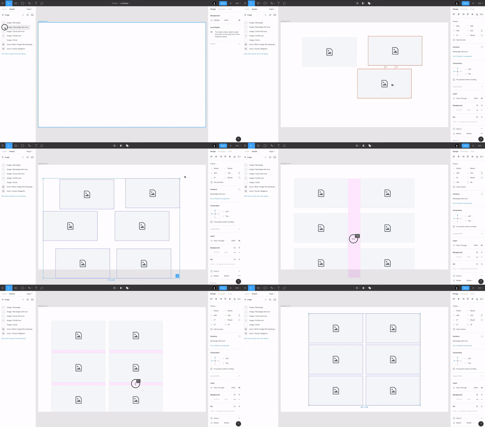
19. Figma, Tidy Up!
Figma’s Tidy Up feature is really when you want to quickly rearrange elements in a grid or just to make everything aligned. Together with the features which I mentioned in point 4 and point 14 — it’s super powerful! Also, another way to tidy up is by hovering over the bottom-right corner of a selection and clicking the blue icon.
20. View Settings
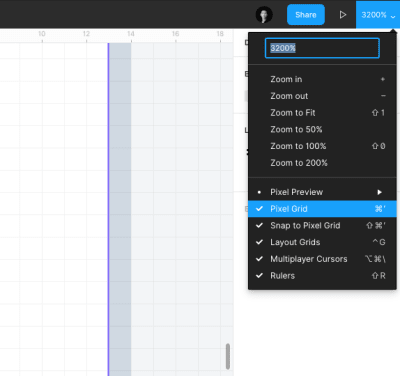
It took me a bit of time to find those settings but they are quite handy when you know where they are located. You can configure how you see your workplace in the “Settings” dropdown menu in the top right corner of the window. Allowing you to show Rulers, the Grid, enable/disable “Snap to Pixel Grid” (which sometimes is a bit annoying), but also hide the other players’ (designers) cursors when you want a bit of focus and don’t want to be distracted by others.
21. Bonus Tip: Figma Plugins
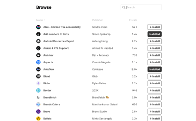
Figma just recently introduced their new plugins feature which will allow people to build custom plugins tailored for their own workflows.
I think plugins will add a lot of value to the entire Figma ecosystem and will enhance our design workflows. Some of the best plugins I have tried so far include:
- Content Reel
- Unsplash
- Stark
- Image Palette
- Google Sheet sync
Have a try yourself and maybe you could even build your own plugin to suit your needs!
Recommended reading: Title
Further Reading on SmashingMag:
- Design At Scale: One Year With Figma
- Building A Component Library Using Figma
- Sketch vs Figma, Adobe XD, And Other UI Design Applications
- How To Build A Sketch Plugin With JavaScript, HTML And CSS
 (mb, yk, il)
Articles on Smashing Magazine — For Web Designers And Developers
