Equivalent Experiences: What Are They?
Equivalent Experiences: What Are They?
Eric Bailey
If you spend enough time interacting with digital accessibility practitioners, you may encounter the phrase “equivalent experience.” This saying concisely sums up a lot of the philosophy behind accessibility work.
Our industry tends to place a lot of focus on how, often at the expense of why. For accessibility-related concerns, it is vital to learn about the history, and lived experiences of disabled people as a context for understanding the need for design and code created with access in mind.
This is the first of two articles on the topic of equivalency, and how it relates to digital accessibility. It will help us define what an equivalent experience is. Once we have a common understanding established, I’ll then discuss how to go about implementing equivalent experiences for common accessibility-related issues.
The State Of Things
The truth of the matter is that even though we live in a multi-device world full of smartphones, augmented reality, voice assistants, and IoT smart sensors, our default is still predominately:
- Visual,
- large screen,
- fast connection,
- powerful computer and display,
- male,
- white,
- wealthy,
- young,
- Western,
- technologically-literate,
- and abled.
This is reflective of the biases that are inherent in how we design, develop and grow products.
The previous list may not be the most comfortable thing to read. If you haven’t closed the browser tab already, take a moment to consider your daily workflows, as well as who your coworkers are, and you’ll begin to understand what I’m getting at.
At its core, delivering an equivalent experience is ultimately about preserving intent — with the intent being the motivating force behind creating a website or web app and all the content and features it contains.
This translates to making the meaning behind every interaction, every component, every photo or illustration, every line of code being understandable by the widest range of people, regardless of their device or ability.
Prior Art
I’m not the first person to discuss this topic (and hopefully not the last). Speaker, trainer, and consultant Nicolas Steenhout is one such advocate. His great post, Accessibility is about people, not standards, is well worth reading.
If you’re the kind of person who is into podcasts, his A11y Rules has a wonderful series called Soundbites. It features “short discussions with people with disabilities about the barriers they encounter on the web.” These insightful interviews also touch on what this article discusses.
What Isn’t An Equivalent Experience?
Showing examples of what something is not can be a way to help define it. For equivalent experiences, an example would be a web app geared towards use by the general public not having a mobile breakpoint.

With this example, everyone using a device with a small display is forced to pinch, pan, and zoom to get what they need. Here, the burden is placed on anyone whose only crime was using a smartphone.
Most likely, whoever conceived of, designed, and developed this didn’t stop to think about circumstances other than their own. In this sort of (unfortunately still all too common) scenario, I all but guarantee that the web app looks great on the laptops or desktops of the designers and developers who made it.
A designer saying, “it has enough contrast for me and my ‘old’ eyes” is the same as when a dev says, “works on my machine.”
The thing is though, we don’t design or develop for ourselves.
So, are we really ok with saying, “you don’t matter” to folks who are not like us? #a11y
— Heather (@_hmig) December 19, 2019
People using a smartphone to access this website are victims of circumstance. The extra effort someone needs to do to get it to work indirectly communicates that they weren’t a priority, and therefore not valued. If you’ve used the web for any significant portion of time, I’m willing to bet this, or a similar experience has happened to you.
This example is also a hop, skip, and a jump away from another common, yet serious accessibility issue we often don’t consider: screen zooming:
Screen Zooming
Screen zooming is when someone is prevented from being able to zoom their displays and make text larger—many native mobile apps are guilty of this. When you disallow this sort of behavior, you’re telling prospective users that unless they have vision similar to you, you aren’t interested in them being able to use your app.
For this scenario, a gentle reminder that we will all get older, and with aging comes a whole host of vision-related concerns. A question you should be asking yourself is if your future self will be capable of using the things your present self is making. A follow-up question is if you’re also asking the people you’re managing this.
I just had my eyes dilated, so I can’t read any text that isn’t comically large. I don’t know how to use a screen reader. I’ll be fine in a few hours, but this has been a fascinating journey into how well third-party iOS apps respect text size accessibility settings!
(Thread)
— Em Lazer-Walker (@lazerwalker) January 29, 2020
Accessible Experiences Aren’t Necessarily Equivalent Ones
This might be a little difficult of a concept to grasp at first. Let’s use this Rube Goldberg machine made by Joseph Herscher to pass the pepper to his dinner guest to compare:
To pass the pepper, the machine, sends it through an elaborate system of weights, counterweights, ramps, rolling objects, catapults, guillotines, burners, timers, carousels, etc. — all constructed from commonly found kitchen items. While this setup will technically ensure the pepper is passed, it is an annoying, overwrought, time-intensive process.
Many digital experiences are a lot like a Rube Goldberg machine when it comes to accessibility. Since accessibility issues are so prevalent, many forms of assistive technology provide a large suite of features to allow their user to work around common obstacles.
Unfortunately, discovering obstacles, and then figuring out and activating the appropriate combination of features to overcome them can take a disproportionate amount of time and effort.
To say it another way: A simple click on a button for an abled person may take far more time and effort for a disabled person, depending on how the button has been made.
Chilling Effects
Frustratingly, the extra time and effort a disabled person has to put into operating a technically accessible experience may feed back into their disability condition(s). For example, the presence of a motor control disability such as arthritis may make the overall experience even more taxing.
Cognitive accessibility concerns are also another important thing to consider. What may seem easy to understand or intuitive to use for one person may not be for another. This is especially prevalent in situations where there is:
- Specialized domain knowledge,
- education on a new concept,
- and/or a lack of common affordances for how the user interface operates.
Cognitive accessibility isn’t an abstract concern, either. Poor user interface design that ignores the circumstances of the end user and dumps too much cognitive load onto them can have very real, very serious consequences.

Compounding Effects
These factors are not mutually exclusive. Proponents of Spoon Theory know that inaccessible experiences conspire to sap a person’s mental and physical energy, leaving them exhausted and demotivated. Worse, these sorts of scenarios are often more than just a person perpetually operating at a diminished capacity.
Frustrating digital experiences can lead to a person abandoning them outright, internalizing the system’s fault as their own personal failure. This abandonment may also translate to a person’s willingness and ability to operate other digital interfaces. In other words: the more we turn people away, the more they’ll stop trying to show up.
“Nobody has complained before” is a silly excuse for not caring about accessibility. You’re right, they didn’t complain. They left.
— Vote blue, no matter who. (@karlgroves) December 8, 2018
Don’t Take My Word For It
To make the abstract immediate, I reached out on Twitter to ask people about their experiences using assistive technology to browse the web.
I also took a purposely loose definition of assistive technology. All-too-often we assume the term “accessible” only means “works in a screen reader.” The truth of the matter is that assistive technology is so much more than that.
The way the web is built — its foundational principles and behaviors — make it extraordinarily adaptable. It’s us, the people who build on and for the web, who break that. By failing to consider these devices and methods of interacting with web content, we implicitly drift further away from equivalency.
Consistency
For some, assistive technology can mean specialized browser extensions. These micro-apps are used to enhance, augment, and customize a browsing experience to better suit someone’s needs.
Damien Senger, digital designer, uses a browser extension called Midnight Lizard to enforce a similar experience across multiple websites. This helps them “to focus on the content directly and to limit having too big differences between websites. It is also helping me to avoid too harsh color contrasts that are really uncomfortable.“
Damien also writes, “Often websites are really difficult to read for me because either of the lack of consistency in the layout, too narrow lines or just not enough balance between font size and line height. Related to that, color can create a lot of unhelpful distraction and I am struggling when too harsh contrast is nearby text.”
How To Maintain Equivalency
- A larger font size and comfortable line height goes a long way towards making content pleasant to read.
- A well-considered color palette with good contrast ratios helps to keep the reader immersed in your content.
- Consistent application of color can also help communicate what elements can be interacted with, so long as it is not just the color alone that indicates interactivity.
- Ensure that text content is written using text (not presented as an image), allowing it to be read aloud, restyled, and reformatted.
- Use semantic HTML, sectioning elements, and structured microdata to allow your content to adapt to specialized reading modes and browser extensions.
- Understand that branding includes how something behaves, responds, and reacts in addition to how it looks.
In addition, Damien also augments their browsing experience by using ad blocking technology “not only for ads but to block animations or content that are too distracting for my ADHD.”
It’s not too difficult to imagine why distracting and annoying your users is a bad idea. In the case of ads, the industry is unregulated, meaning that rules to prohibit ADHD, migraine, and/or seizure-triggering animations aren’t honored. Through this lens, an ad blocker is a form of consumer self-defense.
I'll say it again: Telling users their access isn't as important as your bottom line is a BAD take. Ads are fine as long as they don't create a barrier by moving! #ADHD #A11y #PSH #WCAG https://t.co/i6mifI0JRE
— Shell Little 🧜♀️ (@ShellELittle) February 27, 2020
Kenny Hitt also chimes in about ads: “…regardless of the platform, the thing that annoys me most are websites with ads that essentially cause the site to constantly auto update. This prevents me as a screen reader user from reading the content of those websites.”
Again, a lack of regulation means the user must take measures into their own hands to keep the experience equivalent.
How To Maintain Equivalency
- Avoid scripts that refresh the page automatically.
- Avoid flashing and strobing animation, especially animations that are known seizure triggers.
- Provide methods to pause any and all animation.
- Use the
prefers-reduced-motionmedia query to disable animation, if requested.- Don’t use scripts that try to detect ad blocking.
- If a modal is used to inform someone about a newsletter signup, cookie policy, or that they’re using an ad blocker, ensure that the modal traps focus and can be dismissed using a keyboard.
Opportunity
A lack of an equivalent experience translates directly to lost opportunity. Many individuals I spoke with mentioned that they’d abandon a digital experience that was inaccessible more often than not.
Brian Moore mentions, “there are web sites where I like their products a lot but won’t buy them because the site itself is such a struggle, and attempts to reach out have met with either silence or resistance to taking any action.”
Brian cites the Fluance website as the most recent example. The bugs present in its shopping user flows prevents him from buying high-end consumer audio equipment.
Fluance’s entire web presence exists to sell products. While updating a website or web app to be accessible can be an effort-intensive process, it would definitely be in Fluance’s best interest to make sure its checkout user flow is as robust as it could be.

Opportunity isn’t limited to just e-commerce, either. As more and more services digitize, we paradoxically push more people out of being to live in the society that relies on these digitized services—people with protected rights. Again, this shift away from an equivalent experience is the culprit.
Justin Yarbrough was “applying for an accessibility-related job with the Arizona Department of Economic Security over the summer, where they wanted me to take an assessment. The button to start the assessment was a clickable div. They wound up waving the assessment requirement for the position.”
Jim Kiely tells me about his brother, who “has stopped paying his water bill online because the city water website [doesn’t] work well with a screen reader and high contrast.”
Personally, I have friends who have been prevented from submitting résumés to multiple sites because their job application portals were inaccessible.
How To Maintain Equivalency
- Use semantic markup (the
buttonelement for buttons, the anchor element for links,inputandlabelelements for forms, etc.).- Perform an initial test of your user flows using assistive technology to make sure they make sense.
- View your website or web app using High Contrast Mode and inverted colors to make sure interactive content is being displayed properly.
- Use actual assistive technology users to test your user flows.
- Demand third-party vendors to sign off on the accessibility of their product, including a Voluntary Product Accessibility Template (VPAT).
Adaptability
Soren Hamby, product marketing manager and design advocate, writes of their experiences using screen magnification software and screen reading capabilities. Soren has “varying levels of vision so [they] tend to not always need the same level of accommodation.”
Of note, Soren mentions their struggles with grocery delivery apps, specifically “the carts often only read the quantities rather than the item name. It’s much easier to order with a sighted person.”
There are three things to consider here:
First is the surface-level acknowledgment that the app operates differently for different people, the main point this article is driving at.
Second is the fact that Soren uses multiple forms of assistive technology, with the mix a shifting combination depending on a combination of their task at hand and how well the digital interface meets their access needs.
How To Maintain Equivalency
- Make sure that the labels for your interactive controls are relevant and concise.
- Incorporate disability scenarios and conditions into your design personas.
- Avoid using absolute length units. (No, seriously.)
- Avoid setting maximum widths and heights.
- Avoid using fixed and sticky-scrolling components, especially larger-sized ones.
- Test your layouts by zooming and/or increasing your default type size to make sure that content does not get obscured.
This brings us to our third and most important point:
Autonomy
Having to rely on the help of a sighted person to order groceries is not ideal. For many, the acquiring, preparation, and consuming of food can be highly personal acts. Being forced to incorporate outside assistance into this process is far different than willingly inviting someone in to share an experience. The same notion applies to every other digital product, as well.
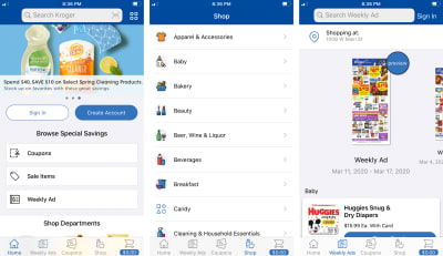
Kenny also mentions grocery apps: “…my local Kroger grocery store has started an app redesign in June 2019 that is breaking accessibility with their app.” In discussing this regression, he goes on to elaborate, “Because I can’t financially change to another business, I won’t let it drop. Kroger is going to discover that I don’t stop with a problem. Persistence in solving problems is a requirement for any disabled person if you want to succeed in the world.”

Equality
Kroger would be wise to listen to Kenny’s feedback. The grocery company Winn-Dixie was recently successfully sued for not being operable with a screen reader. The lawsuit argued that the grocer’s website was heavily integrated with their physical stores, and therefore violated the Americans with Disabilities Act (ADA).
Another recent case involves the Domino’s Pizza franchise. Taken all the way to the Supreme Court, the ruling clearly and unambiguously states that preventing someone from using a website or app, simply because they used screen reading software, is unconstitutional.
For both cases, the cost to implement fixes were far cheaper than going to court—something to think about the next time you’re deciding where to order pizza.
Despite some ugly misconceptions about the ruling, the evidence is clear: in the United States, there is now legal precedent for private companies to be sued for violating civil rights via an inaccessible digital experience. Europe and some parts of Asia have similar laws, as well.
How To Maintain Equivalency
- Understand that technical decisions can have legal consequences.
- Honor the law and don’t create circumstances that lead to discrimination.
- Familiarize yourself with the Web Content Accessibility Guidelines (WCAG).
- Add accessibility requirements to your acceptance criteria.
- Add manual and automated accessibility checks to your design and development workflows.
Reactivity
Another way to maintain an equivalent experience — one that is often not thought about — is to give reports about accessibility issues the same weight and concern as other software bugs.
Reported accessibility issues are oftentimes downplayed and ignored, or are sent to someone ignorant of the issue and/or powerless to fix it.
Kenny, who started using a computer with a screen reader in 1984 says, “When I run into accessibility issues nowadays, I’ll try reporting it, when I get the usual response from the feedback of the person not caring, I just give up and walk away. If [the response] comes from somebody in marketing who doesn’t understand accessibility, I just give up and go away. There’s no point in trying to teach these people about accessibility.”
Kenny’s view is shared by many others in the disability community. Remember what I said about compounding effects earlier.
Brian reports that,
“If I find significant issues with a site, I do report it. Depending on who I talk to it ranges from ‘here’s what doesn’t work’ to all kinds of technical detail about why if I can get to the right people.”
Getting it to the right people is key. Another part of equivalent experience is handling feedback in a timely and constructive way, much as how you would with any other issue with your product or service.
Responding to an accessibility issue is easy:
- Thank the person for taking the time and effort to report the issue.
- Acknowledge the issue and identify what person or team will be handling it.
- Ask clarifying questions as needed.
- Offer potential workarounds, with the understanding that they’re only temporary until the underlying issue is addressed.
- Offer to involve them in the process, including notifying them when the issue has been fixed.
Being open, honest, and transparent about your bug fixing process goes a long way to establishing trust in a population that has historically and routinely been overlooked.
Also know that assigning someone to mind an email address to conduct tasks on behalf of an assistive technology user is not an appropriate, effective, or sustainable solution. Remember the concerns surrounding autonomy discussed earlier.
How To Maintain Equivalency
- Create an accessibility statement, including known issues, a tentative timeline for their fixes, and easy to discover contact information.
- Ensure that anyone customer-facing (quality assurance, customer support, marketing, etc.) are trained on protocol for accessibility-related issue reporting.
- Quantify accessibility-related issues, both internal and reported.
- Be on the lookout for patterns and trends with discovered accessibility issues, as they represent learning opportunities.
- Understand that not all platforms to collect feedback are created equal.
Motivation
We’ve covered actual people’s everyday frustrations, as well as civil rights and the current legal landscape. If these don’t motivate you, allow me to present another factor to consider: profit.
There are two provoking studies I’d like to call attention to, but they are by no means the only studies performed in this space.

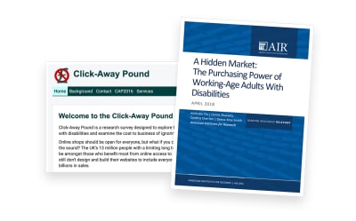
First is the Click Away Pound Survey, a survey conducted in both 2016 and 2019 to “explore the online shopping experience of people with disabilities and examine the cost to business of ignoring disabled shoppers.”
The survey discovered that more than 4 million people abandoned a retail website because of the access barriers they found. These people represent 17.1 billion pounds (~$ 21.1 billion USD) in lost potential revenue.
Second is the The Purchasing Power of Working-Age Adults With Disabilities (PDF), conducted in 2018 by the American Institutes for Research. This study discovered that there is an estimated $ 490 billion in disposable income amongst disabled working-age adults. That’s billion with a capital B.
There are two of the (many) takeaways from these studies I’d like to highlight:
First is that from a historical perspective, the web is still very much new. On top of that, its ubiquity is even more recent, meaning that use by the general population is a small sliver of the amount of time it’s been around.
Second is that the general population contains many people who are disabled, and that their needs are not being met. These unmet needs represent billions of dollars of potential revenue.
This is a gigantic market that we, as an industry, are only now becoming aware of. Rather than approaching accessibility with a mindset of risk aversion, why not use this learning as a great way to view your current and future business opportunities?
Complying with the ADA is by definition the legally required minimum for accessibility. It doesn't account for a good user experience, usability, and innovation. Unless you strive for the minimum all the time, compliance is not enough.https://t.co/qOYw6ji23u
— mikey is at home (@mikeyil) March 5, 2020
Let’s Not Stop Here
Too often we think of accessibility as a problem to be solved, rather than a way of looking at the world. Equivalent experiences necessitate that we question our assumptions and biases and think about experiences outside of our own. It can be an uncomfortable thing to think about at first, but it’s all in the service of making things usable for all.
As web professionals, it is our job, and our privilege to ensure that the experiences we deliver are equivalent. In the second part, we’ll investigate how to do just that.
Further Reading
- “WCAG Primer,” Tetra Logical
- “The Web Accessibility Basics,” Marco Zehe’s Accessibility Blog
- “Web Accessibility Checklist: 15 Things To Improve Your Website Accessibility,” WebsiteSetup.org
- “The Importance Of Manual Accessibility Testing: Call The Professionals,” Eric Bailey, Smashing Magazine
- “Taking Accessibility Beyond Compliance,” Dennis Deacon, 24 Accessibility
- “Videos Of People With Disabilities Using Tech,” Hampus Sethfors, Axess Lab
- “Web Accessibility Perspectives: Explore The Impact And Benefits For Everyone,” Web Accessibility Initiative (WAI), W3C
Thank you to Brian Moore, Damien Senger, Jim Kiely, Justin Yarbrough, Kenny Hitt, and Soren Hamby for sharing their insights and experiences.
 (ra, il)
Articles on Smashing Magazine — For Web Designers And Developers
