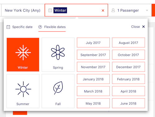
Designing The Perfect Date And Time Picker
What could be so difficult about designing a decent date picker? Basically, we just need an input field and an icon that represents a calendar clearly enough, and once the user clicks on that icon, we pop up a little overlay with the days lined up in rows. Right?

Well, not every date picker fits every interface, just like not every interface actually needs a date picker. But when a date picker is required, quite often it’s just a bit too tedious and annoying to specify that one date, and too often it produces irrelevant results or even a zero-results page, although just a few minor refinements would make it much easier to use.
The post Designing The Perfect Date And Time Picker appeared first on Smashing Magazine.

