Designing A Responsive Music Player In Sketch (Part 2)
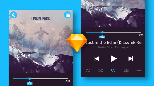
Welcome to the second part of this tutorial, in which we will finish designing the music player that we started in part one. This includes creating the icons at the bottom, as well as making the music player responsive, so that all elements adapt to the width of the artboard and, thus, can be used for different device widths.

Our premise in creating all of the icons is to use basic shapes as often as possible, instead of custom vector elements. Shapes are much easier to set up and modify, and we will still be able to combine them into more complex forms using Boolean operations.
The post Designing A Responsive Music Player In Sketch (Part 2) appeared first on Smashing Magazine.

