Design Mock-Ups Need Dynamic Content: Tools and Plugins
Nothing is perfect on the web. We can’t make sure that our websites always work as intended, but we can try our best to design resilient and flexible websites that aren’t that easy to break — both in terms of interface design and security. Yet neither resilience nor flexibility are usually reflected in our deliverables and mock-ups.

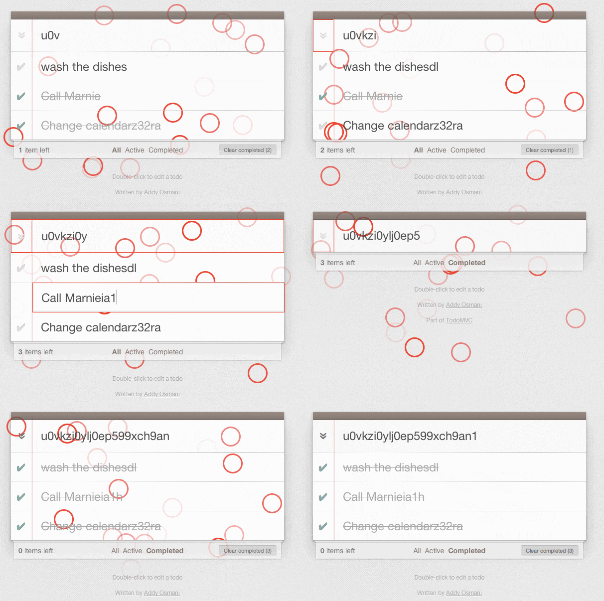
In practice, mock-ups usually represent a perfect experience in a perfect context with perfect data which doesn’t really exist. A good example for it are “optimal” usernames which are perfectly short, fit on a single line on mobile and wrap nicely, or perfect photography that allows for perfectly legible text overlays. It’s not realistic. We need to work with dynamic content in our prototypes, with both average and extremes being represented.
The post Design Mock-Ups Need Dynamic Content: Tools and Plugins appeared first on Smashing Magazine.

