Coloring That Never Gets Old – Black and White for Optimal Contrast
While Material Design with its vibrant and rich color schemes slowly but surely is conquering the World, the time-proven black-and-white palette that can rightly be called a traditional one does not want to relinquish its control and cede its dominance, though it certainly has conceded initiative to Google’s design language.
One of the greatest advantages of this classic coloring lies in its ability to create a startling contrast between the background and foreground that is so vital for good readability and optimal user experience. Although it may seem a bit outdated and insipid, when it comes to displaying content, it is second to none.
Moreover, you are not limited to employing just a solid black or white canvas and copy set inverse. You are welcome to conduct experiments yet still following the doctrine. For example, it is very common to use an image or video background that is intentionally darkened and light main content that naturally stands out from the crowd.
Today we are going to consider 20 grand website designs that prove that the time-honored coloring is never getting old.
Black and White in Web Design
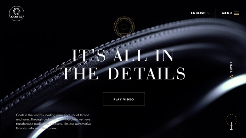
Coats Special
Although the primary color scheme includes three tones, black and white rule the roost here, affecting the majority of the design. Together they catch the mood of the brand and hit the targeted audience with a majestic appeal.
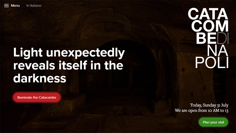
Catacombs of Naples and Rione Sanita
The website demonstrates a traditional use of the coloring: black is used for the background and white is for displaying content. This harmonious pair is enriched with two splashes of bright colors (red and green) that in such a monochromatic environment easily place emphasis on CTAs.
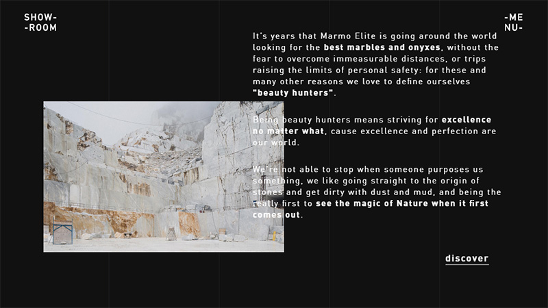
Marmoelite
Marmoelite goes for an interfusion of the classic color scheme and a contemporary multi-layering layout resulting in a pretty nifty and visually-appealing interface. There is so much fresh air and readability is so high that it is really comfortable to browse through the data.
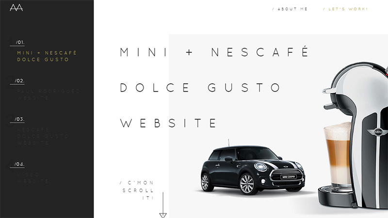
Aaron Marquez
Unlike the above listed examples, Aaron Marquez opts for an inverse solution by using a light background and dark text. Here white is dominant, and it makes the design feel more clean, neat, pure, efficient and professional.
Tantalum
The website has managed to achieve a balance between the content-intensive layout and aesthetics. Although there are so many details on the landing page, thanks to the black and white coloring everything seems to be well-organized and properly structured.
New Style Digital
The website gives off an authority and professionalism; and the black and white coloring plays a vital part in establishing such an atmosphere. It goes perfectly well with the classy hero section, strengthening the overall impression.
Elastique
Elastique utilizes various shades of gray in tandem with black and white that nicely interact with each other. Expectedly, with such a subdued and neutral coloring, everything should look slightly dull. Nevertheless, the layout with a twist saves the day and adds piquancy to experience.
Y78
This is not exactly the classic combination, since there is no pure black, however the video background is darkened, the title is set in white and contrast is achieved, so that it can be easily attributed to this direction.
Zoltar Speaks
The website looks mysterious and alluring, igniting interest at once. What is hidden in the shadows? Here classic the color combo is an integral part of the atmosphere that matches the spirit of the project and catches its mood.
Charlie Burger
The website employs a dark background, white text and dark khaki for highlighting important details and establishing focus. The backdrop is dynamic and visually appealing, yet the sharp contrast gives the content top priority.
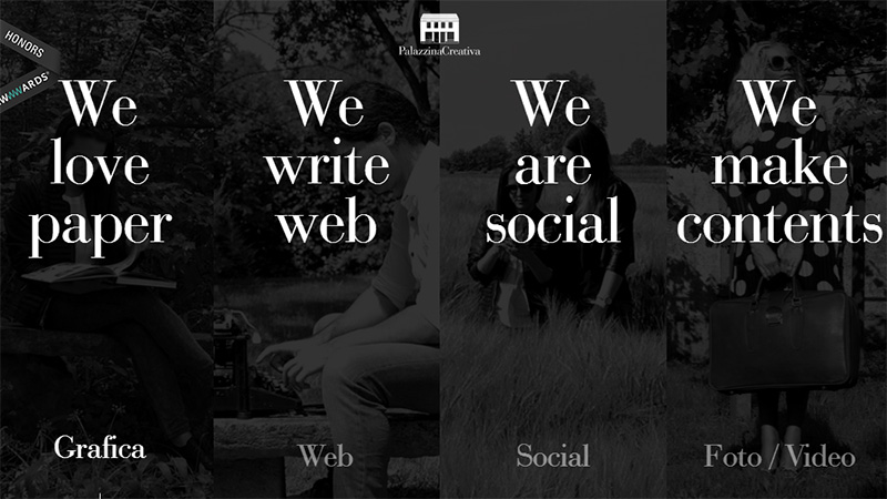
Palazzina Creativa
The agency keeps things admirably simple. The layout is basic; the graphics are plain; and the coloring is modest and casual. The website has a businesslike appeal and exudes an image of professionalism.
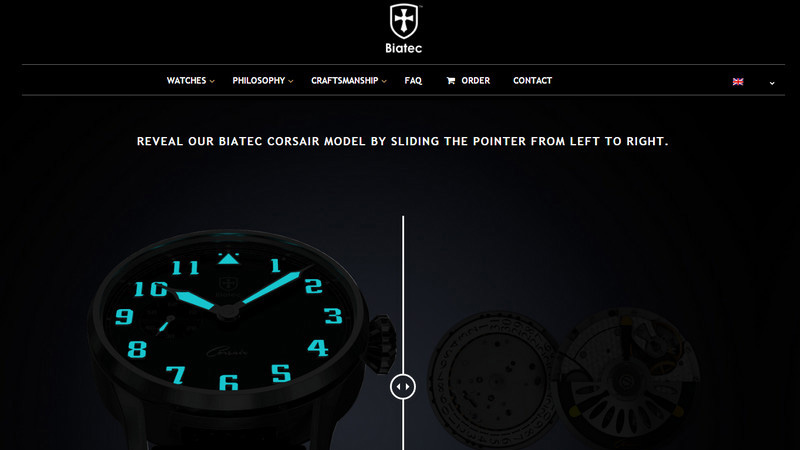
Biatec Watch
This is an excellent example of how the brand and design interact with each other producing a harmonious environment and at the same time looking pretty nifty. Here the modernity meets the traditional nature resulting in an outstanding outcome.
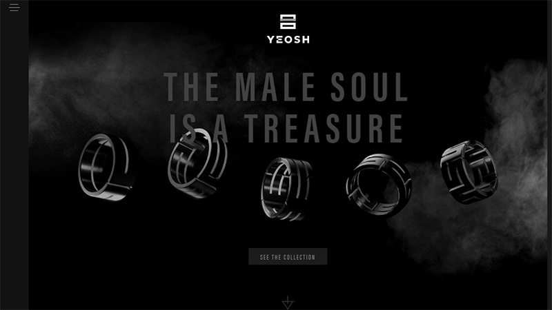
Yeosh
The design conveys the luxury inherent to the brand. Here the elegance and sophistication are done with perfection thanks to the prevailing black color and skillfully used dark shades. White is used to throw the spotlight on the important things and lift the veil from the products.
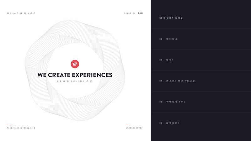
Mossio
Mossio almost achieves equilibrium between the dark and light, though the latter is certainly in the lead. It is tailored to the uniqueness of the content and skillfully reveals the agency’s sphere of expertise.
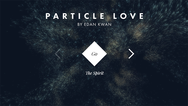
Particle Love
This is a grandiose experiment that demonstrates the possibilities of modern technologies. Edan Kwan has used a particle animation, so it is not surprising that he has chosen black and white as core colors: they do not distract attention from the action, the content is plain and scannable, and highlights the brilliance of the animation.
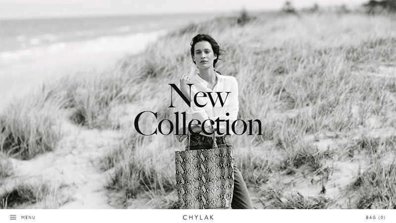
Zofia Chylak
Fashion-related websites quite often settle upon the classic coloring, since it naturally produces an impression of luxury, sophistication, and elegance. Zofia Chylak’s official website is a representative example of that. The interface reflects the brand, looks stylish and produces a powerful impression.
Authenticff
The homepage of Authenticff breathes fresh air and naturalness that makes the experience highly pleasant and comfortable. Smart usage of minimal elements, three-tone palette and bold typeface place the content in the center stage with ease.
Rimowa
This is another dark website on our list that awakens an insatiable curiosity thanks to skillful play with dark and light hues. Although there is no pure white, since the team uses gray shades for graphics and text, still everything is pretty readable.
MXB
The website demonstrates how to get the most out of minimalism and stay creative and exciting. The team leaves things out and keeps only the essentials. For such a concise environment, black and white coloring seems an ideal option.
Hyun’s Portfolio
This online portfolio is a blast from the past. It is increasingly oversimplified: there is no narration, vibrant illustrations, or unusual twists – everything is plain and ordinary, and the coloring is limited yet well-thought-out, like twenty years ago. It gets straight to the point. It is a pleasure to dive into the good old days and experience such interfaces once in a while.
Conclusion
A black and white color scheme is quite often used to transform simplicity into elegance or to add a sense of subtle sophistication to the design. This gruesome-twosome provides the interface with classic traits that enhance aesthetics and at the same time improve user experience, making content flow easily digestible.
What colors do you prefer to use in your projects? Energetic bright? Neutral? Modest gloomy? Or time-proven classic ones?

