
Can You Design A Website For The Five Senses?
Can You Design A Website For The Five Senses?
Suzanne Scacca
Maybe it’s the whiff of someone’s perfume. Or a bite of pizza from a new restaurant. Or a song playing over the loudspeakers at the store. But the second it hits, you’re immediately transported to another place, time, or mood.
Imagine if your website could evoke this kind of response. Visitors who respond to the sensory stimulation would instantly be in a more positive headspace, which they’d then associate with the site and your brand.
Just be careful if you’re going to attempt this. Not every sense-triggered memory or emotion is going to be a positive one, so you want to focus on more generalized and shared experiences that come with little risk of backfiring.
Here are some ideas to help you do this:
Designing For The Sense Of Sight
A website is a medium to be seen, so you’d assume that the sense of sight is the most powerful one to play with. But there’s a difference between a visitor taking in the photos and words on a web page and feeling something because of what they’ve seen.
The truth is, sight is the most pragmatic of the senses. Typically, what you see is what you get.
Nevertheless, it is possible to design a website so that it alters the mood of anyone who visits it.
Color theory is one tool you can use to inspire visitors to feel a certain way based on what they see. However, that can be problematic as colors often have multiple meanings not just across cultures but within them as well. So, while you might think you’re making visitors feel happier with bright yellow hues, it could instead be making them feel overwhelmed and anxious.
What I’d suggest you focus on is how to use visuals to create an immersive experience that transports your visitors to another place or time. They shouldn’t need to look past the homepage for it either (though it’s a good idea if you can make it extend across the site).
Travel and hospitality sites have a tendency to do this well. Let’s look at an example.
Visit Philly is a tourism site I like to use to find things to do around the city. And that’s because this is how most of the pages on the site are designed:

Each page feels like a physically immersive experience without forcing visitors to watch a background video or scroll through a carousel of photos. Instead, each full-sized image perfectly encapsulates the setting that awaits each visitor.
Unlike staged, overly manipulated or stock photos that portray an unrealistic reality, visitors aren’t likely to ignore this kind of content. Because it’s real and it’s also easy to put themselves in the shoes of the people they’re looking at. The man and his dog. The family going for a walk. Or the people enjoying the spectacle that is Spruce Street Harbor Park:
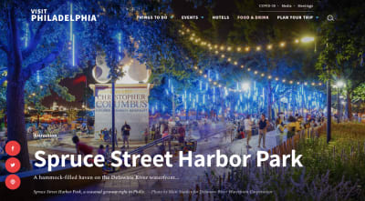
For people who’ve been to Philadelphia, the visuals on this site are likely to lure them back to the good times they had. And for people who are new to the city, the oversized visuals that show off the city’s hotspots enable them to picture what it’s like to go, which is a very effective way to sell someone on an experience.
Designing For The Sense Of Smell
Back in elementary school, our teachers would reward us with good scores on homework and tests with a handwritten note like “Great work!” and a scratch-n-sniff sticker. Like these ones available on Etsy:
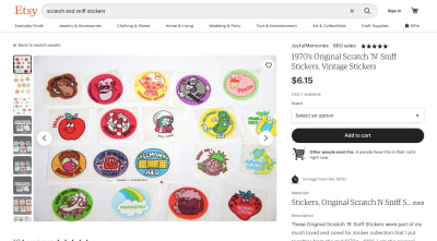
If you don’t know what these are, the name says it all. You scratch your nail against the sticker and it smells just like the picture on it.
Looking at this photo, I can still smell the “Berry Good” strawberry. This is going to sound crazy, but it reminds me of success. I don’t know if my teachers had an entire pack of the strawberry stickers, but it’s the one I got most frequently. And so I guess that’s why I associate it with good grades just by looking at it.
This is what you want to aim for with your website. You want to depict some recognizable scent in a way that the majority (if not all) of your visitors instantly feel good.
For example:
A used bookstore or library website with imagery that depicts rows upon rows of old books like the Providence Athenaeum:
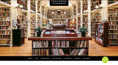
Voracious readers will definitely be able to smell the athenaeum and its old collection of books through this photo.
Or how about a company that’s known for making cleaning products like Tide?

Even if you don’t use Tide to do your laundry, you know exactly what the first image in this carousel is going to smell like.
Fresh laundry is the scent of cleanliness and comfort. I’d also argue that it’s the scent of satisfaction because nothing feels better than getting laundry done and over with.
I also really like what Coffee Culture Cafe & Eatery has done with its homepage video:
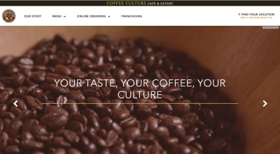
It’s not abnormal for a restaurant or cafe to show photos of its food or drinks. However, this is the raw product: the coffee beans. And as any coffee drinker can attest, this photo smells delicious and is something that’s sure to awaken their anticipation in ordering their first cup.
Designing For The Sense Of Sound
I was driving to the beach over the weekend when a song came on that made me smile. It was “What I Got” by Sublime, a song I listened to many times when making the long drive to the beach with friends in college.
Although I was alone on this particular trip and headed to a different beach, there was something about that song that instantly transformed my mood. The stress I was feeling about work melted away and all I could focus on was how good it was going to feel to spend the day in the sunshine by the water.
That’s something that the right sound can do. It can pull us out of the present and take us back to a memory of the past. Or it can overwhelm us with emotion that has no real grounding in the moment and, yet, there it is.
It doesn’t have to be music. And, honestly, on a website, it shouldn’t be. But that doesn’t mean you can’t still appeal to visitors’ ears through design.
There are two ways to approach this.
The first is to include imagery that depicts a predictable sound and one that brings joy (or whatever positive emotion you’re shooting for). Take the website for Kindermusik:

For many of us, the xylophone was one of the first instruments we were introduced to as kids. So, it’s hard to imagine anyone seeing the top photo and not immediately hear the sounds of a kid banging away on the bars.
And while this school is all about providing kids with music-based education, not every image sounds like music. For instance, the Benefits page has this photo at the top:
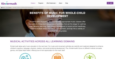
There might not be any sound coming through this site, but we all know the distinctive sound of a baby’s laugh. For parents trying to decide where to have their kids educated, they’ll be pleased to hear the sound of a child laughing as they visit this web page.
The other way to approach sound in design is to remove it entirely from the experience.
This works well for places like Scandinave Spa where customers come to enjoy the solitude and silence as they retreat from pressures of society, work, life and so on:
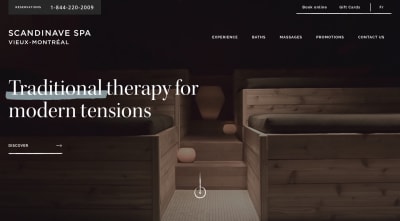
If a lack of noise is what makes the real life experience so valuable, then choosing images that represent this is really important. So, obviously, sites like these won’t have images of people standing around talking nor will it incorporate bright or flashy lights.
A calm experience is best depicted by an absence of noise, movement and distraction.
Designing For The Sense Of Taste
Dr. Bence Nanay wrote about the cooking show paradox on Psychology Today, debating why it is that so many people enjoy watching someone else cook. It can’t possibly be to learn how to cook as recipes are everywhere online. And while they might enjoy the competitive aspect of some of these shows, he suggests the main reason is this:
Watching cooking shows is eating vicariously in the most literal sense possible — we get mental imagery of tasting and smelling the food without actually tasting or smelling it.
I think we can expand a bit further on Nanay’s argument.
I also believe that people become more invested in an outcome when they get to see the process of it being made. This isn’t something we’re usually allowed to see as consumers. We go out to eat and the food is sitting there on a plate for us. So, there’s something about the build-up of watching food or drinks being made that adds something extra to the experience.
That’s why I don’t think it’s enough to just use static photos of a restaurant’s dishes or food company’s products on a website. Not if you want to deeply connect to the visitors’ sense of taste, that is.
For instance, this is the video that’s embedded into the top of Sweet Charlie’s website:
If you’ve ever been to a shop that makes rolled ice cream, you know just how enjoyable it is to watch this process in person. So, for a website to recreate that process — especially for first-time customers wondering what the heck rolled ice cream is — it’s a brilliant move.
Designing For The Sense Of Touch
The sense of touch is a relatively easy one to depict on the web. We see it all the time on ecommerce sites that allow shoppers to zoom in on fabrics and get a sense for what they feel like to touch or wear.
Like the zoom-in capabilities Anthropologie gives its shoppers:
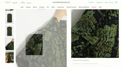
But this is nothing more than window-shopping done virtually. Anyone could walk through a store and brush their hands through racks of clothes. Don’t get me wrong, it’s a necessary functionality. However, this isn’t how we use the sense of touch to create a deeper connection with visitors.
We need to play around with more drastic tactile sensations.
One element you might want to fixate on is temperature. If there’s a heating or cooling element, work with that.
Another element you can play with is the feeling or pressure of human touch. There are many applications for this, though it’s particularly useful for websites that advertise therapeutic services.
For instance, this is how Massage Envy invites people to its spa services:
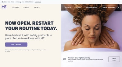
This is a good start. Some spa and massage websites just show images of empty massage rooms and tables. At least here prospective customers can kind of see the massage process.
I don’t think there’s much to feel here though as the positioning of the masseuse and pressure being applied seem unrealistic. I’m guessing it’s a stock photo chosen for its symmetry, color and attractiveness.
But there are ways to capture the tangible experience while still making it look good for a website. For instance, the Bodhi Spa uses a video to take visitors through various services they can experience — alone or with others — at the space.
At one point, they’re shown someone getting a massage:
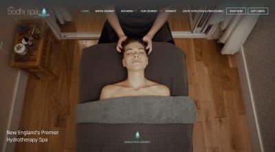
Notice the symmetry of this screengrab and how it doesn’t have to come at the expense of authenticity. Plus, the video shows customers how the massage feels as the masseuse applies pressure and moves her hands around the woman’s neck and head.
Visitors then get to see a couple enjoying the benefits of hydrotherapy, with the woman picking up a handful of salt and placing it in the pool they’re in:
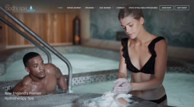
There’s a lot to touch in this video. The fine salt crystals. The warm water in the hydrotherapy tub. And, shortly after this screengrab, the couple holds hands as they enter the cool-down room.
A copywriter can certainly convey a lot of the feel-good benefits of something like this, but it’s also effective to let visitors see it with their own two eyes and experience it vicariously through others.
Wrapping Up
While I think that trying to design for all five senses at once would lead to sensory overload, choosing one particularly potent sense to design for is a great idea.
If you can find a way to recreate that sense through your site, your visitors may experience:
- Heightened awareness,
- Positive and happier thoughts than before they entered the site,
- A greater connection to the bigger picture and a willingness to take next steps on the site.
We often focus on how to connect to our audience through their pain, but why don’t we focus on connecting through happiness for a change? I think we could all use a little more of that these days.
 (ra, yk, il)
Articles on Smashing Magazine — For Web Designers And Developers
