Basic Patterns For Mobile Navigation: Pros And Cons
Once someone starts using your app, they need to know where to go and how to get there at any point. Good navigation is a vehicle that takes users where they want to go. But establishing good navigation is a challenge on mobile due to the limitations of the small screen and the need to prioritize content over chrome.

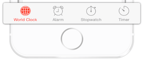
Different navigation patterns have been devised to solve this challenge in different ways, but they all suffer from a variety of usability problems. In this article, we’ll examine five basic navigation patterns for mobile apps and describe the strengths and weaknesses of each of them. If you’d like to add some patterns and spice up your designs, you can download and test Adobe XD for free and get started right away.
The post Basic Patterns For Mobile Navigation: Pros And Cons appeared first on Smashing Magazine.

