Bad for SEO, Good for User: Incredible Parallax-Based Projects
Parallax is widely believed to be an SEO killer, because one-page architecture makes it difficult to manipulate with metadata, keywords, and H1 tags without sacrificing productivity. At the same time, it’s hard to argue that it is a time-proven way of taking user experience to the next level. It enhances structure, sets elements in motion and puts viewers in the driver’s seat letting them choose the direction and speed of the examination of a concept.
It charges the scene with a dynamic behavior, engaging visitors in an unforgettable journey around your project and making surfing a mere pleasure. What’s more, it is an ideal match for tablets and cell phones. With such tremendous potential, it is not surprising that the solution has found its application in various spheres.
Numerous ideas were brought to life with the help of it. Sometimes it is almost invisible, yet it is still there. So that, maybe your parallax-driven website won’t have such a success among search engines, yet it will certainly win over all the visitors. Let’s explore twenty matchless examples.
Parallax-Based Web Projects
Concussion Movie
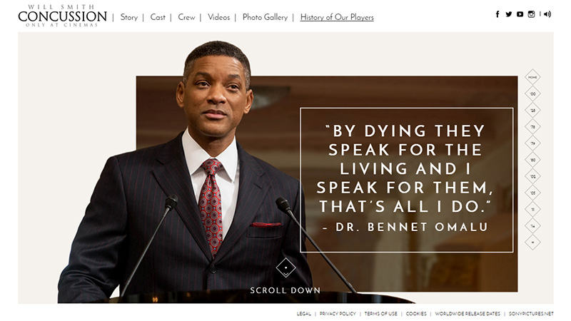
The site is a synthesis of fantastic illustrations, fragments of text and a marvelous geometric vibe. There is a visual path that connects sections together creating a continuous flow that thanks to improved scrolling serves its role perfectly well.
JustCoded
JustCoded is an agency that specializes in trendy high-end solutions, however when it comes to structure, the team prefers to adopt a traditional method of utilizing parallax. It powers the landing page with smooth transitions between web pages and triggers little dynamic effects that make a dramatic entrance for content.
Plastic
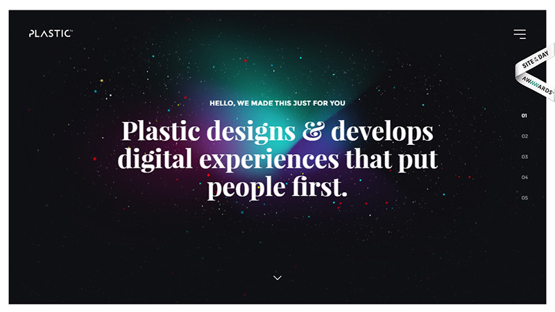
The homepage is reminiscent of a huge slider that sheds light on the recent works of the company in a formal way. Parallax glues everything together, spicing up shiftings between sections and creating an harmonious environment.
Freewrite
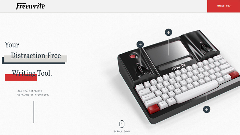
Freewrite’s promo page looks increasingly modern and trendy. The front page is a symbiosis of beautiful layering aesthetics with dynamic accompanying effects. As befits, the parallax powers the layout, giving sections a sprucing up. The only drawback is that it works at full capacity only on desktops.
Cesetti Designer
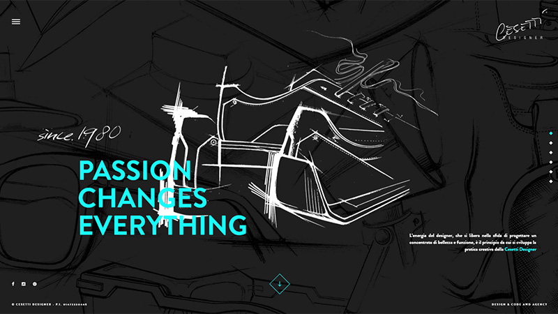
Cesetti Designer has gone a bit further with the solution, making it an integral part of original 3D shiftings between slides. The author has managed to mimic the behavior of real life objects, making the website look just outstanding.
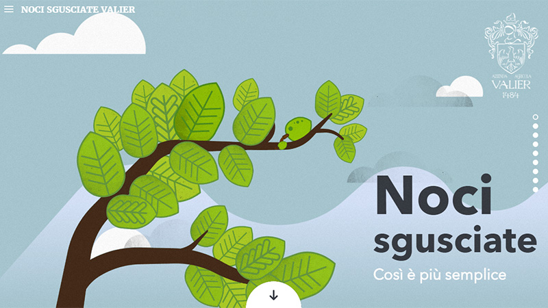
Noci Sgusciate Valier
Noci sgusciate Valier is a typical fully illustrated and partially animated project that leverages a tandem of dramatic scenes and scroll-activated effects. As a result, you can enjoy a story that is alive and energetic.
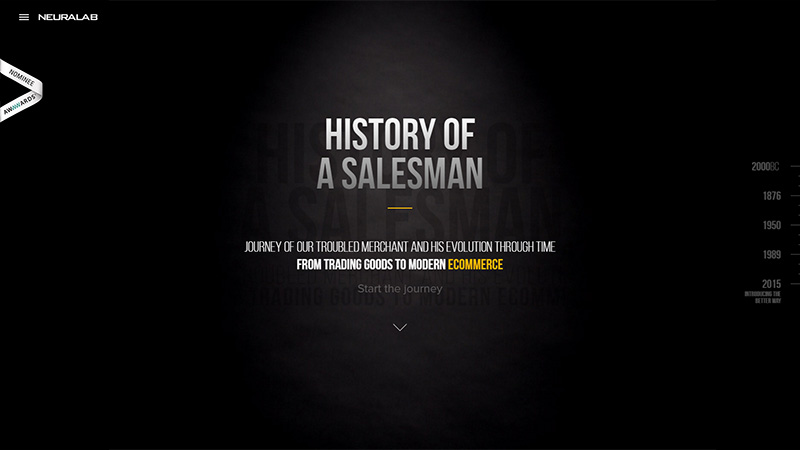
History of a Salesman
The concept drags you into a fascinating journey through the ages where each era is skillfully portrayed and described. Vertical scrolling is an ideal match for injecting some life into the idea.
Facts and Faces of Hunger in America
Here the parallax technique is an integral part of the visual storytelling experience. It adds motion to the picture, forcing people to walk and objects of the scene to move. By following each story, you are getting acquainted with facts and numbers.
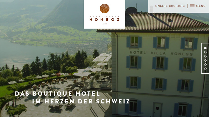
Hotel Villa Honegg
The official website of Hotel Villa Honegg looks stylish, hip and sophisticated. It owes its beauty to various factors: 360-degree view of the place recorded as a small video, hamburger menu button, beautiful typography, convenient online booking and, of course, a classic scrolling solution that ties everything together.
World Science Festival
This informative project feels fun and highly appealing. It requires interaction from the visitors right away, dragging you in with every second. Here, parallax is a fundamental constituent that is simply irreplaceable.
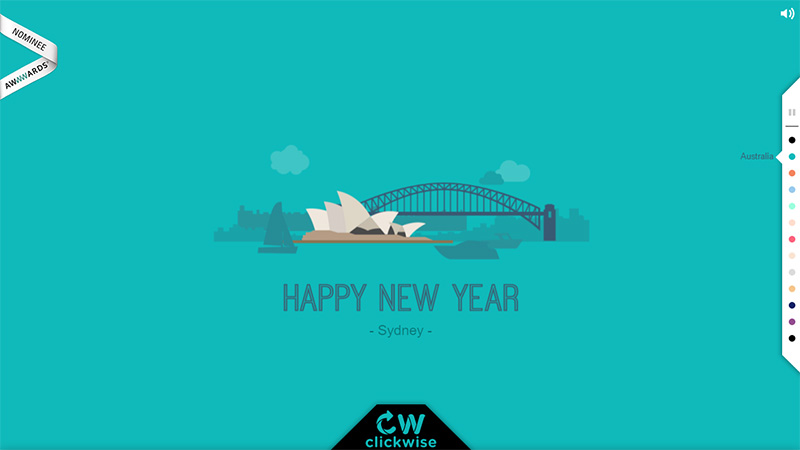
Happy New Year by ClickWise
The website features animated illustrations that show the celebration of the beloved winter holiday. There are a dozen dynamic scenes that are activated by scrolling. The latter also smartens up shifting from one place to another, forcing each sub page to gently fall onto the screen.
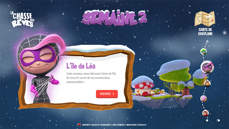
La Chasse aux Reves
Parallax and browser games work together like pieces of a puzzle. La Chasse aux Reves is definite proof of that. The technique helps to make the exploration of various stages an enjoyable pastime, greatly contributing to the continuous action.
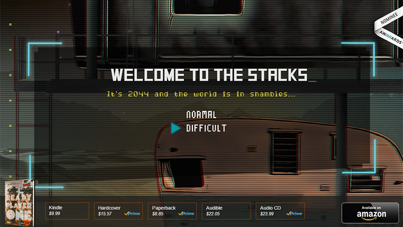
Ready Player One
Unlike all the previous examples, the website has taken a different route with the parallax, putting a twist on it. While you are dragging the scrollbar down, the page begins to move up and that is quite unexpected. This trick gives the website an extra piquancy.
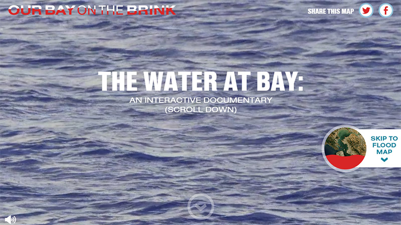
Our Bay on the Brink
This is an entirely interactive trip that has been brought to life with the help of numerous short videos, animated gifs, complementary effects, and scrolling. The latter remains passive and is used just to collect all the pieces together and guide visitors, avoiding overloading the interface with unnecessary movements.
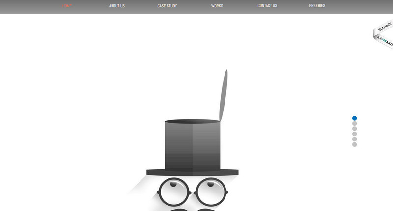
Pixel Fox Studios
The agency has a fascinating online portfolio, the beauty of which lies in an illustrative approach. Here, the parallax stays active as ever, letting the team tell a story. It sets the rhythm, turns on effects and controls everything that is happening.
Grab
The front page is based on a typical horizontal stripe layout that puts in order all the case studies and portfolio pieces. Although the structure is rather traditional, the scrolling in collaboration with small animations adds a subtle sense of interactivity to the project thereby providing visitors with a smooth experience.
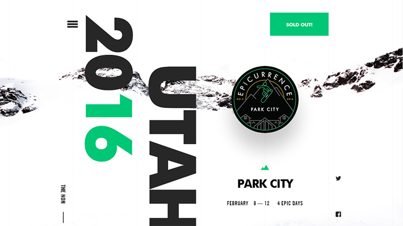
Epicurrence
Epicurrence radiates freshness, sophistication, and modernity. The project balances lots of elements with simplicity creating the right feel for the targeted audience and charming with outstanding appearance. The parallax guides users along the way and makes the exploration of the interface flow.
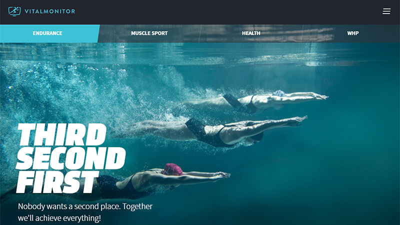
Vital Monitor
Vital Monitor exploits a traditional way of using parallax. Much like the solid foundation that underlies the front-end, it plays the role of an engine that ignites the interface, equips visitors with a handy instrument to move around and simply connects all pieces together, recreating a well-organized stream of data.
USICLLC
USICLLC is another dynamic project in our collection that is powered by parallax. It is an interactive page with carefully dished up stats. As befits, the technique triggers all the action on the page, contributing to an immersive user experience.
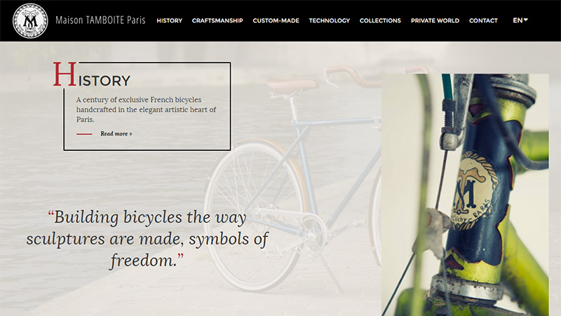
Maison Tamboite Paris
While the scrolling does not do anything unusual, it manages to enhance the conventional linear layout. It skillfully directs visitors from top to bottom and goes beyond telling a story by switching on accompanying effects in sections.
Conclusion
While utilization of parallax in visual storytelling projects is merely trivial and it is really difficult to surprise anyone with that, however, when it comes to complex solutions when the technique is involved in tandem with some original twists like 3D shifting in the personal portfolio of Cesetti Designer, it certainly looks cool and top notch.
Do you know any other interesting realizations on the basis of parallax?

