Earlier this year, a man drove his car into a lake after following directions from a smartphone app that helps drivers navigate by issuing turn-by-turn directions. Unfortunately, the app’s programming did not include instructions to avoid roads that turn into boat launches.
From the perspective of the app, it did exactly what it was programmed to do, i.e. to find the most optimal route from point A to point B given the information made available to it. From the perspective of the man, it failed him by not taking the real world into account.
The same principle applies for accessibility testing.
Designing For Accessibility And Inclusion
The more inclusive you are to the needs of your users, the more accessible your design is. Let’s take a closer look at the different lenses of accessibility through which you can refine your designs. Read article →
Automated Accessibility Testing
I am going to assume that you’re reading this article because you’re interested in learning how to test your websites and web apps to ensure they’re accessible. If you want to learn more about why accessibility is necessary, the topic has been covered extensively elsewhere.
Automated accessibility testing is a process where you use a series of scripts to test for the presence, or lack of certain conditions in code. These conditions are dictated by the Web Content Accessibility Guidelines (WCAG), a standard by the W3C that outlines how to make digital experiences accessible.
For example, an automated accessibility test might check to see if the tabindex attribute is present and if its value is greater than0. The pseudocode would be something like:
Failures can then be collected and used to generate reports that disclose the number, and severity of accessibility issues. Certain automated accessibility products can also integrate as a Continuous Integration or Continuous Deployment (CI/CD) tool, presenting just-in-time warnings to developers when they attempt to add code to a central repository.
These automated programs are incredible resources. Modern websites and web apps are complicated things that involve hundreds of states, thousands of lines of code, and complicated multi-screen interactions. It’d be absurd to expect a human (or a team of humans) to mind all the code controlling every possible permutation of the site, to say nothing of things like regressions, software rot, and A/B tests.
Automation really shines here. It can repeatedly and tirelessly pour over these details with perfect memory, at a rate far faster than any human is capable of.
However…
Automated accessibility tests aren’t a turnkey solution, nor are they a silver bullet. There are some limitations to keep in mind when using them.
Thinking To Think Of Things
One of both the best and worst aspects of the web is that there are many different ways to implement a solution to a problem. While this flexibility has kept the web robust and adaptable and ensured it outlived other competing technologies, it also means that you’ll sometimes see code that is, um, creatively implemented.
The test suite is only as good as what its author thought to check for. A naïve developer might only write tests for the happy path, where everyone writes semantic HTML, fault-tolerant JavaScript, and well-scoped CSS. However, this is the real world. We need to acknowledge that things like tight deadlines, unfamiliarity with the programming language, atypical user input, and sketchy 3rd party scripts exist.
For example, the automated accessibility testing site Tenon.io wisely includes a rule that checks to see if a form element has both a label element and an aria-label associated with it, and if the text strings for both declarations differ. If they do, it will flag it as an issue, as the visible label may be different than what someone would hear if they were navigating using a screen reader.
If you’re not using a testing service that includes this rule, it won’t be reported. The code will still “pass”, but it’s passing by omission, not because it’s actually accessible.
State
Some automated accessibility tests cannot parse the various states of interactive content. Critical parts of the user interface are effectively invisible to automation unless the test is run when the content is in an active, selected, or disabled state.
By interactive content, I mean things that the user has yet to take action on, or aren’t present when the page loads. Unopened modals, collapsed accordions, hidden tab content and carousel slides are all examples.
It takes sophisticated software to automatically test the various states of every component within a single screen, let alone across an entire web app or website. While it is possible to augment testing software with automated accessibility checks, it is very resource-intensive, usually requiring a dedicated team of engineers to set up and maintain.
Just having the presence of ARIA does not guarantee that it will automatically make something accessible. Unfortunately, and in spite of its first rule of use, ARIA is commonly misunderstood, and consequently abused. A lot of off-the-shelf code has this problem, perpetuating the issue.
For example, certain ARIA attributes and values can only be applied to certain elements. If incorrectly applied, assistive technology will ignore or misreport the declaration. Certain roles, known as Abstract Roles, only exist to set up the overall taxonomy and should never be placed in markup.
<button role="command">Save</button> <!-- Never do this -->
To further complicate the issue, support for ARIA is varied across browsers. While an attribute may be used appropriately, the browser may not communicate the declared role, property, or state to assistive technology.
There is also the scenario where ARIA can be applied to an element and be valid from a technical standpoint, yet be unusable from an assistive technology perspective. For example:
<h1 aria-hidden=“true”> Tired of unevenly cooked asparagus? Try this tip from the world’s oldest cookbook. </h1>
Headings — especially first-level headings — are vital in communicating the purpose of a page. If a person is using assistive technology to navigate, the aria-hidden declaration applied to the h1 element will make it difficult for them to quickly determine the page’s purpose. It will force them to navigate around the rest of the page to gain context, an annoying and labor-intensive process.
Some automated accessibility tests may scan the code and not report an error since the syntax itself is valid. The automation has no way of knowing the greater context of the declaration’s use.
This isn’t to say you should completely avoid using ARIA! When authored with care and deliberation, ARIA can fix the gaps in accessibility that sometimes plague complicated interactions; it provides some much-needed context to the people who rely on assistive technology.
Much-Needed Context
As the soggy car demonstrates, computers are awful at understanding the overall situation of the outside world. It’s up to us humans to be the ultimate arbiters in determining if what the computer spits out is useful or not.
Debunking
Before we discuss how to provide appropriate context, there are a few common misunderstandings about accessibility work that need to be addressed:
Second, accessibility is more than just screen readers. The rules outlined in the Web Content Accessibility Guidelines ensure that the largest number of people can read and operate technology, regardless of ability or circumstance.
For example, the rule that stipulates a website or web app needs to be able to work regardless of device orientation benefits everyone. Some people may need to mount their device in a fixed location in a specific orientation, such as in landscape mode on the arm of a wheelchair. Others might want to lie in bed and watch a movie, or better investigate a product photo (pinch and pull zooming will also be helpful to have here).
Third, disabilities can be conditional and can be brought about by your environment. It can be a short-term thing, like rain on your glasses, sleep deprivation, or an allergies-induced migraine. It can also be longer-term, such as a debilitating illness, broken limb, or a depressive episode. Multiple, compounding conditions can (and do) affect individuals.
That all being said, many accessibility fixes that help screen readers work properly also benefit other assistive technologies.
Get Your Feet Wet
Knowing where to begin can be overwhelming. Consider Michiel Bijl’s great advice:
“Before you release a website, tab through it. If you cannot see where you are on the page after each tab; you're not finished yet. #a11y
Tab through a few of the main user flows on your website or web app to determine if all interactive components’ focus states are visually apparent, and if they can be activated via keyboard input. If there’s something you can click or tap on that isn’t getting highlighted when receiving keyboard focus, take note of it. Also pay attention to the order interactive components are highlighted when focused — it should match the reading order of the site.
If you need a baseline to compare your testing to, Dave Rupert has an excellent project called A11Y Nutrition Cards, which outlines expected behavior for common interactive components. In addition, Scott O’Hara maintains a project called a11y Styled Form Controls. This project provides examples of components such as switches, checkboxes, and radio buttons that have well-tested and documented support for assistive technology. A clever reader might use one of these resources to help them try out the other!
With that out of the way, I’m going to share a fourth myth with you: not every assistive technology user is a power user. Like with any other piece of software, there’s a learning curve involved.
In her post about Aaptiv’s redesign, Lisa Zhu discovers that their initial accessibility fix wasn’t intuitive. While their first implementation was “technically” correct, it didn’t line up with how people who rely on VoiceOver actually use their devices. A second solution simplified the interaction to better align with their expectations.
Don’t assume that just because something hypothetically functions that it’s actually usable. Trust your gut: if it feels especially awkward, cumbersome, or tedious to operate for you, chances are it’ll be for others.
Dive Right In
While not every accessibility issue is a screen reader issue, you should still get in the habit of testing your site with one. Not an emulator, simulator, or some other proxy solution.
If you find yourself struggling to operate a complicated interactive component using basic screen reader commands, it’s probably a sign that the component needs to be simplified. Chances are that the simplification will help non-assistive technology users as well. Good design benefits everyone!
The same goes for navigation. If it’s difficult to move around the website or web app, it’s probably a sign that you need to update your heading structure and landmark roles. Both of these features are used by assistive technology to quickly and efficiently navigate.
Both of these are sidebars, but only one of them is semantically described as such. A computer doesn’t know what a sidebar is, so it’s up to you to tell it.
Another good thing to review is the text content used to describe your links. Hopping from link to link is another common assistive technology navigation technique; some screen readers can even generate a list of all link content on the page:
“Think before you link! Your "helpful" click here links look like this to a screen reader user. ALT = JAWS links list”
When navigating using an ordered list devoid of the surrounding non-link content, avoiding ambiguous terms like “click here” or “more info” can go a long way to ensuring a person can understand the overall meaning of the page. As a bonus, it’ll help alleviate cognitive concerns for everyone, as you are more accurately explaining what a user should expect after activating a link.
How To Test
Each screen reader has a different approach to how it announces content. This is intentional. It’s a balancing act between the product’s features, the operating system it is installed on, the form factor it is available in, and the types of input it can receive.
The Browser Wars taught us the folly of developing for only one browser. Similarly, we should not cater to a single screen reader. It is important to note that many people rely exclusively on a specific screen reader and browser combination — by circumstance, preference, or necessity’making this all the more important. However, there is a caveat: each screen reader works better when used with a specific browser, typically the one that allows it access to the greatest amount of accessibility API information.
All of these screen readers can be used for free, provided you have the hardware. You can also virtualize that hardware, either for free or on the cheap.
Automate
Automated accessibility tests should be your first line of defense. They will help you catch a great deal of nitpicky, easily-preventable errors before they get committed. Repeated errors may also signal problems in template logic, where one upstream tweak can fix multiple pages. Identifying and resolving these issues allows you to spend your valuable manual testing time much more wisely.
It may also be helpful to log accessibility issues in a place where people can collaborate, such as Google Sheets. Quantifying the frequency and severity of errors can lead to good things like updated documentation, opportunities for lunch and learn education, and other healthy changes to organizational workflow.
The two most popular screen readers on Windows are JAWS and NVDA.
JAWS
JAWS (Job Access With Speech) is the most popular and feature-rich screen reader on the market. It works best with Firefox and Chrome, with concessions for supporting Internet Explorer. Although it is pay software, it can be operated in full in demo mode for 40 minutes at a time (this should be more than sufficient to perform basic testing).
Windows comes bundled with a built-in screen reader called Narrator. It works well with Edge, but has difficulty interfacing with other browsers.
Apple
macOS
VoiceOver is a powerful screen reader that comes bundled with macOS. Use it in conjunction with Safari, first making sure that full keyboard access is enabled.
iOS
VoiceOver is also included in iOS, and is the most popular mobile screen reader. Much like its desktop counterpart, it works best with Safari. An interesting note here is that according to the 2017 WebAIM screen reader survey, a not-insignificant amount of respondents augment their phone with external hardware keyboards.
Android
Google recently folded TalkBack, their mobile screen reader, into a larger collection of accessibility services called the Android Accessibility Suite. It works best with Mobile Chrome. While many Android apps are notoriously inaccessible, it is still worth testing on this platform. Android’s growing presence in emerging markets, as well as increasing internet use amongst elderly and lower-income demographics, should give pause for consideration.
If you do not require the use of assistive technology on a frequent basis then you do not fully understand how the people who do interact with the web.
Much like traditional user testing, being too close to the thing you created may cloud your judgment. Empathy exercises are a good way to become aware of the problem space, but you should not use yourself as a litmus test for whether the entire experience is truly accessible. You are not the expert.
If your product serves a huge population of users, if its core base of users trends towards having a higher probability of disability conditions (specialized product, elderly populations, foreign language speakers, etc.), and/or if it is required to be compliant by law, I would strongly encourage allocating a portion of your budget for testing by people with disabilities.
“At what point does your organisation stop supporting a browser in terms of % usage? 18% of the global pop. have an #Accessibility requirement, 2% people have a colour vision deficient. But you consider 2% IE usage support more important? Support everyone be inclusive.”
This isn’t to say you should completely delegate the responsibility to these testers. Much as how automated accessibility testing can detect smaller issues to remove, a first round of basic manual testing helps professional testers focus their efforts on the complicated interactions you need an expert’s opinion on. In addition to optimizing the value of their time, it helps to get you more comfortable triaging. It is also a professional courtesy, plain and simple.
There are a few companies that perform manual testing by people with disabilities:
We also need to acknowledge the other large barrier to accessible sites that can’t be automated away: poor user experience.
User experience can make or break a product. Your code can compile perfectly, your time to first paint can be lightning quick, and your Webpack setup can be beyond reproach. All this is irrelevant if the end result is unusable. User experience encompasses all users, including those who navigate with the aid of assistive technology.
If a person cannot operate your website or web app, they’ll abandon it and not think twice. If they are forced to use your site to get a service unavailable by other means, there’s a growing precedent for taking legal action (and rightly so).
As a discipline, user experience can be roughly divided into two parts: how something looks and how it behaves They’re intrinsically interlinked concepts — work on either may affect both. While accessible design is a topic unto itself, there are some big-picture things we can keep in mind when approaching accessible user experiences from a testing perspective:
How It Looks
The WCAG does a great job covering a lot of the basics of good design. Color contrast, font size, user-facing state: a lot of these things can be targeted by automation. What you should pay attention to is all the atomic, difficult to quantify bits that compound to create your designs. Things like the words you choose, the fonts you use to display them, the spacing between things, affordances for interaction, the way you handle your breakpoints, etc.
“A good font should tell you: the difference between m and rn the difference between I and l the difference between O and 0.”
It’s one of those “an ounce of prevention is worth a pound of cure” situations. Smart, accessible defaults can save countless time and money down the line. Lean and mean startups all the way up to multinational conglomerates value efficient use of resources, and this is one of those places where you can really capitalize on that. Put your basic design patterns — say collected in something like a mood board or living style guide — in front of people early and often to see if your designed intent is clear.
How It Behaves
An enticing color palette and collection of thoughtfully-curated stock photography only go so far. Eventually, you’re going to have to synthesize all your design decisions to create something that addresses a need.
Behavior can be as small as a microinteraction, or as large as finding a product and purchasing it. What’s important here is to make sure that all the barriers to a person trying to accomplish the task at hand are removed.
If you’re using personas, don’t create a separate persona for a user with a disability. Instead, blend accessibility considerations into your existing ones. As a persona is an abstracted representation of the types of users you want to cater to, you want to make sure the kinds of conditions they may be experiencing are included. Disability conditions aren’t limited to just physical impairments, either. Things like a metered data plan, non-native language, or anxiety are all worth integrating.
“When looking at your site's analytics, remember that if you don't see many users on lower end phones or from more remote areas, it's not because they aren't a target for your product or service. It is because your mobile experience sucks. As a developer, it's your job to fix it.”
User testing, ideally simulating conditions as close to what a person would be doing in the real world (including their individual device preferences and presence of assistive technology), is also key. Verifying that people are actually able to make the logical leaps necessary to operate your interface addresses a lot of cognitive concerns, a difficult-to-quantify yet vital thing to accommodate.
We Shape Our Tools, Our Tools Shape Us
Our tool use corresponds to the kind of work we do: Carpenters drive nails with hammers, chefs cook using skillets, surgeons cut with scalpels. It’s a self-reinforcing phenomenon, and it tends to lead to over-categorization.
Sometimes this over-categorization gets in the way of us remembering to consider the real world. A surgeon might have a carpentry hobby; a chef might be a retired veterinarian. It’s important to understand that accessibility is everyone’s responsibility, and there are many paths to making our websites and web apps the best they can be for everyone. To paraphrase Mikey Ilagan, accessibility is a holistic practice, essential to some but useful to all.
Used with discretion, ARIA is a very good tool to have at our disposal. We shouldn’t shy away from using it, provided we understand the how and why behind why they work.
The same goes for automated accessibility tests, as well as GPS apps. They’re great tools to have, just get to know the terrain a little bit first.
Introduction To Animation And The iMessage App Store With Shruggie
Introduction To Animation And The iMessage App Store With Shruggie
Simon Schmid
When the App Store for iMessage in late 2016 went live, I releasedKaomotion, a sticker app with animated kaomoji inside. Ever since the release of this app, I wanted to write up a tutorial about how a simple text character like shruggie (i.e. ¯\_(ツ)_/¯) can be animated to give it life-like features:
The Shruggie animation we’re going to make. (Large preview)
What you are going to read in this article is a step-by-step guide of setting up a canvas in After Effects and then going through with the animation. You’ll also read about how well the app containing more than 30 animated stickers worked and what some of the specific issues are you might be having on the App Store for iMessage:
We’re starting with setting up a new composition (⌘ + N) within After Effects with the following settings:
1000px × 1000px;
a frame rate of 30 frames per second;
a quarter on resolution;
a run time of 2 seconds.
This is going to be the basic canvas we’re going to work with during the animation. We’re choosing a square since that is what you have to deal with within iMessage and Apple’s sticker implementation.
Since kaomoji are simple text-based emoticons we’re going to copy-paste a a Shruggie “¯\_(ツ)_/¯” from the first source we can find being Jeremy Burge’s Emojipedia via Google.
After having found it on Emojipedia we’re pasting it as a text layer into After Effects. It’s time to utilise the text tool.
The Shruggie inside your canvas might not look exactly the way you’ve found him on Google, or on Emojipedia for that matter, that’s because of differences in font types. We’ve chosen a font that makes Shruggie look decent and made him stretch across the canvas to prepare him for his facelift: double-click on the Source Name to select all characters.
The Character Menu
Double click Name Source and then get the font type in your Character menu.
Select Layer, then S + Scale (by sliding right for example).
To position the layer properly, we’re scaling it up to fill the canvas by selecting the layer by pressing S, then Scale and then finally moving the scale until it fits.
To further explore some smaller tweaks let’s look into making our Shruggie a little more connected. For that we’re looking into some kerning and height options. To adjust the gap between Shruggie’s arm and hand, we’ll use the kerning tool (V/A) either manually in the menu or with another keyboard shortcut:
Kerning
Select Space + ALT + ← →. When we’re happy with the kerning gaps, we’ll adjust the height of the arms and make it look like the arms are actually connected. To join up the slashes with the underscore we’re going to play around with increasing the height of the slash/vertical scale, moving it vertically and potentially adjusting the baseline. In our case we’ve increased the height of the slash character to 120% and then adjusted vertically:
If you repeat the steps above on the other side we’ll by now have a pretty looking Shruggie, but what’s that, we don’t like how it aligns at all, do we?
The next steps are a repetition of what we’ve done before: we’re selecting the middle part and moving it down vertically to align with Shruggie’s arms, shoulders, and hands. It looks pretty good, but let’s double-check on that first impression by zooming in!
Zoom in
You can zoom in by pressing ⌘ + +, and also by pressing on the , + . keys. In our case, we found we need to change it to properly align Shruggie’s face with his arms, which is another repetition of the above resizing and realigning skills.
In order to animate our base Shruggie, we’re going to use the Puppet Pin Tool. Essentially it lets us work on any vector elements within After Effects, which includes our text assets. Let’s start:
The Puppet Pin Tool
Now what we’ll want to do is put pins where we want the joints to be: hands, elbows, shoulders, and so on. Press on ⌘ + P to do the trick:
When you get a yellow highlight, that means that everything has been well done and After Effects recognizes the element as a vector and therefore you can place your pins. One thing that’s worth looking out for is to make sure that your pins/keyframes are at time 0 in your timeline at this stage:
The key to doing this effectively is to start with your main poses. We’re going to start with our start and end poses in place. We can do that by copying the keyframes that have been set up by our puppet pins in the beginning to our end state. The reason for this is simple: this is the start and our default pose, that’s the pose we want to return to in order to get a coherent animation.
Set Up Start And End Point
Select the layout and press U, then copy-paste to the end state.
Copying keyframes from start state and end state. (Large preview)
As you can see it in in the gif above selecting the layout and pressing U returns every property of a layer that has keyframes as little diamonds. These little 💠 now also constitute your end state.
Setting the Middle Stage
In order to have a stage that we want to animate to and from, we’ll put that right in the middle:
Select the timeline in the middle (1 sec in our example). (Large preview)
Now that we’re in the middle of our animation we’re going to make changes to our default state in such a way that we want to constitute our middle state:
This means we’re going to raise the shoulder puppet pin, get the elbow and arms a little closer to your body and give the hand a proper “shrug” movement. This will automatically create those keyframes at that point in time, which will then animate our two default stages between each other.
Here’s the demonstration of the animation we get when we manually move the timeline with our cursor:
We’re following the exact same process for the right part of Shruggie’s shoulder and then add a bit of movement to Shruggies face which gives him a distinct look smirking over his shoulders and giving us the impression of: “Meh, you know, nothing to do about that”.
Space Bar To Play
Select layer + Space. When you hit the Space key you can get a first impression of our animation:
What you’ll notice immediately is that the character seems to miss character. That is mostly due to the fact that our animation plays at the same speed for the entire two seconds. That is the hallmark of mostly dodgy animation — you’ll want it to not just evenly move between two points.
The easiest way to fix it up and give Shruggie a bit more realism, believability is to use a technique called ease-in and ease-out (or cushioning or a number of other ways). It’s basically speeding up the animation and then speeding it down again before reaching the end of the animation timeline.
It’s a cheap way of breathing some more life into our Shruggie. To do that we’re using a great little After Effects plugin called Ease and wiz that lets us apply some easing without much work:
Select all keyframes and then apply Ease and wizz with the options most suitable for your animation.
Applying Ease and wizz and some options. (Large preview)
In our case we’ve chosen to go with the following settings:
Easing:Quart
Type:In and Out
Keys:All
Curvaceous:no
If we now run our animation again with the space bar, you’ll notice you’ll get something very close to the animation embedded at the beginning of this post. This means that we’re done, and we can be very proud of our work.
6. Further Reading About The Motion Basics
The tutorial you’ve just read introduces only the very basics of animation by way of making Shruggie move. In order to progress in animation, you’ll need to dig in further into the basics of motion. Further reading on some of those basics will help you improve further.
Below you’ll find an article describing the basics of motion and then some that relate to motion/animation with UX and software to come back full circle on the web:
7. Bonus Reading: Life On The App Store For iMessage
The above tactics were applied to a whole bunch of kaomoji for the already mentioned as stated in the introduction.
I’ve launched the sticker app to some early support on Product Hunt, however, the app itself failed to be picked up by Apple or any audience on the App Store at large. I’d like to point out two realities on the App Store that anyone trying to make a sticker app needs to face:
Competition by big brands;
The wrath of users who don’t get the concept of stickers.
Problem: Prevalence Of Brands
If you want a shot at being consistently in the top 50 of the top paid iMessage stickers, then it helps to be a big brand or a notoriously known character. I’m not going to attach much meaning to this, just state it as a fact and provide the evidence below of screenshots collected in April 2018 (when I first wrote the draft on this article) on the Swiss App Store for iMessage.
Of the top 40 (that’s the top paid category), around 18 are likely to be well known characters turning that fact into downloads:
The subtitle of this section is somewhat provocatively chosen, as there is no intrinsic problem with this as these characters are uniquely suited for stickers, though it’s an issue as this is just what you’re up against. Of course, the economic reality also shows around curation:
The left shows a screenshot of the first batch of curated stickers (66% big brand) in April of 2018, the right shows a screenshot of late August of 2018, where I encountered the exact same setup.
Again, this is not to pass judgment at Apple as I think they’ve become much better at curation in the App Store in general. As a summary of this situation, I think it is fair to say that other sticker ecosystems such as LINE’s have allowed more creativity to flourish and that the sticker ecosystem on the App Store is hard to advance into successfully.
Users still don’t get (or do not want?) stickers and the next point is a testament to this:
Problem: Facing The Wrath Of Users
The most annoying problem with the App Store for iMessage is still the fact that users do not know how to use them (i.e. stickers). That results in an abundance of one-star reviews.
In the case of Korea, Kaomotion got 80 one-star reviews in a matter of a few days by users complaining about the app not being there on their phone.
“아니 삭제하는갓두 업네요..삭제좀요 사용하는 법도 모르겟어요” translates to “I don’t know how to use it.” (Large preview)
This can then look like the next screenshot fast, and Apple doesn’t seem to care to help clean out the mess, even after trying to address the users in Korean:
What an abundance of 1 star reviews in Korean looks like. (Large preview)
They’re essentially all saying the same: “The App isn’t on our phone.” Any one-star reviews are essentially also going to stay forever as no-one seems to care about what you have to say.
Solutions to the discoverability problem of stickers in the interface
I’m not the first one or the only one to write about this problem, however I’d like to offer some possible remedies below.
18 months after the introduction of the App Store for iMessage users still don’t know how to send and receive stickers (though I must say that Apple tried to stitch the interface up within iMessage).
In this regard, you can only try to fix these problems by attacking the problem head-on and giving as much information as possible to users.
Writing guides on the App Store page Use the (text) screen real estate Apple gives you to write a step to step guide about how stickers are sent.
Writing more in-depth guides elsewhere Do a blog post or something similar about the same topic with screenshots, gifs, or a video (I’ve made one here for Kaomotion).
Use a screenshot or app preview Finally, you may want to be explicit even on your screenshots about how your app is used. Even Wonder Woman seems to have been experiencing the same problem and used a screenshot to offer remedy:
Wonder Woman: “How to send stickers”. (Large preview)
You will likely still get users complaining, this way you’ll have an easy way to describe to them what needs to be done in order to use your stickers.
Were I to go back to the launch of the sticker store, I probably wouldn’t go through the hardship of creating Kaomotion once again, however, I’m glad I got to write about animation basics for After Effects!
I hope this tutorial gave you an interesting glimpse at both After Effects and the iMessage App Store. If you’re into this, you might want to go hang out at this new animation community called Keyframes.
The goal of machine learning is to find patterns in data and use those patterns to make predictions. It can also give us a framework to discuss machine learning problems and solutions — as you’ll see in this article.
First, we will start with definitions and applications for machine learning. Then, we will discuss abstractions in machine learning and use that to frame our discussion: data, models, optimization models, and optimization algorithms. Later on in the article, we will discuss fundamental topics that underlie all machine learning methods and conclude with practical guidance for getting started with using machine learning. By the end, you should have an understanding of how to advance your practice and study of machine learning.
Let’s begin.
So, What Exactly Is Machine Learning?
Machine learning is generically a set of techniques to find patterns in data. Applications range from self-driving cars to personal AI assistants, from translating between French and Taiwanese to translating between voice and text. There are a few common applications of machine learning that already or could potentially permeate your day-to-day.
Detecting anomalies Recognize spikes in website traffic or highlight abnormal bank activity.
Recommend similar content Find products you may be looking for or even Smashing Magazine articles that are relevant.
Predict the future Plan the path of neighboring vehicles or identify and extrapolate market trends for stocks.
The above are few of many applications of machine learning, but most applications tie back to learning the underlying distribution of data. A distribution specifies events and probability of each event. For example:
With 50% probability, you buy an item $ 5 or less.
With 25% probability, you buy an item $ 5-$ 10.
With 24% probability, you buy an item $ 10-100.
With 1% probability, you buy an item > $ 100.
Using this distribution, we can accomplish all of our tasks above:
Detecting anomalies With a $ 100 purchase, we can confidently call this an anomaly.
Recommend similar content A purchase of $ 3 means we should recommend more items $ 5 or less.
Predict the future Without any prior information, we can predict that the next purchase will be $ 5 or less.
With a distribution of data, we can accomplish a myriad of tasks. In sum, one goal in machine learning is to learn this distribution.
Even more generically, our goal is to learn a specific function with particular inputs and outputs. We call this function our model. Our input is denoted x. Say our model, which accepts input x, is
f(x) = ax
Here, a is a parameter of our model. Each parameter corresponds to a different instance of our model. In other words, the model where a=2 is different from the model where a=3. In machine learning, our goal is to learn this parameter, changing it until we do “well.” How do we determine which values of a do “well”?
We need to define a way to evaluate our model, for each parameter a. To start, the output of f(x) is our prediction. We will refer to y as our label, meaning the true and desired output. With our predictions and our labels, we can define a loss function. One such loss function is simply the difference between our prediction and our label, |f(x) - y|. Using this loss function, we can then evaluate different parameters for our model. Picking the best parameter for our model is known as training. If we have a few possible parameters, we can simply try each parameter and pick the one with the smallest loss!
However, most problems are not as simple. What happens if there are an infinite number of different parameters? Let’s say all decimal values between 0 and 1? Between 0 and infinity? This brings us to our next topic: abstractions in machine learning. We will discuss different facets of machine learning, to compartmentalize your knowledge into data, models, objectives, and methods of solving objectives. Beyond learning the right parameter, there are plenty of other challenges: how do we break down a problem as complex as controlling a robot? How do we control a self-driving car? What does it mean to train a model that identifies faces? The section below will help you organize answers to these questions.
Abstractions
There are countless topics in machine learning — at various levels of specificity. To better understand where each piece fits in the larger picture, consider the following abstractions for machine learning. These abstractions compartmentalize our discussion of machine learning topics, and knowing them will make it easier for you to frame topics. The following classifications are taken from Professor Jonathan Shewchuck at UC Berkeley:
Application and Data Consider the possible inputs and the desired output for the problem.
Questions: What is your goal? How is your data structured? Are there labels? Is it reasonable for us to extract output from the provided inputs?
Example: The goal is to classify pictures of handwritten digits. The input is an image of a handwritten number. The output is a number.
Model Determine the class of functions under consideration.
Questions: Are linear functions sufficient? Quadratic functions? Polynomials? What types of patterns are we interested in? Are neural networks appropriate? Logistic regression?
Example: Linear regression
Optimization Problem Formulate a concrete objective in mathematics.
Questions: How do we define loss? How do we define success? Should we apply additionally penalties to bias our algorithm? Are there imbalances in the data our objective needs to consider?
Example: Find `x` that minimizes |Ax-b|^2
Optimization Algorithm Determine how you will solve the optimization problem.
Questions: Can we compute a solution by hand? Do we need an iterative algorithm? Can we convert this problem to an equivalent but easier-to-solve objective, and solve that one?
Example: Take derivative of the function. Set it to zero. Solve for our optimal parameter.
Abstraction 1: Data
In practice, collecting, managing, and packaging data is 90% of the battle. The data contains samples in which each sample is a specific realization of our input. For example, our input may generically be images of dogs. The first sample is specifically a picture of Maxie, my Bernese Mountain dog-chow chow mix at home. The second sample is specifically a picture of Charlie, a young corgi.
While training your model, it is important to handle your data properly. This means separating our data accordingly and not peeking prematurely at any set of data. In general, our data is split into three portions:
Training set This is the dataset you train your model on. The model may see this set hundreds of times.
Validation set This is the dataset you evaluate your model on, to assess accuracy and tune your model or method accordingly.
Test set This is the dataset you evaluate on to assess accuracy, once at the very end. Running on the test set prematurely could mean your model overfits to the test set as well, so run only once. We will discuss the notion of “overfitting” in more detail below.
Abstraction 2: Models
Machine learning methods are split into the following two:
Supervised Learning
In supervised learning, our algorithm has access to labeled data. Still, we explore the following two classes of problems:
Classification Determine which of k classes {C_1, C_2, ... C_k} to which each sample belongs, e.g. “Which breed of dog is this?” The dog could be one of {"corgi", "bernese mountain dog", "chow chow"...}
Regression Determine a real-valued output (which are often probabilities), e.g. “What is the probability this patient has neuroblastoma (eye cancer)?”
Unsupervised Learning
In unsupervised learning, our algorithm does not have access to labels, and we explore the following classes of problems:
Clustering Cluster samples into k clusters. We do not have a label for the resulting clusters. “Which DNA sequences are most similar?”
Dimensionality reduction Reduce the number of “unique” (linearly independent) features we consider. “What are common features of faces?”
Abstraction 3: Optimization Objective
Before discussing optimization objectives and algorithms, we’ll need an example to discuss. Least squares are the canonical example. We will restrict our attention to a specific form of least squares: Let us return to our grade-school problem of fitting a line to some points.
Let’s recall the equation of a line:
y = m * x + b
Assume we have such a line. This is the true underlying model.
True model. The line that generates our data. (Large preview)
Now, sample points from this line.
True data. Data that is sampled from the true model. (Large preview)
For each point, jiggle it a little bit. In other words, add noise, which is random perturbations. This noise is due to real-world processes.
Noise. Real-world perturbations that affect our data. This may be due to imprecision in measurements, lossy compression, and so on. (Large preview)
This gives us our observed data. We will call these points (x_1, y_1), (x_2, y_2), (x_3, y_3).... This is the training data we are given to train a model on. We do not have access to the underlying line that generated this data (the original green line).
Observations. Our true data with noise and ultimately what we will use to train a model. (Large preview)
Say we have an estimate for the parameters of a line. In this case, the parameters are m and b. This gives us a predicted line, drawn in blue below.
Proposed model. The result of training a model on our observations. (Large preview)
We wish to evaluate our blue line, to see how accurate it is. To start, we use m and b to estimate y. We compute a set of ŷ values.
ŷ_i = m * x_i + b
The error for a single predicted ŷ_i and true y_i is simply
(ŷ_i−y_i)^2
Our total error is then the sum of squared differences, across all samples. This yields our loss.
∑(ŷ_i−y_i)^2
Presented visually, this is the vertical distance between our observed points and our predicted line.
Observed error. The distance between our observed data and our proposed model. (Large preview)
Plugging in ŷ_i from above, we then have the total error in terms of m and b.
∑(m * x_i + b − y_i)^2
Finally, we want to minimize this quantity. This yields our objective function, abstraction 3 from our list of abstractions above.
min_{m, b} ∑(m * x_i + b−y_i)^2
The above states in mathematics that the goal is to minimize the loss by changing values of m and b. The purpose of this section was to motivate fitting a line of best of fit, a special case of least squares. Additionally, we showed examined the least squares objective. Next, we need to solve this objective.
Abstraction 4: Optimization Algorithm
How do we minimize this? We take the derivative with respect to m`, set to 0 and solve. After solving, we obtain the analytical solution. Solving for an analytical solution was our optimization algorithm, the fourth and final abstraction in our list of abstractions.
Note: The important portion of this section is to inform you that least squares have a closed form solution, meaning that the optimal solution for our problem can be computed, explicitly. To understand why this is significant, we need to examine a problem without a closed-form solution. For example, we could never solve x=logx for a standard base-10 logarithm. Try graphing these two lines, and we see that they never intersect. In which case, we have no closed-form solution. On the other hand, ordinary least squares have a closed-form — which is good news. For any problem reduced to least squares, we can then compute the optimal solution, given our data and assumptions.
Fundamental Topics
Before studying more methods, it is necessary to understand the undercurrents of machine learning. These will govern the initial study of machine learning:
Bias-Variance Tradeoffs
One of machine learning’s most dreaded evils is overfitting in which a model is too closely tailored to the training data. In the limit, the most overfit model will memorize the data. This might mean that if one does well on exam A, one repeats every detail for exam B — down to the duration of an inter-exam restroom trip and whether or not one used the urinal.
A related but less common evil is underfitting, where the model is not sufficiently expressive to capture important information in the data. This could mean that one looks only at homework scores to predict exam scores, ignoring the effects of reading notes, completing practice exams, and more. Our goal is to build a model that generalizes to new examples while making the appropriate distinctions.
Given these two evils, there are a variety of approaches to fighting both. One is modifying your optimization objective to include a term that penalizes model complexity. Another is tuning hyperparameters that govern either your objective or your algorithm, which may correspond to notions such as “training speed” or “momentum.” The bias-variance tradeoff gives us a precise way of defining and handling both overfitting and underfitting.
Maximum Likelihood Estimation (MLE) + Maximum A Posteriori (MAP)
Say we have ice cream flavors A, B, and C. We observe different recipes. Our goal is to predict which flavor each recipe produces.
One way to predict flavors based on recipes is to first estimate the following probability:
P(flavor|recipe)
Given this probability and a new recipe, how can we predict the flavor? Given a recipe, simply consider the probability of each of the flavors A, B, C.
Then, pick the flavor that has the highest probability. Above, flavor B has the highest probability, given our recipe. Thus, we predict flavor B. Restating the above rule in mathematics, we have:
argmax_{flavor} P(flavor|recipe) # argmax means take the flavor that corresponds to the max value
However, the only information at our disposal is the reverse: the probability of some recipe given the flavor.
P(recipe|flavor)
For Maximum Likelihood Estimates, we make assumptions and find that the two values are proportional.
P(recipe|flavor) ~ P(flavor|recipe)
Since we’re only interested in the class with maximum probability P(flavor|recipe), we can simply find the class with maximum probability, for a proportional value P(recipe|flavor).
argmax_{flavor} P(recipe|flavor)
MLE offers the above objective as one way to predict, using the probability of data given the labels.
However, allow me to convince you that it’s reasonable to assume we have (x|y). We can estimate this from observed, real-world data. For example, say we wish to estimate the number of marbles each student in your class carries, based on the number of rubber ducks the student carries.
Each student’s number of rubber ducks is the data x, and the number of marbles she or he has is y. We will use this sample data below.
For every y, we can compute the number of x, given us P(x|y). For the first one, P(x=1|y=1), consider all of the rows where y=1. There are 2, and only one of them has x=1. Therefore, P(x=1|y=1) = 1⁄2. We can repeat this for all values of x and y.
Least squares draw lines of best fit for us. Note that least squares can fit the model anytime the model is linear in its inputs x and outputs y.
Say m=1. We have the following equation:
y = x + b
However, what if we had data that doesn’t generally follow a line? Specifically, consider a set of data sampled along a circle. Recall that the equation for a circle is:
x^2 + y^2 = r^2
Can least squares fit this well? As it stands, no. The model is not linear in its inputs x and outputs y. Instead, the model above is quadratic in x and y. However, it turns out that we can use still use least squares, just with a modification. To accomplish this, we featurize our samples.
Consider the following: what if the input to our model was x_ = x^2 and y_ = y^2? Then, our model is trying to learn the following model.
x_ + y_ = r^2
Is this linear in the model’s input x_ and output y_? Yes. Note the subtlety. The current model is still quadratic in x,y but it is linear in x_,y_. This means that least squares can fit the data if we square x^2 and y^2 before training least squares.
More generally, we can take any non-linear featurization to apply least squares to labels that are non-linear in the features. This is a fairly powerful tool, known as featurization.
However, featurizations lead to more complex models. Regularization allows us to penalize model complexity, ensuring that we do not overfit the training data.
Conclusion
In this article, you’ve touched on major topics in the fundamentals of machine learning. Using the abstractions above, you now have a framework to discuss machine learning problems and solutions. Using the fundamental topics above, you now also have quintessential concepts to learn more about, giving you the necessary tools to evaluate risk and other concerns in a machine learning application.
Further Reading
We will continue to explore these topics in depth, both the undercurrents of machine learning and specific methods. In the interim, here are resources to further your study and exploration of machine learning:
Ever spent an hour (or even a day) working on something just to throw the whole lot away and redo it in five minutes? That isn’t just a beginner’s code mistake; it is a real-world situation that you can easily find yourself in especially if the problem you’re trying to solve isn’t well understood to begin with.
This is why I’m such a big proponent of upfront design, user research, and creating often multiple prototypes — also known as the old adage of “You don’t know what you don’t know.” At the same time, it is very easy to look at something someone else has made, which may have taken them quite a lot of time, and think it is extremely easy because you have the benefit of hindsight by seeing a finished product.
This idea that simple is easy was summed up nicely by Jen Simmons while speaking about CSS Grid and Piet Mondrian’s paintings:
“I feel like these paintings, you know, if you look at them with the sense of like ‘Why’s that important? I could have done that.’ It’s like, well yeah, you could paint that today because we’re so used to this kind of thinking, but would you have painted this when everything around you was Victorian — when everything around you was this other style?”
I feel this sums up the feeling I have about seeing websites and design systems that make complete sense; it’s almost as if the fact they make sense means they were easy to make. Of course, it is usually the opposite; writing the code is the simple bit, but it’s the thinking and process that goes into it that takes the most effort.
With that in mind, I’m going to explore building a text box, in an exaggeration of situations many of us often find ourselves in. Hopefully, by the end of this article, we can all feel more emphatic to how the journey from start to finish is rarely linear.
A Comprehensive Guide To User Testing
So you think you’ve designed something that’s perfect, but your test tells you otherwise. Let’s explore the importance of user testing. Read more →
Brief
We all know that careful planning and understanding of the user need is important to a successful project of any size. We also all know that all too often we feel to need to rush to quickly design and develop new features. That can often mean our common sense and best practices are forgotten as we slog away to quickly get onto the next task on the everlasting to-do list. Rinse and repeat.
Today our task is to build a text box. Simple enough, it needs to allow a user to type in some text. In fact, it is so simple that we leave the task to last because there is so much other important stuff to do. Then, just before we pack up to go home, we smirk and write:
<input type="text">
There we go!
Oh wait, we probably need to hook that up to send data to the backend when the form is submitted, like so:
<input type="text" name="our_textbox">
That’s better. Done. Time to go home.
How Do You Add A New Line?
The issue with using a simple text box is it is pretty useless if you want to type a lot of text. For a name or title it works fine, but quite often a user will type more text than you expect. Trust me when I say if you leave a textbox for long enough without strict validation, someone will paste the entire of War and Peace. In many cases, this can be prevented by having a maximum amount of characters.
In this situation though, we have found out that our laziness (or bad prioritization) of leaving it to the last minute meant we didn’t consider the real requirements. We just wanted to do another task on that everlasting to-do list and get home. This text box needs to be reusable; examples of its usage include as a content entry box, a Twitter-style note box, and a user feedback box. In all of those cases, the user is likely to type a lot of text, and a basic text box would just scroll sideways. Sometimes that may be okay, but generally, that’s an awful experience.
Thankfully for us, that simple mistake doesn’t take long to fix:
<textarea name="our_textbox"></textarea>
Now, let’s take a moment to consider that line. A <textarea>: as simple as it can get without removing the name. Isn’t it interesting, or is it just my pedantic mind that we need to use a completely different element to add a new line? It isn’t a type of input, or an attribute used to add multi-line to an input. Also, the <textarea> element is not self-closing but an input is? Strange.
This “moment to consider” sent me time traveling back to October 1993, trawling through the depths of the www-talk mailing list. There was clearly much discussion about the future of the web and what “HTML+” should contain. This was 1993 and they were discussing ideas such as <input type="range"> which wasn’t available until HTML5, and Jim Davis said:
“Well, it’s far-fetched I suppose, but you might use HTML forms as part of a game playing interface.”
This really does show that the web wasn’t just intended to be about documents as is widely believed. Marc Andreessen suggested to have <input type="textarea"> instead of allowing new lines in the single-line text type, [saying]: (http://1997.webhistory.org/www.lists/www-talk.1993q4/0200.html)
“Makes the browser code cleaner — they have to be handled differently internally.”
That’s a fair reason to have <textarea> separate to text, but that’s still not what we ended up with. So why is <textarea> its own element?
I didn’t find any decision in the mailing list archives, but by the following month, the HTML+ Discussion Document had the <textarea> element and a note saying:
“In the initial design for forms, multi-line text fields were supported by the INPUT element with TYPE=TEXT. Unfortunately, this causes problems for fields with long text values as SGML limits the length of attributea literals. The HTML+ DTD allows for up to 1024 characters (the SGML default is only 240 characters!)”
Ah, so that’s why the text goes within the element and cannot be self-closing; they were not able to use an attribute for long text. In 1994, the <textarea> element was included, along with many others from HTML+ such as <option> in the HTML 2 spec.
Okay, that’s enough. I could easily explore the archives further but back to the task.
Styling A <textarea>
So we’ve got a default <textarea>. If you rarely use them or haven’t seen the browser defaults in a long time, then you may be surprised. A <textarea> (made almost purely for multi-line text) looks very similar to a normal text input except most browser defaults style the border darker, the box slightly larger, and there are lines in the bottom right. Those lines are the resize handle; they aren’t actually part of the spec so browsers all handle (pun absolutely intended) it in their own way. That generally means that the resize handle cannot be restyled, though you can disable resizing by setting resize: none to the <textarea>. It is possible to create a custom handle or use browser specific pseudo elements such as ::-webkit-resizer.
It’s important to understand the defaults, especially because of the resizing ability. It’s a very unique behavior; the user is able to drag to change the size of the element by default. If you don’t override the minimum and maximum sizes then the size could be as small as 9px × 9px (when I checked Chrome) or as large as they have patience to drag it. That’s something that could cause mayhem with the rest of the site’s layout if it’s not considered. Imagine a grid where <textarea> is in one column and a blue box is in another; the size of the blue box is purely decided by the size of the <textarea>.
Other than that, we can approach styling a <textarea> much the same as any other input. Want to change the grey around the edge into thick green dashes? Sure here you go: border: 5px dashed green;. Want to restyle the focus in which a lot of browsers have a slightly blurred box shadow? Change the outline — responsibly though, you know, that’s important for accessibility. You can even add a background image to your <textarea> if that interests you (I can think of a few ideas that would have been popular when skeuomorphic design was more celebrated).
Scope Creep
We’ve all experienced scope creep in our work, whether it is a client that doesn’t think the final version matches their idea or you just try to squeeze in a tiny tweak and end up taking forever to finish it. So I ( enjoying creating the persona of an exaggerated project manager telling us what we need to build) have decided that our <textarea> just is not good enough. Yes, it is now multi-line, and that’s great, and yes it even ‘pops’ a bit more with its new styling. Yet, it just doesn’t fit the very vague user need that I’ve pretty much just thought of now after we thought we were almost done.
What happens if the user puts in thousands of words? Or drags the resize handle so far it breaks the layout? It needs to be reusable, as we have already mentioned, but in some of the situations (such as a ‘Twittereqsue’ note taking box), we will need a limit. So the next task is to add a character limit. The user needs to be able to see how many characters they have left.
In the same way we started with <input> instead of <textarea>, it is very easy to think that adding the maxlength attribute would solve our issue. That is one way to limit the amount of characters the user types, it uses the browser’s built-in validation, but it is not able to display how many characters are left.
We started with the HTML, then added the CSS, now it is time for some JavaScript. As we’ve seen, charging along like a bull in a china shop without stopping to consider the right approaches can really slow us down in the long run. Especially in situations where there is a large refactor required to change it. So let’s think about this counter; it needs to update as the user types, so we need to trigger an event when the user types. It then needs to check if the amount of text is already at the maximum length.
So which event handler should we choose?
change Intuitively, it may make sense to choose the change event. It works on <textarea> and does what it says on the tin. Except, it only triggers when the element loses focus so it wouldn’t update while typing.
keypress The keypress event is triggered when typing any character, which is a good start. But it does not trigger when characters are deleted, so the counter wouldn’t update after pressing backspace. It also doesn’t trigger after a copy/paste.
keyup This one gets quite close, it is triggered whenever a key has been pressed (including the backspace button). So it does trigger when deleting characters, but still not after a copy/paste.
input This is the one we want. This triggers whenever a character is added, deleted or pasted.
This is another good example of how using our intuition just isn’t enough sometimes. There are so many quirks (especially in JavaScript!) that are all important to consider before getting started. So the code to add a counter that updates needs to update a counter (which we’ve done with a span that has a class called counter) by adding an input event handler to the <textarea>. The maximum amount of characters is set in a variable called maxLength and added to the HTML, so if the value is changed it is changed in only one place.
var textEl = document.querySelector('textarea') var counterEl = document.querySelector('.counter') var maxLength = 200 textEl.setAttribute('maxlength', maxLength) textEl.addEventListener('input', (val) => { var count = textEl.value.length counterEl.innerHTML = $ {count}/$ {maxLength} })
Browser Compatibility And Progressive Enhancement
Progressive enhancement is a mindset in which we understand that we have no control over what the user exactly sees on their screen, and instead, we try to guide the browser. Responsive Web Design is a good example, where we build a website that adjusts to suit the content on the particular size viewport without manually setting what each size would look like. It means that on the one hand, we strongly care that a website works across all browsers and devices, but on the other hand, we don’t care that they look exactly the same.
Currently, we are missing a trick. We haven’t set a sensible default for the counter. The default is currently “0/200” if 200 were the maximum length; this kind of makes sense but has two downsides. The first, it doesn’t really make sense at first glance. You need to start typing before it is obvious the 0 updates as you type. The other downside is that the 0 updates as you type, meaning if the JavaScript event doesn’t trigger properly (maybe the script did not download correctly or uses JavaScript that an old browser doesn’t support such as the double arrow in the code above) then it won’t do anything. A better way would be to think carefully beforehand. How would we go about making it useful when it is both working and when it isn’t?
In this case, we could make the default text be “200 character limit.” This would mean that without any JavaScript at all, the user would always see the character limit but it just wouldn’t feedback about how close they are to the limit. However, when the JavaScript is working, it would update as they type and could say “200 characters remaining” instead. It is a very subtle change but means that although two users could get different experiences, neither are getting an experience that feels broken.
Another default that we could set is the maxlength on the element itself rather than afterwards with JavaScript. Without doing this, the baseline version (the one without JS) would be able to type past the limit.
User Testing
It’s all very well testing on various browsers and thinking about the various permutations of how devices could serve the website in a different way, but are users able to use it?
Generally speaking, no. I’m consistently shocked by user testing; people never use a site how you expect them to. This means that user testing is crucial.
It’s quite hard to simulate a user test session in an article, so for the purposes of this article, I’m going to just focus on one point that I’ve seen users struggle with on various projects.
The user is happily writing away, gets to 0 characters remaining, and then gets stuck. They forget what they were writing, or they don’t notice that it had stopped typing.
This happens because there is nothing telling the user that something has changed; if they are typing away without paying much attention, then they can hit the maximum length without noticing. This is a frustrating experience.
One way to solve this issue is to allow overtyping, so the maximum length still counts for it to be valid when submitted but it allows the user to type as much as they want and then edit it before submission. This is a good solution as it gives the control back to the user.
Okay, so how do we implement overtyping? Instead of jumping into the code, let’s step through in theory. maxlength doesn’t allow overtyping, it just stops allowing input once it hits the limit. So we need to remove maxlength and write a JS equivalent. We can use the input event handler as we did before, as we know that works on paste, etc. So in that event, the handler would check if the user has typed more than the limit, and if so, the counter text could change to say “10 characters too many.” The baseline version (without the JS) would no longer have a limit at all, so a useful middle ground could be to add the maxlength to the element in the HTML and remove the attribute using JavaScript.
That way, the user would see that they are over the limit without being cut off while typing. There would still need to be validation to make sure it isn’t submitted, but that is worth the extra small bit of work to make the user experience far better.
This gets us to quite a solid position: the user is now able to use any device and get a decent experience. If they type too much it is not going to cut them off; instead, it will just allow it and encourage them to edit it down.
There’s a variety of ways this could be designed differently, so let’s look at how Twitter handles it:
Twitter has been iterating its main tweet <textarea> since they started the company. The current version uses a lot of techniques that we could consider using.
As you type on Twitter, there is a circle that completes once you get to the character limit of 280. Interestingly, it doesn’t say how many characters are available until you are 20 characters away from the limit. At that point, the incomplete circle turns orange. Once you have 0 characters remaining, it turns red. After the 0 characters, the countdown goes negative; it doesn’t appear to have a limit on how far you can overtype (I tried as far as 4,000 characters remaining) but the tweet button is disabled while overtyping.
So this works the same way as our <textarea> does, with the main difference being the characters represented by a circle that updates and shows the number of characters remaining after 260 characters. We could implement this by removing the text and replacing it with an SVG circle.
The other thing that Twitter does is add a red background behind the overtyped text. This makes it completely obvious that the user is going to need to edit or remove some of the text to publish the tweet. It is a really nice part of the design. So how would we implement that? We would start again from the beginning.
You remember the part where we realized that a basic input text box would not give us multiline? And that a maxlength attribute would not give us the ability to overtype? This is one of those cases. As far as I know, there is nothing in CSS that gives us the ability to style parts of the text inside a <textarea>. This is the point where some people would suggest web components, as what we would need is a pretend <textarea>. We would need some kind of element — probably a div — with contenteditable on it and in JS we would need to wrap the overtyped text in a span that is styled with CSS.
What would the baseline non-JS version look like then? Well, it wouldn’t work at all because while contenteditable will work without JS, we would have no way to actually do anything with it. So we would need to have a <textarea> by default and remove that if JS is available. We would also need to do a lot of accessibility testing because while we can trust a <textarea> to be accessible relying on browser features is a much safer bet than building your own components. How does Twitter handle it? You may have seen it; if you are on a train and your JavaScript doesn’t load while going into a tunnel then you get chucked into a decade-old legacy version of Twitter where there is no character limit at all.
What happens then if you tweet over the character limit? Twitter reloads the page with an error message saying “Your Tweet was over the character limit. You’ll have to be more clever.” No, Twitter. You need to be more clever.
Retro
The only way to conclude this dramatization is a retrospective. What went well? What did we learn? What would we do differently next time or what would we change completely?
We started very simple with a basic textbox; in some ways, this is good because it can be all too easy to overcomplicate things from the beginning and an MVP approach is good. However, as time went on, we realized how important it is to have some critical thinking and to consider what we are doing. We should have known a basic textbox wouldn’t be enough and that a way of setting a maximum length would be useful. It is even possible that if we have conducted or sat in on user research sessions in the past that we could have anticipated the need to allow overtyping. As for the browser compatibility and user experiences across devices, considering progressive enhancement from the beginning would have caught most of those potential issues.
So one change we could make is to be much more proactive about the thinking process instead of jumping straight into the task, thinking that the code is easy when actually the code is the least important part.
On a similar vein to that, we had the “scope creep” of maxlength, and while we could possibly have anticipated that, we would rather not have any scope creep at all. So everybody involved from the beginning would be very useful, as a diverse multidisciplinary approach to even small tasks like this can seriously reduce the time it takes to figure out and fix all the unexpected tweaks.
Back To The Real World
Okay, so I can get quite deep into this made-up project, but I think it demonstrates well how complicated the most seemingly simple tasks can be. Being user-focussed, having a progressive enhancement mindset, and thinking things through from the beginning can have a real impact on both the speed and quality of delivery. And I didn’t even mention testing!
I went into some detail about the history of the <textarea> and which event listeners to use, some of this can seem overkill, but I find it fascinating to gain a real understanding of the subtleties of the web, and it can often help demystify issues we will face in the future.
In 2016, Apple announced a new extension that will allow developers to better customize their push and local notifications called the UNNotificationContentExtension. The extension gets triggered when a user long presses or 3D touches on a notification whenever it is delivered to the phone or from the lock/home screen. In the content extension, developers can use a view controller to structure the UI of their notification, but there was no user interaction enabled within the view controller — until now. With the release of iOS 12 and XCode 10, the view controller in the content extension now enables user interaction which means notifications will become even more powerful and customizable.
At WWDC 2018, Apple also announced several changes to notification settings and how they appear on the home screen. In an effort to make users more aware of how they are using apps and allowing more user control of their app usage, there is a new notification setting called “Deliver Quietly.” Users can set your app to Delivery Quietly from the Notification Center, which means they will not receive banners or sound notifications from your app, but they will appear in the Notification Center. Apple using an in-house algorithm, which presumably tracks often you interact with notifications, will also ask users if they still want to receive notifications from particular apps and encourage you to turn on Deliver Quietly or turn them off completely.
Notifications are getting a big refresh in iOS 12, and I’ve only scratched the surface. In the rest of this article, we’ll go over the rest of the new notification features coming to iOS 12 and how you can implement them in your own app.
There are two ways to send push notifications to a device: remotely or locally. To send notifications remotely, you need a server that can send JSON payloads to Apple’s Push Notification Service. Along with a payload, you also need to send the device token and any other authentication certificate or tokens that verify your server is allowed to send the push notification through Apple. For this article, we focus on local notifications which do not need a separate server. Local notifications are requested and sent through the UNUserNotificationCenter. We’ll go over later how specifically to make the request for a local notification.
In order to send a notification, you first need to get permission from the user on whether or not they want you to send them notifications. With the release of iOS 12, there are a lot of changes to notification settings and permissions so let’s break it down. To test out any of the code yourself, make sure you have the Xcode 10 beta installed.
Notification Settings And Permissions
Deliver Quietly
Delivery Quietly is Apple’s attempt to allow users more control over the noise they may receive from notifications. Instead of going into the settings app and looking for the app whose notification settings you want to change, you can now change the setting directly from the notification. This means that a lot more users may turn off notifications for your app or just delivery them quietly which means the app will get badged and notifications only show up in the Notification Center. If your app has its own custom notification settings, Apple is allowing you to link directly to that screen from the settings management view pictured below.
In order to link to your custom notification setting screen, you must set providesAppNotificationSettings as a UNAuthorizationOption when you are requesting notification permissions in the app delegate.
In didFinishLaunchingWithOptions, add the following code:
When you do this, you’ll now see your custom notification settings in two places:
If the user selects Turn Off when they go to manage settings directly from the notification;
In the notification settings within the system’s Settings app.
Deep link to to custom notification settings for NotificationTester from notification in the Notification Center. (Large preview) Deep link to custom notification settings for NotificationTester from system’s Settings app. (Large preview)
You also have to make sure to handle the callback for when the user selects on either way to get to your notification settings. Your app delegate or an extension of your app delegate has to conform to the protocol UNUserNotificationCenterDelegate so you can then implement the following callback method:
Another new UNAuthorizationOption is provisional authorization. If you don’t mind your notifications being delivered quietly, you can set add .provisional to your authorization options as shown below. This means that you don’t have to prompt the user to allow notifications — the notifications will still show up in the Notification Center.
So now that you’ve determined how to request permission from the user to deliver notifications and how to navigate users to your own customized settings view, let’s go more into more detail about the actual notifications.
Sending Grouped Notifications
Before we get into the customization of the UI of a notification, let’s go over how to make the request for a local notification. First, you have to register any UNNotificationCategory, which are like templates for the notifications you want to send. Any notification set to a particular category will inherit any actions or options that were registered with that category. After you’ve requested permission to send notifications in didFinishLaunchingWithOptions, you can register your categories in the same method.
let hiddenPreviewsPlaceholder = "%u new podcast episodes available" let summaryFormat = "%u more episodes of %@" let podcastCategory = UNNotificationCategory(identifier: "podcast", actions: [], intentIdentifiers: [], hiddenPreviewsBodyPlaceholder: hiddenPreviewsPlaceholder, categorySummaryFormat: summaryFormat, options: []) UNUserNotificationCenter.current().setNotificationCategories([podcastCategory])
In the above code, I start by initiating two variables:
hiddenPreviewsPlaceholder This placeholder is used in case the user has “Show Previews” off for your app; if we don’t have a placeholder there, your notification will show with only “Notification” also the text.
summaryFormat This string is new for iOS 12 and coincides with the new feature called “Group Notifications” that will help the Notification Center look a lot cleaner. All notifications will show up in stacks which will be either representing all notifications from the app or specific groups that the developer has set for there app.
The code below shows how we associate a notification with a group.
@objc func sendPodcastNotification(for podcastName: String) { let content = UNMutableNotificationContent() content.body = "Introducing Season 7" content.title = "New episode of (podcastName):" content.threadIdentifier = podcastName.lowercased() content.summaryArgument = podcastName content.categoryIdentifier = NotificationCategoryType.podcast.rawValue sendNotification(with: content) }
For now, I’ve hardcoded the text of the notification just for the example. The threadIdentifier is what creates the groups that we show as stacks in the Notification Center. In this example, I want the notifications grouped by podcast so each notification you get is separated by what podcast it’s associated with. The summaryArgument matches back to our categorySummaryFormat we set in the app delegate. In this case, we want the string for the format: "%u more episodes of %@" to be the podcast name. Lastly, we have to set the category identifier to ensure the notification has the template we set in the app delegate.
func sendNotification(for category: String, with content: UNNotificationContent) { let uuid = UUID().uuidString let trigger = UNTimeIntervalNotificationTrigger(timeInterval: 5, repeats: false) let request = UNNotificationRequest(identifier: uuid, content: content, trigger: trigger) UNUserNotificationCenter.current().add(request, withCompletionHandler: nil) }
The above method is how we request the notification to be sent to the device. The identifier for the request is just a random unique string; the content is passed in and we create the content in our sendPodcastNotification method, and lastly, the trigger is when you want the notification to send. If you want the notification to send immediately, you can set that parameter to nil.
Grouped notifications for NotificationTester. (Large preview) Notification grouped with previews turned off. (Large preview)
Using the methods we’ve described above, here’s the result on the simulator. I have a button that has the sendPodcastNotification method as a target. I tapped the button three times to have the notifications sent to the device. In the first photo, I have “Show Previews” set to “Always” so I see the podcast and the name of the new episodes along with the summary that shows I have two more new episodes to check out. When “Show Previews” is set to “Never,” the result is the second image above. The user won’t see which podcast it is to respect the “No Preview” setting, but they can still see that I have three new episodes to check out.
Notification Content Extension
Now that we understand how to set our notification categories and make the request for them to be sent, we can go over how to customize the look of the notification using the Notification Service and Notification Content extensions. The Notification Service extension allows you to edit the notification content and download any attachments in your notification like images, audio or video files. The Notification Content extension contains a view controller and storyboard that allows you to customize the look of your notification as well as handle any user interaction within the view controller or taps on notification actions.
To add these extensions to your app go File → New → Target.
Adding new target to app for the Notification Content Extension. (Large preview)
You can only add them one at a time, so name your extension and repeat the process to add the other. If a pop-up appears asking you to activate your new scheme, click the “Activate” button to set it up for debugging.
For the purpose of this tutorial, we will be focusing on the Notification Content Extension. For local notifications, we can include the attachments in the request, which we’ll go over later.
First, go to the Info.plist file in the Notification Content Extension target.
Info.plist for the Notification Content Extension. (Large preview)
The following attributes are required:
UNNotificationExtensionCategory A string value equal to the notification category which we created and set in the app delegate. This will let the content extension know which notification you want to have custom UI for.
UNNotificationExtensionInitialContentSizeRatio A number between 0 and 1 which determines the aspect ratio of your UI. The default value is 1 which will allow your interface to have its total height equal to its width.
I’ve also set UNNotificationExtensionDefaultContentHidden to “YES” so that the default notification does not show when the content extension is running.
You can use the storyboard to set up your view or create the UI programmatically in the view controller. For this example I’ve set up my storyboard with an image view which will show the podcast logo, two labels for the title and body of the notification content, and a “Like” button which will show a heart image.
Now, in order to get the image showing for the podcast logo and the button, we need to go back to our notification request:
For each image, we get the file path and use that to create a UNNotificationAttachment. Added that to our notification content allows us to access the images in the Notification Content Extension in the didReceive method shown below.
func didReceive(_ notification: UNNotification) { self.newEpisodeLabel.text = notification.request.content.title self.episodeNameLabel.text = notification.request.content.body let imgAttachment = notification.request.content.attachments[0] let buttonNormalStateAtt = notification.request.content.attachments[1] let buttonHighlightStateAtt = notification.request.content.attachments[2] guard let imageData = NSData(contentsOf: imgAttachment.url), let buttonNormalStateImgData = NSData(contentsOf: buttonNormalStateAtt.url), let buttonHighlightStateImgData = NSData(contentsOf: buttonHighlightStateAtt.url) else { return } let image = UIImage(data: imageData as Data) let buttonNormalStateImg = UIImage(data: buttonNormalStateImgData as Data)?.withRenderingMode(.alwaysOriginal) let buttonHighlightStateImg = UIImage(data: buttonHighlightStateImgData as Data)?.withRenderingMode(.alwaysOriginal) imageView.image = image likeButton.setImage(buttonNormalStateImg, for: .normal) likeButton.setImage(buttonHighlightStateImg, for: .selected) }
Now we can use the file path URLs we set in the request to grab the data for the URL and turn them into images. Notice that I have two different images for the different button states which will allow us to update the UI for user interaction. When I run the app and send the request, here’s what the notification looks like:
Content extension loaded for NotificationTester app. (Large preview)
Everything I’ve mentioned so far in relation to the content extension isn’t new in iOS 12, so let’s dig into the two new features: User Interaction and Dynamic Actions. When the content extension was first added in iOS 10, there was no ability to capture user touch within a notification, but now we can register UIControl events and respond when the user interacts with a UI element.
For this example, we want to show the user that the “Like” button has been selected or unselected. We already set the images for the .normal and .selected states, so now we just need to add a target for the UIButton so we can update the selected state.
override func viewDidLoad() { super.viewDidLoad() // Do any required interface initialization here. likeButton.addTarget(self, action: #selector(likeButtonTapped(sender:)), for: .touchUpInside) }
Now with the above code we get the following behavior:
Selecting like button within notification. (Large preview)
In the selector method likeButtonTapped, we could also add any logic for saving the liked state in User Defaults or the Keychain, so we have access to it in our main application.
Notification actions have existed since iOS 10, but once you click on them, usually the user will be rerouted to the main application or the content extension is dismissed. Now in iOS 12, we can update the list of notification actions that are shown in response to which action the user selects.
First, let’s go back to our app delegate where we create our notification categories so we can add some actions to our podcast category.
When the user selects “Play,” we want the action to be updated to “Pause.” If they select “Queue Next,” we want that action to be updated to “Remove from Queue.” We can do this in our didReceive method in the Notification Content Extension’s view controller.
func didReceive(_ response: UNNotificationResponse, completionHandler completion: (UNNotificationContentExtensionResponseOption) -> Void) { guard let currentActions = extensionContext?.notificationActions else { return } if response.actionIdentifier == "play-action" { let pauseAction = UNNotificationAction(identifier: "pause-action", title: "Pause", options: []) let otherAction = currentActions[1] let newActions = [pauseAction, otherAction] extensionContext?.notificationActions = newActions } else if response.actionIdentifier == "queue-action" { let removeAction = UNNotificationAction(identifier: "remove-action", title: "Remove from Queue", options: []) let otherAction = currentActions[0] let newActions = [otherAction, removeAction] extensionContext?.notificationActions = newActions } else if response.actionIdentifier == "pause-action" { let playAction = UNNotificationAction(identifier: "play-action", title: "Play", options: []) let otherAction = currentActions[1] let newActions = [playAction, otherAction] extensionContext?.notificationActions = newActions } else if response.actionIdentifier == "remove-action" { let queueAction = UNNotificationAction(identifier: "queue-action", title: "Queue Next", options: []) let otherAction = currentActions[0] let newActions = [otherAction, queueAction] extensionContext?.notificationActions = newActions } completion(.doNotDismiss) }
By resetting the extensionContext?.notificationActions list to contain the updated actions, it allows us to change the actions every time the user selects one. The behavior is shown in the gif below.
There’s a lot to do before iOS 12 launches to make sure your notifications are ready. The steps vary in complexity and you don’t have to implement them all. Make sure to first download XCode 10 beta so you can try out the features we’ve gone over. If you want to play around with the demo app I’ve referenced throughout the article, check it out on Github.
For Your Notification Permissions Request And Settings, You’ll Need To:
Determine whether or not you want to enable provisional authorization and add it to your authorization options.
If you have already have a customized notification settings view in your app, add providesAppNotificationSettings to your authorization options as well as implement the call back in your app delegate or whichever class conforms to UNUserNotificationCenterDelegate.
For Notification Grouping:
Add a thread identifier to your remote and local notifications so your notifications are correctly grouped in the Notification Center.
When registering your notification categories, add the category summary parameter if you want your grouped notification to be more descriptive than “more notifications.”
If you want to customize the summary text even more, then add a summary identifier to match whichever formatting you added for the category summary.
For Customized Rich Notifications:
Add the Notification Content extension target to your app to create rich notifications.
Design and implement the view controller to contain whichever elements you want in your notification.
Consider which interactive elements would be useful to you, i.e. buttons, table view, switches, etc.
Update the didReceive method in the view controller to respond to selected actions and update the list of actions if necessary.
Further Reading
“Notifications,” Apple’s list of various documentation regarding user notifications
CSS Shapes Level 1 has been available in Chrome and Safari for a number of years, however, this week it ships in a production version of Firefox with the release of Firefox 62 — along with a very nice addition to the Firefox DevTools to help us work with Shapes. In this article, I’ll take a look at some of the things you can do with CSS Shapes. Perhaps it’s time to consider adding some curves to your designs?
What Are CSS Shapes?
The CSS Shapes specification Level 1 defines three new properties:
shape-outside
shape-image-threshold
shape-margin
The purpose of this specification is to allow content to flow around a non-rectangular shape, something which is quite unusual on our boxy web. There are a few different ways to create shapes, which we will have a look at in this tutorial. We will also have a look at the Shape Path Editor, available in Firefox, as it can help you to easily understand the shapes on your page and work with them.
In the current specification, shapes can only be applied to a float, so any shapes example needs to start with a floated element. In the example below, I have a PNG image with a transparent background in which I have floated the image left. The text that follows the image now flows around the right and bottom of my image.
What I would like to happen is for my content to follow the shape of the opaque part of the image, rather than follow the line of the physical image file. To do this, I use the shape-outside property, with the value being the URL of my image. I’m using the actual image file to create a path for the content to flow around.
Note that your image needs to be CORS compatible, so hosted on the same server as the rest of your content or sending the correct headers if hosted on a CDN. Browser DevTools will usually tell you if your image is being blocked due to CORS.
This method of creating shapes uses the alpha channel of the image to create the shape, as we have a shape with a fully transparent area, then all we need do is pass the URL of the image to shape-outside and the shape path follows the line of the fully opaque area.
Creating A Margin
To push the line of the text away from the image we can use the shape-margin property. This creates a margin between the line of the shape and the content running alongside it.
In the case above, we have the image displayed on the page and then the text curved around it. However, you could also use an image as the path for the shape in order to create a curved text effect without also including the image on the page. You still need something to float, however, and so for this, we can use Generated Content.
In this example, we have inserted some generated content, floated it left, given it a width and a height and then used shape-outside with our image just as before. We then get a curved line against the whitespace, but no visible image.
Using A Gradient For Our Shape
A CSS gradient is just like an image, which means we can use a gradient to create a shape, which can make for some interesting effects. In this next example, I have created a gradient which goes from blue to transparent; your gradient will need to have a transparent or semi-transparent area in order to use shapes. Once again, I have used generated content to add the gradient and am then using the gradient in the value for shape-outside.
Once the gradient becomes fully transparent, then the shape comes into play, and the content runs along the edge of the gradient.
Using shape-image-threshold To Position Text Over A Semi-Opaque Image
So far we have looked at using a completely transparent part of an image or of a gradient in order to create our shape, however, the third property defined in the CSS Shapes specification means that we can use images or gradients with semi-opaque areas by setting a threshold. A value for shape-image-threshold of 1 means fully opaque while 0 means fully transparent.
A gradient like our example above is a great way to see this in action as we can change the shape-image-threshold value and move the line along which the text falls to more opaque areas or more transparent areas. This property works in exactly the same way with an image that has an alpha channel yet is not fully transparent.
This method of creating shapes from images and gradients is — I think — the most straightforward way of creating a shape. You can create a shape as complex as you need it to be, in the comfort of a graphics application and then use that to define the shape on your page. That said, there is another way to create our shapes, and that’s by using Basic Shapes.
CSS Shapes With Basic Shapes
The Basic Shapes are a set of predefined shapes which cover a lot of different types of shapes you might want to create. To use a basic shape, you use the basic shape type as a value for shape-outside. This type uses functional notation, so we have the name of the shape followed by brackets (inside which are some values for our shape).
The options that you have are the following:
inset()
circle()
ellipse()
polygon()
We will take a look at the circle() type first as we can use this to understand some useful things which apply to all shapes which use the basic shape type. We will also have a look at the new tools in Firefox for inspecting these shapes.
In the example below, I am creating the most simple of shapes: a circle using shape-outside: circle(50%). I’m using generated content again, and I have given the box a background color, and also added a margin, border, and padding to help highlight some of the concepts of using CSS Shapes. You can see in the example that the circle is created centered on the box; this is because I have given the circle a value of 50%. That value is the <shape-radius> which can be a length or a percentage. I’ve used a percentage so that the radius is half of the size of my box.
This is a really good to time have a look at the shape that has been created using the Firefox Shape Path Editor. You can inspect the shape by clicking on the generated content and then clicking the little shape icon next to the property shape-outside; your shape will now highlight.
The Shape Path Editor highlights the circle shape (Large preview)
You can see how the circle extends to the edge of the margin on our box. This is because the initial reference box used by our shape is margin-box. You already know something of reference boxes if you have ever added box-sizing: border-box to your CSS. When you do this, you are asking CSS to use the border-box and not the default content-box as the size of elements. In Shapes, we can also change which reference box is used. After any basic shape, add border-box to use the border to define the shape or content-box to use the edge of the content (inside the padding). For example:
You will see the circle appear to become much smaller. It is now using the width of the content — in this case the width of the box at 150px — rather than the margin box which includes the padding, border, and margin.
The content-box is the edge of the content of the square we created with our generated content (Large preview)
Inspecting your element in Firefox DevTools will also show you the reference boxes so you can choose which might give you the best result with your particular shape.
Reference boxes highlighted in Firefox (Large preview)
The Position Value
A second value can be passed to circle() which is a position; if you do not pass this value, it defaults to center. However, you can use this value to pull your circle around. In the next example, I have positioned the circle by using shape-outside(50% at 30%); this changes where the center of the circle is positioned.
Something useful to know is that the same <basic-shape> values can be used as a value for clip-path. This means that after creating a shape, you can clip away the image or background color that extends outside of the shape. In the example below, I am going to do this with our example gradient background, so that we end up with a circle that has text curved around from our square box.
All of the above concepts can be applied to our other basic shapes. Now let’s have a quick look at how they work.
inset()
The inset() value defines a rectangle. This might not seem very useful as a float is a rectangle, however, this value means that you can inset the content wrapping your shape. It takes four values for top, right, bottom, and left plus a final value which defines a border radius.
In the example below, I am using the values to inset the content on the right and bottom of the floated image, plus adding a border radius around which my content will wrap using shape-outside: inset(0 30px 100px 0 round 40px). You can see how the content is now over the background color of the box:
An ellipse is a squashed circle and as such needs two radii for x and y (in that order). You can then push the ellipse around just as with circle using the position value. In the example below, I am creating an ellipse and then using clip-path with the same values to remove the content outside of my shape.
In the above example, I also used shape-margin to demonstrate how we can use this property as with our image generated shapes to push the content away.
polygon()
Creating polygon shapes gives us the most flexibility, as our shapes can be created with three or more points. The value passed to the polygon needs to be three or more pairs of values which represent coordinates.
It is here where the Firefox tools become really useful as we can use them to help create our polygon. In the below example, I have created a polygon with four points. In the Firefox DevTools, you can double-click on any line to create a new point, and double-click again to remove it. Once you have created a polygon that you are happy with, you can then copy the value out of DevTools for your CSS.
As CSS Shapes are applied to a float, in many cases the fallback is that instead of seeing the content wrap around a shape, the content will wrap around a floated element (in the way that content has always wrapped around floats). Browsers ignore properties they do not understand, so if they don’t understand Shapes, it doesn’t matter that the shape-outside property is there.
Where you should take care would be in any situation where not having shapes could mean that content overlaid an area which made it difficult to read. Perhaps you are using Shapes to push content away from a busy area of a background image, for example. In that case, you should first make sure that your content is usable for the non-Shapes people, then use Feature Queries to check for support of shape-outside and overwrite that CSS and apply the shape. For example, you could use a margin to push the content away for non-Shapes visitors and remove the margin inside your feature query.
.content { margin-left: 120px; } @supports (shape-outside: circle()) { .content { margin-left: 0; /* add the rest of your shapes CSS here */ } }
With Firefox releasing their support we now only have one main browser without support for Shapes — Edge. If you want to see Shapes support across the board you could go and vote for the feature here, and see if we can encourage the implementation of the feature in Edge.
Find Out More About CSS Shapes
In this article, I’ve tried to give a quick overview of some of the interesting things that are possible with CSS Shapes. For a more in-depth look at each feature, check out the Guides to CSS Shapes over at MDN. You can also read a guide to the Shape Path Editor in Firefox.
Get Your Mobile Site Ready For The 2018 Holiday Season
Get Your Mobile Site Ready For The 2018 Holiday Season
Suzanne Scacca
After reading the title of this article, it might seem like it’s jumping the gun, but with retailers turning on holiday music and putting out holiday-related displays earlier and earlier every year, your consumers are primed to start thinking about the holidays earlier, too. In fact, a study done by the Tampa Bay Times revealed that in-store shoppers were exposed to holiday music as early as October 22 in 2017.
Of course, e-commerce handles the holiday season a bit differently than brick-and-mortar. It’s not really necessary to announce promotions or run sales in late October or early November. However, that doesn’t mean you should wait until the last minute to prepare your mobile website for the holidays.
In this article, I’m going to give you a quick rundown of what happened during the 2017 holiday sales season and, in particular, what role mobile played in it. Then, we’re going to dig into holiday design and marketing tactics you can use to boost sales through your mobile website for the 2018 holiday season.
Before we get started, I want to quickly add a disclaimer:
This particular section focuses on e-commerce statistics because this kind of data is readily available. Something like the total number of page visits, subscribed readers, and leads generated… well, it’s not.
So, although I only use data to express how important mobile was to 2017 holiday sales, keep in mind that the tips that follow pertain to all websites. Even if your site doesn’t expressly sell goods or services, blogs and other content-driven sites can take advantage of this, too!
Now, let’s take a look at the numbers:
Total Retail Sales
The National Retail Federation calculated the total amount of retail sales–online and in-store–to be $ 691.9 billion between November and December, a 5.5% bump from 2016.
Total e-Commerce Sales
Adobe put the total amount of e-commerce sales during that same timeframe at $ 108.15 billion in 2017.
Adobe’s stats on 2016 and 2017 holiday e-commerce revenue (Source: Adobe) (Large preview)
e-Commerce Sales By Device
Adobe takes it even further and breaks down the share of revenue by device:
Breakdown of desktop, smartphone and tablet sales for 2017 holiday season (Source: Adobe) (Large preview)
e-Commerce Sales vs. Traffic
While smartphone and tablet sales still trail those on desktop, there are a couple interesting things to note here. For starters, desktop revenue has mostly flatlined year-over-year whereas mobile continues to grow. In addition, there’s an interesting disparity between how much traffic comes from each device and what percentage of revenue it generates:
Traffic vs. revenue for desktop, smartphone, tablet (Source: Adobe) (Large preview)
Pay close attention to desktop and smartphone. As you can see, more visits stem from smartphones than any other device and, yet, desktop leads the way in conversions:
Statista shows the breakdown between desktop, smartphone, and tablet conversions in Q1 2018 (Source: Statista) (Large preview)
Is this indicative of a lack of trust in smart devices to handle purchases?
In all likelihood, it probably isn’t. Data from other sources indicates that on holidays, in particular, mobile reigns supreme in terms of visits and conversions:
Thanksgiving Day: 62% of traffic / 46% of purchases.
Christmas Day: 68% of traffic / 50% of purchases.
Also, let’s not forget to take into account the strengths of mobile devices within the shopper’s experience. According to the four micro-moments as defined by Google, a large number of mobile users commonly search for the following:
“I want to know.”
“I want to go.”
“I want to do.”
“I want to buy.”
The second and third are clearly indicative of a searcher’s desire to find something outside their devices (and their homes) to spend money on. That might even be so for the fourth, though it could also be an indication that they want to do their research on mobile and complete the purchase on desktop.
Either way, we know that smartphones tend to be a primary facilitator in the customer’s journey and not something that’s putting an end to the shopping experience as a whole.
5 Tips To Prepare Your Mobile Site For The 2018 Holiday Season
While the overall numbers indicate that desktop is the leading platform for holiday sales, it’s not a universal rule that can be applied to each and every day in November and December. This is why your own data will have to play a big role in the design choices you make for your mobile site this season.
You have to admit, no matter how stressed or unhappy you might feel around the holidays, there is something nice about encountering just the right hint of holiday “cheer”. And that’s one of the keys to doing this right: finding the right amount of holiday flavor to infuse into your website.
Before we get into what you can do to spruce up your mobile web design, I want to remind you that security and speed are critical elements to check off your list before November gets here. These might not be in your realm of responsibilities, but that doesn’t mean you shouldn’t keep an eye on them.
If you’re doing all this design work in anticipation of boosting conversions over the holidays, don’t let it all be for nothing by forgetting about performance and security essentials. To protect your site from potentially harmful traffic surges, start with this front-end performance checklist. With regards to security, you can use these security improvement tips.
Now, let’s talk about the five ways in which you can prepare your mobile website for the 2018 holiday season:
1. Study Last Year’s Data
If your website has been live and actively doing business for more than a year, you need to start with the data from 2017. Using Google Analytics and your CRM platform, locate answers to the following questions:
What was the prominent device that generated traffic? Sales?
Google Analytics allows you to divvy up traffic based on technology in a number of ways:
Under Browser & OS, you can sort visitors by browser:
My business really isn’t affected by the holidays at all… except that I know things are going to be super quiet on and around Thanksgiving and the major holidays in December. This is still important information for me to have.
For businesses that directly sell products or services through their site or content-based sites that plan publication schedules based on traffic, you’ll likely see a different trajectory in terms of highs and lows.
When did sales start to increase (if they don’t coincide with traffic)?
Again, for some of you, the matter of sales is irrelevant if you don’t offer any through your site. For everyone else, however, use the Google Analytics Conversions tab along with sales logged through your payment gateway or CRM to check this number.
Just remember that you have to activate the Conversions module in Google Analytics if you want it to track that data. If you didn’t remember last year, put it in place for this year.
Did the holiday uptick remain consistent until the end of the season or were there temporary dropoffs?
Much of this has to do with how you promote holiday-related events, promotional offers or content through your website. If you consistently market around the holidays from November 1 to the end of the year, you should see relatively steady traffic and sales.
Some days, of course, may be slower than others (like during workdays or earlier in the season), so it’s good to get a sense for the ebb and flow of your site’s holiday traffic. On the other hand, your website might be a major draw only on special sales days and the holidays themselves, so you can use this data to harness your energy for a big push on the days when it’ll have the greatest impact.
Try to identify patterns, so you can plan your design and marketing strategy accordingly.
When did traffic and sales return to their usual amount?
At some point, your site is going to see a dip in activity. There are some businesses that embrace this.
Let’s use Xfinity as an example. Around mid-November of last year, this is the holiday-centric message the top of the home page was pushing:
Xfinity promotes ways to make your home holiday ready (Source: Xfinity) (Large preview)
A month later, on December 9, any mention of the holidays was gone and replaced by a promotion of the upcoming Olympic Winter Games.
One can only assume that a major sporting event like the Olympics helps Xfinity sign more subscribers than trying to capture last-minute sales for the holidays.
Logically, this makes sense. December is a busy time for families. They’re planning travel, purchasing gifts and running around town in preparation for the upcoming celebrations. Most people probably don’t have time to set up a new cable or Internet package and wait around for Xfinity to configure it then.
Bottom line: it’s okay if your holiday-related traffic and sales drop off earlier than December 31. Study your data and let your user behavior guide you in your mobile design and promotion strategy.
What were the most popular sources for mobile traffic?
It’s actually not enough to identify the most popular sources of mobile traffic for your site. Sure, you want to know if organic SEO and social media promotional efforts worked to bring traffic to it… but it won’t really matter if those visitors abandoned the site without taking action.
When you start digging through the ways in which you acquired mobile visitors, make sure to review the sources and keywords used against other telling metrics, like:
Bounce rate
Time on site
Pages visited
This will give you a good sense for what sources — e.g. keywords, PPC ads, social media content, promotional backlinks from other sites — that attracted high-quality leads to it during the holiday season.
What were the most/least successful promotions?
One more thing to look at is what exactly performed the best between November and December with mobile visitors.
Did you run a pop-up promoting free shipping that was dismissed by most mobile visitors, but greatly taken advantage of by those on desktop? Did your custom home page banner touting an upcoming Black Friday sale get more clicks than the home page banner otherwise does at other times of the year? And what pathway resulted in the most conversions?
Dig into what exactly it was that appealed to your mobile visitors. Then, as you work on this year’s plan, focus on reproducing that success.
2. Assess The Navigation
The navigation plays two important roles on a website:
High-level tabs inform visitors on what they’ll find on the site; essentially answering the question, “Is this of relevance to me?”
The navigation itself provides visitors with shortcuts to parts of the site that matter most to them, simplifying their pathway to conversion.
When reviewing your navigation in the context of holiday traffic, you must ensure that it fulfills both of these roles.
Let’s look at two websites that provide relevant links during the holidays while also streamlining the visitors’ journey from entry to holiday-related pages.
Food52 is an online hub for people who enjoy cooking. You can buy kitchen gadgets from the site and peruse a whole bunch of content related to food and cooking.
I want to call out a number of things Food52 does especially well in terms of navigation:
The Food52 home page includes Thanksgiving-related categories (Source: Food52) (Large preview)
The hamburger menu is prominently displayed in the top-left, which is exactly where visitors’ eyes will go as they follow the Z-shaped pattern for reading.
The shopping cart, search bar shortcut and profile link are also displayed in the top header, making it easy to navigate to elements that support the shopping experience.
If you scroll down on the home page (as I’ve done in the screenshot above), Food52 includes a good mix of Thanksgiving-related content along with its standard fare. In addition, it includes categories that help users filter through content that’s most relevant to them.
One other thing I’d like to point out is the navigation itself:
Simplified and customized navigation from Food52 for Thanksgiving (Source: Food52) (Large preview)
There are a number of things you’ll notice:
The mobile navigation is quite simplified. Despite how many categories and types of pages the site has, the navigation keeps this from being an overwhelming choice.
There are special tabs for Thanksgiving and Holiday. This will get users directly to content related to the holiday they’re cooking for.
The Hotline — which is its customer service forum — is also featured in the mobile navigation. This element is especially important around the holidays when visitors have questions they need answered quickly.
L.L.Bean is another website that handles mobile navigation well.
As you can see, there are four buttons located within the mobile header:
Hamburger navigation icon: bolded and well-placed;
L.L.Bean logo for easy backtracking to the home page;
A shopping cart icon which will keep stored items top-of-mind with mobile users;
An ever-present search bar to speed up navigation even further.
Once a mobile user expands the hamburger navigation, they encounter this:
L.L.Bean prioritizes customer service and gifts around the holidays (Source: L.L.Bean) (Large preview)
As you can see, “Call Us” is the first option available within the mobile navigation. Again, with people in a rush and trying to get purchases done right over the holidays, having a direct line of communication to the company is important. The account link and “Ship To” personalization are also nice touches as these icons keep conversion top-of-mind.
Now, looking down the navigation, you’ll see this is a pretty standard mega menu. However, take note that at the very top of this category (as is the case for all others) appears a page for “Gifts”. This is not something you see the rest of the year, so that’s another holiday-related touch meant to streamline searches and sales.
3. Use Add-ons At Checkout
Here is everything you need to know to optimize conversions at mobile checkout. If I can add an additional two cents to this matter, though, I’d like to briefly talk about add-ons at checkout… but only around the holidays.
Typically, I believe that a fully streamlined checkout process is essential to capturing as many conversions as possible on mobile devices. It’s hard enough typing out all that information (if it doesn’t auto-populate) and trusting that devices and websites will keep payment information secure.
However…
When it comes to designing the checkout for holiday shoppers, I think it’s at least worth experimenting with add-ons. For example:
Promo codes
Free delivery options
Shorter, but more premium delivery or pick up in store options
Gift wrapping.
Nordstrom doesn’t even wait for visitors to get to the checkout to promote this.
Nordstrom promotes free shipping and returns right away (Source: Nordstrom) (Large preview)
The very top of the site has a sticky bar promoting the free shipping and returns offer. This way, visitors are already in the mindset that they can get their Black Friday purchases or holiday gifts for even cheaper than planned.
The top-half of the Fitbit homepage gets visitors into the mindset that there are cost savings galore here. Not only are items on sale, but certain orders come with free and expedited shipping. And the site clearly states when the sale ends, which will keep customers from getting upset if gifts don’t arrive on time. (It will also probably motivate them to get their shopping done sooner if they want to cash in on the sale.)
So all appropriate expectations regarding pricing and shipping are set right from the very get-go, making checkout go more smoothly.
I know that some may argue these will be bad for UX (and normally I’d join them), but I don’t see them as distractions during the holidays. This is an expensive and busy time of year.
Anything you can add to checkout that says, “Hey, we’re thinking about you and want to make this holiday season go just a little more smoothly” would go over well with your users.
4. Give Images A Seasonal Touch
Images are a tricky thing this time of year. You want to use them to appeal to holiday-minded visitors, but you don’t want to overdo it because images add a lot of pressure to your server. You need your site running fast, so be smart about what you do with them.
Resize them before you ever add them to your site. There’s no need to use oversized images if they’re going to appear smaller online.
Optimize your images with compression tools before and after they’re added to the design. This will free up some space they would otherwise take.
If your users’ journey starts above-the-fold, you might want to consider lazy-loading images.
That said, images can go a long way in communicating to visitors that your site and business are ready to spread some holiday cheer without having to ever explicitly say it. This might be the ideal choice for those of you who design websites for global audiences. Perhaps you’d rather use an image that evokes a festive feeling because you don’t want to unintentionally offend anyone who doesn’t celebrate the holiday your copy calls express attention to.
I wouldn’t necessarily say the images used here are festive, but there are unique elements that evoke a certain association with the holidays. Like the color green used within the photos. Or the partial glances of what appear to be snow globes. They’re seasonal elements, but not necessarily relegated to Christmas, Hanukkah or Kwanzaa.
Then, there’s the United States Postal Service (USPS) website. Granted, this website targets visitors within the United States, but it remains mindful of the differences in religions practiced and holidays celebrated.
USPS uses a non-denominational image to promote the holidays (Source: USPS) (Large preview)
The message remains neutral as does the image itself. The USPS is simply trying to help people quickly and festively send holiday cards, gifts and other items to distant relatives and friends.
5. Review The Customer Journey
The factor of speed is a big one when it comes to designing the customer journey. While the navigation cuts down on any unnecessary steps that might be taken when visitors can afford a more leisurely pace, your design should expedite the rest.
In other words:
Start talking about holiday-related content, products, pages and links right on the home page.
Make sure you have at least one mention above-the-fold, whether it’s in the navigation, in a blog link or in a seasonal promo.
Use the data from last year to streamline the ideal pathway from the home page to conversion.
Walk through that pathway as a visitor on both desktop and mobile. Is it as clear, concise and direct as possible?
Check the responsiveness of the pathway. Your site, in general, needs to be responsive, but if you’re optimizing a certain journey for visitors and you want them to convert on mobile, then extra care needs to be taken.
Below is another example from the Food52 website from the holidays. As you can see in this snippet, two kinds of holiday-related content are promoted. What’s cool about them, though, is that it’s not necessarily in-your-face.
Food52 adds a holiday touch to its home page design and copy (Source: Food52) (Large preview)
The relish recipe could easily be used any time of the year. However, because pomegranates are often considered a winter food, this falls into the category of holiday-related content. The second post is more blatant about attracting holiday readers.
The final element in this screenshot is also worth taking note of. To start, it appears they’ve customized the copy specifically for this time of year. All it takes is one addition of the word “joyfully” to let visitors know that Food52 took time to make its site just a little more festive.
I also want to give them kudos for including a newsletter subscription box here and in other key areas of the site.
If the research from Adobe is right and only about half of mobile visitors convert, then this is a smart design choice. This way, Food52 can collect visitor information on mobile and contact them later. When interested visitors receive the reminder at a more convenient time and place, they can hop onto their desktop or other preferred device and finish the conversion process.
Another site which I think handles the customer journey optimization well is Cracker Barrel.
Cracker Barrel doesn’t overdo it when it comes to designing for the holidays. Instead, it’s developed a series of calls-to-action that set certain types of visitors on the right path.
The first one features an image of what looks like a holiday feast with the CTA “Order Heat N’ Serve”. That’s brilliant. If people are taking the time to visit this site right before Thanksgiving, it’s probably to see if they can get help preparing their major feast… which it appears they can.
The second section sort of looks festive, though I’d still say they play it safe with choice of color, texture and gift card image. With a CTA of “Buy Gift Cards”, they’re now appealing to holiday shoppers. Not only can you get a whole feast conveniently prepared by Cracker Barrel, but you can buy gifts here, too.
Sometimes designing for the holidays isn’t about the blatant use of snowflake imagery or promoting recipes for cooking a turkey. Sometimes it’s about understanding what your users’ particular needs are at that time and helping setting them on that exact journey right away.
Wrap-Up
I understand that there are ways to add a dancing Santa to a site or to spruce up pop-ups with animated text and images, but I think subtler is better.
It’s kind of like the whole holiday music and decorations thing. How many times have you gone to your local drug store at the end of October for the purposes of getting Halloween candy, only to be met by an entire aisle full of holiday decorations? Or maybe you entered a department store like Macy’s in November, thinking you’ll beat the crazy holiday crowds. And, yet, holiday music is already playing. It’s overkill.
If you want to impress mobile visitors with your website around the holidays, focus on making this a worthwhile experience. Optimize your server for high volumes of traffic, put extra security in place, reorganize the navigation and add some small festive touches to your design that call attention to the most relevant parts of your site at this time of year.
[ This is a sponsored post on behalf of Monday ] Monday.com is a project management tool for teams and freelancers that allows you to manage your projects, team,…
Come Rain Or Come Shine: Inspiring Wallpapers For September 2018
Come Rain Or Come Shine: Inspiring Wallpapers For September 2018
Cosima Mielke
September is a time of transition. While some are trying to conserve the summer feeling just a bit longer, others are eager for fall to come with its colorful leaves and rainy days. But no matter how you feel about September or what the new month might be bringing along, this wallpaper collection sure has something to inspire you.
Just like every month since more than nine years already, artists and designers from across the globe once again challenged their creative skills and designed wallpapers to help you break out of your routine and give your desktop a fresh makeover. Each one of them comes in versions with and without a calendar for September 2018 and can be downloaded for free.
As a little extra goodie, we also went through our archives on the look for some timeless September wallpaper treasures which you’ll find assembled at the end of this post. Please note that these oldies, thus, don’t come with a calendar. Happy September!
Please note that:
All images can be clicked on and lead to the preview of the wallpaper,
You can feature your work in our magazine by taking part in our Desktop Wallpaper Calendar series. We are regularly looking for creative designers and artists to be featured on Smashing Magazine. Are you one of them?
“Seasons come and go, but our brave cactuses still stand. Summer is almost over, and autumn is coming, but the beloved plants don’t care.” — Designed by Lívia Lénárt from Hungary.
“This is our way of asking the summer not to go away. We were inspired by travel and exotic islands. In fact, it seems that September was the seventh month in the Roman calendar, dedicated to Vulcan, a god of fire. The legend has it that he was the son of Jupiter and Juno, and being an ugly baby with a limp, his mother tried to push him off a cliff into a volcano. Not really a nice story, but that’s where the tale took us. Anyway, enjoy September — because summer’s not over yet!” — Designed by PopArt Studio from Novi Sad, Serbia.
“The lands are painted gold lit with autumn blaze. And all at once the leaves of the trees started falling, but none of them are worried. Since, everyone falls in love with fall.” — Designed by Mindster from India.
“Summer is officially over and we will no longer need our inflatable flamingos. Now, we’ll need umbrellas. And some flamingos will need an umbrella too!” — Designed by Marina Bošnjak from Croatia.
“September is the beginning of the course. We see it as a never ending road because we are going to enjoy the journey.” — Designed by Veronica Valenzuela from Spain.
“They say ‘patience is a virtue’, and so great opportunities and opulence in life come to those who are patient. Here we depicted a snail in the visual, one which longs to seize the shine that comes its way. It goes by the same watchword, shows no impulsiveness and waits for the right chances.” — Designed by Sweans from London.
Some things are too good to be forgotten and our wallpaper archives are full of timeless treasures. So here’s a small selection of favorites from past September editions. Please note that these don’t come with a calendar.
Autumn Rains
“This autumn, we expect to see a lot of rainy days and blues, so we wanted to change the paradigm and wish a warm welcome to the new season. After all, if you come to think of it: rain is not so bad if you have an umbrella and a raincoat. Come autumn, we welcome you!” — Designed by PopArt Studio from Serbia.
“As summer comes to a close, so does the end of blue crab season in Maryland. Blue crabs have been a regional delicacy since the 1700s and have become Maryland’s most valuable fishing industry, adding millions of dollars to the Maryland economy each year. With more than 455 million blue crabs swimming in the Chesapeake Bay, these tasty critters can be prepared in a variety of ways and have become a summer staple in many homes and restaurants across the state. The blue crab has contributed so much to the state’s regional culture and economy, in 1989 it was named the State Crustacean, cementing its importance in Maryland history.” — Designed by The Hannon Group from Washington DC.
“It is inevitable. Summer is leaving silently. Let us think of ways to make the most of what is left of the beloved season.” — Designed by Bootstrap Dashboards from India.
“September is usually considered as early autumn so I decided to draw some trees and leaves. However, nobody likes that summer is coming to an end, that’s why I kept summerish colours and style.” — Designed by Kat Gluszek from Germany.
“While September’s Autumnal Equinox technically signifies the end of the summer season, this wallpaper is for all those summer lovers, like me, who don’t want the sunshine, warm weather and lazy days to end.” — Designed by Vicki Grunewald from Washington.
“We all know the saying ‘Miss, my dog ate my homework!’ Well, not everyone has a dog, so here’s a wallpaper to inspire your next excuse at school ;)” — Designed by Ricardo Gimenes from Sweden.
“This summer we have seen lighting come to the forefront of design once again, with the light bulb front and center, no longer being hidden by lampshades or covers. Many different bulbs have been featured by interior designers including vintage bulbs, and oddly shaped energy-saving bulbs. We captured the personality of a variety of different bulbs in this wallpaper featuring the Bulb family.” — Designed by Carla Genovesio from the USA.
“In the night from September 20th to 21st, the world has one of the most unusual environmental events — Night of the bats. Its main purpose: to draw public attention to the problems of bats and their protection, as well as to debunk the myths surrounding the animals, as many people experience unjustified superstitious fear, considering them vampires.” — Designed by cheloveche.ru from Russia.
“September is the start of spring in Australia so this bright wallpaper could brighten your day and help you feel energized!” — Designed by Tazi Design from Australia.
Please note that we respect and carefully consider the ideas and motivation behind each and every artist’s work. This is why we give all artists the full freedom to explore their creativity and express emotions and experience throughout their works. This is also why the themes of the wallpapers weren’t anyhow influenced by us, but rather designed from scratch by the artists themselves.
Thank you to all designers for their participation. Join in next month!
In this article, I will introduce the subject of competitive analysis, which is basically a method to determine how well your competitors are performing. My aim is to introduce the subject to those of you who are new to the concept. It should be useful if you are new to product design, UX, interaction or digital design, or if you have experience in these fields but have not performed a competitive analysis before.
No prior knowledge of the topic is needed because I’ll be explaining what the term means and how to perform a competitive analysis as we go. I am assuming some basic knowledge of the design process and UX research, but I’ll provide plenty of practical examples and reference links to help with any terms and concepts you might be unfamiliar with.
Note:If you are a beginner in UX and interaction design, it would be good to know the basics of the design process and to know what is UX research (and the methods used for UX research) before diving into the article’s main topic. Please read the next section carefully because I’ve added reference links to help you get started.
Competitive Analysis, Service Design Cycle, Five-Stages Design Process
If you are a UX designer, then you might be aware of the service design cycle. This cycle contains four stages: discover, explore, test and listen. Each one of these stages has multiple research methods, and competitive analysis is part of the exploration. Susan Farrell has very helpfully distinguished different UX research methods and activities that can be performed for your project. (You can check this detailed segregation in her “UX Research Cheat Sheet”.)
The image below shows the four steps and the most commonly used methods in these steps.
Please don’t confuse the five-stages design process with the service design cycle. Basically, they serve the same purpose in the design thinking process, but are explained in different styles. Here is a brief explanation of what these five stages contain:
Empathize This stage involves gaining a clear understanding of the problem you are trying to solve from the user’s point of view.
Define This stage involves defining the correct statement for the problem you are trying to solve, using the knowledge you gained in the first stage.
Ideate In this stage, you can generate different solution ideas for the problem.
Prototype Basically, a prototype is an attempt to give your solution some form so that it can be explained to others. For digital products, a prototype could be a wireframe set created using pen and paper or using a tool such as Balsamiq or Sketch, or it could be a visual design prototype created using a tool such as Sketch, Figma, Adobe XD or InVision.
Test Testing involves validating and evaluating all of your solutions with the users.
You can perform UX research at any stage. Many articles and books are available for you to learn more about this design process. “Five Stages in the Design Thinking Process” by Rikke Dam and Teo Siang is one of my favorite articles on the topic.
The most frequent methods used by UX professionals during the exploration stage of the design life cycle. (Nielsen Norman Group, “User Experience Careers” survey report) (Large preview)
According to Nielsen Norman Group’s “User Experience Careers” survey report, 61% of UX professionals prefer to do the competitive analysis for their projects. But what exactly is competitive analysis? In simple language, competitive analysis is nothing but a method to determine how your competitors are performing, what they are offering and how well they are doing it.
Sometimes, competitive analysis is referred as competitive usability evaluation.
Why Should You Do A Competitive Analysis?
There are many reasons to do a competitive analysis, but I think the most important reason is that it helps us to understand the rights and wrongs of our own product or service.
Using competitive analysis, you can make decisions based on knowledge of what is currently working well for your users, rather than based on guesses or intuition. In doing competitive analysis, you can also identify risks in your product or service and use those insights to add value to it.
Recently, I was working on a project in which I did a competitive analysis of a feature (collaborative meeting note-taking) that a client wanted to introduce in their web app. Note-taking is not exactly a new or highly innovative thing, so the biggest challenge I was facing was to make this functionality simpler and easier to handle, because the product I was working on was in the very early stages of development. The feature, in a nutshell, was to create a simple text document where some interactive action items could be added.
Because a ton of apps are out there that allow you to create simple text documents, I decided to do a competitive analysis for this functionality. (I’ll explain this process in more detail later in the section “Five Easy Steps to Do a Competitive Analysis”.)
How To Find The Right Competitors?
Basically, there are two types of competitors: direct and indirect. As a UX designer, your role is to study the designs of these competitors.
Jaime Levy gives very good definitions of direct and indirect competitors in her book UX Strategy. You can learn more about competitive analysis (and types of competitors) in chapter 4 of the book, “Conducting Competitive Research”.
Direct competitors are the ones who offer the same, or a very similar, set of features to your current or future customers, which means they are solving a similar problem to the one you are trying to solve, for a customer base that you are targeting as well.
Indirect competitors are the ones who offers a similar set of features but to a different customer segment; or, they target your exact customer base without offering the exact same set of features, which means indirect competitors are solving the same problem but for a different customer base, or are solving the same problem but offer a different solution.
You can search for these types of competitors online (by doing a simple web search), or you can directly ask your current and potential customers what they are using already. You can also look for your direct and indirect competitors on websites such as Crunchbase and Product Hunt, and you can search for them in the Google Play and the iOS App Store.
Five Easy Steps To Do A Competitive Analysis
You can perform a competitive analysis for your existing or new product using the following five-step process.
5 steps to do a competitive analysis. (Large preview)
1. Define And Understand The Goals
Defining and understanding the goal is an integral part of any UX research process. You must define an accurate goal (or set of goals) for your research; otherwise, there is a chance you’ll get the wrong outcome.
Draft all of your goals right before starting your process. When defining your goals, consider the following questions: Why are you doing this competitive analysis? What kind of outcome do you expect? Will this analysis affect UX decisions?
Remember: When setting up goals for any kind of UX research, be as specific as possible.
I mentioned earlier that I recently performed a competitive analysis for a collaborative meeting note-taking feature, to be introduced in the app that I was developing for a client. The goals for my research were very general because innumerable apps all provide this type of functionality, and the product I was working on was in the very early stages of development.
Even though your research goals might be simple, make them as specific as possible, and write them all down. Writing down your goals will help you stay on the right track.
The goals for my analysis were more like questions for which I was trying to find the answers. Here is the list of goals I set for this research:
Which apps do users prefer for note-taking? And why do they prefer them? Goal: To find out the user’s behavior with these apps, their preferences and their comfort zone.
What is the working mechanism of these apps? Goal: To find how out competitors’ apps work, so that we can identify their pros and cons.
What are the “star” features of these apps? Goal: To identify functionalities that we were trying to introduce as well, to see whether they already exist and, if they exist, how exactly they were implemented.
How comfortable does a user feel when using these apps? Goal: To identify user loyalty and engagement in the apps of our competitors.
How does collaborative editing work in these competitive apps? Goal: To identify how collaborative-editing functionality works and to study its technical aspects.
What is the visual structure and user interface of these apps? Goal: To check the visual look and feel of the apps (user interface and interaction).
2. Find The Right Competitors
After setting the goals, go on a search and make a list of both direct and indirect competitors. It’s not necessary to analyze all of the competitors you find. The number is completely up to you. Some people suggest analyzing at least two to four competitors, while others suggest five to ten or more.
Finding the right competitors for my research wasn’t a hard task because I already knew many apps that provided similar features, but I still did a quick search on Google, and the results were a bit surprising — surprising because most of the apps I knew turned out to be more like indirect competitors to the app I was working on; and later, after a bit more searching, I also found the apps that were our direct competitors.
Putting each competitor in the right list is a very important part of competitive analysis because the features and functionality in your competitors’ apps are based on exactly what users of those apps want. Let’s assume you put one indirect competitor, XYZ, under the “direct competitors” list and start doing your analysis. While doing the research, you might find some impressive feature in XYZ’s app and decide to add a similar feature in your own app; then, later it turns out that the feature you added is not useful for the users you are targeting. You might end up wasting a lot of energy, time and money building something that is not at all useful. So, be careful when sorting your competitors.
For my research, the competitors were as follows:
Direct competitorsQuip, Cisco Spark Meeting Notes, Workboard, Lucid Meeting, Less Meeting, MeetingSense, Minute-it, etc.
All of the apps above provide the same type of functionality, which we were trying to introduce for almost the same type of user base.
Indirect competitorsEvernote, Google Keep, Google Docs, Microsoft Word, Microsoft OneNote and other traditional note-taking apps and pen-paper note-taking methods.
The user base for all of the above is not exactly different from the user base we were targeting, but most of the users we were targeting were using these apps because they were unaware of the more convenient ways to take meeting notes.
3. Make A Competitive Analysis Matrix
A competitive analysis matrix is not complex, just a simple spreadsheet. You can use Microsoft Excel, Google Sheets, Apple Numbers or any other tool you are comfortable with.
First, divide all competitors you’ve found into two groups (direct and indirect) and put them in a spreadsheet. Jamie Levy suggests making the following columns:
competitor’s name,
URL,
login credentials,
purpose,
year founded.
Example of competitive analysis matrix spreadsheet from UX Strategy, Jaime Levy’s book. (Large preview)
I would recommend digging a bit deeper and adding a few more columns, such as for “unique features”, “pros and cons”, etc. It would help to summarize your analysis. It’s not necessary to set your columns exactly as mentioned above. You can modify the columns to your own research goals and needs.
For my analysis, I created only four columns. My competitive analysis matrix looked as follows:
Competitor nameIn this column, I put the names of all of the competitors.
URLThese are website links or app download links for these competitors.
Features/commentsIn this column, I put all of my comments, some ”star” features I needed to focus on, and the pros and cons of the competitor. I color-coded the cells so that later I (or anyone viewing the matrix) could easily identify the difference between them. For example, I used light yellow for features, light purple for comments, green for pros and red for cons.
Screenshots/video linksIn this column, I put all of the screenshots and videos related to the features and comments mentioned in the third column. This way, it became very easy and quick to understand what a particular comment or feature was all about.
Once you are done with the analysis matrix spreadsheet, move on and create a summary of your findings. Be as specific as possible, and try to answer all of your questions while setting up a goal or during the overall process.
This will help you and your team members and stakeholders make the right design and UX decisions. This summary will also help you find new design and UX opportunities in the product you’re building.
In writing the summary and the presentation for the competitive analysis that I did for this collaborative note-taking app, the competitive analysis matrix helped me a lot. I drafted a document with all of the high-level takeaways from this analysis and answered all of the questions that were set as goals. For the presentation, I shared the document with the client, which helped both the client and me to finalize the features, the flows and the end requirements for the product.
5. Presentation
The last step of your competitive analysis is the presentation. It’s not a typical slideshow presentation — rather, just share all of the data and information you collected throughout the process with your teammates, stakeholders and/or clients.
Getting feedback from everywhere you can and being open to this feedback is a very important part of the designer’s workflow. So, share all of your finding with your teammates, stakeholders and clients, and ask for their opinion. You might find some missing points in your analysis or discover something new and exciting from someone’s feedback.
Conclusion
We live in a data-driven world, and we should build products, services and apps based on data, rather than our intuition (or guesswork).
As UX designers, we should go out there and collect as much data as possible before building a real product. This data will help us to create a solid product that users will want to use, rather than a product we want or imagine. These kinds of products are more likely to succeed in the market. Competitive analysis is one of the ways to get this data and to create a user-friendly product.
Finally, no matter what kind of product you are building or research you are conducting, always try to put yourself in the users’ shoes every now and then. This way, you will be able to identify the users’ struggles and ultimately deliver a better solution.
I hope this article has helped you plan and make your first competitive analysis for your next project!
Further Reading
If you want to become a better UX, interaction, visual (UI) or product designer, there are a lot of sources from which you can learn — articles, books, online courses. I often check the following few: Smashing Magazine, InVision blog, Interaction Design Foundation, NN Group and UX Mastery. These websites have a very good collection of articles on the topics of UI and UX design and UX research.

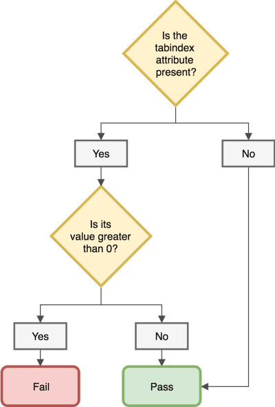


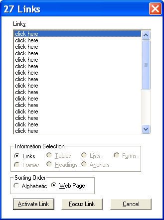
 (rb, ra, yk, il)


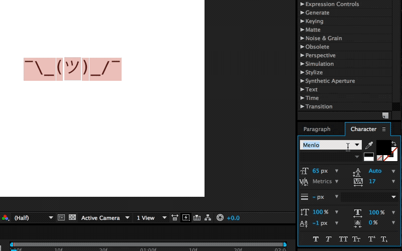

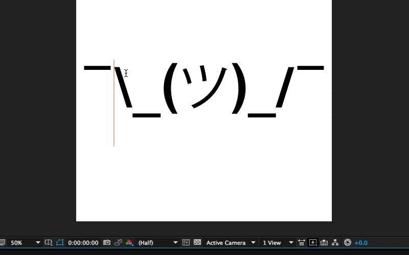
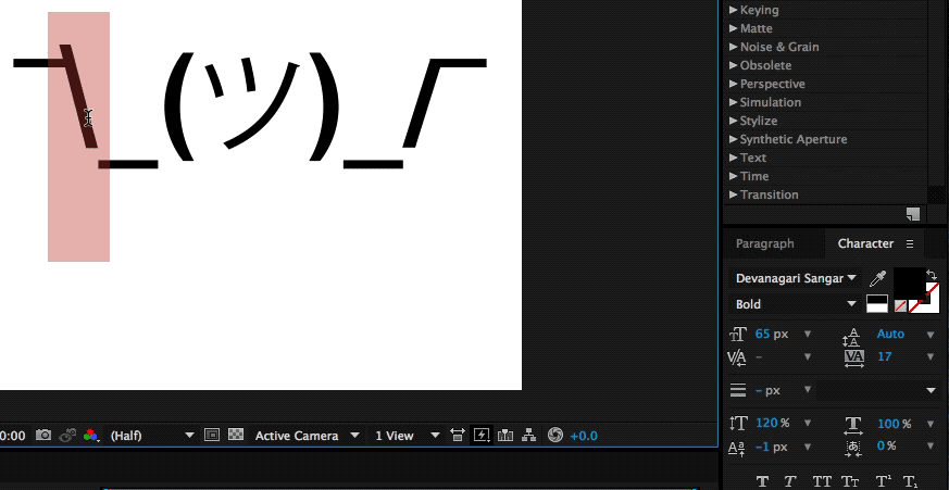

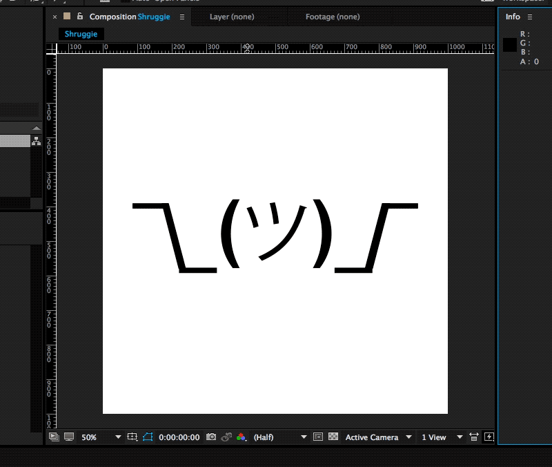
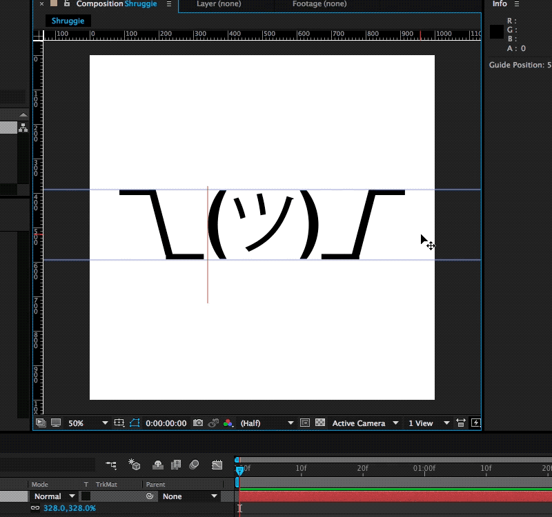

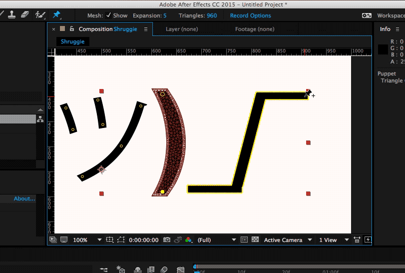
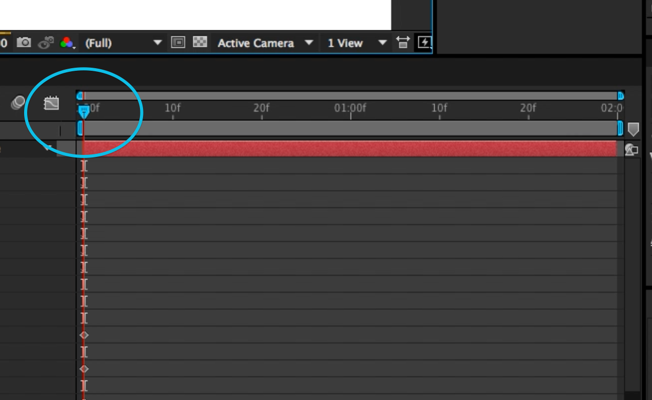

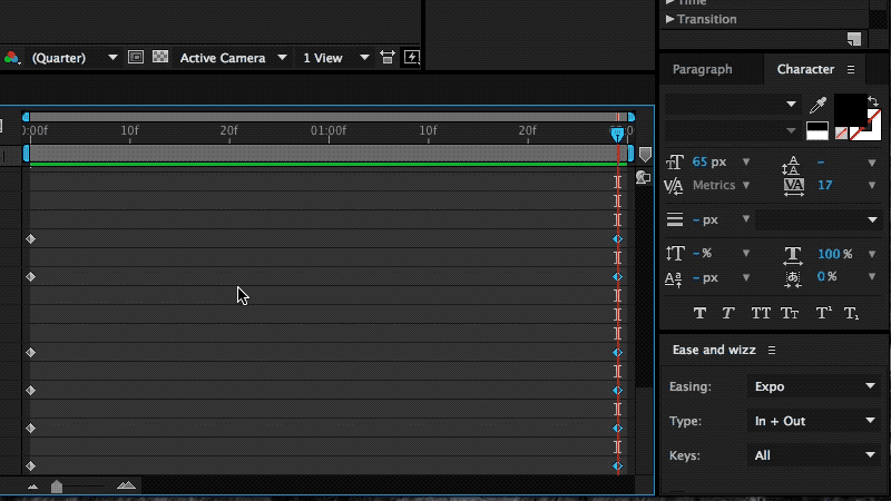
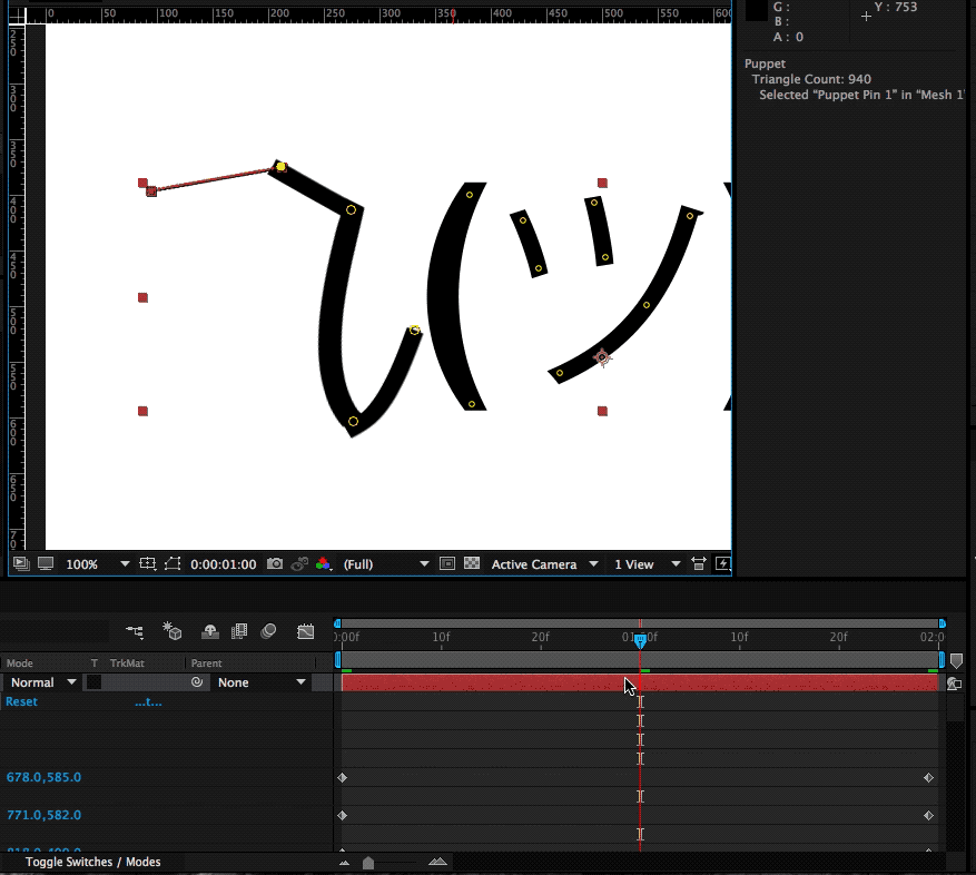

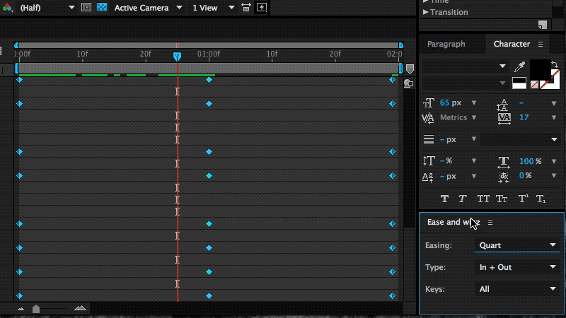


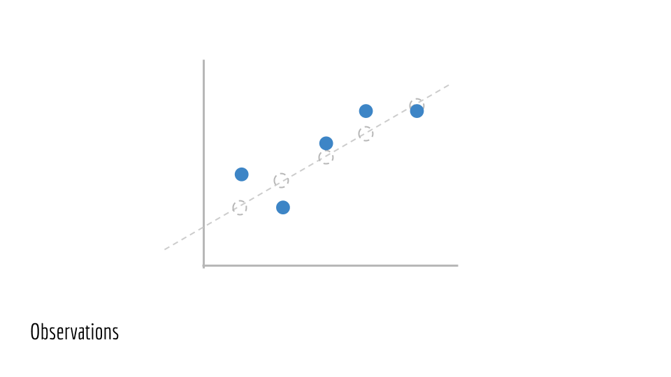


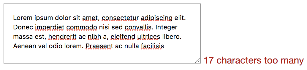

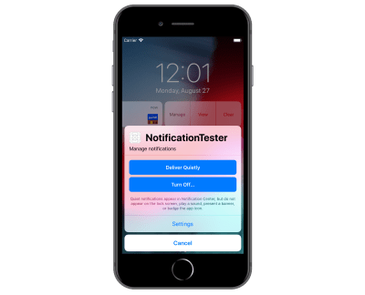

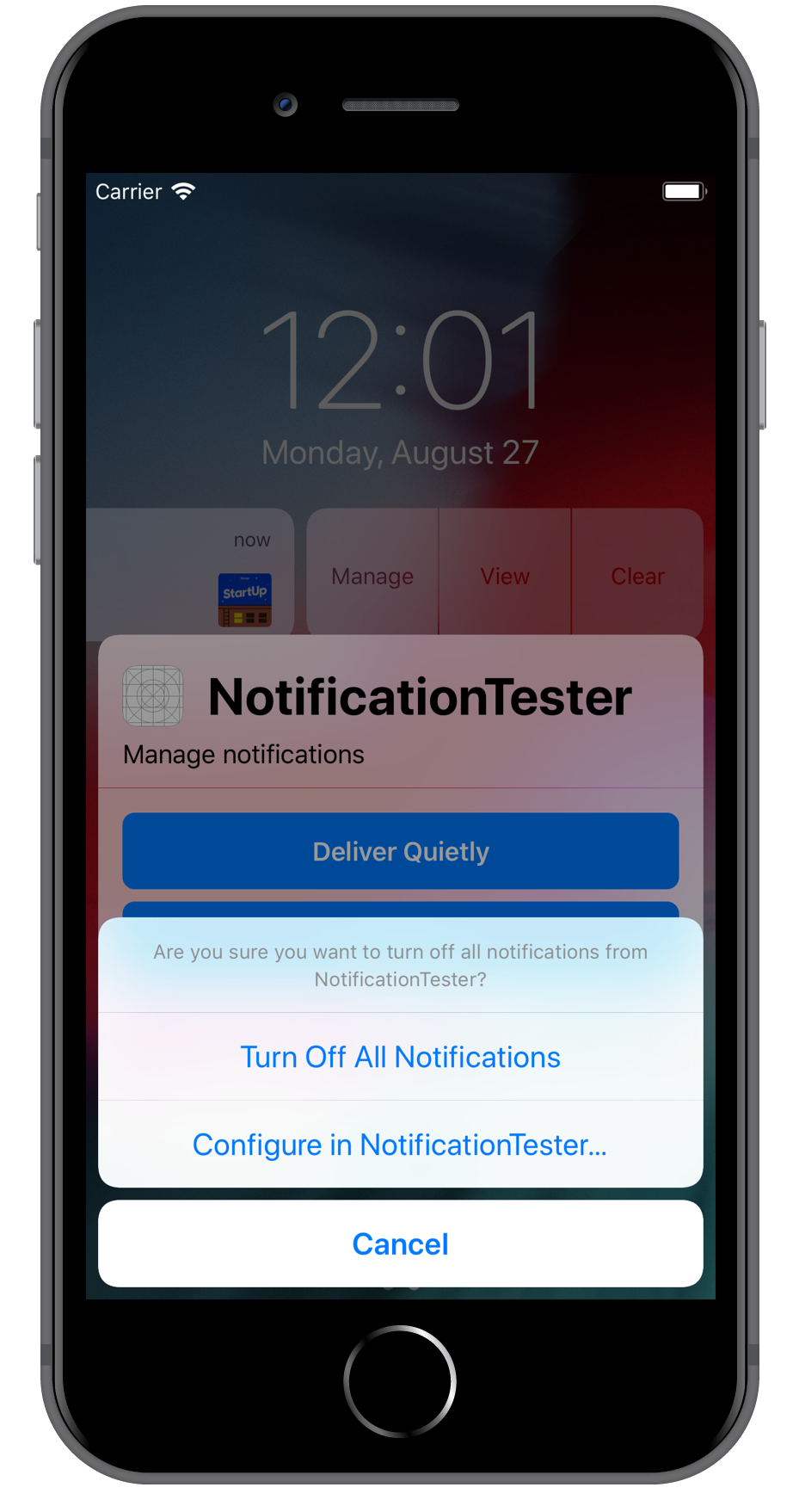
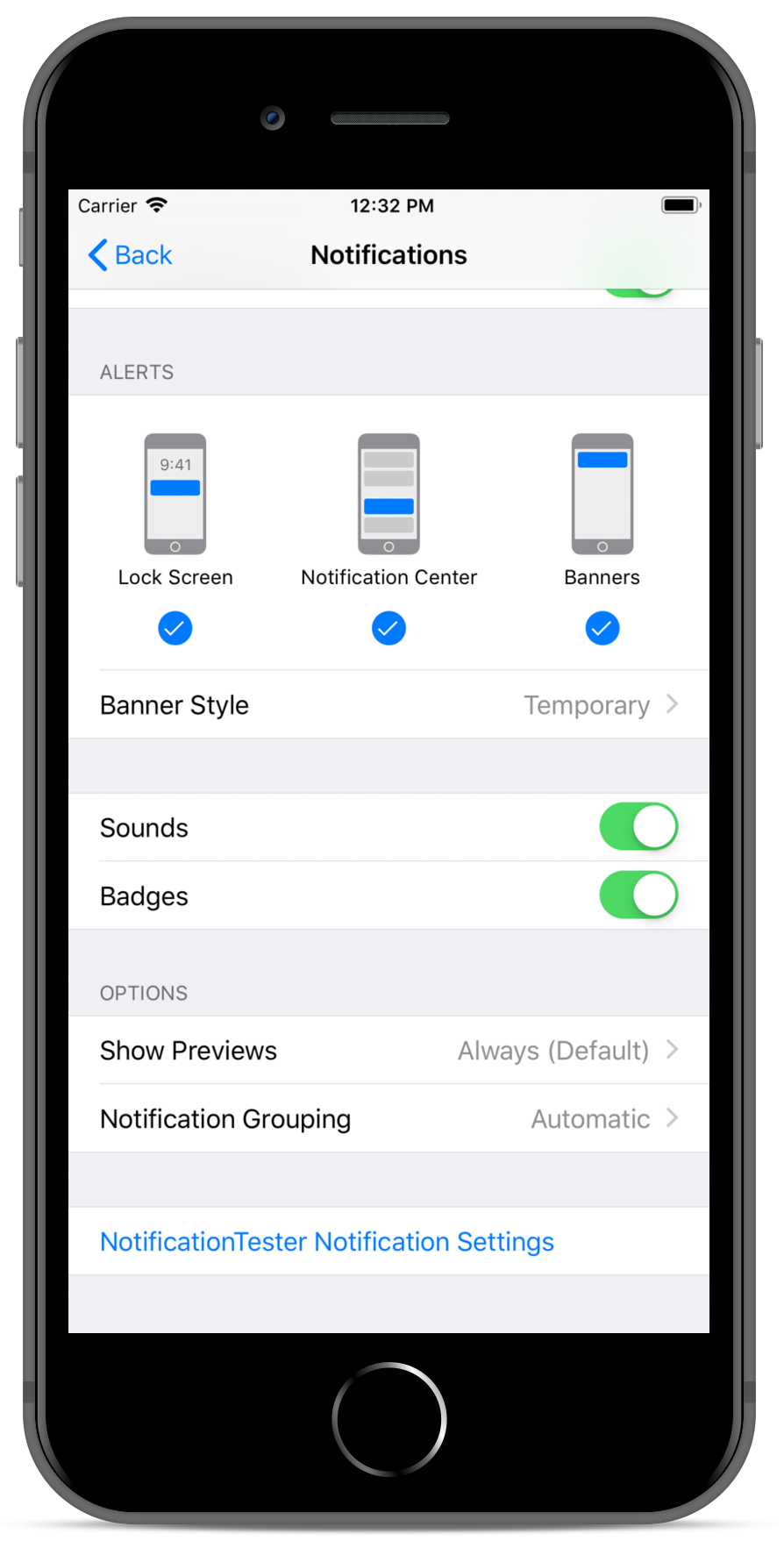


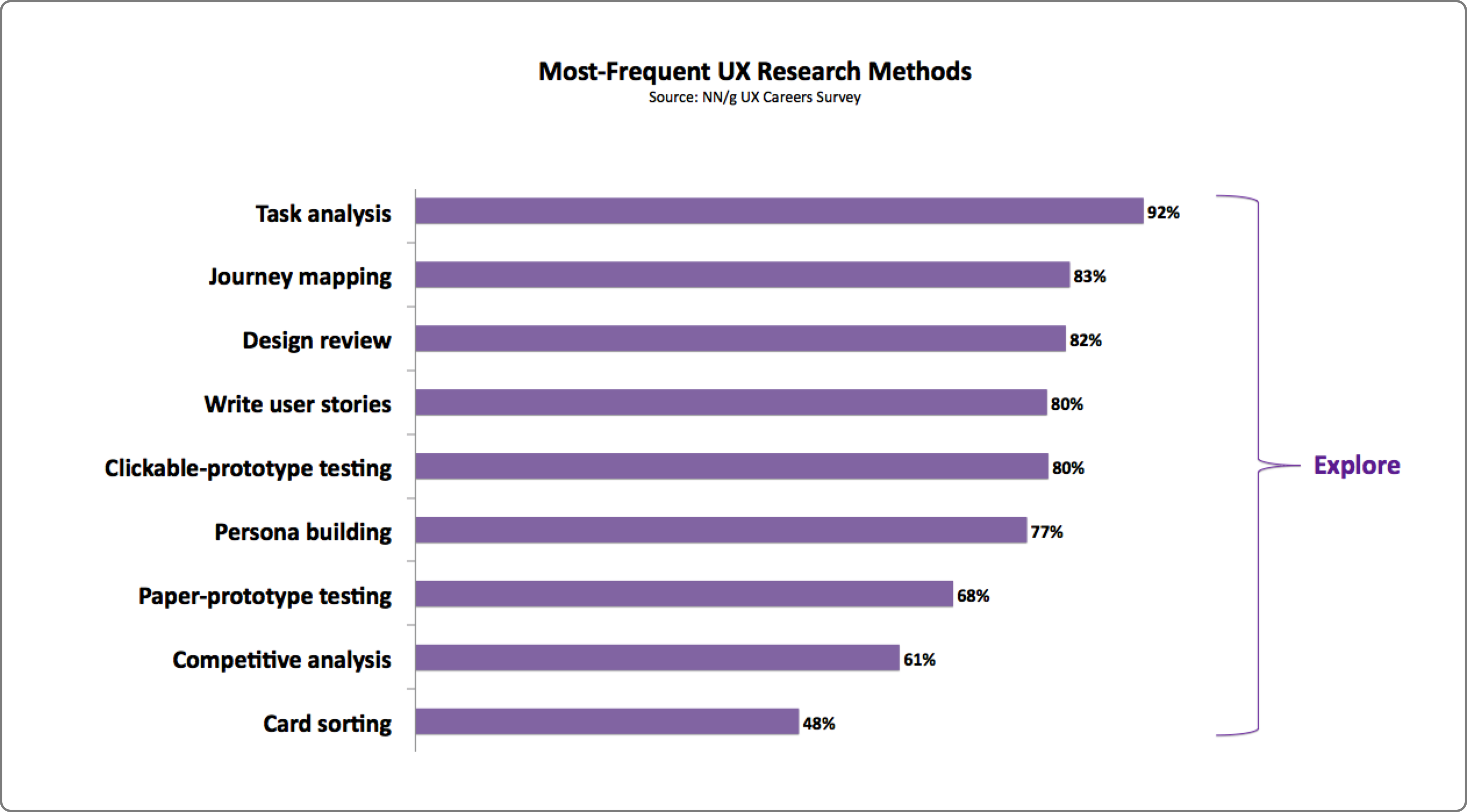


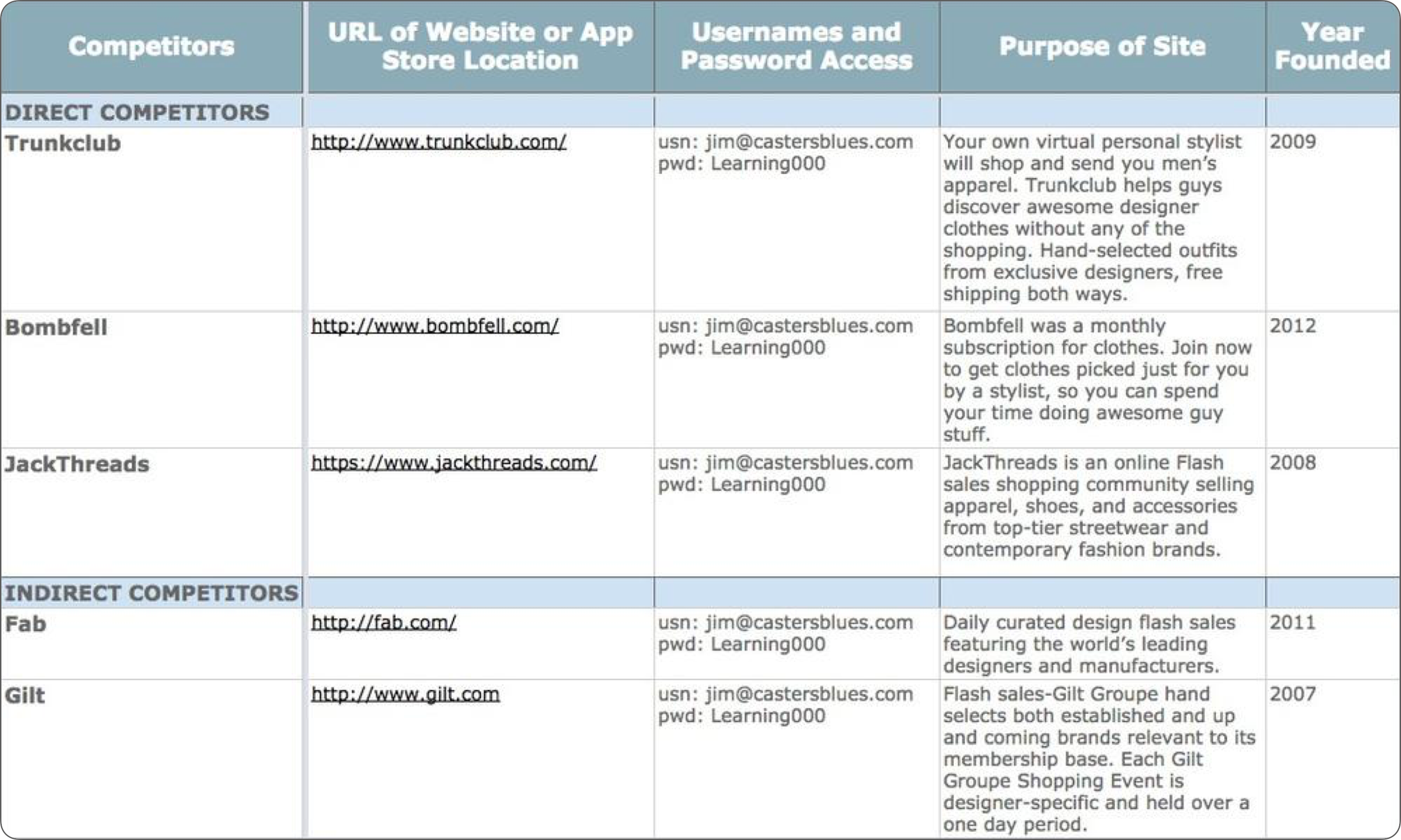

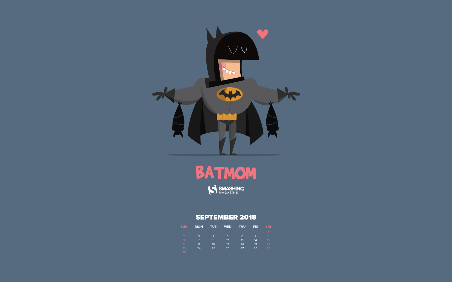
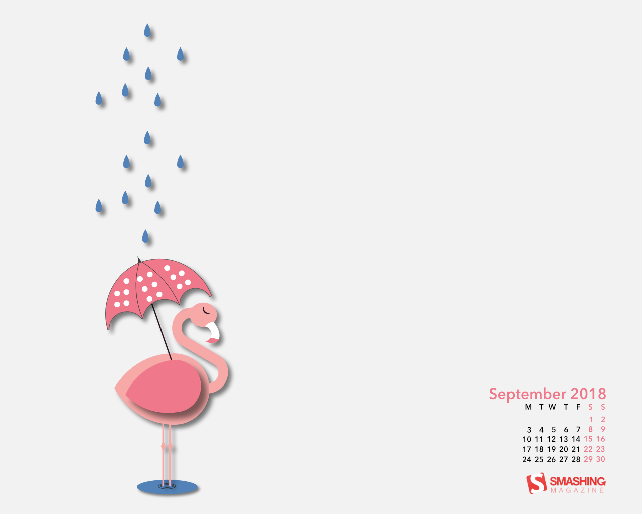
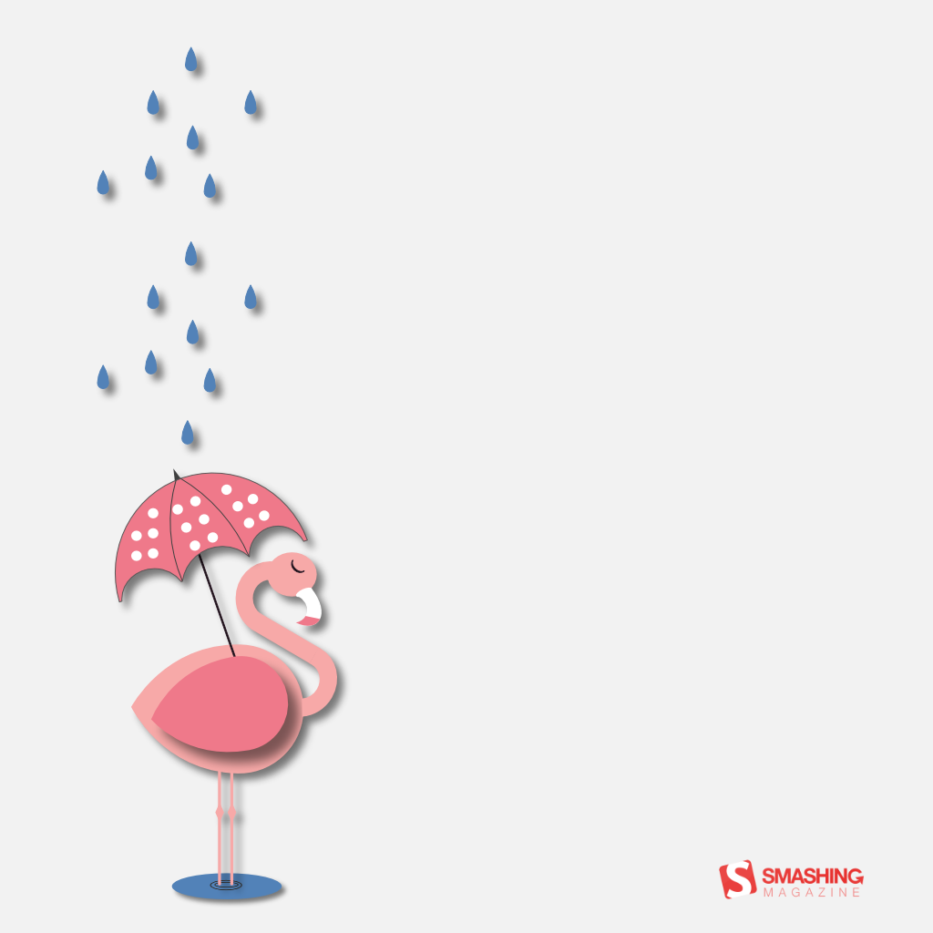
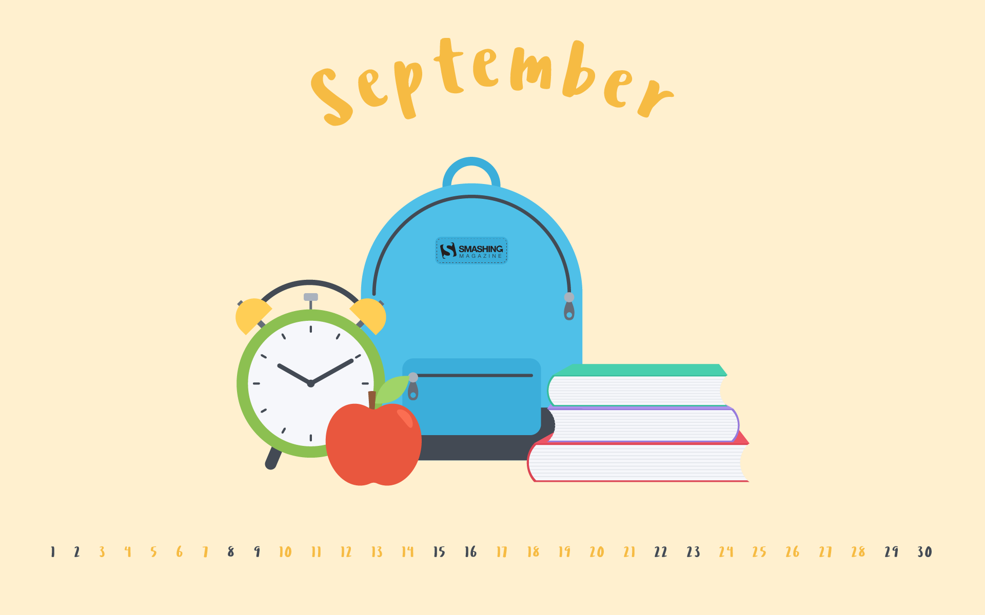
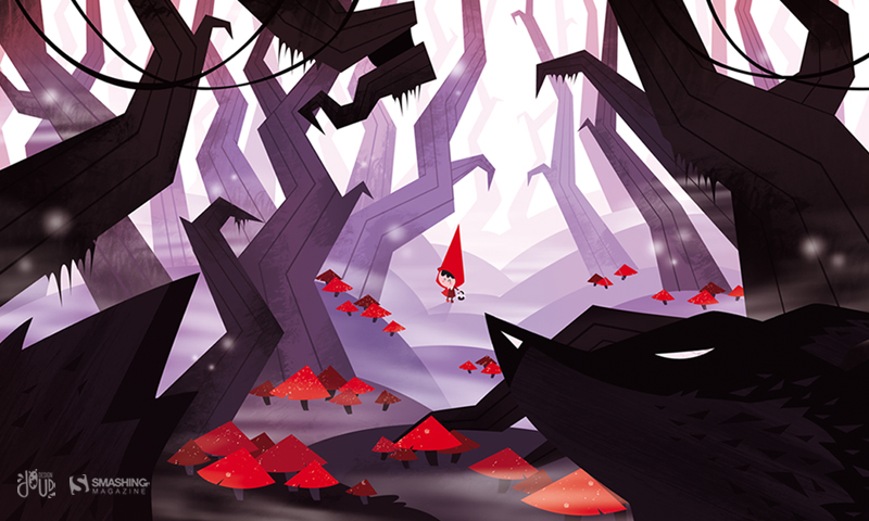
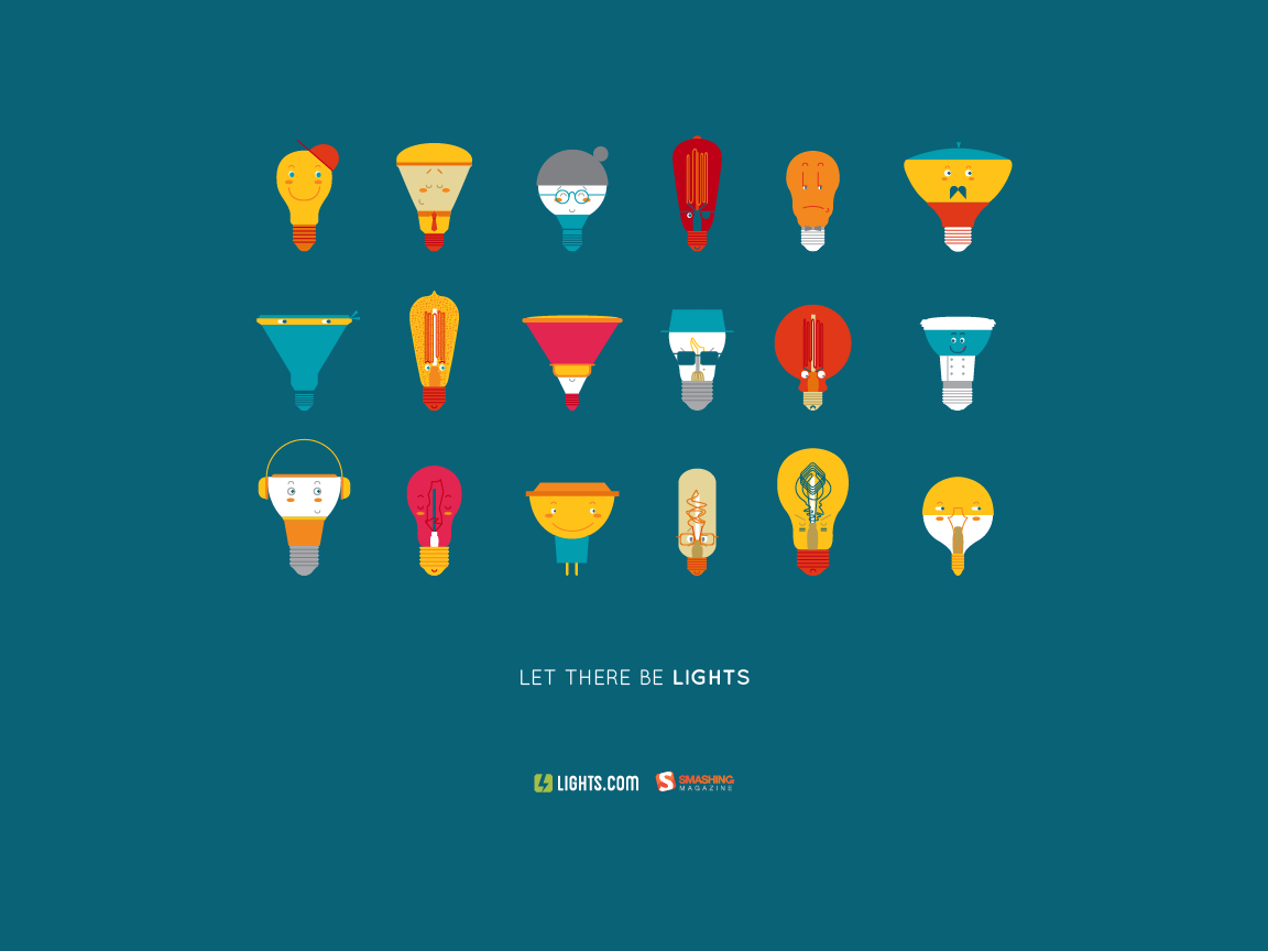
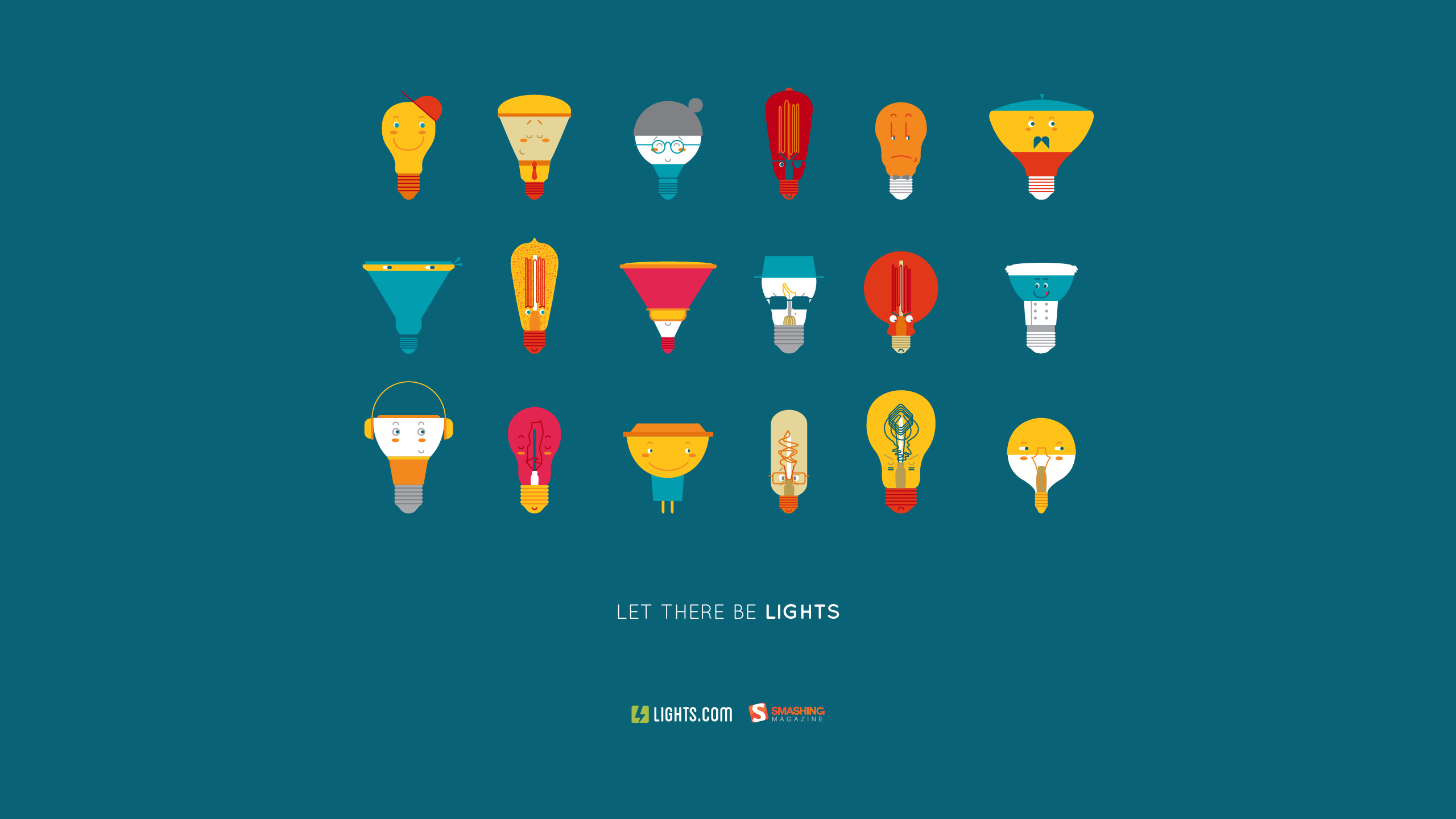