Attention to Branding: 20 Websites with Beautiful Logotypes
In the World of WebGL, brilliant HTML5 experiments, fancy animations and holistic user experience, sometimes we forget about the small static elements of design. They are the most vital and fundamental details that represent personality and individuality. Today we are talking about brand identity and its crucial constituent – logotype.
It can be a purely graphic realization, type-based emblem or both – the most important is that it should provide an instant public recognition for your company, uniquely identifying and separating it from others. It is vital for your business, so that when you create a website for your agency, restaurant or local firm it should have a high priority.
In today’s collection, we will consider twenty great examples of sites where logotypes stand the competition and bring benefits for the whole aesthetic.
Outstanding Logos in Web Design
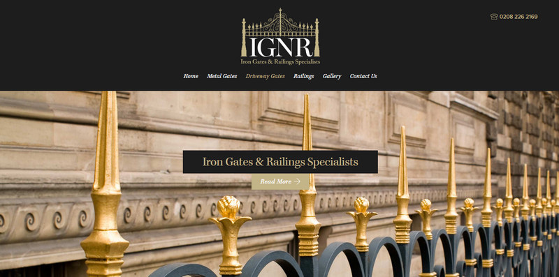
Iron Gates and Railings Specialists
With its majestic and exquisite logotype, the Iron Gates and Railings Specialists demonstrates that it is a part of the country with a royal family. It goes perfectly well with the header background made in the same theme and modest yet elegant color palette.
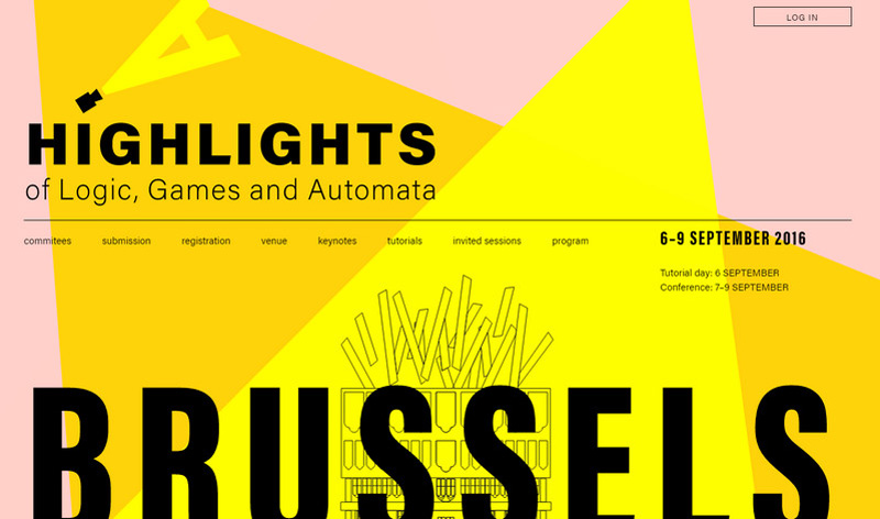
Highlights Conference
Highlights Conference has an attractive logo that is a visual representation of the name of the project. It is a simple take on portraying the ‘highlights’. It ideally blends in and skillfully finishes off the environment.
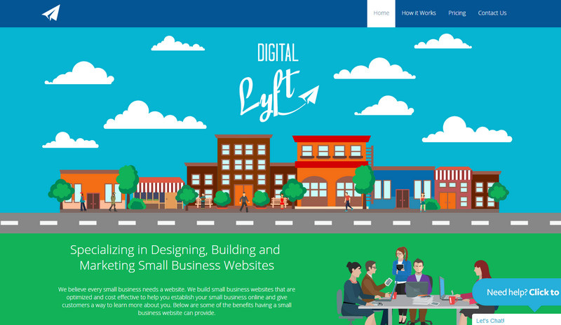
Digital Lyft
Although the website is based on a lavish cartoonish composition that establishes a pretty friendly atmosphere right away, however, the team has opted for less fantasy logotype, using a combination of several fonts that nicely play together and a small touch in a form of origami paper plane that links everything together.
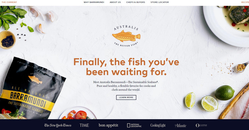
Australis The Better Fish
As is always the case, here the logotype impersonates and pictures the name of the restaurant and company. It is made as a classic badge with a mixture of typefaces and a beautiful vector illustration of a fish set in the heart of the composition.
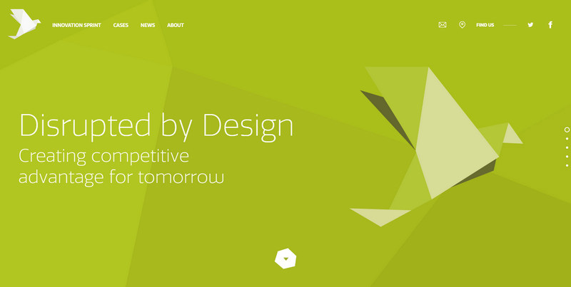
Disrupted by Design
Using origami style elements in the interface is a simple way to give ordinary objects an interesting twist. Here the paper bird is used for several purposes: as a logotype and as a decorative detail in the slider.
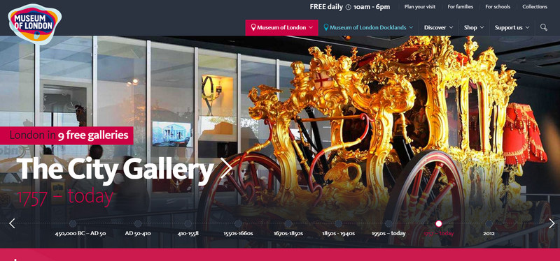
Museum of London
Although the official page of the Museum of London slightly breathes with snobbery, nevertheless its logotype tells us that it has something to offer, and you should be prepared for some fun. It is bright, energetic and entirely positive.
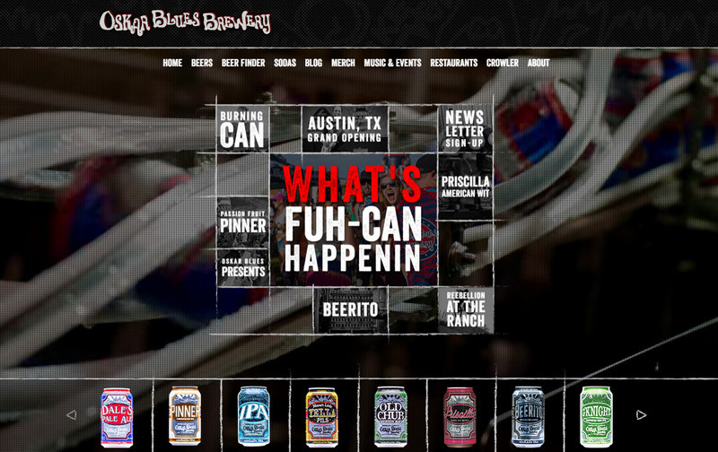
Oskar Blues Brewery
The front page of Oskar Blues Brewery can boast of great work with the fonts since the type-based centerpiece placed in the heart of the screen is a masterpiece. The logotype made in a whimsical typeface corresponds to the general mood and serves as a subtle focal anchor. Although it is not the first thing that draws the attention, it is still an eye-catcher.
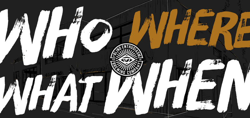
Blind Enthusiasm
Blind Enthusiasm heavily relies on the typography that seizes the entire homepage. It simply bombards online visitors. Surprisingly, the tiny circular logotype that is located in the middle of this chaos easily grabs the attention with its sophisticated design that strongly resembles an emblem of the Sun with encrusted Egyptian motifs.
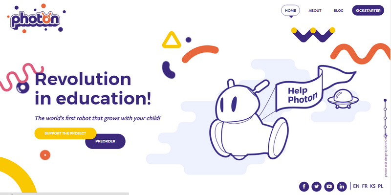
Meetphoton
Much like the design of the website, the logotype reflects the passion for the tech industry and at the same time conveys the cheerful atmosphere inherent to the content.
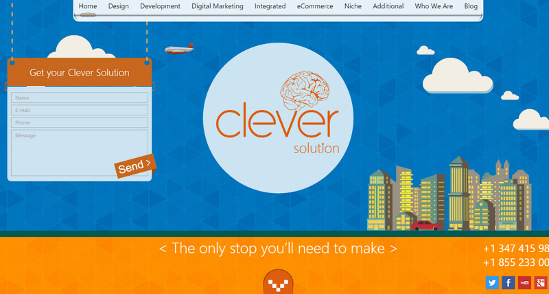
Clever Solution
Clever Solution has a plain, straightforward and tasteless logotype, but it skillfully translates the name of the agency into neat and sleek illustration. As befits, it is a symbiosis of the font and vector drawing – together they express the meaning of the title.
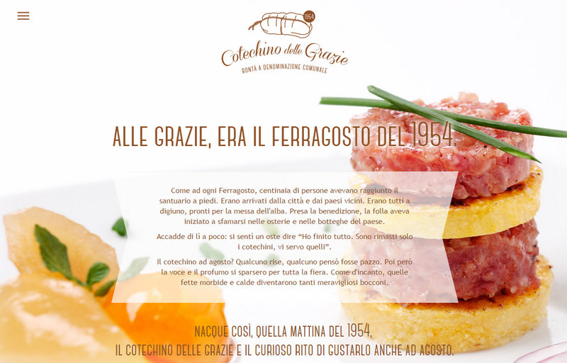
Cotechino delle Grazie
The team has incorporated an Italian flavor in every aspect of this design, and the logotype is no exception. Elegant curves of letterforms paired with a gentle palette and line art make it an appropriate decorative finishing touch for the yummy restaurant aesthetics.
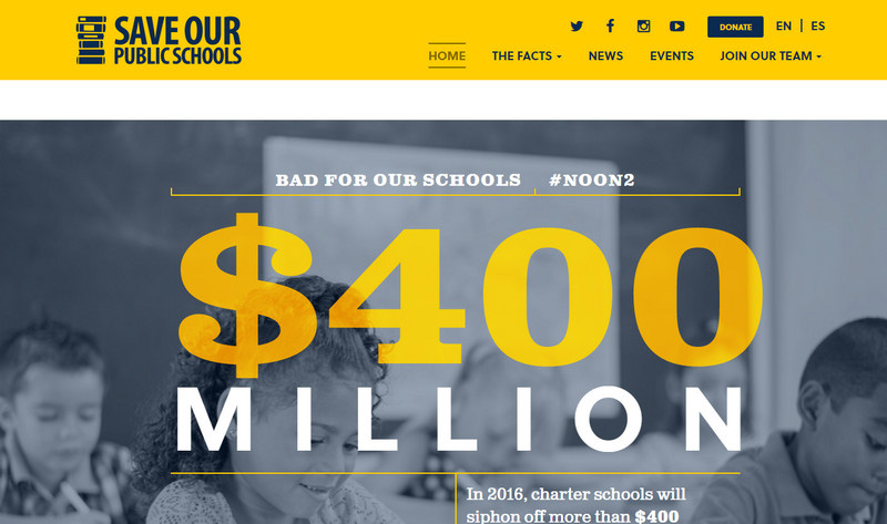
Save our Public Schools
The project intends to raise awareness about pretty serious issues; so predictably, the logotype looks weighty and austere. It is an harmonious, well-balanced mixture of typography and vector illustration of a pile of books that symbolizes belonging to the education system.
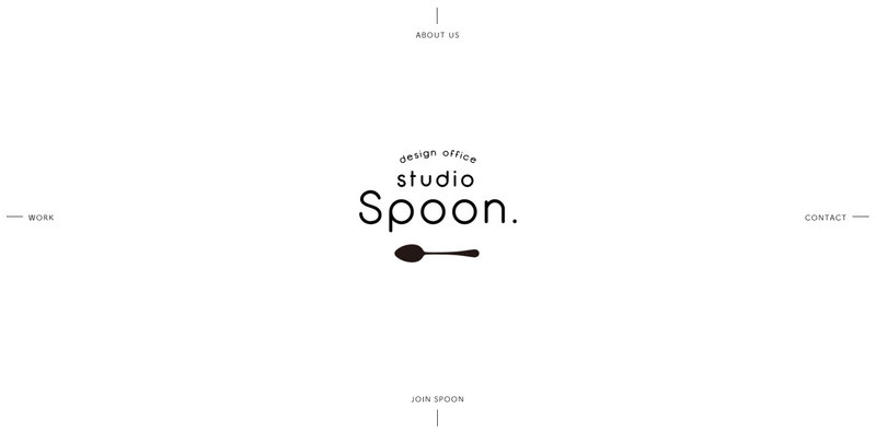
Studio Spoon
Studio Spoon has a minimalistic landing page with a considerable amount of fresh air and limited color palette. The logotype occupies here a central position not only because of its position but also because of the absence of extra content. It is exquisite, smart and polished.
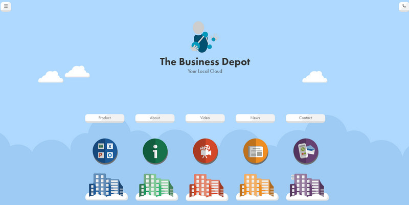
The Business Depot
The team tries to achieve a businesslike air in an unexpected way: using a fully illustrated environment, flat icons, and gorgeous coloring. And they have succeeded: the interface exudes images of the serious company with creative thinking. The logotype here is an integral element of the composition.
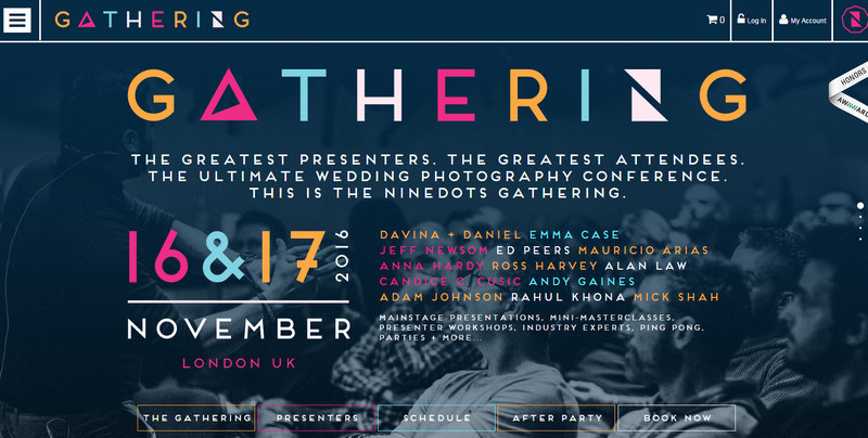
Gathering
The team behind the Gathering demonstrates that unique customized typography can inject life and soul into any primitive lettering. Here the bright logotype with a powerful geometric feeling sets the tone for the project and makes the website a winner in our eyes.
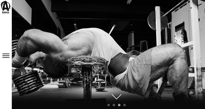
Animal Pak
Animal Pak has a brutal grunge styled logotype that does its job perfectly well. With just one glance it becomes apparent that the project is related to something masculine, bold and powerful, naturally appealing to the targeted audience.
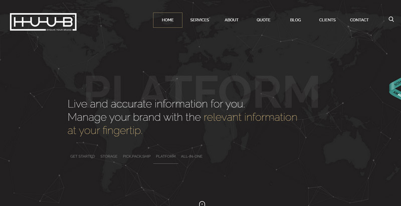
The Huub
The Huub has an unmistakable techno style that is professionally executed. The logotype has a digital and somewhat futuristic vibe that expresses the spirit of the platform. It is simple but at the same time elegant and smart.
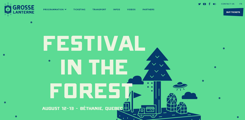
Grosse Lanterne
Here the logotype is an integral part of brand identity that makes for a nice atmospheric touch. It echoes with the illustration on the homepage as well as fits to the language of the website.
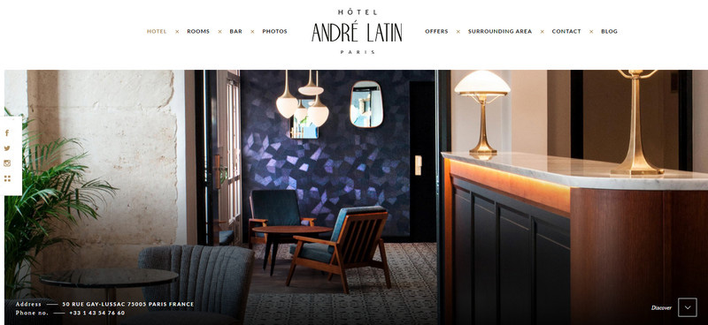
Hotel Andre Latin
The website features a kind of logo that is commonly used nowadays: an elaborate mixture of several typefaces that form the badge with a natural and exquisite look. It is set in the middle of the page, breaking the navigation into two parts and at the same time striking the eye with its refined appearance.
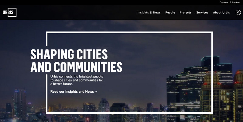
Urbis
The beauty of this logotype does not lie in its lavish or intricate appearance; it lies in its ability to make the homepage feel complete and harmonious, adding a subtle sense of the boxy vibe. You do not need to be lush and opulent to catch the attention; sometimes clever realization is everything you may require.
Conclusion
As a rule we do not focus our attention on the logo when we stumble upon a website with the desired information; however, when created with soul and heart it becomes that tiny, unobtrusive detail that makes the whole difference.
When you prototype a site, do you use the logo as a starting point for your design? Does it affect your choice of colors, fonts and/or layout?
The post Attention to Branding: 20 Websites with Beautiful Logotypes appeared first on Onextrapixel – Web Design and Development Online Magazine.
