Artistry Dose – The Use of Ornamental Backgrounds in Website Design
The last couple of years we have been leaning more toward flat style; and 2016 is no exception. Whether we craft a website design or interface for a mobile application, as a rule, we stop our choice on clean, intuitive layouts, harmonious and moderate color schemes, a generous amount of whitespace, and plain graphics.
However, living in a flat world can be boring, so every now and then we require an enormous dose of artistry, something big, wild and overwhelming that will satisfy our hunger for inspiration and amazement. And it seems that creative agencies hear our calls by blessing the Web with outstanding, highly decorative and exquisite designs.
Today we have prepared a collection of ornamental website designs with a strong artistry vibe to brighten up the atmosphere.
Websites with Ornamental Backgrounds
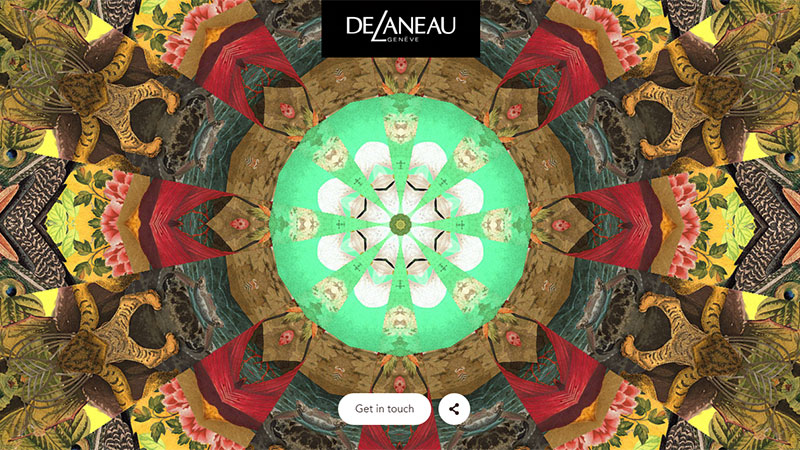
DeLaneau
DeLaneau fascinates online visitors from the first seconds. The ‘welcome’ section features a brilliant take on a digital kaleidoscope. It is bright, dynamic, visually appealing and engrossing.
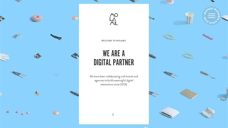
Molamil
Molamil is based on an image background, which owes its beauty to isometric projection. Everything is arranged in order and supplied with a proper amount of white space. It nicely goes together with a flat solid block placed in the center.
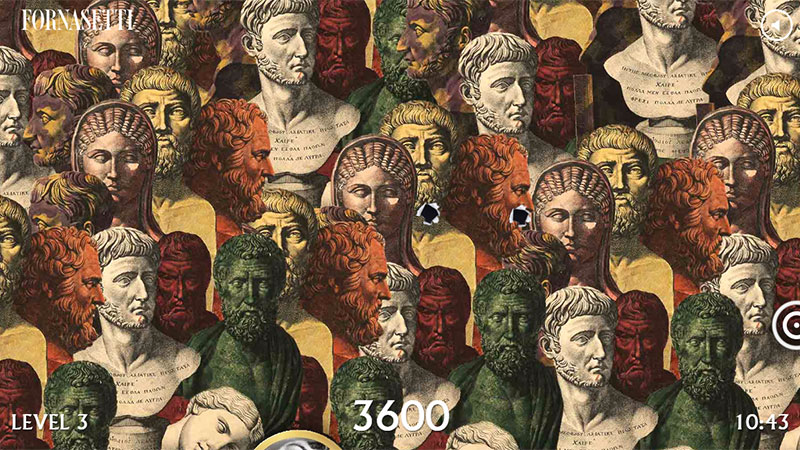
Fornasetti
Fornasetti offers visitors to participate in a small browser game that is populated with lavish backgrounds. Each level is defined by its own bizarre and impressive image that is composed of repeated patterns. The project is simply mesmerizing.
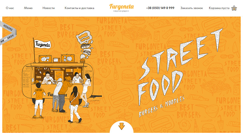
Furgoneta
Furgoneta has a marvelous urban vibe, where the background plays a vital role, strengthening the general feeling. It consists of sketchy drawings that are densely packed together and muted to look seamless and organic. It fits well with hand-drawn graphics and the artistic nature of the project.
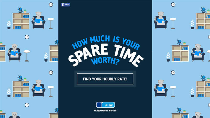
Spare Time
Spare Time magnetizes with a soft and pleasant, picturesque background that is constructed with the help of a repeated pattern. The latter is a small vector highly detailed illustration that thanks to calm coloring and flat style does not overwhelm readers and perfectly contributes to the general atmosphere.
Pixel2HTML
Pixel2HTML leverages a subtle dim picture for its header section that serves as a solid foundation for the foreground elements. Much like the second example in our list, it also features isometric icons. Together they symbolize the workspace and workflow of the designer.
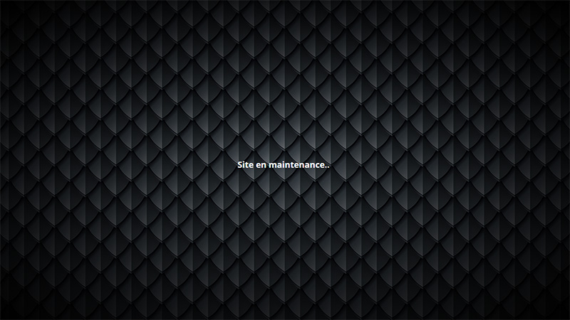
Dragon Noir
Although the website is under maintenance, it does not mean that it should be dull. The team shows how to transform a primitive one-screen page into an engaging design just by using a crisp and polished pattern that is reminiscent of Dell laptop’s lid. It gives the concept an exquisite look, brutal nature, and businesslike appeal.
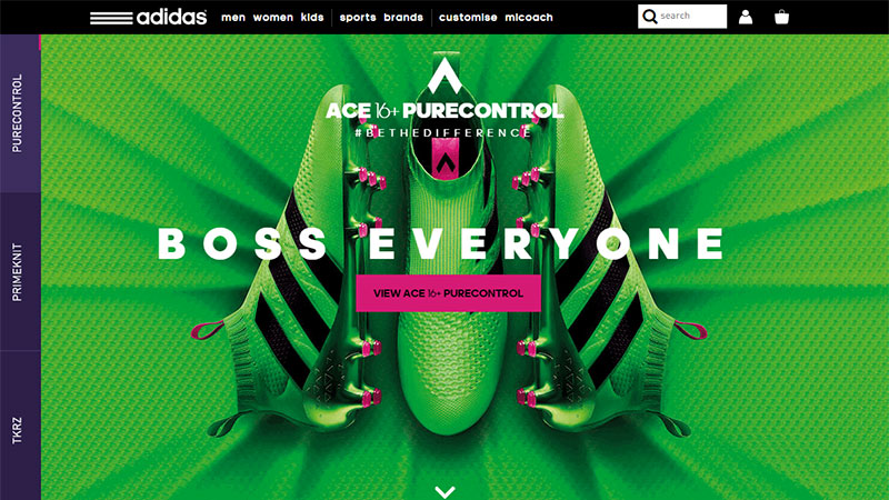
Adidas Football
Adidas Football charms with a bright and energetic interface. The sophisticated greenish backgrounds that are enriched with subtle material textures enormously reinforce the general impression and reflect the spirit of the company.
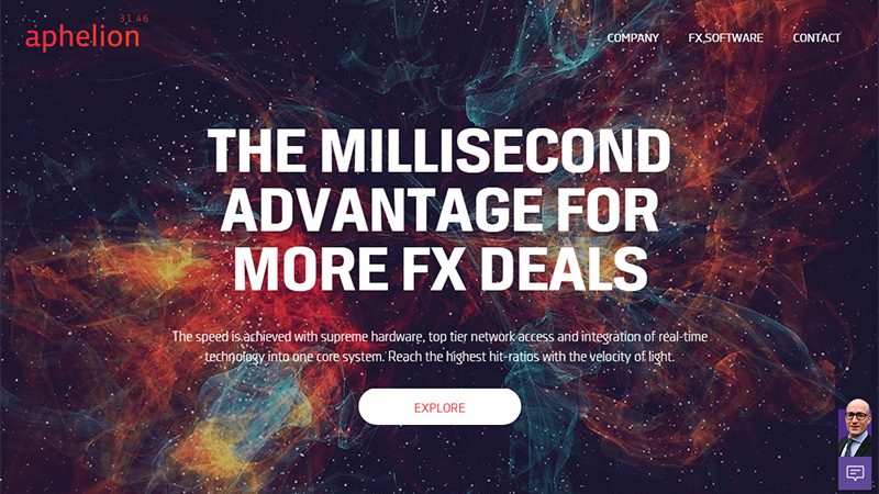
Aphelion
The cosmic theme runs through the project. Bright abstract illustration used for a backdrop lets the page radiate a techno vibe and look futuristic and cutting-edge. The solution significantly adds to the brand identity, driving home a point of the professional and high-end product.
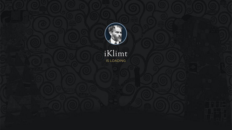
iKlimt
The loading screen, as well as the main page, utilizes a gorgeous fancy background that increases the artistic aesthetics and gives the website a rich appearance. It brightens up minutes of waiting and lightens up the general atmosphere.
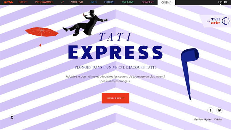
Tati Express
For its ‘welcome’ page Tati Express leverages a common geometric pattern that is made in a flat style and a matching coloring. Stripes with angular feel supply the design with a subtle 3 dimensional touch and instill a sense of originality.
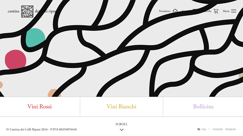
Cantina dei colli ripani
The homepage is personified by a bizarre background that instantly catches the eye. It is pretty wide, wild and authentic, yet it is not deprived of artistic traits that radiate charm. The black and white combination saves the users from feeling overwhelmed.
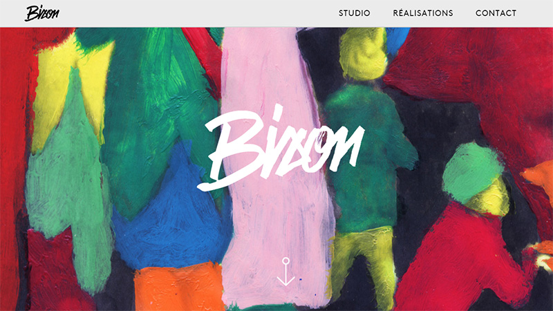
Bison Studio
Bison Studio greets the online audience with an impressive painting that is full of color and life. It reflects the spirit and captures the artistic mood of the agency, delivering a fantastic first impression.
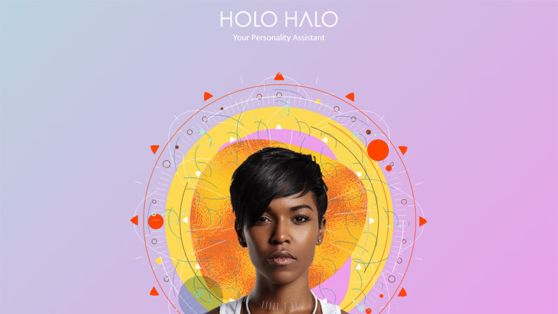
Holo Halo
The website is defined by several circular centerpieces that are set on the background. Skillfully combining geometric shapes and oriental features, they stamp a bright personality on the design, naturally directing attention towards people.
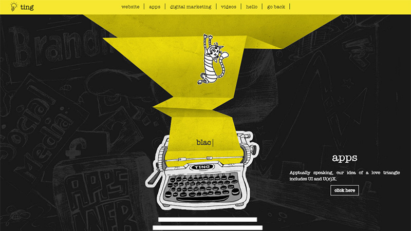
Ting Digital
Ting Digital has an incredible online portfolio that gets the most out of hand-drawn illustrations, textures, drawings and realistic renderings. The backdrop of several sections is reminiscent of a chalkboard with inscriptions and doodles that ideally blends in and finishes off the theme.
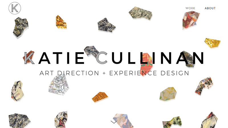
Katie Cullinan
Although the personal portfolio of Katie Cullinan does not have a dramatic image background, it is still unique and decorative. Different rocks that are chaotically scattered throughout the ‘welcome’ screen recreate enough aesthetics to make the project feel artistic and original.
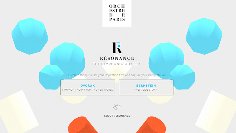
Resonance
The background is a symbiosis of flat elements and 3 dimensional objects that are laconically dispersed across the page. They are set in a subtle motion to smarten the aesthetics and spice up the user experience. While there is nothing extraordinary, the trick works great here.
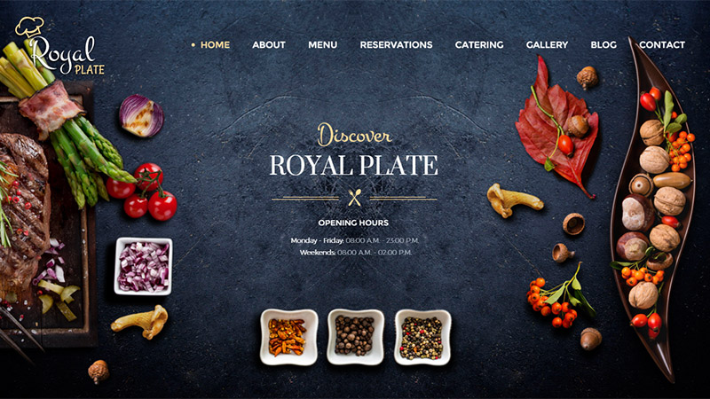
Royal Plate
Royal Plate has a typical design for a restaurant-related website. It is populated with professionally treated textures, carefully arranged renderings of foodstuffs, sketchy graphics and handwritten fonts. The visitors dive into a sophisticated environment with an ornamental note that gives an edge to the appetite.
Ted Baker
Here the tone is set by the backdrop that is a bit schmaltzy yet inviting and friendly. The bright geometric pattern that eventually forms the shape of a heart meets the mood of the project and instills a sense of chic and glamour.
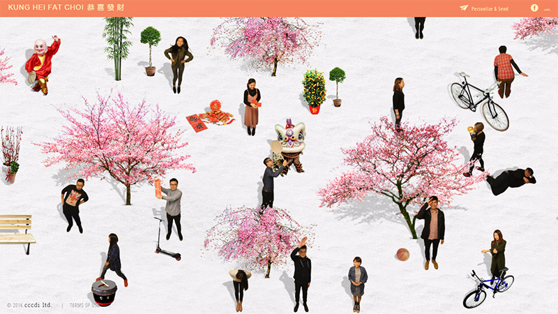
Kung Hei Fat Choi
The front page features a dynamic artistic scene that consists of moving objects, realistic models, and funny characters. The solution is really original and inventive.
Conclusion
Designed to draw attention, lush and provocative backgrounds can be very tricky to use. You are always just one step away from disaster. You have to maintain a balance between all the details of the composition in order to avoid overwhelming viewers. However, used wisely and carefully, they are able to leave a powerful impression and distinguish a project from the others.
How do you find such websites? Do they look appropriate in the era of flat style?

