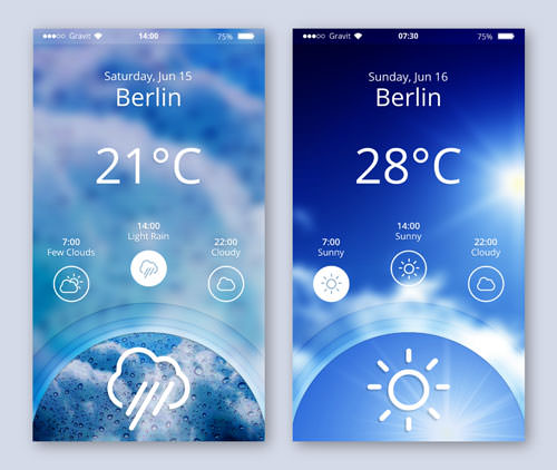
An Introduction To Gravit Designer: Designing A Weather App (Part 2)
Welcome back to the second part of this tutorial on Gravit Designer. In the first part we took a general look at Gravit and set everything up, created the background image in the weather app and the status bar, and then started to make the initial elements of the design’s content. Let’s continue where we left off.

Having created the main text layers of the content area in part one of this tutorial, let’s continue with the weather conditions for the different times of day.
The post An Introduction To Gravit Designer: Designing A Weather App (Part 2) appeared first on Smashing Magazine.

