Three Insights I Gained While Researching Vue.js Accessibility
JavaScript frameworks like React, Angular and Vue have a very bad reputation when it comes to web accessibility. But is this due to inherent technical limitations or insurmountable problems of those tools? I think not. During the research phase of my book, “Accessible Vue,” I gained three insights regarding web app accessibility in general and the framework in particular. Considering these, perhaps it’s worth taking another perspective around accessible Vue apps.
Insight 1: JavaScript Framework Features For Accessibility Are Underused
Component-based design, enabled and enforced by modern JavaScript frameworks, does not only provide great developer experiences and project ergonomics when used in a smart way, but it can also offer advantages for accessibility. The first is the factor of reusability, i.e. when your component gets used in several places within your app (perhaps in different forms or shapes) and it only has to be made accessible only once. In this case, an increased developer experience actually helps the user and “baking accessibility into components” (as Hidde de Vries puts it) creates a win-win scenario for everyone.
The second aspect that comes with component based-designs are props — namely in the form that one component can inherit or get context from its parent environment. This forwarding of “environment data” can serve accessibility as well.
Take headlines, for example. A solid and comprehensible headline structure is not only good for SEO but especially for people using screen readers. When they encounter a sound document outline, constructed with headlines that structure a web page or app, screen reader users gain a quick overview of the web page they are on. Just like visually-abled users don’t read every word on a page but scan for interesting things, blind screen reader users don’t make their software read each and every word. Instead, they are checking a document for content and functionality they are interested in. Headlines, for that matter, are keeping pieces of content together and are at the same time providing a structural frame of a document (think timber frame houses).
What makes headlines providing a structure is not only their mere existence. It is also their nesting that creates an image inside a user’s mind. For that, a web developer’s headline toolbox contains six levels (<h1> to <h6>). By applying these levels, both editors and developers can create an outline of content and a reliable functionality that users can expect in the document.
For example, let’s take the (abridged) headline tree from the GOV.UK website:
1 — Welcome to GOV.UK 2 — Popular on GOV.UK 2 — Services and information 3 — Benefits 3 — Births, deaths, marriages and care 3 — Business and self-employment // …etc 2 — Departments and policy 3 — Coronavirus (COVID 19) 3 — Travel abroad: step by step …etc Even without visiting the actual page and without actually perceiving it visually, this headline tree created a table of contents helping you understand what sections can be expected on the front page. The creators used headline elements to herald data following it and didn’t skip headline levels.
So far, so familiar (at least in correlation with search engines, I guess). However, because a component can be used in different places of your app, hardwired headline levels inside them can sometimes create a suboptimal headline tree overall. Relations between headlines possibly aren’t conveyed as clear as in the example above (“Business and self-employment” does not stand on its own but is related to “Services and information”).
For example, imagine a listing of a shop’s newest products that can be placed both in the main content and a sidebar — it’s quite possible that both sections live in different contexts. A headline such as <h1>Our latest arrivals</h1> would make sense above the product list in the main content — given it is the central content of the whole document or view.
The same component sporting the same <h1> but placed in a sidebar of another document, however, would suggest the most important content lives in the sidebar and competes with the <h1> in the main content. While what I described above is a peculiarity of component-based design in general this gives us a perfect opportunity to put both aspects together — the need for a sound headline tree and our knowledge about props:
Context Via props
Let’s progress from theoretical considerations into hands-on code. In the following code block, you see a component listing the newest problems in an online shop. It is extremely simplyified but the emphasis is on line 3, the hardcoded <h1>:
<template> <div> <h1>Our latest arrivals</h1> <ol> <li>Product A</li> <li>Product B</li> <!-- etc --> </ol> </div> </template> To use this component in different places of the app without compromising the document’s headline tree, we want to make the headline level dynamic. To achieve this, we replace the <h1> with Vue’s dynamic component name helper called, well, component:
<component :is="headlineElement">Our latest arrivals</component> In the script part of our component, we now have to add two things:
- A component prop that receives the exact headline level as a string,
headlineLevel; - A computed property (
headlineElementfrom the code example above) that builds a proper HTML element out of the stringhand the value ofheadlineLevel.
So our simplified script block looks like this:
<script> export default { props: { headlineLevel: { type: String }, computed: { headlineElement() { return "h" + this.headlineLevel; } } } </script> And that’s all!
Of course, adding checks and sensible defaults on the prop level is necessary — for example, we have to make sure that headlineLevel can only be a number between 1 and 6. Both Vue’s native Prop Validation, as well as TypeScript, are tools at your disposal to do just that, but I wanted to keep it out of this example.
If you happen to be interested in learning how to accomplish the exact same concept using React, friend of the show magazine Heydon Pickering wrote about the topic back in 2018 and supplied React/JSX sample code. Tenon UI’s Heading Components, also written for React, take this concept even further and aim to automate headline level creation by using so-called “LevelBoundaries” and a generic <Heading> element. Check it out!
Insight 2: There Are Established Strategies To Tackle Web App Accessibility Problems
While web app accessibility may look daunting the first time you encounter the topic, there’s no need to despair: vested accessibility patterns to tackle typical web app characteristics do exist. In the following Insight, I will introduce you to strategies for supplying accessible notifications, including an easy implementation in Vue.js (Strategy 1), then point you towards recommended patterns and their Vue counterparts (Strategy 2). Lastly, I recommend taking a look at both Vue’s emerging (Strategy 3) and React’s established accessibility community (Strategy 4).
Strategy 1: Announcing Dynamic Updates With Live Regions
While accessibility is more than making things screen reader compatible, improving the screen reader experience plays a big part of web app accessibility. This is rooted in the general working principle of this form of assistive technology: screen reader software transforms content on the screen into either audio or braille output, thus enabling blind people to interact with the web and technology in general.
Like keyboard focus, a screen reader’s output point, the so-called virtual cursor, can only be at one place at once. At the same time, one core aspect of web apps is a dynamic change in parts of the document without page reload. But what happens, for example, when the update in the DOM is actually above the virtual cursor’s position in the document? Users likely would not notice the change because do not tend to traverse the document in reverse — unless they are somehow informed of the dynamic update.
In the following short video, I demonstrate what happens (or rather, what not happens) if an interaction causes a dynamic DOM change nowhere near the virtual cursor — the screen reader just stays silent:

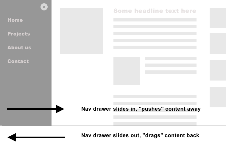
In this case, you need to establish at least two refs: One for the trigger button that opens the navigation (let’s call it navTrigger), and one for the element that gains focus as soon as the navigation is visible (navContainer in this example, an element which needs tabindex="-1" to be programmatically focusable). So that, when the trigger button is clicked, the focus will be sent into the navigation itself. And vice versa: As soon as the navigation closes, the focus must return to the trigger.
After having read the paragraphs above, I hope one thing becomes clear for you, dear reader: Once you understand the importance of focus management, you realize that all the necessary tools are at your fingertips — namely Vue’s this.$ refs and JavaScript’s native .focus()
Conclusion
By highlighting some of my core findings regarding web app accessibility, I hope that I have been able to help reduce any diffuse fear of this topic that may have existed, and you now feel more confident to build accessible apps with the help of Vue.js (if you want to dive deeper into the topic, check out if my little ebook “Accessible Vue” can help you along the journey).
More and more websites are becoming more and more app-like, and it would be sad if these amazing digital products were to remain so barrier-laden only because web developers don’t know exactly where to start with the topic. It’s a genuinely enabling moment once you realize that a vast majority of web app accessibility is actually “good old” web accessibility, and for the rest of it, cowpaths are already paved.
Articles on Smashing Magazine — For Web Designers And Developers
