UX Optimizations For Keyboard-Only And Assistive Technology Users
UX Optimizations For Keyboard-Only And Assistive Technology Users
Aaron Pearlman
(This is a sponsored article.) One of the cool things about accessibility is that it forces you to see and think about your application beyond the typical sighted, mouse-based user experience. Users who navigate via keyboard only (KO) and/or assistive technology (AT) are heavily dependent not only on your application’s information architecture being thoughtful, but the affordances your application makes for keeping the experience as straightforward as possible for all types of users.
In this article, we’re going to go over a few of those affordances that can make your KO/AT user experiences better without really changing the experience for anyone else.
Additions To Your Application’s UX
These are features that you can add to your application to improve the UX for KO/AT users.
Skip Links
A skip link is a navigation feature that invisibly sits at the top of websites or applications. When it is present, it is evoked and becomes visible on your application’s first tab stop.
A skip link allows your user to “skip” to various sections of interest within the application without having to tab-cycle to it. The skip link can have multiple links to it if your application has multiple areas of interest you feel your users should have quick access to your application’s point of entry.
For KO/AT users, this is a helpful tool to both allow them to rapidly traverse your app and can help orient them to your application’s information architecture. For all other users, they likely will never even know this feature exists.
Here’s an example with how we handle skip links. After you click the link, hit Tab ⇥ and look in the upper-left corner. The skip link has two links: Main Content and Code Samples. You can use Tab ⇥ to move between them, hit Enter to navigate to the link.

Shortcuts/Hotkey Menus
This is a feature that I think everyone is familiar with: shortcuts and hotkeys. You’ve likely used them from time to time, they are very popular amongst power users of an application, and come in a variety of incarnations.
For KO/AT users, shortcuts/hotkeys are invaluable. They allow them to use the applications, as intended, without having to visually target anything or tab through the application to get to an element or content. While frequent actions and content are always appreciated when represented in a shortcut/hotkey menu, you may also want to consider some slightly less frequent actions that may be buried in your UI (for good reason) but are still something that a user would want to be able to access.
Making shortcuts for those functions will be extremely helpful to KO/AT users. You can make the command a bit more involved, such as using (3) keystrokes to evoke it, to imply it’s a less frequently used piece of functionality. If you have a shortcut/hotkey menu make sure to find a way to promote it in your applications so your users, especially your KO/AT users, can find it and use it effectively.
User Education
User education refers to a piece of functionality that directs the users on what to do, where to go, or what to expect. Tooltips, point outs, info bubbles, etc. are all examples of user education.
One thing you should ask yourself when designing, placing, and/or writing copy for your user education is:
“If I couldn’t see this, would it still be valuable to understand ______?”
Many times it’s just reorienting the user education through that lens that can lead to a much better experience for everyone. For example, rather than saying “Next, click on the button below,” you may want to write, “To get started, click the START button.” The second method removes the visual orientation and instead focus on the common information both a sighted and KO/AT user would have at their disposal.
Note: I should mention it’s perfectly OK to use user education features, like point outs, to visually point out things on the application just make sure the companion text lets your KO/AT users understand the same things which are referred to visually.
See the Pen ftpo demo by Harris Schneiderman.
Augmentations To Your Application’s UX
There are changes or tweaks you can make to common components/features to improve the UX for KO/AT users.
Modal Focusing
Now we’re getting into the nitty-gritty. One of the great things about accessibility is how it opens the doorway to novel ways to solve problems you may have not considered before. You can make something fully WCAG 2.0 AA accessible and solve the problem with very different approaches. For modals, we at Deque came up with an interesting approach that would be totally invisible to most sighted-users but would be noticed by KO/AT users almost immediately.
For a modal to be accessible it needs to announce itself when evoked. Two common ways to do this are: focus the modal’s body after the modal is open or focus the modal’s header (if it has one) after the modal is open. You do this so the user’s AT can read out the modal’s intent like “Edit profile” or “Create new subscription”.
After you focus the body or header, hitting Tab ⇥ will send focus to the next focusable element in the modal — commonly a field or, if it’s in the header, sometimes it’s the close button (X). Continuing to tab will move you through all the focusable elements in the modal, typically finishing with terminal buttons like SAVE and/or CANCEL.
Now we get to the interesting part. After you focus the final element in the modal, hitting Tab ⇥ again will “cycle” you back to the first tab stop, which in the case of the modal will be either the body or the header because that’s where we started. However, in our modals we “skip” that initial tab stop and take you to the second stop (which in our modals is the close (X) in the upper corner. We do this because the modal doesn’t need to keep announcing itself over and over each cycle. It only needs to do it on the initial evocation not on any subsequent trips through, so we have a special programmatic stop which skips itself after the first time.
This is a small (but appreciated) usability improvement we came up with exclusively for KO/AT users which would be completely unknown to everyone else.
See the Pen modal demo by Harris Schneiderman.
Navigation Menus Traversing And Focus/Selected Management
Navigation menus are tricky. They can be structured in a multitude of ways, tiered, nested, and have countless mechanisms of evocation, disclosure, and traversing. This makes it important to consider how they are interacted with and represented for KO/AT users during the design phase. Good menus should be “entered” and “exited”, meaning you tab into a menu to use it and tab out of it to exit it (if you don’t use it).
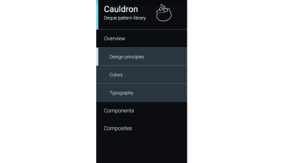
This idea is best illustrated with a literal example, so let’s take a look at our 2-tier, vertical navigation from Cauldron.
- Go to https://pattern-library.dequelabs.com/;
- Hit Tab ⇥ three times. The first tab stop is the skip link (which we went over previously), the second is the logo which acts as “return to home” link, and the third tab enters the menu;
- Now that you are in the menu, use the arrow keys (→ and ↓) to move and open sections of the menu;
- Hitting Tab ⇥ at any point will exit you from the menu and send you to the content of the page.

Navigation menus can also work in conjunction with some of the previous topics such as shortcut/hotkey menus to make using the menu even more efficient.
Logical Focus Retention (I.E. Deleting Row, Returning Back To A Page)
Focus retention is very important. Most people are familiar, at least in concept, with focusing elements in their logical intended order on the page; however, it can get murky when an element or content changes/appears/disappears.
- Where does focus go when then field you are on is deleted?
- What about when you’re sent to another tab where the application has a new context?
- What about after a modal is closed due to a terminal action like SAVE?
For a sighted user there are visual cues which can inform them of what happened.
Here’s an example: You have an Edit Recipe modal which lets your user add and remove any ingredients. There is one ingredient field with an “Add another ingredient” button below it. (Yes, it’s styled as a link but that’s a topic for another day.) Your focus is on the button. You click the button and a new field appears between the button and the first field. Where should the focus go? Most likely your user added another ingredient to engage with it so the focus should shift from the button into the newly added field.
See the Pen focus retention by Harris Schneiderman.
The big takeaway from all this isn’t so much the specific examples but the mentality which supports them — consider the UX for your application through the lens of the KO/AT user as well sighted, mouse-only user. Some of the best and most clever ideas come from the most interesting and important challenges.
If you need help ensuring that your features are accessible, all of the examples above plus countless more can be tested using Deque’s free web accessibility testing application: axe pro. It’s free and you can sign up here.
 (ra, il)
Articles on Smashing Magazine — For Web Designers And Developers
