Re-Branding and Re-Design – For Better or For Worse
Re-branding is challenging and tricky. It may only seem that slightly enhancing the logotype can’t do harm, in fact even tiny corrections can push customers away. We are people of habit and changes scare us. Considering this, not every company is brave enough to risk its time-proven widely-known face.
Take a look at some of the Goliaths of the industry: Coca-Cola, Adidas, Chanel have not drastically changed their traditional elements of brand identity such as logotypes, typography or coloring for ages. And they still rock. What actually demands the modifications and upgrades are their websites and mobile applications.
Re-designing is quite another matter. It is a normal event. Society frequently generates new requirements, and corporations need to keep up with the rest to stay afloat. Sites that are occasionally improved are more likely to hit their targeted audience and convert casual users into regular ones.
However, there is always room for perfection. And even the best ones can be enhanced by some clever guys. To prove this in practice, we have amassed a collection of fresh and original redesign concepts that were created by the talented folks from the Behance community.
You will find revamped versions of the most popular websites and platforms including YouTube, Wikipedia, Facebook, Twitter and others. Do these solutions look better or worse than the original ones? It is for you to decide. Share with us your thoughts.
Re-designed website concepts
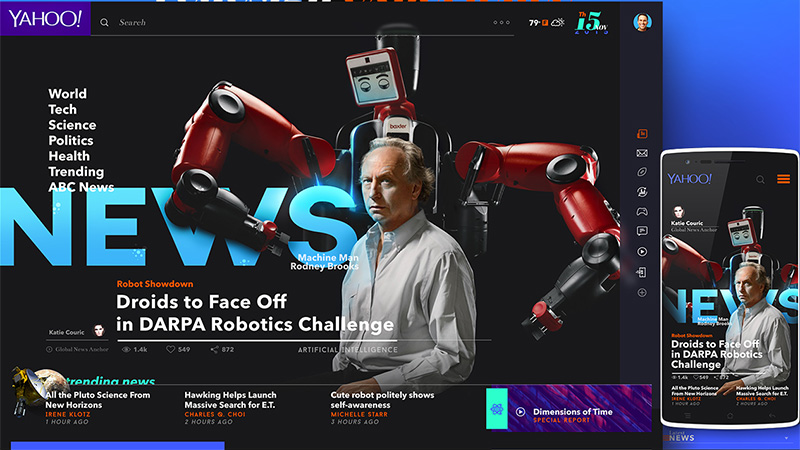
Yahoo! News Redesign Experience by Josué Solano
The artist offers a more sophisticated and polished design. The page strikes a balance between multimedia and text, neatly putting content above everything. Dark coloring provides a good contrast to graphics as well as gives images greater focus.
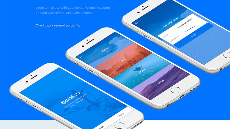
Mail.ru application redesign concept by Zhenya Rynzhuk and Artem Golubtsov
This productive collaboration resulted in a beautiful, well-balanced and properly organized theme. Each screen looks elegant, chic and stylish. Although there is a ton of impressive visuals, the UI does not overwhelm visitors at all.
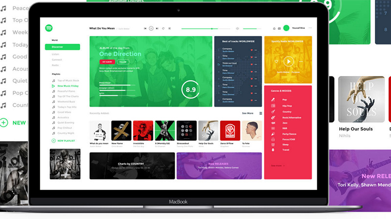
Spotify – Redesign Application
Spotify — Redesign Application by Youssef Rina has a wonderful, bright and refreshing appearance. The home page is based on a card concept that treats content pretty well. The smart color palette plays a significant role: it naturally separates functional blocks one from another and establishes a friendly atmosphere.
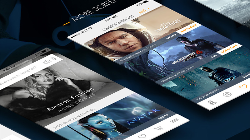
Amazon Redesign by Ömer Ercan
The author achieves the harmony between the multimedia and contextual data. Classic horizontal stripe layout paired with solid blocks with information and sharp, clear graphics creates order out of chaos and supplies users with a pleasant experience.
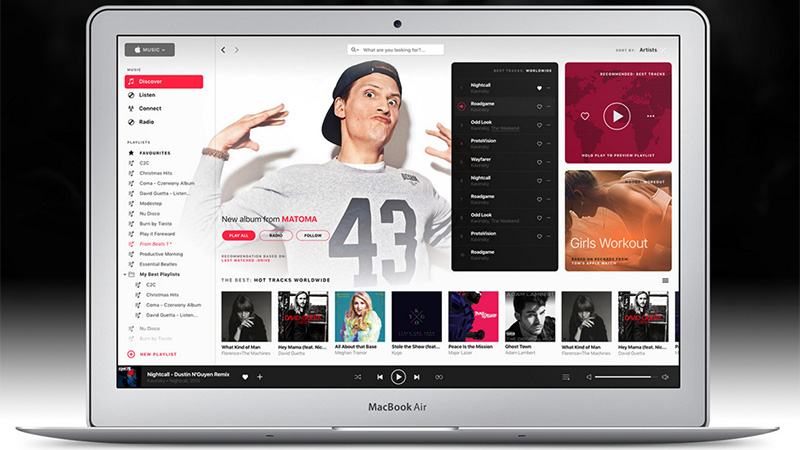
Apple Music Redesign concept by Tom Koszyk
Much like the Spotify concept, this one gets its beauty from the cleverly adapted card design and carefully chosen coloring. The time proven block model does all the heavy lifting, efficiently organizing the multimedia.
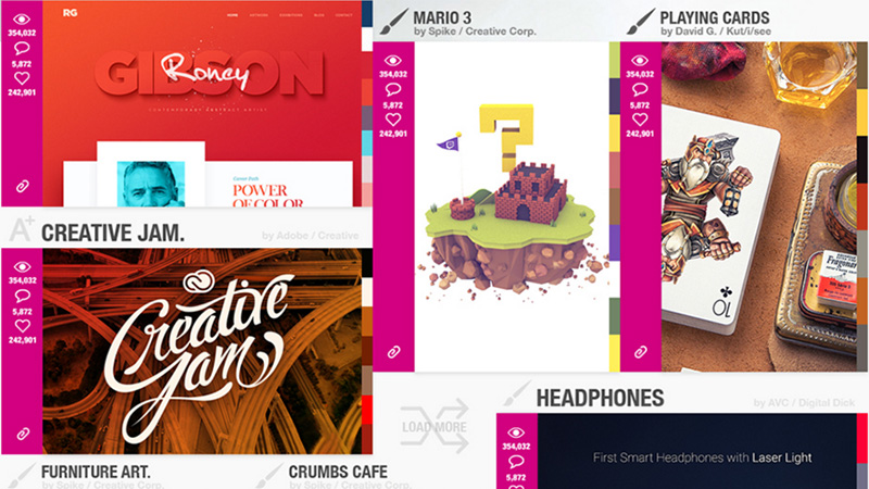
Dribbble Redesign
Dribbble Redesign by Atuka Kelbakiani has a juicy appearance. Not only does the artist save the brand coloring, but also makes the project radiate artistry and creativity inherent to the famous gallery. Each screen includes only the vital information and unobtrusively puts emphasis on the works.
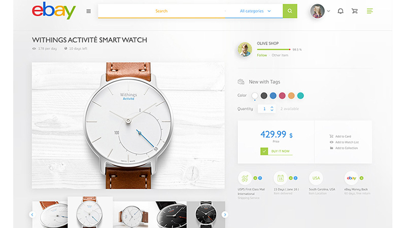
Ebay Redesign
Ebay Redesign by Tintin s. exudes an image of stylishness, refinement, and finesse. While the actual design of the online auction platform evokes quite mixed feelings since it is overloaded with products and ads, this fresh take on a frontend magnetizes with an incredibly clean and organized appearance.
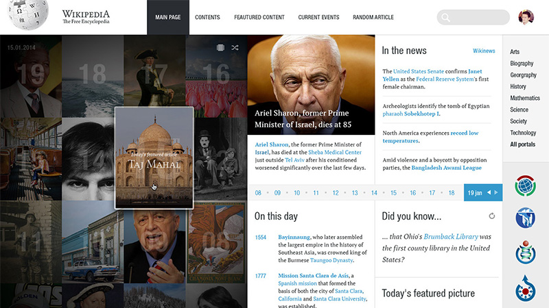
Wikipedia Redesign Concept
George Kvasnikov has rethought and brought fresh air into the main page. He showcases revamped versions of the grid view and cover view. The clean layout in tandem with sharp typography improves the readability of the project, letting online visitors enjoy the content.
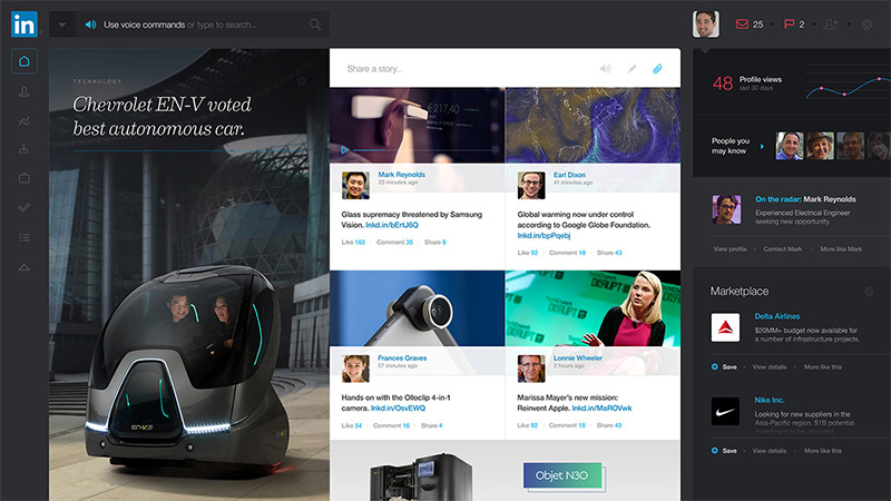
LinkedIn Redesign
LinkedIn Redesign by Flavio Argemi embraces the power of dark coloring. The latter helps the content to stand out from the background and naturally draws the attention. The reinvented homepage has managed to cover lots of data and at the same time remain tidy and handy to navigate.
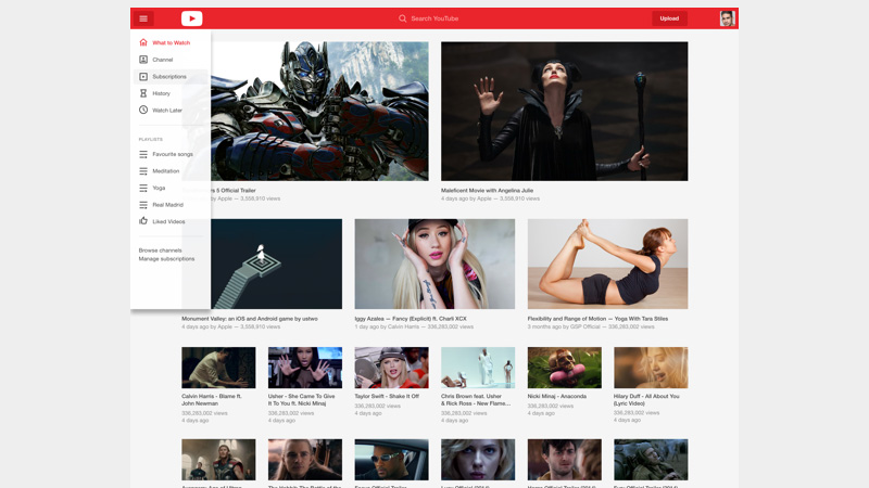
YouTube Redesign
Roland Hidvegi presents a whole case study. You will find here numerous reimagined UI components: homepage, navigation, iconography, and others. The artist sticks to brand coloring as well as makes an excellent use of white space. He demonstrates website and versions for tablets and mobiles.
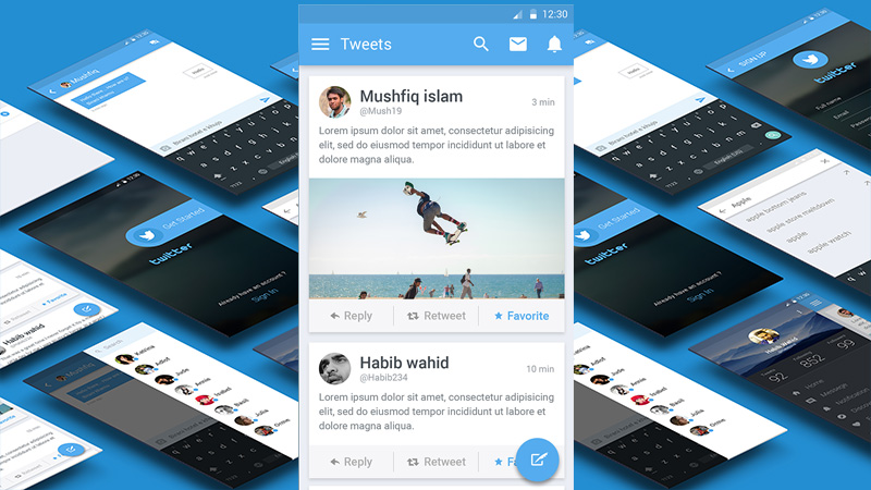
Twitter Redesign by Mumtahina Nity
The author equips a mobile application with an elegant, stylish and pretty bright facelift. Everything is made with Material Design in mind, so that here you will find flat graphics, floating action button, sharp, legible typography, the proper balance between content and visuals and much more.
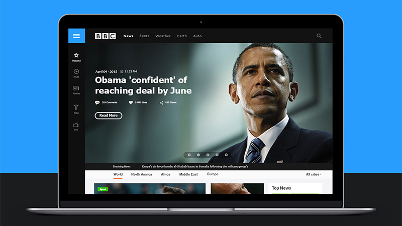
BBC Concept Redesign
BBC Concept redesign by Baraa Bilal looks strong and polished. Black and white coloring enriched with the soft blue set the tone to be businesslike. Iconography is pixel-perfect. The layout is conventional, yet it plays quite well here.
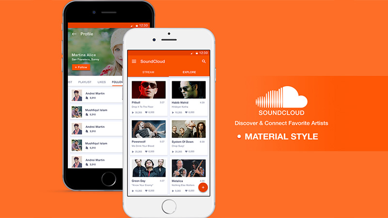
SoundCloud Redesign
SoundCloud Redesign by Sultan Mahmud is powered with some cutting-edge features taken from Material Design. The screens deliver a favorable impression and save users from getting lost in a bunch of multimedia data.
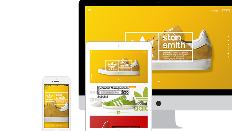
Adidas – Redesign
Adidas – Redesign by Nugraha Jati Utama speaks completely through the visuals. The front page heavily relies on incredible photos of products. Vibrant coloring and geometric touches complement the renderings and achieve a wonderful aesthetic.
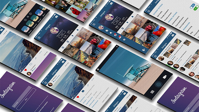
Instagram Redesign
Instagram redesign by Andrej Potyomin is centered around the images and galleries of images. Gorgeous gradients, elegant slide-out sidebars, solid iconography, ghost buttons and beautiful typography are the main building bricks of the UI.
Forbes Concept Redesign
Forbes Concept redesign by Ruslan Siiz keeps things simple and natural. The homepage is well-organized, and the content is correctly systematized. The concept is bolstered by the modular system that puts everything in its place. Dark coloring strengthens the impact and contributes to readability.
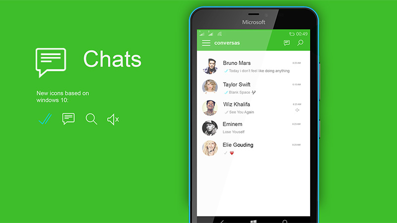
Concept WhatsApp by uell_ palma
Inspired by Windows 10 and Material Design principles, the artist has managed to come up with such an outstanding facelift. Bright two-tone coloring creates a refreshing aesthetic. Iconography and typography improve readability, allowing users to quickly scan the content.
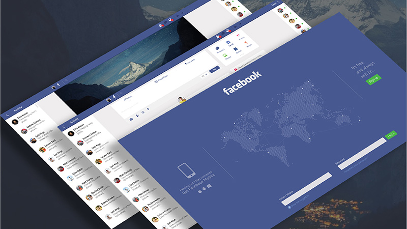
Facebook Redesign
Narayan Karthik organizes data without adding complexity. The front end feels open, friendly, natural and coherent. The artist delineates the content and supplies functional blocks with the extra fresh air.
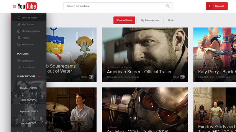
YouTube by Lucas Nonato
The interface is built upon four main components: three-column layout, slide-out sidebar, solid bright graphics and a generous amount of whitespace. Thus, the homepage covers multimedia with ease and still provides users with handy navigation through the project.
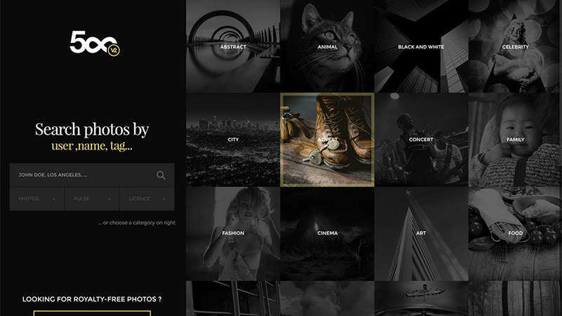
500px Redesign Concept
500px redesign concept by Jaja Design shows equilibrium between a ton of images and text. The dark palette brings to the scene a subtle sense of sophistication and chic. The artist skillfully intensifies the selected image through displaying the thumbnail in color.
Conclusion
While redesigns as a rule always remain concepts, it is nice to experience projects that were smartened and improved by people from outside. Some of them are enhanced regarding functionality while others just feature a more stylish and polished look. Nevertheless, all of them comply with brand identity that is vital in achieving a successful redesign.
What do you think about these concepts? Which one is the most worthy candidate to compete against the current UI?
