Monthly Web Development Update 8/2018: The Cost Of JavaScript, Ethics In Open Source, And QUIC
Monthly Web Development Update 8/2018: The Cost Of JavaScript, Ethics In Open Source, And QUIC
Anselm Hannemann
Building technology and software has become a very responsible job. People trust the products we create, and they can have a significant impact on their lives, too. Considering this, we not only need to think about inclusive solutions, but also stand up and advocate for ethics, reliability, and security. It’s a position that gives us power.
Eric Meyer published an article elaborating the problems which an HTTPS-only web is bringing along. In it, he reveals that developing countries suffer a lot from this development as they often have bad internet connections and, due to the encryption, they now experience more website errors than before. Ben Werdmüller jumped in and published the article “Stop building for San Francisco” in which he points out one of the biggest problems we have as developers: We use privileged hardware and infrastructure. We build experiences using the latest iPhones, Macbooks with Gigabit or fast 4G connections but never consider that most people we’re building for use devices and infrastructures that are far from being that well-equipped. Making the web more secure is a great idea, beyond question, but we should also keep in mind the consequences that the latest tech and our design decisions might have for others.
Developers have been asking a lot about Safari’s Intelligent Tracking Prevention (ITP) and how to debug websites with it enabled. Now the WebKit team shares the ITP Debug Mode which gives you a lot more flexibility and tools to track down issues.
The latest version of Chrome (68) brings a new “not secure” notification when visiting HTTP pages. Be aware of this and upgrade your sites accordingly. Also new in Chrome 68 are the new Page Lifecycle API, a great new API for page events, as well as the Payment Handler API. HTTP cache is now ignored when requesting updates to a service worker, bringing Chrome in line with the spec and other browsers. Apart from that, the cursor values grab and grabbing are now unprefixed in the new version — finally.
General
If you’re building for Open Source, you need to decide which license your project should use. Now there’s a new option, the Just World License. It’s for developers who “agree in general with the principles of open source software but are uncomfortable with their software being used as part of efforts to destroy lives, our environment and our future”.
Ethics for Design is a project where twelve designers and researchers from eight European cities discuss the, sometimes harmful, impact of design on our societies and what designers can do to work for the good of all and not just a few.
Tooling
Prashant Palikhe wrote a long story about the art of debugging with Chrome’s Developer Tools, which I can highly recommend as it’s a very complete reference to get to know the developer tools of a browser. If you use another browser, that’s not a big problem as most tools are quite similar.
WebP is an image format with a couple of nice features and likely one of the best-known new formats besides the common JPEG/PNG ones. However, creating WebP images can still be a challenge, so Jeremy Wagner wrote a guide on how to convert images to WebP.
Many of us are addicted to communication tools like Slack. The folks from Wildbit decided to shut down Slack for a week — with a significant effect on how they work. An interesting case study about how we tend to get too comfortable with a useful tool and don’t use it as we should anymore. From time to time, it’s important to reset our minds.
Dennis Reimann published the first stable version of UIEngine, a workbench for UI-driven development.
Security
A new Observer is around: The ReportingObserver API lets you know when your site uses a deprecated API or runs into a browser intervention. So far, it’s available in Chrome 69. You could easily use this to send errors that previously were only available in the Console to your backend or error handling service.
Web Performance
Do you remember QUIC (Quick UDP Internet Connections)? The protocol engineered by Google that they use internally and that is shaping up quite well for larger use? While the IETF is currently standardizing the format towards the end of the year, Cloudflare engineers now share their experience from testing it.
A QUIC handshake only takes a single round-trip between client and server to complete, whereas TCP and TLS usually need two. (Image source)
Dave Rupert shares the A11Y Nutrition Cards, a project that attempts to digest and simplify the accessibility expectations when it comes to component authoring.
One year after they introduced their Progressive Web App, Zack Argyle from the Pinterest engineering team takes a look back. It’s important to note why they decided to build a PWA: “Our mobile web experience for people in low-bandwidth environments and limited data plans was not good”. But the results for them are amazing to see.
Philip Walton introduces the new Page Lifecycle API which helps us determine page states in the browser more easily via events, such as the page being in the background (not visible), active, frozen or even terminated.
Addy Osmani researched the cost of JavaScript in 2018 and now shares evidence that every byte of JavaScript is still the most expensive resource we can send to mobile phones because it can delay interactivity significantly. This is a problem especially for not so capable phones that are widely used outside the tech industry.
What’s the real cost of JavaScript? One of the findings from Addy Osmani’s research: It takes a low-end 2018 phone 32 seconds longer than an iPhone 8 to process JavaScript for CNN.com. (Image source)
Paris Marx wrote about why he thinks digital nomads are not the future. He argues that location independence is only possible because of communication infrastructures built with public funds and that it’s not fair to abuse them.
It’s not the first time a company is testing a 4-day workweek. However, it’s great to see how the concept can be established successfully and with benefits for both — the employees and the work done.
Jeremy Nagel makes us think about the impact of our open-source code: As developers we tend to believe that making our code freely available is an amazing move but we forget that we make it available to bad players as well — to coal miners, to pollution-contributing companies, to those who use people to get rich while mistreating them, to those who rip you off indirectly. It’s not that you can’t do anything about it; you have to be aware of these issues and apply a better license or add a dedicated statement to your code.
India has a big plastic waste problem. Since a couple of months, a couple of fishers don’t ignore the plastic problem anymore but collect all the waste in their nets instead, and bring it back to the shore where it’s used to build roads. A great idea of making use of trash efficiently.
A couple of years ago, Google announced a new mobile-first initiative it wanted web designers and marketers to pick up on. This was our introduction to micro-moments.
These are not to be confused with micro-interactions, which are miniscule engagements websites have with visitors when they “touch” key points of the interface. A mouse changes its appearance when a user hovers over a clickable element. A display error appears after a field is incorrectly populated. A checkbox briefly enlarges and changes color after it’s been ticked off. These are micro-interactions.
Basically, these are four key moments in every consumer’s life when they decide to pick up their mobile device for a specific purpose. As such, it’s your job to know how to specifically design for these micro-moments.
When a visitor arrives at a mobile website (or app), they’ve come with a clear motivation:
“I want to know.”
“I want to go.”
“I want to do.”
“I want to buy.”
Seems pretty simple, right? However, as Google launched this initiative a couple of years ago, its had time to quietly observe users in these micro-moments as well as the websites that have most aptly responded to them. As you will soon see, consumers have incredibly high expectations for what the mobile web can do for them. Basically, they want you to be a mind reader and anticipate their every need (and even their location) without them having to say a word.
Is that intimidating? It shouldn’t be. You already have all the information you’d ever need to answer that question.
Here is how you should be designing your mobile website to respond to and draw in consumers as they experience these micro-moments:
1. Start With The Data
Google Analytics will help you decipher where they’re spending the most time productively on your website.
Once you know where exactly visitors see the greatest value in your product, you can then turn to third-party tools like Answer the Public to give you some insights into what relevant questions your users may be asking about you.
Ultimately, this data needs to tell you all about your customers’ journey before they ever reach you. What exactly was the question that triggered them to pick up their smartphone and do that search? If you can identify those micro-moments, you can start using various design elements to respond to these questions.
People are searching at the exact moment they need something and are looking for places that can meet their immediate need. In other words, when making these on-the-spot decisions, they are more loyal to their need than to any particular place.
Although we’ve heard a lot about customer loyalty to brands in the past, it’s interesting to get Google’s take on this matter.
While consumers may indeed still remain loyal to brands that take very good care of them and produce a high-quality product nearly 100% of the time, this opportunity to steal attention from those customers in one of their micro-moments is real. Do that enough times and your brand and website could realistically win that customer over so long as you are there every time they go searching to fill that need.
One of the ways you can do this is by providing users with instant solutions. Is your business open now? Can you mail out that new product same-day? Will there be an open table at your restaurant tonight? Answer that immediately and you could find conversions increase dramatically.
The top of the Delaware State Fair home page gives users easy access to everything they want to know and do. (Source: Delaware State Fair) (Large preview)
Look at the top of the homepage. There are the dates of the fair, which probably answer one of the most commonly searched questions. There is a link to the concert lineup as well as calendar, which answers anything people would want to know about special events they might want to go to. And then there’s a button to buy tickets right away. It’s all right there.
Office Depot is a company that also explicitly addresses immediate needs:
The Office Depot mobile site uses a variety of time-driven design elements to satisfy visitors’ needs. (Source: Office Depot) (Large preview)
As you can see in the example above, Office Depot uses a number of design tactics and elements to play into this need for immediacy.
There is a search bar at the very top. Consumers don’t have to even bother with navigation or scrolling through pages if they don’t want to/have the time to.
You’ll also see that the closest store’s hours are posted and boldly tell me how quickly I can have any products available in store.
Finally, you have the promotional categories for upcoming needs for parents that are about to send kids back to school.
Another website is Universal Studios Orlando; it does a great job sparing mobile users the trouble of sifting through irrelevant information and instead gets them to exactly what they need:
Universal Studios includes immediate options for research and booking on the home page and navigation. (Source: Universal Studios) (Large preview)
Aside from a single banner at the top of the home page, the Universal Studios website design gives visitors exactly what they want right away. The navigation includes only the most pertinent links to information and booking as does this succinct section on the home page. There’s really no time to waste when the options are so clear.
And here is one final example of a website that deals in immediacy, albeit with a more subtle design technique: Nordstrom:
Nordstrom appeals to immediacy with this one subtle trick. (Source: Nordstrom) (Large preview)
As you can see, this is a pretty typical e-commerce product page. However, there’s one key difference: Nordstrom is subtly calling attention to its Anniversary Sale and the main reason why there is a significant price drop for this purchase. Rather than use an obtrusive pop-up to announce the sale and pester users to shop, it’s made the price change directly on the page and drawn attention to it with the highlighted text.
Not only have mobile searches for ‘best’ grown over 80% in the past two years, but searches for ‘best’ have shown higher growth among ‘low-consideration’ products than ‘high-consideration’ products. In other words, we’re all becoming research-obsessed, even about the small stuff.
We understand that the opinions of family, friends, and colleagues matter greatly in the minds of consumers. But as more and more of them to turn the web to make their purchases, it means being open to trusting other opinions online as well — ones that may be more conveniently expressed from a company’s website, from an influencer’s blog, or from social media.
Wherever those words of wisdom happen to come from, it’s important to take Google’s research to heart. With so many consumers now obsessed with this idea of having the best of everything and being able to get it in a pinch, your website needs to be the answer to that question.
But that’s the tricky part. According to Google, it’s not as simple as being a dog food manufacturer and configuring your site to be the answer to:
“Best Dog Food”
Consumers experience these micro-moments at a granular level. Sure, there may be some who think, “What is the best dog food?” But isn’t it more likely that question would be more specific in nature? For instance:
Best puppy food?
Best grain-free dog food?
Best vegan dog food?
Let’s take a look at Google, for example. Here’s a variety of searches for a singular “best of” concept:
Example of the variety in “Best” searches in Google. (Source: Google) (Large preview)
As you can see, it goes beyond the basic questions. Through your design and your content, you must be ready to answer the most relevant questions your users have about your product or service.
With content, you’ll be able to answer many of the “I want to know” questions that are related to the brand with things like:
Informational pages regarding services and products.
Whitepapers, ebooks, case studies, reports, and other long-form content that provide heavily researched answers on related matters.
Blog posts, vlogs, podcasts, and other shorter content that can dabble more in appealing to the emotions of consumers.
Tutorials and guides that directly answer questions that consumers are asking.
As far as the design piece is concerned, it’s your responsibility to highlight these pages, so visitors don’t have to dig through various parts or layers of the site (like the footer or secondary navigation) to find their answers.
Google told them it was here, so it’s your job to get them right to it.
The navigation will play a big part in this, as evidenced by Globus Journeys:
As you can see in this example, Globus Journeys answers many of those micro-moments right within the navigation: tips on touring (Touring 101), tips on travel best practices (Travel Tips), deals available for travel (Deals & Offers), etc.
Another way to use navigational design to inform visitors on what they’ll learn/know from this experience can take place on the blog. Salesforce has an interesting example of this:
There is the standard navigation for the Salesforce website, and then there is the navigation that’s specific to the Salesforce blog. This gives you — as the designer and planner of the site’s layout — a chance to better and more clearly organize content found within it. So, when visitors show up and want to know tips specific to one of those categories, it doesn’t require random searches or (even worse) endless scrolling through a full blog feed.
Another way you can more quickly and thoroughly inform visitors on topics of interest to them is by using strategically placed sections within blog posts.
While you likely won’t have anything to do with the writing of a website’s blog content, you will have control over its layout and formatting. The first thing you can do to expedite the knowledge acquisition process is by using callouts to detail and link to the various sections covered on the page as Be Brain Fit does:
Be Brain Fit calls out a linkable index of topics from the blog post. (Source: Be Brain Fit) (Large preview)
Of course, the post itself is easy to scan, so readers could guide themselves to the most relevant parts. However, by placing this towards the top of the piece, you’re enabling them to get right to the information they seek.
I’m also going to suggest that pop-ups would be helpful in this matter.
Fit Small Business not only provides all the information needed, but also offers an alternative solution to what they seek. (Source: Fit Small Business) (Large preview)
I encountered this blog post after doing a search for the best way to create a Facebook page. This was one of the links on the first SERP. I was actually quite pleased with the post as a whole. It broke it up into easy-to-follow steps, attractive and informative visuals, and got me the answer I needed.
However, I was especially pleased to see the bottom banner pop-up after I finished getting through the post. Not only has Fit Small Business attempted to reach its audience by providing helpful content, but it’s also providing an alternative solution to anyone who got here and realized, “Eh, I really don’t want to bother with this on my own.”
Looking for something nearby — a coffee shop, noodle restaurant, shoe store — is one of the most common searches we do. In fact, nearly one-third of all mobile searches are related to location.
Here’s the thing though: users aren’t using “near me” qualifiers as much anymore.
Google demonstrates how location qualifiers are decreasing in use. (Source: Google) (Large preview)
According to Google, this is because many consumers now assume that search engines, websites, and mobile apps are tracking this sort of information already. They expect that if they search for something like “dog food,” Google will automatically serve them the most relevant results — and that includes taking into account location proximity.
In Google’s research, it found that about two-thirds of mobile consumers are more likely to buy something from a website or app if information is geographically personalized. There are a plethora of ways to communicate this local-friendliness to visitors — through the copy, through various design elements, and even photos.
Google is a pioneer in this space and so I want to give it a special shout-out in this section for what it does with search results:
Google’s auto-populated search results aren’t just for Google. (Source: Google) (Large preview)
The biggest thing to take away from here is the fact that Google provides its users with auto-populated search recommendations. These are based on the users’ geography, behavior, history, as well as what Google knows about the query itself. As you can see here, it expands on Baltimore to provide more specific results based on the area of the city in which the user wants to drink.
With AI-assisted search functionality, any website can offer this same level of smart search for its users.
Of course, you first need to get access to visitors’ geographic data before you can provide them with these kinds of smart and geographically relevant results. One way to do this is to require them to sign in and fill out a profile with these details. Another way, however, is by serving them with this geotargeting request as Best Buy has done:
Best Buy requests for access to users’ geographic location. (Source: Best Buy) (Large preview)
Once you have access to a visitors’ current location, however, you can start providing them with information that helps them with the “I want to go”, “I want to do”, and the “I want to buy” micro-moments that caused them to reach for the phone in the first place.
Here is what the Best Buy website shows me after I granted it permission:
Best Buy uses its visitors’ location to provide helpful in-store visit details. (Source: Best Buy) (Large preview)
The top of the page now displays the nearest location to me as well as opening hours. As I peruse the rest of the site, I will receive relevant information regarding in-store product availability, buy-online-pick-up-in-store options, and so on. This is a really great option for businesses with a sales website and brick-and-mortar location that want to merge the two experiences.
You could also benefit from using this on websites that offer services, appointments, and reservations. Here is an example of what The Palm Restaurant does with my information:
To start, it uses my information to let me know right away if there even is a location close to me. Philadelphia isn’t too far, but it’s still nice to have the address fully displayed so I can make up my mind about whether I want to dine there. And, if I do, I can choose the “Reservations” button above it.
What’s especially nice about this is that the reservation form is pre-populated:
As you can see, it’s used a mixture of my geographic location along with the most popular reservation types (i.e. two people at 7 p.m.) to pre-populate the form. This saves me, as the user, time in filling it out and making my reservation.
Every day, people are becoming more reliant on their smartphones to help make last-minute purchases or spur-of-the-moment decisions. In fact, smartphone users are 50% more likely to expect to purchase something immediately while using their smartphone compared to a year ago.
Recently, I wrote a post about what you need to know to increase mobile checkout conversions. The underlying message was that mobile consumers have certain expectations that need to be met if you intend on converting them there (as opposed to switching back to desktop).
Convenience in getting the information they want is one of them.
Speed in getting to and through checkout is another.
Handling their contact and payment information securely is the final piece.
Clearly, web designers are doing something right as over half of smartphone users reach for their phone to buy something and subsequently do. But it can’t stop with the 10 tips offered in that article. You need to be able to predict what they’re going to purchase and what exactly they want to do when you catch them in those exact micro-moments.
UPack includes a price quote form at the very top of the website. (Source: UPack) (Large preview)
At the very top of every page is a short price quote form that asks only the most pertinent details they need in order to provide a quote to interested customers. By anticipating that’s what they’re looking to do when they visit a moving company’s website, UPack likely experiences very high conversion rates.
However, if someone should arrive at this form and wonder, “Should I even bother with a quote from UPack?”, they’ve provided an answer to that on the next step down on the home page:
UPack uses an explainer graphic to sell the value of its service right away. (Source: UPack) (Large preview)
This explainer graphic is simple. It includes four points and shows how exactly someone uses the UPack service to move their home from one destination to another. When someone arrives there with the intention of getting help with their move, UPack has already made it all the more simple in just one scroll and two panels of the home page.
Then, you have a company like HostGator that doesn’t waste any time at all:
HostGator’s home page includes smart design callouts that sum up its services. (Source: HostGator) (Large preview)
If someone shows up on a web hosting company’s website — especially one that is well known as they are — of course they know what they want to do. Now, they could hop into the navigation and dig deeper into the various hosting plans (which some may do). However, HostGator is probably hoping to appeal to two specific audiences with these “Buy Now!” callouts on the home page:
The web developer who knows exactly which plan he or she needs, and doesn’t need a full page to explain the benefits to him.
The small business owner who doesn’t know a thing about web hosting, but trusts HostGator’s good name and just wants to get their web hosting purchases ASAP.
This is a really good choice of design techniques if you know that a good portion of your audience will be immediately ready to buy upon entering the site. If they don’t have to click through to another site, don’t make them do it.
And, of course, CTAs, in general, are an important element to use when designing for micro-moments. When they’re designed well — colorful, large, well-labeled — you’re essentially giving your users a shortcut to conversion.
BarkBox uses a number of these right on its home page:
BarkBox has a number of CTA shortcuts available on its website. (Source: BarkBox) (Large preview)
Since the brand is particularly well-known among dog owners, this is a good move. While there are some people who enjoy scrolling through the site to see the funny dog pictures and find out more about what’s in this month’s BarkBox, if they’ve arrived here on mobile, they shouldn’t have to wait to subscribe. BarkBox provides those shortcuts in a number of locations, ensuring there’s no friction between its customers and their goals.
Wrapping Up
It’s pretty amazing to watch the web change so quickly as consumers become more trusting of their mobile devices. Now, nearly two years after Google first began recommending that we design with micro-moments in mind, it appears that these suggestions have really paid off.
Designing for micro-moments gives us the opportunity to more effectively reach consumers in their moment of need. This, consequently, means reaching consumers who are in a more purchase-intent mindset as opposed to ones casually browsing the web. If you can use your data and design to actively reach consumers in their micro-moments, you can effectively increase your mobile site’s conversion rate in the years to come.
Scroll bouncing (also sometimes referred to as scroll ‘rubber-banding’, or ‘elastic scrolling’) is often used to refer to the effect you see when you scroll to the very top of a page or HTML element, or to the bottom of a page or element, on a device using a touchscreen or a trackpad, and empty space can be seen for a moment before the element or page springs back and aligns itself back to its top/bottom (when you release your touch/fingers). You can see a similar effect happen in CSS scroll-snapping between elements.
However, this article focuses on scroll bouncing when you scroll to the very top or very bottom of a web page. In other words, when the scrollport has reached its scroll boundary.
Collecting Data, The Powerful Way
Did you know that CSS can be used for collecting statistics? Indeed, there’s even a CSS-only approach for tracking UI interactions using Google Analytics. Read article →
A good understanding of scroll bouncing is very useful as it will help you to decide how you build your websites and how you want the page to scroll.
Scroll bouncing is undesirable if you don’t want to see fixed elements on a page move. Some examples include: when you want a header or footer to be fixed in a certain position, or if you want any other element such as a menu to be fixed, or if you want the page to scroll-snap at certain positions on scroll and you do not want any additional scrolling to occur at the very top or bottom of the page which will confuse visitors to your website. This article will propose some solutions to the problems faced when dealing with scroll bouncing at the very top or bottom of a web page.
My First Encounter With The Effect
I first noticed this effect when I was updating a website that I built a long time ago. You can view the website here. The footer at the bottom of the page was supposed to be fixed in its position at the bottom of the page and not move at all. At the same time, you were supposed to be able to scroll up and down through the main contents of the page. Ideally, it would work like this:
Scroll bouncing in Firefox on macOS. (Large preview)
It currently works this way in Firefox or on any browser on a device without a touchscreen or trackpad. However, at that time, I was using Chrome on a MacBook. I was scrolling to the bottom of the page using a trackpad when I discovered that my website was not working correctly. You can see what happened here:
Oh no! This was not what was supposed to happen! I had set the footer’s position to be at the bottom of the page by setting its CSS position property to have a value of fixed. This is also a good time to revisit what position: fixed; is. According to the CSS 2.1 Specification, when a “box” (in this case, the dark blue footer) is fixed, it is “fixed with respect to the viewport and does not move when scrolled.” What this means is that the footer was not supposed to move when you scroll up and down the page. This was what worried me when I saw what was happening on Chrome.
To make this article more complete, I’ll show you how the page scrolls on both Mobile Edge, Mobile Safari and Desktop Safari below. This is different to what happens in scrolling on Firefox and Chrome. I hope this gives you a better understanding of how the exact same code currently works in different ways. It is currently a challenge to develop scrolling that works in the same way across different web browsers.
Scroll bouncing in Safari on macOS. A similar effect can be seen for Edge and Safari on iOS. (Large preview)
Searching For A Solution
One of my first thoughts was that there would be an easy and a quick way to fix this issue on all browsers. What this means is that I thought that I could find a solution that would take a few lines of CSS code and that no JavaScript would be involved. Therefore, one of the first things I did, was to try to achieve this. The browsers I used for testing included Chrome, Firefox and Safari on macOS and Windows 10, and Edge and Safari on iOS. The versions of these browsers were the latest at the time of writing this article (2018).
HTML And CSS Only Solutions
Absolute And Relative Positioning
One of the first things I tried, was to use absolute and relative positioning to position the footer because I was used to building footers like this. The idea would be to set my web page to 100% height so that the footer is always at the bottom of the page with a fixed height, whilst the content takes up 100% minus the height of the footer and you can scroll through that. Alternatively, you can set a padding-bottom instead of using calc and set the body-container height to 100% so that the contents of the application do not overlap with the footer. The CSS code looked something like this:
This solution works in almost the same way as the original solution (which was just position: fixed;). One advantage of this solution compared to that is that the scroll is not for the entire page, but for just the contents of the page without the footer. The biggest problem with this method is that on Mobile Safari, both the footer and the contents of the application move at the same time. This makes this approach very problematic when scrolling quickly:
Absolute and Relative Positioning.
Another effect that I did not want was difficult to notice at first, and I only realized that it was happening after trying out more solutions. This was that it was slightly slower to scroll through the contents of my application. Because we are setting our scroll container’s height to 100% of itself, this hinders flick/momentum-based scrolling on iOS. If that 100% height is shorter (for example, when a 100% height of 2000px becomes a 100% height of 900px), the momentum-based scrolling gets worse. Flick/momentum-based scrolling happens when you flick on the surface of a touchscreen with your fingers and the page scrolls by itself. In my case, I wanted momentum-based scrolling to occur so that users could scroll quickly, so I stayed away from solutions that set a height of 100%.
Other Attempts
One of the solutions suggested on the web, and that I tried to use on my code, is shown below as an example.
This code works on Chrome and Firefox on macOS the same way as the previous solution. An advantage of this method is that scroll is not restricted to 100% height, so momentum-based scrolling works properly. On Safari, however, the footer disappears:
On iOS Safari, the footer becomes shorter, and there is an extra transparent (or white) gap at the bottom. Also, the ability to scroll through the page is lost after you scroll to the very bottom. You can see the white gap below the footer here:
Shorter Footer on iOS Safari.
One interesting line of code you might see a lot is: -webkit-overflow-scrolling: touch;. The idea behind this is that it allows momentum-based scrolling for a given element. This property is described as “non-standard” and as “not on a standard track” in MDN documentation. It shows up as an “Invalid property value” under inspection in Firefox and Chrome, and it doesn’t appear as a property on Desktop Safari. I didn’t use this CSS property in the end.
To show another example of a solution you may encounter and a different outcome I found, I also tried the code below:
This actually works well across the different desktop browsers, momentum-based scrolling still works, and the footer is fixed at the bottom and does not move on desktop web browsers. Perhaps the most problematic part of this solution (and what makes it unique) is that, on iOS Safari the footer always shakes and distorts very slightly and you can see the content below it whenever you scroll.
Solutions With JavaScript
After trying out some initial solutions using just HTML and CSS, I gave some JavaScript solutions a try. I would like to add that this is something that I do not recommend you to do and would be better to avoid doing. From my experience, there are usually more elegant and concise solutions using just HTML and CSS. However, I had already spent a lot of time trying out the other solutions, I thought that it wouldn’t hurt to quickly see if there were some alternative solutions that used JavaScript.
Touch Events
One approach of solving the issue of scroll bouncing is by preventing the touchmove or touchstart events on the window or document. The idea behind this is that the touch events on the overall window are prevented, whilst the touch events on the content you want to scroll through are allowed. An example of code like this is shown below:
// Prevents window from moving on touch on older browsers. window.addEventListener('touchmove', function (event) { event.preventDefault() }, false) // Allows content to move on touch. document.querySelector('.body-container').addEventListener('touchmove', function (event) { event.stopPropagation() }, false)
I tried many variations of this code to try to get the scroll to work properly. Preventing touchmove on the window made no difference. Using document made no difference. I also tried to use both touchstart and touchmove to control the scrolling, but these two methods also made no difference. I learned that you can no longer call event.preventDefault() this way for performance reasons. You have to set the passive option to false in the event listener:
// Prevents window from moving on touch on newer browsers. window.addEventListener('touchmove', function (event) { event.preventDefault() }, {passive: false})
Libraries
You may come across a library called “iNoBounce” that was built to “stop your iOS webapp from bouncing around when scrolling.” One thing to note when using this library right now to solve the problem I’ve described in this article is that it needs you to use -webkit-overflow-scrolling. Another thing to note is that the more concise solution I ended up with (which is described later) does a similar thing as it on iOS. You can test this yourself by looking at the examples in its GitHub Repository, and comparing that to the solution I ended up with.
Overscroll Behavior
After trying out all of these solutions, I found out about the CSS property overscroll-behavior. The overscroll-behavior CSS property was implemented in Chrome 63 on December 2017, and in Firefox 59 on March 2018. This property, as described in MDN documentation, “allows you to control the browser’s scroll overflow behavior — what happens when the boundary of a scrolling area is reached.” This was the solution that I ended up using.
All I had to do was set overscroll-behavior to none in the body of my website and I could leave the footer’s position as fixed. Even though momentum-based scrolling applied to the whole page, rather than the contents without the footer, this solution was good enough for me and fulfilled all of my requirements at that point in time, and my footer no longer bounced unexpectedly on Chrome. It is perhaps useful to note that Edge has this property flagged as under development now. overscroll-behavior can be seen as an enhancement if browsers do not support it yet.
Conclusion
If you don’t want your fixed headers or footers to bounce around on your web pages, you can now use the overscroll-behavior CSS property.
Despite the fact that this solution works differently in different browsers (bouncing of the page content still happens on Safari and Edge, whereas on Firefox and Chrome it doesn’t), it will keep the header or footer fixed when you scroll to the very top or bottom of a website. It is a concise solution and on all the browsers tested, momentum-based scrolling still works, so you can scroll through a lot of page content very quickly. If you are building a fixed header or footer on your web page, you can begin to use this solution.
The Complete Anatomy Of The Gutenberg WordPress Editor
The Complete Anatomy Of The Gutenberg WordPress Editor
Manish Dudharejia
It seems that Gutenberg has been a term of controversy in the world of WordPress lately. Hailed as the most significant change to WordPress 5.0 this year, the Gutenberg editor has received a mixed response from web developers and regular folk alike. All of this chaos is making it difficult to see Gutenberg for what it really is. So, I’ll try to put some of the confusion to rest once and for all.
Named after Johannes Gutenberg, who invented the mechanical printing press, Gutenberg was introduced to the world by Matt Mullenweg at WordCamp Europe in 2017. In essence, Gutenberg is a new WordPress editor, with dozens of cutting-edge features. It simplifies website creation and editing for the average non-technical user.
It has earned several accolades, from “WordPress’s new publishing experience” to “the future of website creation”. Some skeptics think it is the nail in the coffin for WordPress. All this babble aside, Gutenberg is going to be way more than just an editor for WordPress (which I will discuss next).
It allows website creators to build a website using blocks, which are small drag-and-drop units. Thus, it replaces the current inconsistent and distracting customization process. It also enables HTML tags such as section and figure, outputting solid HTML. At the time of writing, Gutenberg is still a plugin. However, the community is planning to merge it with WordPress 5.0 this year.
2. More Than Just An Editor
Gutenberg is more than just an editor because it allows you to handle website content in customizable chunks or blocks. You don’t need to be fluent in HTML or write shortcodes. You can control a website’s entire layout (both back end and front end) from a single console.
This new editor attempts to combine the best features from both page-builder plugins such as Divi and Visual Composer, as well as do-it-yourself platforms such as Medium, Wix and Squarespace. So, just like those page-builder plugins, you can handle multi-column layouts through a single interface.
Does this spell the end of plugins such as Divi and Beaver Builder? That’s a topic for another post, but the short answer is no. Gutenberg is unlikely to replace those plugins completely. You can continue to use them even once Gutenberg becomes the default editor.
3. What Does Gutenberg Change In WordPress?
The sole purpose of the Gutenberg editor is to provide an alternative to the current open text editor, not to mention the difficult-to-remember shortcodes, with an agile and visual user interface (UI). So, unlike the current WordPress editor, you don’t have to:
import images, multimedia and approved files from the media library or add HTML shortcodes;
copy and paste links for embeds;
write shortcodes for specialized assets of different plugins;
create featured images to be added at the top of a post or page;
add excerpts for subheads;
add widgets for content on the side of a page.
In short, Gutenberg doesn’t change how WordPress functions. It does, however, change the way website owners (or creators) interact with it. Instead of a whole lot of shortcodes and meta boxes, you will be using simple blocks.
What Are Blocks?
Consider a block as the most basic (therefore, smallest) unit of the new editor. They will be the building blocks of WordPress 5.0. In other words, everything—including content, images, quotes, galleries, cover images, audio, video, headings, embeds, custom codes, paragraphs, separators and buttons—will turn into distinct blocks. Because you can drag and drop each block, identifying these items and placing them on the page becomes a lot easier.
4. Installing Gutenberg
You can download the latest version of Gutenberg directly from the WordPress repository. You can also search for it under “Add New” plugins in your WordPress dashboard. I would recommend installing it in your staging environment. However, you’ll need the latest version of WordPress (version 4.8 or later) to install the Gutenberg editor.
Sign into your WordPress admin dashboard.
Go to the Plugins menu on the left side of the dashboard.
Click “Plugins” to open the “Add New” menu.
Type “Gutenberg” in the search box, located in the top-left corner.
You will see the Gutenberg plugin in the results.
Click the “Install Now” button.
Click the “Activate” button to initiate the plugin.
Once installed and activated, Gutenberg will show an icon in the left menu bar. When you launch it for the first time, you will see a new sample post, titled “Gutenberg Demo.” You can practice on the demo post before creating your own.
Go to “Posts” in the left menu bar of your WordPress dashboard. The new post will launch in Gutenberg first. You can later edit it in both the classic editor and Gutenberg.
Go to the “Posts” menu, and hover the mouse over a saved post to see the option to choose between the two editors. Although the classic editor option is available for the time being, it will most likely be removed with the launch of WordPress 5.0.
You can also switch between the two editors when editing a post. Click on the dropdown menu in the upper-right corner to toggle between the visual editor mode and the text editor (i.e. code). Alternatively, you can also use the shortcut Ctrl + Shift + Alt + M to switch between editors.
This feature allows you to copy all content in the HTML version with just one click. You can open this feature in both editors by clicking on the dropdown menu in the upper-right corner of the dashboard.
“ The ‘Copy All Content’ tool in Gutenberg (Large preview)
E. Content Structures
This feature allows you to count the number of words in an entire post. You can also see the number of headings, paragraphs and blocks with just a click. Click the information icon (i) in the upper-left area.
This feature will come handy if you’re running a blog. When you turn this on in the document settings, that particular post will always appear on the front page of your blog. And just turn it off to remove it from the front page.
Making your post stick to the front page (Large preview)
I. Using Blocks
As mentioned, blocks are the fundamental unit of the new Gutenberg editor. To use Gutenberg efficiently, you need to understand how to use these blocks. I will cover the main blocks one by one. Click the plus (+) button next to the redo/undo option to open the blocks menu.
Common Blocks
Common blocks allow you to add the elements required to create a rich UI.
Paragraph The paragraph block comes with a few excellent features, such as custom font sizes, drop caps, background colors and text colors, among others. You are also able to add more CSS classes here.
Image This element comes with a new feature that allows you to toggle between gallery and image layouts. You also get more control over images because you can set particular size dimensions, percentage size ratios, and an alternative text description for each image.
As the name suggests, these blocks comprise all of the formatting tools.
Table Adding a table using custom HTML code was a tedious job. With the table block, however, the task is a lot easier. You are able to add and remove rows and columns of a table without coding.
Use your imagination to create a stunning layout using this block. Each element in this block comes with excellent features.
Button You can add buttons such as “Subscribe now” and “Buy now” using this block. It has different options, including alignment and font styles. You can also set the background color and shape of the button.
Columns (beta) Creating columns in the code-based editor is time-consuming and laborious. This block allows you to add text columns. You are able to add one to six columns in a single row.
These blocks allow you to add an archive, categories, the latest posts and the latest comments with just a click anywhere on the page. You are also able to adjust these elements without any coding.
Latest Post With this block element, you can show posts in a grid view or list view, organize them in categories, and order them alphabetically or according to publication date. You can also choose to display the publication date.
You can easily access any embeds using these blocks. Whether you want to add a YouTube or Twitter link, it’s super-easy and quick. All you need to do is paste the URL in the given blank space, and Gutenberg will embed the code for you. Here is an example of inserting a YouTube link:
Reusable blocks give developers improved usability. You can convert any block into a reusable block so that you can use it in a different location. You can edit the same and save it as a new reusable block again.
You can also see a preview of a reusable block. All reusable blocks are available under the “Shared Block” options. Most importantly, you can turn one back into a regular block anytime.
Under this option, you will see the most used blocks, for quick access. Alternatively, you can use the search box to find a block by name.
J. Edit Block
To edit any block, open the dropdown menu by clicking in the upper-right corner of the block. You will see different options, including to edit as HTML, duplicate and add to the reusable blocks.
Using this feature, you can insert a new block anytime. When you bring your mouse over a block, you will see a plus icon (+). Click it to insert a new block.
The Slash Autocomplete feature is available in Gutenberg 1.1.0 and later versions. Chances are you are already familiar with the similar feature in Slack. It was added to reduce the amount of pointing and clicking required to create new blocks.
When you open a new block, just press / (slash key) on your keyboard to select any of the autocomplete options. It works in the default paragraph block only, but it might become a part of other types of blocks in the future.
No technical skill is required to make a custom layout for a blog post or website. It works like Medium, so people looking for that kind of style and user-friendly editing experience will love it.
It allows you to create a consistent and advanced design without relying much on TinyMCE.
Furthermore, blocks are an excellent concept. They allow non-developers to intuitively craft complex layouts. If you are new to WordPress or have no knowledge of it whatsoever, you are still going to love it.
The Gutenberg editor itself works well on mobile (it’s responsive). Unlike its predecessor, it allows you to make quick edits on the go. In fact, mobile-savvy developers can manage to do more than just a few quick edits.
The increased screen space is proving to be a less distracting user experience for many developers.
Hardcore developers can still create customized reusable blocks using HTML5. So, it seems like a win-win for both geeks and non-technical users.
Cons
For the time being, there is no Markdown support in the beta version of the WordPress editor.
It still doesn’t support responsive columns. You will need to do some custom coding to make this feature responsive. So, using this feature on mobile isn’t an option right now.
The design layout options are inadequate at the moment.
Compatibility issues could be a significant concern for some WordPress users.
You get only partial support for meta boxes. For now, it only supports Yoast SEO. So, using most custom plugins in Gutenberg is not possible. However, developers are working hard to extend meta box support.
Backward compatibility is going to be a primary concern for most developers. It will destroy current plugins and themes, especially ones that require integration with TinyMCE.
7. Understanding Compatibility Issues
Despite its simplicity and agility, Gutenberg might not be everyone’s cup of tea. Most WordPress developers might find it difficult to work with, especially in the beginning. They will need to retrain their reflexes to get used to the new UX.
Owing to the backward-compatibility issue, you will need to update many plugins and themes to ensure they are fully compatible with the new editor.
For the time being, blocks are more focused on content. As a result, Gutenberg lacks precision and control over the layout of custom websites.
Shortcodes are replaced by shortcode blocks. However, you will still be able to add shortcodes from the widget block.
Meta boxes will be available under a new name and a new UI. Conflicting meta boxes are likely to lead to the classic editor, instead of Gutenberg, with an alert. While this system might prove helpful, some meta boxes will not be supported in Gutenberg.
Custom post types are supported and remain backward-compatible in Gutenberg.
You won’t be able to turn off Gutenberg once it is integrated in WordPress core. However, you can disable it using the official plugin anytime.
8. Gutenberg Is The Future
Contrary to popular opinion, Gutenberg is not a replacement for the current text editor. It is a new way to build websites. I like to think of it as Facebook for WordPress.
You don’t need to be a computer geek to publish things on Facebook or any other social media platform. Gutenberg is just a way to bring this simplicity and flexibility to WordPress, so that people don’t need to code in order to create and publish websites. That’s why I think it is going to be the future, not only for WordPress, but for the web in general.
Granted, Gutenberg has a long way to go. People (including me) have had issues with its implementation, but soon we will have Gutenberg-ready themes, plugins and tools surfacing everywhere. Nevertheless, you have to start somewhere. So, you might as well be a part of this change from the beginning.
9. Latest News And Further Resources
If you are interested in riding the Gutenberg train from the beginning, here are a few links to find the latest buzz. Keep in mind that none of these websites are officially endorsed by WordPress.
Whether you like it or not, Gutenberg is coming to WordPress 5.0. Do try to be a part of the ongoing discussion about it on the web. It will certainly help. In fact, while you’re at it, try to speed up the development process with your skills. Meanwhile, let me know if this post has shed some light on the topic. Drop your queries and suggestions in the comments section. I would love to keep the conversation going.
Everything You Need To Know About Alignment In Flexbox
Everything You Need To Know About Alignment In Flexbox
Rachel Andrew
In the first article of this series, I explained what happens when you declare display: flex on an element. This time we will take a look at the alignment properties, and how these work with Flexbox. If you have ever been confused about when to align and when to justify, I hope this article will make things clearer!
History Of Flexbox Alignment
For the entire history of CSS Layout, being able to properly align things on both axes seemed like it might truly be the hardest problem in web design. So the ability to properly align items and groups of items was for many of us the most exciting thing about Flexbox when it first started to show up in browsers. Alignment became as simple as two lines of CSS:
The alignment properties that you might think of as the flexbox alignment properties are now fully defined in the Box Alignment Specification. This specification details how alignment works across the various layout contexts. This means that we can use the same alignment properties in CSS Grid as we use in Flexbox — and in future in other layout contexts, too. Therefore, any new alignment capability for flexbox will be detailed in the Box Alignment specification and not in a future level of Flexbox.
The Properties
Many people tell me that they struggle to remember whether to use properties which start with align- or those which start with justify- in flexbox. The thing to remember is that:
justify- performs main axis alignment. Alignment in the same direction as your flex-direction
align- performs cross-axis alignment. Alignment across the direction defined by flex-direction.
Thinking in terms of main axis and cross axis, rather than horizontal and vertical really helps here. It doesn’t matter which way the axis is physically.
Main Axis Alignment With justify-content
We will start with the main axis alignment. On the main axis, we align using the justify-content property. This property deals with all of our flex items as a group, and controls how space is distributed between them.
The initial value of justify-content is flex-start. This is why, when you declare display: flex all your flex items line up against the start of the flex line. If you have a flex-direction of row and are in a left to right language such as English, then the items will start on the left.
Note that the justify-content property can only do something if there is spare space to distribute. Therefore if you have a set of flex items which take up all of the space on the main axis, using justify-content will not change anything.
We can do other things with that space. We could ask for it to be distributed between our flex items, by using justify-content: space-between. In this case, the first and last item will be flush with the ends of the container and all of the space shared equally between the items.
The spare space is shared out between the items (Large preview)
We can ask that the space to be distributed around our flex items, using justify-content: space-around. In this case, the available space is shared out and placed on each side of the item.
The items have space either side of them (Large preview)
A newer value of justify-content can be found in the Box Alignment specification; it doesn’t appear in the Flexbox spec. This value is space-evenly. In this case, the items will be evenly distributed in the container, and the extra space will be shared out between and either side of the items.
These values work in the same way if your flex-direction is column. You may not have extra space to distribute in a column however unless you add a height or block-size to the flex container as in this next demo.
If you have added flex-wrap: wrap to your flex container, and have multiple flex lines then you can use align-content to align your flex lines on the cross axis. However, this will require that you have additional space on the cross axis. In the below demo, my cross axis is running in the block direction as a column, and I have set the height of the flex container to 60vh. As this is more than is needed to display my flex items I have spare space vertically in the container.
I can then use align-content with any of the values:
As with justify-content, we are working with the lines as a group and distributing the spare space.
The place-content Shorthand
In the Box Alignment, we find the shorthand place-content; using this property means you can set justify-content and align-content at once. The first value is for align-content, the second for justify-content. If you only set one value then both values are set to that value, therefore:
We now know that we can align our set of flex items or our flex lines as a group. However, there is another way we might wish to align our items and that is to align items in relationship to each other on the cross axis. Your flex container has a height. That height might be defined by the height of the tallest item as in this image.
The container height is defined by the third item (Large preview)
It might instead be defined by adding a height to the flex container:
THe height is defined by a size on the flex container (Large preview)
The reason that flex items appear to stretch to the size of the tallest item is that the initial value of align-items is stretch. The items stretch on the cross access to become the size of the flex container in that direction.
Note that where align-items is concerned, if you have a multi-line flex container, each line acts like a new flex container. The tallest item in that line would define the size of all items in that line.
In addition to the initial value of stretch, you can give align-items a value of flex-start, in which case they align to the start of the container and no longer stretch to the height.
The items aligned to the start of the cross axis (Large preview)
The value flex-end moves them to the end of the container on the cross axis.
The items aligned to the end of the cross axis (Large preview)
If you use a value of center the items all centre against each other:
Centering the items on the cross axis (Large preview)
We can also do baseline alignment. This ensures that the baselines of text line up, as opposed to aligning the boxes around the content.
The align-items property means that you can set the alignment of all of the items at once. What this really does is set all of the align-self values on the individual flex items as a group. You can also use the align-self property on any individual flex item to align it inside the flex line and against the other flex items.
In the following example, I have used align-items on the container to set the alignment for the group to center, but also used align-self on the first and last items to change their alignment value.
A common question is why it is not possible to align one item or a group of the items on the main axis. Why is there no -self property for main axis alignment in Flexbox? If you think about justify-content and align-content as being about space distribution, the reason for their being no self-alignment becomes more obvious. We are dealing with the flex items as a group, and distributing available space in some way — either at the start or end of the group or between the items.
If might be also helpful to think about how justify-content and align-content work in CSS Grid Layout. In Grid, these properties are used to distribute spare space in the grid container between grid tracks. Once again, we take the tracks as a group, and these properties give us a way to distribute any extra space between them. As we are acting on a group in both Grid and Flexbox, we can’t target an item on its own and do something different with it. However, there is a way to achieve the kind of layout that you are asking for when you ask for a self property on the main axis, and that is to use auto margins.
Using Auto Margins On The Main Axis
If you have ever centered a block in CSS (such as the wrapper for your main page content by setting a margin left and right of auto), then you already have some experience of how auto margins behave. A margin set to auto will try to become as big as it can in the direction it has been set in. In the case of using margins to center a block, we set the left and right both to auto; they each try and take up as much space as possible and so push our block into the center.
Auto margins work very nicely in Flexbox to align single items or groups of items on the main axis. In the next example, I am achieving a common design pattern. I have a navigation bar using Flexbox, the items are displayed as a row and are using the initial value of justify-content: start. I would like the final item to be displayed separated from the others at the end of the flex line — assuming there is enough space on the line to do so.
I target that item and give it a margin-left of auto. This then means that the margin tries to get as much space as possible to the left of the item, which means the item gets pushed all the way over to the right.
If you use auto margins on the main axis then justify-content will cease to have any effect, as the auto margins will have taken up all of the space that would otherwise be assigned using justify-content.
Fallback Alignment
Each alignment method details a fallback alignment, this is what will happen if the alignment you have requested can’t be achieved. For example, if you only have one item in a flex container and ask for justify-content: space-between, what should happen? The answer is that the fallback alignment of flex-start is used and your single item will align to the start of the flex container. In the case of justify-content: space-around, a fallback alignment of center is used.
In the current specification you can’t change what the fallback alignment is, so if you would prefer that the fallback for space-between was center rather than flex-start, there isn’t a way to do that. There is a note in the spec which says that future levels may enable this.
Safe And Unsafe Alignment
A more recent addition to the Box Alignment specification is the concept of safe and unsafe alignment using the safe and unsafe keywords.
With the following code, the final item is too wide for the container and with unsafe alignment and the flex container on the left-hand side of the page, the item becomes cut off as the overflow is outside the page boundary.
Safe alignment tries to prevent data loss (Large preview)
These keywords have limited browser support right now, however, they demonstrate the additional control being brought to Flexbox via the Box Alignment specification.
The alignment properties started as a list in Flexbox, but are now in their own specification and apply to other layout contexts. A few key facts will help you to remember how to use them in Flexbox:
justify- the main axis and align- the cross axis;
To use align-content and justify-content you need spare space to play with;
The align-content and justify-content properties deal with the items as a group, sharing out space. Therefore, you can’t target an individual item and so there is no -self alignment for these properties;
If you do want to align one item, or split a group on the main axis, use auto margins to do so;
The align-items property sets all of the align-self values as a group. Use align-self on the flex child to set the value for an individual item.
Web Performance For Third Party Scripts: SmashingConf Videos
Web Performance For Third Party Scripts: SmashingConf Videos
The Smashing Editorial
We are continuing our exploration of video from Smashing Conferences this year with two videos that explore the impact of third party scripts. These scripts can add functionality, and give us valuable information, but what do they cost?
These two talks will help you to assess the third party scripts you might be considering adding to a site, and to be able to advise your clients or team members when the request comes in to add yet another script to a global include file!
Name That Script!
Recorded at the SmashingConf in San Francisco earlier this year, Trent Walton asks how can we objectively measure the value of third party scripts for advertising, A/B testing, or analytics? We need to consider their impact on web performance, user experience, as well as understand if they really help our business goals.
A/B Testing, Ads and Other Third Party Tags
At the SmashingConf in London, Andy Davies approached the same subject from a technical angle, showing us the impact that “just a snippet of JavaScript” can have.
(This is a sponsored article.) The entire ecosystem in which we are designing and researching the user experience is shifting and changing constantly. Traditional UX skills need to be expanded to meet the reality of the modern digital ecosystem. Understanding the user is essential to the job, but you also need to understand the wider user context. How do they discover they have a need? How do they find and evaluate a product to meet that need?
This three-part series outlines the three phases of the product life cycle, the future of UX, and the skills and approach you’ll need to design modern digital products.
Part 1: Attraction Going out there to get users to evaluate your product.
Part 2: Activation Signing up, onboarding users, asking for payment.
Part 3: Retention Encouraging users to come back and keep using and paying for your product.
Due to their technical skills, creativity and deep understanding of user needs, UXers are in a perfect position to apply marketing, SEO and growth-hacking tools and processes to their work.
For focused UX efforts, it’s all about knowing user outcomes at each stage of their journey.
The days of changing the text on one button and having a dramatic effect on the user experience are behind us. Luckily, we have the processes and skills in our UX toolbox to meet this changing world.
More often than not, there are many small usability and experience issues throughout a user journey that cumulatively create a poor experience.
Mapping out the full user life cycle will help us discover and fix these problems. It’s often the case that a problem at the very beginning of the user journey only surfaces when a user drops out further along in the product life cycle.
We need data to help us understand how UX professional can improve performance. We’ll need user research data, business metrics, data to frame decisions made when improving UX, and metrics to help us understand the business values.
Marketing metrics tracked by team employing growth hacking. (Source). (Large preview)
Plotting Out the Journey
When we talk about the attraction phase, we’re talking about users discovering they have a need, discovering our product and visiting our website to see if our product meets their needs.
Within the life cycle, we can split the larger three phases into smaller phases to help us plan our approach. In this case, we can use Philip Kotler’s model (expanded to six steps by Bryony Thomas):
Awareness: realizing they have a need;
Interest: looking for something to help with that need;
Evaluation: looking at products that help with their need;
Trial: trying the product to see if it meets their need;
Adoption: choosing a product and using it for a while;
Loyalty: deciding to continue using the product or switching to a different one.
We’re interested in the first three parts, which fall under the attraction phase.
We’ll look into trial, adoption and loyalty in future parts of this series.
We’ll use the customer life cycle to align user needs and expectations — what they want and when they need it — to business metrics. We’ll also look at a tool and UX process to use at each step on the journey.
As we move through the process we’ll use the example of a money management app that helps people understand what they are spending and save money.
1. Awareness: They Understand That They Have A Need
The first battle isn’t fought on the ground but in the mind of the customer. It isn’t fought with your built out solution but instead with an offer.
This is most challenging phase because there is very little that is concrete in terms of user need.
Users can’t articulate what they want, but by looking at how they complete a task or the context of their life, we can identify the problems they face, how they address (or don’t!) the problems now, and potential product features to address the problems.
The goal here is to identify unmet, hidden user needs. This is something Amazon, for example, is very good at.
The secret to Amazon’s success? Be the first to uncover hidden needs. Jeff Bezos, founder of amazon.com. (Large preview)
How To Identify A Need And A Solution Using Fro-Tos
A good technique to use here is to plot the current problem as articulated by the user and then the result of that problem being solved.
Al Ramadan, in his book Play Bigger, named this overarching science category design.
Category design takes people on a journey. We refer to it as creating a from/to. Actually, we use a shorthand term: frotos. Remember, a great new category is one that solves a problem people didn’t know they had, or solves an obvious problem no one thought could be solved.
You have to help them move from the way they used to think, to a new frame of reference. This is what it means to condition the market. You have to first define and market the problem — and only then can you help people understand that you can solve the problem better than anyone else.
The “from” is the problem the user is facing. The “to” is the solution your product offers. The solution described here are the words the user uses to solve the problem.
If we take the example of our money management tool, in user research, we would identify the from as:
I don’t have much money left at the end of the month. Why?
The user then identifies the to as:
I need to something to help me analyze what I spend.
Put the two together and you have frotos: a definition of the problem and an articulation of the solution.
User research helps us uncover the hidden needs and identify the frotos.
User Research To Uncover Frotos And Other Useful Details
Traditionally, user research has been focused on the experience of the product. We need to expand user research to include all parts of the user acquisition phase.
It’s not easy to research with users who aren’t yet interacting with you. We can turn to the same tools that we are using to raise awareness to also find users to research with.
Recruit and conduct research with users who might respond to your product’s messaging by using Facebook ads or Google demographic targeting. You can then use a tool like Ethn.io to ask them a few questions to aid with recruitment.
The value in researching users who are in the user acquisition phase is that they don’t bring any preconceptions of your product. In fact, when you are reaching out to users for them to give you feedback, don’t talk much about who you are researching for.
Ethnographic and contextual research is the most useful tool here. Going out and observing users in their homes and offices is a great technique. Watching a user go through a typical task will help you identify their needs. You can’t simply ask users what their unmet needs are because they won’t know. The only true way to get to unmet need is to observe behavior.
With our money management app, we might observe that some potential users under 30 years of age don’t have much money left at the end of the month to save or are curious about how much they spend on coffee.
The user research can also uncover any common identifiable traits (and patterns of behavior) that your users show, such as age-related (for example, they are under 30) or interests they share (love of coffee). We can use these traits to target them in our messaging.
The goal from the user research is to uncover unmet needs and identify the frotos: the from state and the to state.
An example of a froto might be:
FROM I love coffee, but it can get expensive. I wonder how much I spend a month on coffee?
TO I need to know how much I spend on expensive luxuries like coffee, so that I can reduce my spend.
Below is a high-level journey map for our money management app, showing needs mapped against each phase of the life cycle.
In the awareness phase, we can see how the need is quite abstract, but we can clearly see a need for our product. Our money management app can help people understand their current spending. (Large preview)
Personas To Target
Personas are a divisive issue in the UX world. For the purpose of targeting users in the intent stage, we need to know demographic traits and interests.
We can then use tools such as Facebook ads to target the users who will respond to our frotos.
Facebook ad targeting: We can see how easy it is to find the users we are looking for based on their interests and age group. (Large preview)
In Facebook ads, we can target a specific age group who are coffee lovers. We can use this to target users who might be in the market for our product because they might spend a lot on coffee. Let’s roll up our sleeves and start designing the interactive elements to support this behavior.
Prototyping Attraction
Prototyping and wireframing have traditionally been limited to designing just the product. A modern UXer needs to take prototyping into the wider context and design interactions from the very beginning of the user journey. Rapid prototyping interactions at each step of the product life cycle to gather user feedback and validate ideas can save a lot of time, money and effort later.
For our money management app, we’ll design a Facebook ad to target potential users. We know what copy to include in the ad from our frotos.
An example showing how easy it is to create a Facebook ad prototype interaction. (Large preview)
When we get our target users and run user testing on the prototype, we’re testing the entire user experience — from awareness onwards — receiving high-quality UX insights from all parts of the user journey.
The attraction phase is really important for the user experience because it’s where expectations are set. As shown below, we need to use the tools and UX activities at our disposal to design the interactions with our user as we would design the interactions within the product.
An overview of tools and activities to use to improve the UX during the attraction phase. (Large preview)
2. Interest
The interest phase is characterized by the user looking for a product to help with the frotos we identified during the awareness phase.
Here, we’ll be working with our SEO colleagues, which means we UXers need to know the tools and processes that SEO practitioners use to help design the search and discovery journey.
Back To The Experience Map To Review The Interest Phase
We used user research to identify the frotos and the questions and information at each step of the journey.
We can see from the related search terms what other words our target audience might type in when looking for our product. These words will help us design and improve the search user experience.
You can also use the free Google keyword research tool from SERPS.com to help define the terms used by your users to describe the problem. The higher the volume, the more likely a person is to search for that term.
A list of related search terms based on our initial query. Also shown is the relative popularity of each term. (Large preview)
We can use these search terms to refine the language we use when building the next part of our prototype.
Design The Ad In Your Prototype Tool
We can use Google’s Keyword Planner to design the interest phase of our prototype. You can update the text and the design will change in real time. This is the best approach because Google is constantly changing the format of paid and organic search listings, and any design templates will be quickly out of date.
Creating the ad in Google’s tool shows a live preview of how it will look. (Large preview)
You can also live prototype the ad in using Google’s tools on desktop and mobile.
You can preview the ad on desktop and mobile. (Large preview)
Our prototype now contains details for the first two subphases of the attraction part of the user life cycle.
Now that we have generated interest in the product, we need to start looking at how our user will evaluate our product to see if it is something they would want to invest time in.
3. Evaluation
The evaluation phase is all about the first visit to our website and that all-important first impression.
We need to look at where users are landing from, be it Facebook ads, Google search results or indeed other routes to our product, such as YouTube, Instagram or Pinterest.
Google Analytics can tell us the most common landing pages and where people come from. A report named “Network Referrals” can help.
We can see here that Facebook is major source of inbound traffic. (Large preview)
SiteTuners’ custom Google Analytics report identifies landing pages with a high bounce rate. We can interpret these as pages users are interested in, but users can’t find what they need or the messaging might not resonate with them. This report is fantastic for UXers to find pages that are causing problems and need to be improved.
Google Analytics shows pages with high-traffic and high-bounce rates (i.e. problematic pages). (Large preview)
Quick Sprout’s tool is great for evaluating landing pages to give you some clues as to why the page we identified from the custom report is failing.
Prototype The Landing Page
User research has helped us define what our users need at each step, and we’ve mapped out those needs. If it’s an existing product, then we know which landing pages are causing us problems.
The journey map can help us determine the type of copy to include on the landing page — what the user is expecting to see, what questions they need answering and what concerns they may have.
The three parts of the attraction phase and user questions and information needs. (Large preview)
We can then directly translate the user needs into the design for the landing page.
A quick mockup of the landing page meeting the user questions and information needs. (Large preview)
Understanding and mapping the problems users have, the solutions they need, as well as the questions they have when evaluating will make designing this page a straightforward task. If we have an existing but underperforming landing page, we’ll know what content the user is expecting and can evaluate and recommend what needs to change.
Previously, when prototyping we may have used lorem ipsum text. Now, we don’t need to because we have the copy we need. We can design the calls to action to reflect the problems our users are facing, increasing the likelihood of them using our product. No more need for lorem ipsum!
This landing page is just the start. In the next UX life cycle article, we’ll look at further enhancements.
User Research The Journey, Including The Landing Page
We can now use the prototype to user test the whole attraction journey, from initial awareness to evaluation. Another Smashing Magazine article has some great suggestions to help with your user research.
Just Scratching The Surface
We’ve looked at how UXers can learn from other disciplines, such as marketing and SEO, to better understand, research, design and improve the attraction phase of the product life cycle.
If you’d like to learn more, I suggest these great books:
In the next part of the series, we’ll look at the next phase, activation: helping users to sign up, onboard and pay for your product.
This article is part of the UX design series sponsored by Adobe. Adobe XD tool is made for a fast and fluid UX design process, as it lets you go from idea to prototype faster. Design, prototype and share — all in one app. You can check out more inspiring projects created with Adobe XD on Behance, and also sign up for the Adobe experience design newsletter to stay updated and informed on the latest trends and insights for UX/UI design.
We Are Just Getting Started: 1,000 Smashing Members
We Are Just Getting Started: 1,000 Smashing Members
Vitaly Friedman
We’ve all been there: bringing a new product to the market is a tough nut to crack. It requires patience, commitment, and a bit of healthy stubbornness. That’s the exact attitude we started off with when we launched our shiny new Smashing Membership last October — a friendly and respectful community that keeps this website alive, along with books, webinars, discounts, networking, and a seasoned selection of fancy cats.
Thanks to the generous support of Smashing Members, we’re incredibly honored to have crossed the 1,000 members mark today. This is a very important day for us, and frankly, it’s quite flattering to see 1,000 people actively supporting our little site and sharing our goals. In fact, with Membership, sometimes it feels like walking around a small town in which everyone knows each other and their friends, and so we know many members by name, and we’ve also met some of them at Smashing Conferences. It’s a wonderful family that shares similar values and wants to get better at their work. But it’s also a family that wants to bring along a shift in the industry.
The People Behind The Scenes
When looking at obscure avatars and nicknames appearing in remote corners of the web, it’s easy to forget that there are actually real people behind them. That’s why it was important for us that the Membership experience is focused around real names and real faces of the community members — both on the new Smashing Magazine website and in our Membership Slack channel. It’s the people who shape the community and make it feel like home, and so Membership should become a humane product, with approachable and friendly authors, contributors and attendees.
We reached out to a few members to ask them why out of all the wonderful resources on the web, they chose to support the red, cat-friendly, and quirky Smashing Magazine, and what they found useful or remarkably painful during their Membership so far.
Allen Brady
Allen is based in Knoxville, TN. He is passionate about building great experiences on the web for companies and their audiences. Currently he is learning to make the web more accessible with great HTML, CSS and inclusive design.
“I wanted to support Smashing Magazine as soon as they launched their membership program because not only have they been an excellent resource over the years with all the fantastic articles, books and conferences, but also because they’re so great at amplifying the voices in this industry, which is really important. I know that with my membership I’m getting a diverse range of perspectives that’s really helped shape me into a better developer.
The best part about this membership is the community. There’s a fantastic Slack group where you can talk about your projects, ask for help or just chat about whatever. The webinars have also been great. My favorite part is that we get to chat with the hosts and each other during the live recording. Involving the community in everything they can seems to be a theme with Smashing Magazine. It sets them apart from other resources out there and I love it.”
Verena Vertonghen
Verena‘s journey in the development world started 6 years ago. She studied Multimedia Technology with a specialisation in Web&UX in Antwerp.
“Now I’m a front-end developer who also picks up some design challenges from time to time. I love creating all sorts of things and going on walks with my dogs. Because Smashing Magazine has been an invaluable learning resource for me throughout my studies and my career. I decided on membership to support the continuation of all the great work that Smashing Magazine already offers. But also because you get even more goodies when you do.
Some of the things I really like about it are the eBooks, previews to articles, webinars and the Slack channel that gives me the opportunity to connect with people that have a similar profile. The user experience is overall really great, and SmashingMag cat mascot gives a very playful and personal vibe!”
Emily Serven
Emily is a recent college graduate and new member of the workforce. In her spare time, she like practicing photography, listening to foreign music, and occasionally playing Overwatch.
“I remember checking SmashingMag regularly as far back as middle school and have always loved the quality and steady quantity of content. I know I can trust the quality of writing on Smashing (especially considering there’s so much content and noise from other places to sift through nowadays)!
I’m also a cat person, for sure. I’ve found the available resources to be really useful (eBook library and book discounts), and I can’t wait for the printed magazine to come out. That’s the other thing about Smashing; even though the medium in which I express my work as a web dev is primarily digital, Smashing still recognizes the value of well-produced and attractive physical media. I love getting the physical books for that reason.
Oh, another thing. I used to freelance more back in middle school until I got my full-time position recently. When I found Smashing for the first time, I really loved how it really ‘got’ me and my job. There was coding, but also design (Photoshop, UX, etc.) and freelance articles specifically. It all felt very well balanced. I think that helped me develop my dev skills and the other auxiliary talents in a way that led to my holistic view of dev nowadays, too.
Arthur Leonov
Arthur is a product designer that also codes front-end. He is a firm believer that merging design and technology can solve even the most difficult problems.
“I’m a designer that codes front-end. What a combo, right? I also believe that merging design and technology can solve even the most difficult problems in this world. The Smashing community keeps me inspired and informed day in and day out.
I catch up on SmashingMag every morning because it is one of the few online magazines in this industry who puts a lot of emphasis on good quality, relevant, and practical content.”
It might sound like an overstatement, but these people have already made a difference. They’ve helped us initiate projects that we wouldn’t be able to support otherwise. Now, don’t get me wrong: with dwindling ad revenues facing us, of course our aim was to earn enough with the help of the Membership to keep the magazine independent and self-funded. But that’s just one side of the story. Our aim was also to support design education and new voices in the industry; reward great people doing great work; foster open, diverse, inclusive and accessible initiatives. Last but not least, we wanted to help community events and projects, and the people behind them.
Did we achieve any of these goals with the money we’ve earned? I’m glad you asked.
So How Much Money Did We Earn? Total: $ 33,128
Initially, we were hoping to provide a larger financial support for new design/tech education initiatives and open-source projects, but with limited resources we had to be more realistic and pragmatic. We reached 1,013 Smashing Members in 257 days, with 30 supporters, 562 members, and 421 smashers. That makes a current total of $ 6,689 gross per month for August 2019.
Since the launch of the Membership, Smashing Members contributed a total of $ 33,128 net over the course of 10 months (including current month):
Month
Net revenue
Total
$ 33,128
November 2017
$ 1,104
December 2017
$ 1,530
January 2018
$ 2,130
February 2018
$ 2,181
March 2018
$ 2,748
April 2018
$ 4,015
May 2018
$ 4,440
June 2018
$ 4,750
July 2018
$ 4,990
August 2018
$ 5,240
It goes without saying that these kind contributions massively helped us cover monthly costs, from maintenance to honorarium for authors, in particular:
Honorarium for authors contributing articles and chapters for Smashing Magazine, our eBooks and printed books,
All design education initiatives and community support is enabled by Smashing Membership,
All money was reinvested in the Magazine and Membership projects.
From day one, we kept things fully transparent; we’ve been sharing monthly reports on how much money we’ve earned and how we spent it. So here’s what happened since the launch of Membership last year.
Smashing TV: 24 Live Sessions
Each month, we are proud to host 2 curated webinars for Smashing Members. We’ve teamed up with active members of the community to run 1:1 interactive sessions with Smashing Members. Overall, we ran 24 Smashing TV webinars on front-end, UX, ethics, performance, accessibility and design workflow. With Marcy Sutton, Val Head, Dan Rose, Ada Rose Cannon, Martin Splitt, Michael Riethmueller, Sara Soueidan, dina Amin, Rachel Andrew and Dan Mall, among others.
The goal of every session is to be highly practical and provide actionable insights and learnings — be it in front-end or in user experience. Everyone can also suggest topics for upcoming webinars in the Membership Slack channel, and we’ll invite speakers to cover the topic. Of course, live recordings of these sessions are available as well, and are later released publicly for free for everybody.
Smashing TV: “Smashing Big Bang Redesign” with Vitaly Friedman
Design/Tech Courses And Trainings
These days there is always something to do, learn, or wrap your head around these days, and because all of us tend to get lost in small details, video tutorials and courses can be quite helpful. There are of course huge video course platforms which are wonderful, but there are also many fantastic one-man-show-teachers out there in the community who produce courses and tutorials for everybody to learn from.
It’s not easy to maintain and grow a community, and we are proud to help community initiatives around the world to connect like-minded designers and developers.
If you are running a meet-up or a community in your city, we’d be happy to support you as well. Just drop us a line and tell us a bit about your community, and we’ll make it happen!
Smashing Book 6: New Frontiers In Web Design
It took us a while, but we are almost there. The brand new Smashing Book 6 is coming out early September, with contributions by Laura Elizabeth, Marcy Sutton, Rachel Andrew, Mike Riethmuller, Harry Roberts, Lyza Gardner, Yoav Weiss, Adrian Zumbrunnen, Greg Nudelman, Ada Rose Cannon, and yours truly.
It explores common pain points and solutions from real-world projects: be it accessibility in times of single-page apps, performance loading patterns, making design systems work in real-life, AR/VR, responsive art-direction, building an advanced service worker and designing for next-gen interfaces. A book packed with practical advice for designers and developers alike, designed and illustrated by Chiara Aliotta.
The book is being finished as we speak, but we’ve been slowly releasing chapters, so Members can actually start reading the book already before its official release. All new books and eBooks — as well as upcoming Smashing Print magazine (currently in the works) — is made available for Members free of charge. But that goes without saying, doesn’t it?
Smashing Diversity Program
There is a huge amount of discrimination out there, and not everybody is getting a fair chance even though they deserve one. That’s why we’ve launched a Smashing Diversity program, providing conference and workshop tickets for students, non-profits, and people who might not be able to afford a conference ticket or attend a workshop. We also make sure that our conference volunteers can attend the sessions they’d love to see.
Beyond that, please ping us if there is a way we can help you become a better speaker. To support and encourage new voices in the industry, I’ll be heading to Paris for Mozilla’s Tech Speaker program to provide mentorship, training, and opportunities to up-and-coming speakers from all over the world.
Support New Wave Of Digital Education
Tiego Pedras and Sara Ramos run the New Digital School, a new design education initiative in Porto, Portugal. In fact, they spoke about their project at SmashingConf Freiburg last year. Their goal is to provide students with better front-end and design education to be ready for real-life world.
For two years in a row now, I was honored to be able to explore the current state of front-end, interface design, and responsive art-direction with students from all over the world. In February this year, I headed to Porto to spend a week with students from India, Malaysia, Portugal, France and USA for an entire week. Each group of students was working on their own project, ranging from interactive VR storytelling to (hello, Miguel and Sarthak!) to Olympics leaderboards (and hello to you, Prashant and Marissa!).
It might not sound like a big deal, but it was so rewarding to see the sparkle in the eyes of the students as they were working on their projects. Being able to provide an experience that hopefully many students will remember was a huge privilege and a remarkable moment in the entire experience. And it was all possible thanks to the contributions of our Smashing Members. I couldn’t be more proud of this effort.
Berlin Design Campus
Late June is usually quite slow, with most projects slowly fading into sleep mode. Well, it was quite the opposite for us. For June, we teamed up with Prjctr Design School (Kyiv, Ukraine) to run Berlin Design Campus — a week-long trip to Berlin to explore digital design agencies and studios with students from Ukraine. It was our first initiative to improve design education by setting up a project of our own.
We visited the offices of Mozilla (thanks, Emanuela and Amin!), SinnerSchrader (thanks, Martin!), EdenSpiekermann (thanks, Daniel!), Hort (thanks, Eike!), Fjord (thanks, Simon and Jake!), Contentful (thanks, Ben!), Matteo Cevucci (previously EdenSpiekermann, Thoughtworks) with hands-on workshops in those companies throughout the week.
We couldn’t be more proud to team up with Prjctr Design School from Kiev, Ukraine who are trying change the education landscape in Kiev, Ukraine, and London. Visuals were designed by the Prjctr team as well. (Image source) (Large preview)
We visited both design agencies and larger consultancy firms, spoke with local freelancers, artists and entrepreneurs. We’ve set up informal evening meetings in which students could ask questions, and we organized visits to offices so students could see how other professionals work. It was a fascinating week with practical insights you would never get otherwise; a look behind the scenes in actual real-life projects with early prototypes that failed and hands-on exercises to work on.
During Berlin Design Campus, we visited a number of offices in Berlin. One of them was Mozilla’s office, with a hands-on workshop by Amin al Hazwani. (Image source) (Large preview)
You never get to visit or see how designers in those respected companies work, and what their processes look like. So happy and honored to be a part of this little initiative, and looking forward to more adventures in the future. Again, made possible through contributions of wonderful Smashing Members.
New SmashingConf Experience
With a few more resources available to us, we were able to focus on exploring new formats for Smashing Conferences. Being inspired by our Italian friends from the NoSlidesConf, we tested a brand new format in Toronto earlier this year: interactive live sessions in which speakers were not allowed to use slides (be it Powerpoint, Keynote or Reveal.js). Instead, we encouraged speakers to show how they work, how they design and build, what their setup looks like, and give audience insights into how they think as they make progress in their work.
One of those unforgettable moments. When Gemma O’Brien brought her entire studio to SmashingConf Toronto, a conference where speakers weren’t allowed to use slides. We’ll be rolling out this format at all Smashing events in 2019. (Image credit: Marc Thiele) (Large preview)
Instead of speaking in front of a podium, we set up a coffee shop-alike setting with speakers sitting at the desk and literally walking the audience through their thought process. It was a quite special event. Some speakers felt challenged and excited about the new format, and attendees appreciated the fact that every session was unique and pushed the speakers outside their comfort zones. That’s why we’ll be rolling out this format for SmashingConf 2019, along with lightning talks, design nights, and a book exchange board. It goes without saying: all Smashing Members are getting a heavy discount on all Smashing Conferences.
Giving Back To The Community
Of course, Smashing Magazine has always been free, but with Rachel Andrew joining us on board last year, we now have a strong and keen Editor-in-Chief focusing on getting the best articles out there every single day. Since then, we’ve published 87 articles — all thoroughly reviewed and edited by the Smashing Editorial team. We refocus back on the heart of it all — yours truly Smashing Magazine.
We are committed to make the content we get out there accessible to as many people as possible. That goes for our eBooks as well. That’s why we also publicly released “Inclusive Design Patterns” eBook by Heydon Pickering (PDF, ePUB, Amazon Kindle), a wonderful book on inclusive design patterns — for free. Why? Because accessibility matters.
We Are Just Getting Started
1,000 is a first major milestone for us. Not many people know it, but the entire Smashing team is actually quite small, with just 13 of us floating from one project to another. Frankly, we might be a bit slow at times, but we are trying our best to bring along a positive change to our industry.
We need less craziness and narrow-mindedness around us, and we need more respect, care, and constructive help. That’s the goal we are aiming to provide with the Smashing Membership, with our next projects, and with your help. There might be something in it for you, too. We are in it for a long game. We are, after all, just getting started.
Huge thank you to Cosima Mielke for helping with preparations of this article, and Scott Whitehead for his kind support and work on the Smashing Membership. You are truly smashing!
What Happens When You Create A Flexbox Flex Container?
What Happens When You Create A Flexbox Flex Container?
Rachel Andrew
In a short series of articles, I’m going to spend some time in detailed unpacking of Flexbox — in the same way I have done in the past with grid. We’ll have a look at the things Flexbox was designed for, what it really does well, and why we might not choose it as a layout method. In this article, we will take a detailed look at what actually happens when you add display: flex to your stylesheet.
A Flex Container, Please!
In order to use Flexbox, you need an element that will be the flex container. In your CSS, you use display: flex:
Let us spend a little while thinking about what display: flex really means. In the Display Module Level 3, each value of display is described as actually being a combination of two things: an inner display model, and an outer display model. When we add display: flex, we are really defining display: block flex. The outer display type of our flex container is block; it acts like a block level element in normal flow. The inner display type is flex, so items directly inside our container will participate in flex layout.
This is something you might never have really thought about but probably understand anyway. The flex container acts like any other block on your page. If you have a paragraph following by a flex container, both of these things behave as we have become accustomed to block elements behaving.
We can also define our container with a value of inline-flex which is like using display: inline flex, i.e. a flex container that acts like an inline level element, with children that participate in flex layout. The children of our inline flex container behave in the same way that children of our block flex container behave; the difference is how the container itself behaves in the overall layout.
This concept of elements having an outer display type, which defines how they behave as a box on the page (plus an inner display type) dictating how their children behave is quite useful. You can apply this thinking to any box in CSS. How does this element act? How do the children of this element act? The answers relate to their outer and inner display models.
Rows Or Columns?
Once we have defined our flex container, some initial values come into play. Without our adding any extra properties, the flex items display as a row. This happens because the initial value of the flex-direction property is row. If you don’t set it, you get a row.
The flex-direction property is how we set the direction of the main axis. Other values for flex-direction are:
column
row-reverse
column-reverse
With our items in a row, the items are placed with the first item at the start edge of the inline dimension and display in the order that they appear in the source. In the specification, this edge is described as main-start:
main-start is at the start of the inline dimension (Large preview)
If we use the value column, the items begin to lay out from the start edge of the block dimension and therefore form a column.
main-start is the start of the block dimension (Large preview)
When we use row-reverse, the location of main-start and main-end are switched; therefore, the items lay themselves out one after the other ending up in reverse order.
main-start is at the end of the inline dimension (Large preview)
The value column-reverse does the same thing. It’s important to remember that these values don’t “switch the order of items” although this is what we see happening, they change the place where the flow of items starts: by switching where main-start is. So our items do display in reverse order, but that is because they start laying out at the other end of the container.
It is also important to remember that when this happens, the effect is purely visual. We are asking the items to display themselves starting at the end edge; they are still flowing in the same order and this is the order that your screen reader uses and also the order they can be tabbed through. You should never use row-reverse when what you really want to do is change the order of the items. Make that change in your document source.
The Two Axes Of Flexbox
We have already exposed an important feature of flexbox: the ability to switch the main axis from row to column. This axis switching is why I think that often it is easier to understand things like alignment in Grid Layout first. With Grid, working in two dimensions, you can align on both axes in pretty much the same way. Flexbox is a little trickier because different things happen depending on whether you are working with the main axis, or the cross axis.
We have already encountered the main axis, i.e. the axis that you define as the value of flex-direction. The cross axis is the other dimension. If you have set flex-direction: row, your main axis is along the row, and your cross axis is down the columns. With flex-direction: column, the main axis is down the column and your cross axis along the rows. It is here where we need to explore another important feature of Flexbox, and that is the fact that it is not tied to the physical dimensions of the screen. We don’t talk about a row running from left to right, or a column from top to bottom, because that is not always the case.
Writing Modes
When I described row and column above, I mentioned the block and inline dimensions. This article is written in English, which is a horizontal writing mode. This means that when you ask Flexbox to give you a row, you get a horizontal display of your flex items. In this case, main-start is on the left — the place in which sentences start in English.
If I were working in a right-to-left language such as Arabic, then the start edge would be on the right:
The initial values of flexbox mean that if all I do is create a flex container, my items would start on the right and be displayed moving towards the left. The start edge in the inline direction is the place where sentences start in the writing mode you are using.
If you happen to be in a vertical writing mode and ask for a row, your row will run vertically, because that is the way in which rows of text run in a vertical language. You can try this by adding the writing-mode property to your flex container and setting it to the value vertical-lr. Now, when you set flex-direction to row, you get a vertical column of items.
So a row can run horizontally, with a main-start of the left or the right, and also run vertically with main-start at the top. It’s still a flex-direction of row even if our horizontal text accustomed minds find it hard to think of a row running vertically!
To cause the items to lay themselves out in the block dimension, we set the value of flex-direction to column or column-reverse. In English (or in Arabic), we then see the items displaying one on top of the other down the page, starting at the top of the container.
In a Vertical Writing Mode, the Block dimension runs across the page, as this is the direction blocks are laid out in those writing modes. If you ask for a column in vertical-lr, your blocks will run left to right vertically:
However, no matter in which direction the blocks are displayed, if you are working with a column then you are working in the block dimension.
Understanding the fact that a row or a column can run in different physical directions is helpful in understanding some of the terminology being used for Grid and Flexbox. We don’t refer to ‘left and right’ or ‘top and bottom’ in Flexbox and Grid because we don’t make any assumption as to the writing mode of our document. All of CSS is becoming more writing mode aware; if you are interested in some other properties and values being implemented to make the rest of CSS behave in this same way, read my article on Logical Properties and Values.
As a summary, remember that:
flex-direction: row
main axis = inline dimension
main-start will be where sentences begin in that writing mode
cross axis = block dimension
flex-direction: column
main axis = block dimension
main-start will be where blocks start to lay out in that writing mode
cross axis = inline dimension
Initial Alignment
Some other things happen when we apply display: flex. Some initial alignment happens. In a future article in this series, we will take a good look at alignment; however, in our exploration of display: flex, we should look at the initial values that are applied.
Note: It is worth noting that while these alignment properties started life in the Flexbox specification, the Box Alignment specification will ultimately supersede those defined in the Flexbox specification, as explained in the Flexbox specification.
Main-Axis Alignment
The initial value of justify-content is set to flex-start. It is as if our CSS was:
This is the reason that our flex items line up at the start edge of the flex container. It’s also the reason why when we set row-reverse they switch to the end edge because that edge then becomes the start of the main axis.
When you see an alignment property which begins with justify-, then it applies to the main axis in Flexbox. So justify-content performs main-axis alignment and aligns our items to the start.
The other possible values for flex-direction are:
flex-end
center
space-around
space-between
space-evenly (added in Box Alignment)
These values deal with the distribution of available space in the flex container. This is why the items are moved around, or spaced out. If you add justify-content: space-between, then any available space is shared out between the items. However, this can only happen if there is free space to start with. If you had a tightly packed flex container (with no extra space after all the items had been laid out), then justify-content would do nothing at all.
You can see this if you switch your flex-direction to column. Without a height on the flex container there is no free space, so setting justify-content: space-between won’t achieve anything. If you add a height and make it so that the container is taller than is required to display the items, then the property has an effect:
Items are also aligned on the cross axis with a single line flex container; the alignment that we are performing is to align the boxes against each other in the line. In the next example, one of our boxes has more content in than all the others. Something is telling the other boxes to stretch to the same height. That something is the align-items property, which has an initial value of stretch:
When you see an alignment property which begins with align- and you are in flexbox, then you are dealing with cross-axis alignment, and align-items aligns the items within the flex line. The other possible values are:
flex-start
flex-end
center
baseline
If you do not want the boxes to all stretch to the height of the tallest, then setting align-self: flex-start will cause them all to align to the start edge of the cross axis.
Finally, the flex items themselves also have initial values, they are set to:
flex-grow: 0
flex-shrink: 1
flex-basis: auto
This means that our items will not grow by default to fill the available space on the main axis. If flex-grow were set to a positive value, this would cause the items to grow and take up any available space.
The items can shrink, however, as flex-shrink is set to the positive value of 1. This means that if we have a very narrow flex container, then the items will get as small as they can before any overflow happens. This is sensible behavior; in general, we want things to stay inside their boxes and not overflow if there is space to display them.
In order to get the best possible layout by default, flex-basis is set to auto. We will have a proper look at what that means in a future article in this series, however, most of the time you can think of auto as “big enough to fit the content”. What you will see happen, when you have flex items that fill the container, and one of those items has a larger amount of content than the others, the larger item will be given more space.
This is Flexbox’s flexibility in action. With a flex-basis of auto and no sizing applied to the items, the flex items have a base size of the max-content size. This would be the size they would be if they stretched out and did no wrapping whatsoever. Then, space is taken away from each item in proportion, detailed in the following note in the flexbox specification.
“Note: The flex shrink factor is multiplied by the flex base size when distributing negative space. This distributes negative space in proportion to how much the item is able to shrink, so that e.g. a small item won’t shrink to zero before a larger item has been noticeably reduced.”
The larger item has less space taken away and so we get the final layout. You can compare the two screenshots below, both taken using the example above. However, in the first screenshot, the third box has a smaller amount of content, and therefore our columns have a more equal distribution of space.
The items flex to give the larger item more room (Large preview)
Flexbox here is helping us to end up with a reasonable end result given no other input from the person writing the CSS. Rather than reduce the space evenly and end up with a very tall item with a couple words on each line, it assigns that item more space to lay itself out. Within this kind of behavior is the key to the real use cases for Flexbox. Flexbox is at its best when used to lay sets of things out — along one axis — in a flexible and content aware way. I’m touching on a little of the detail here, but we will take a proper look at these algorithms later in this series.
Summary
In this article, I’ve taken the initial values of Flexbox, in order to explain what actually happens when you say display: flex. It’s a surprising amount once you begin to unpack it, and contained within these few properties are many of the key features of flex layouts.
Flex layouts are flexible: they try to make good choices by default about your content — squishing and stretching to get the best readability. Flex layouts are writing mode aware: the directions of row and column relate to the writing mode being used. Flex layouts allow alignment of the items as a group on the main axis, by choosing how space is distributed. They allow alignment of items within their flex line, moving the items on the cross axis in relationship to each other. Importantly, flex layouts understand how big your content is, and try to make good basic decisions in order to display it. In future articles, we will explore these areas in more depth, and consider further exactly when and why we might choose to use Flexbox.
User Experience Psychology And Performance: SmashingConf Videos
User Experience Psychology And Performance: SmashingConf Videos
The Smashing Editorial
Today, we’d like to shine a light on two videos from our archives as we explore two very different approaches to User Experience (UX). The first explores how we relate our websites to the needs and situations of our visitors, trying to meet them where they are emotionally. The second is a detailed technical exploration into how we measure and track the data around performance as it relates to user experience.
The second video may seem unrelated to the first video; however, while the collecting and analyzing of data might seem very impersonal, the improvements we can make based on the information makes a real difference to the experience of the people we build our sites to serve.
Designing Powerful User Experiences With Psychology
Recorded at the SmashingConf in San Francisco earlier this year, Joe Leech explains how psychology impacts user experience. Joe explains the frustrations people using our products face, and the things happening in their everyday lives and environment that can make interacting with our websites and applications difficult. He goes on to help us understand how we can design in a way to help these visitors rather than frustrate them.
How’s The UX On The Web, Really?
Once you have created a great user experience, how do you know that it is really working well? Especially in terms of site performance, we can track how people are using our sites and examine that data to see what is really happening.
At the SmashingConf in London, Ilya Grigorik was the Mystery Speaker and spoke about the ways to assess performance in real terms, and benchmark your application against other destinations on the web.


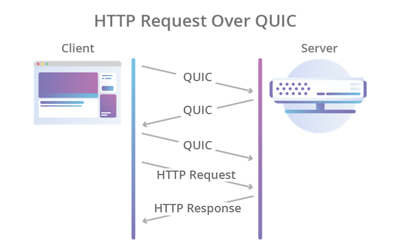
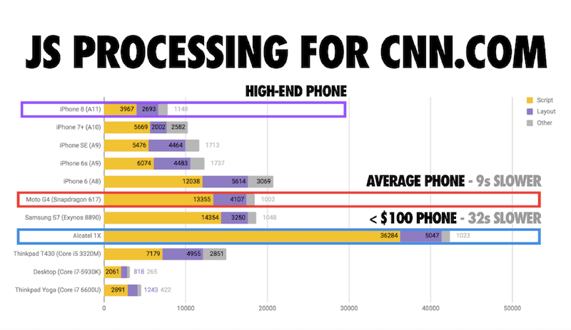
 (cm)
(cm) 


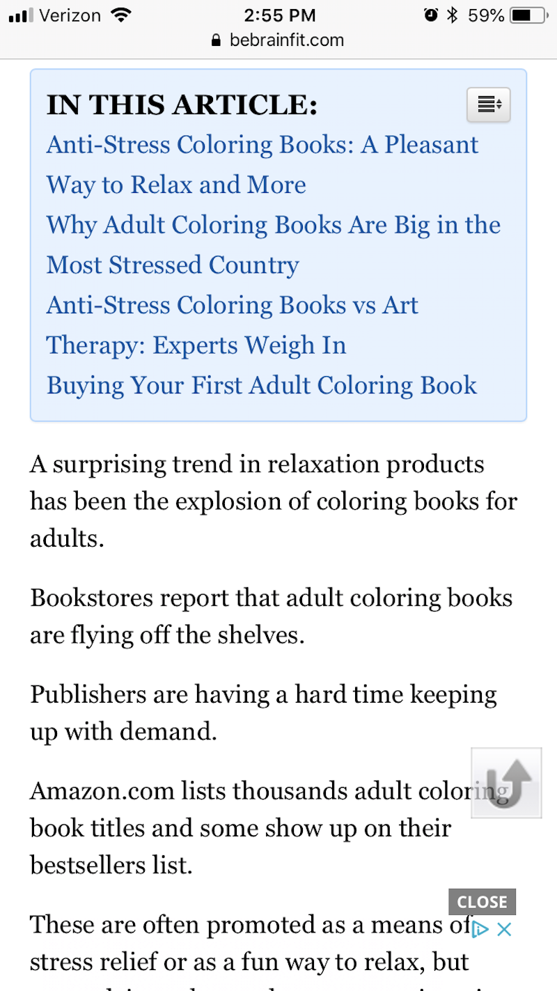


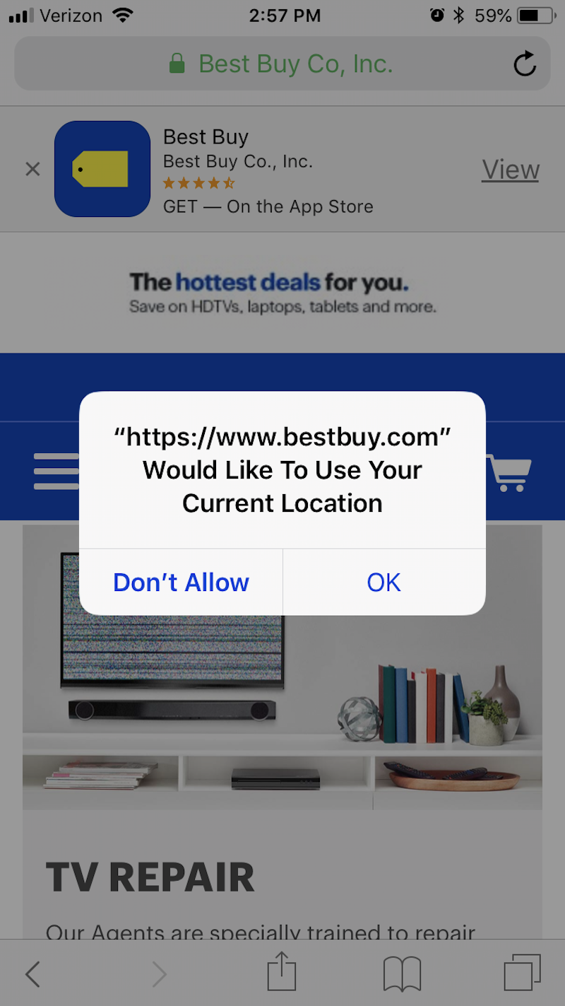

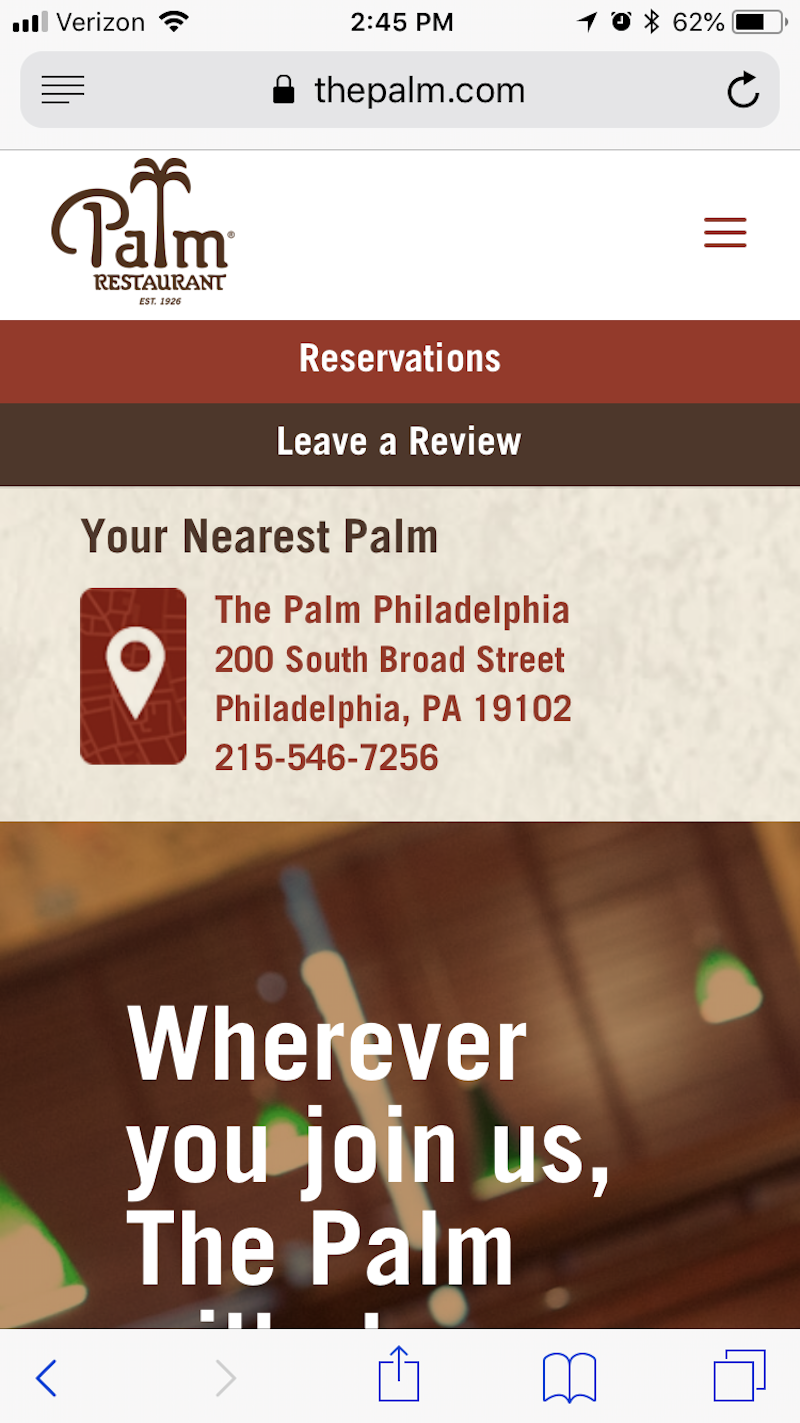
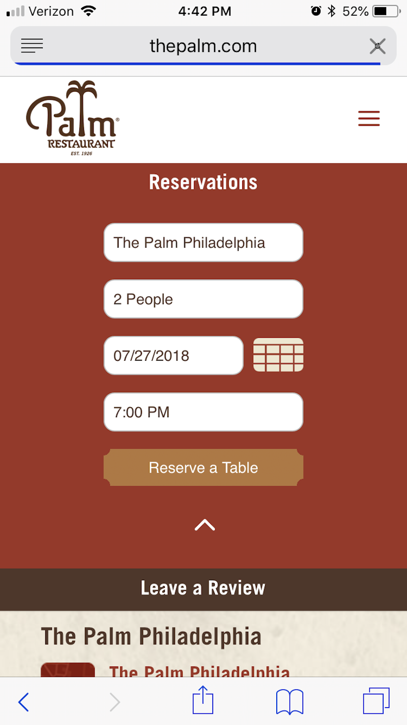


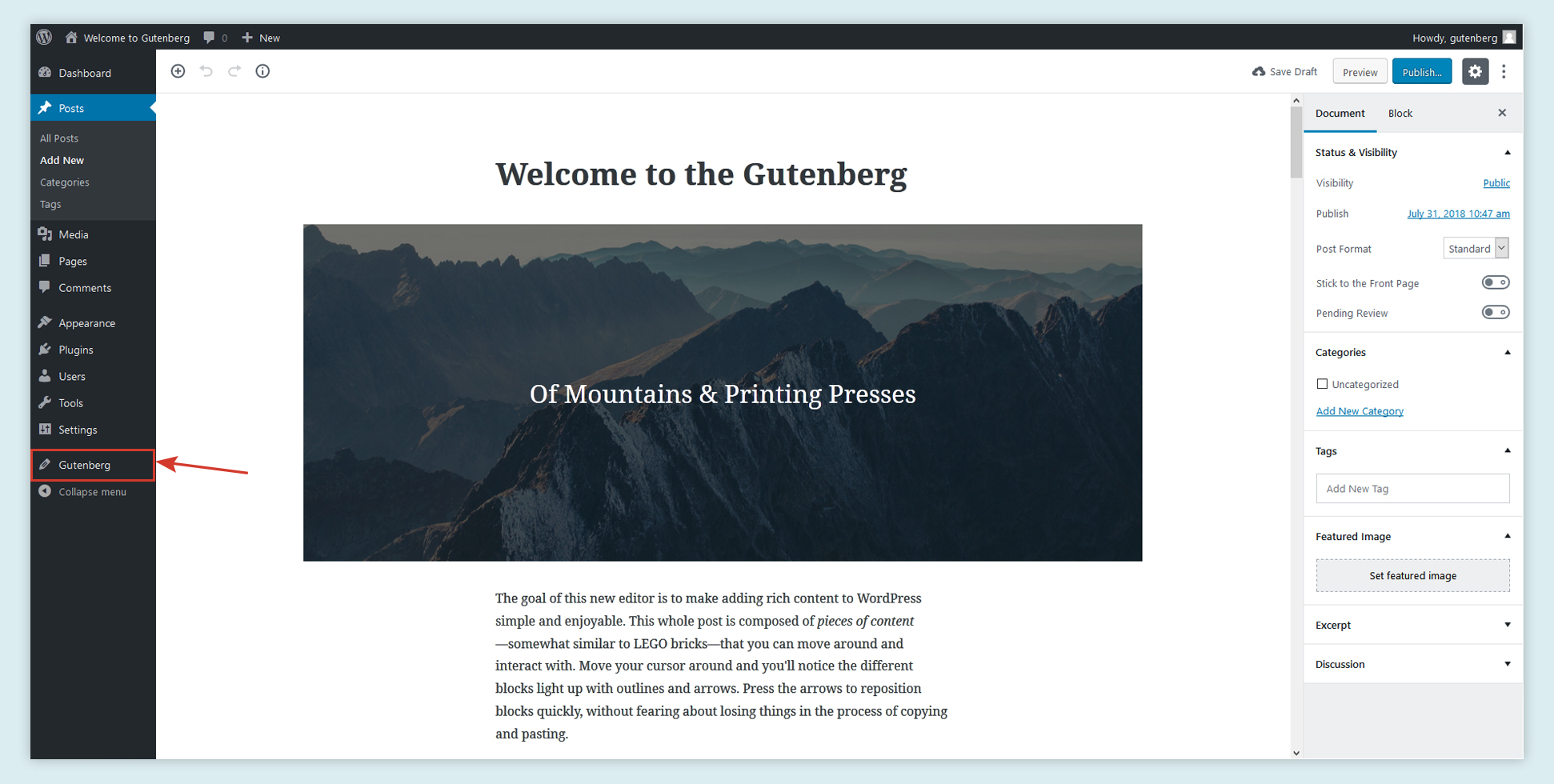
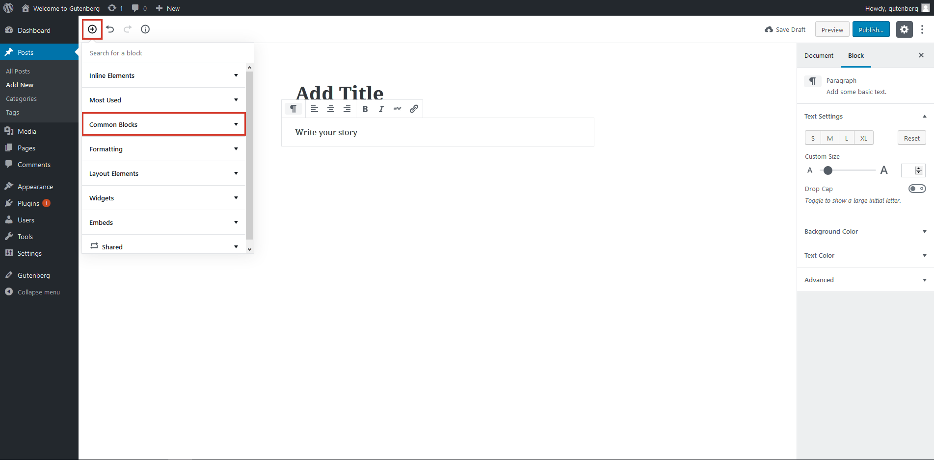


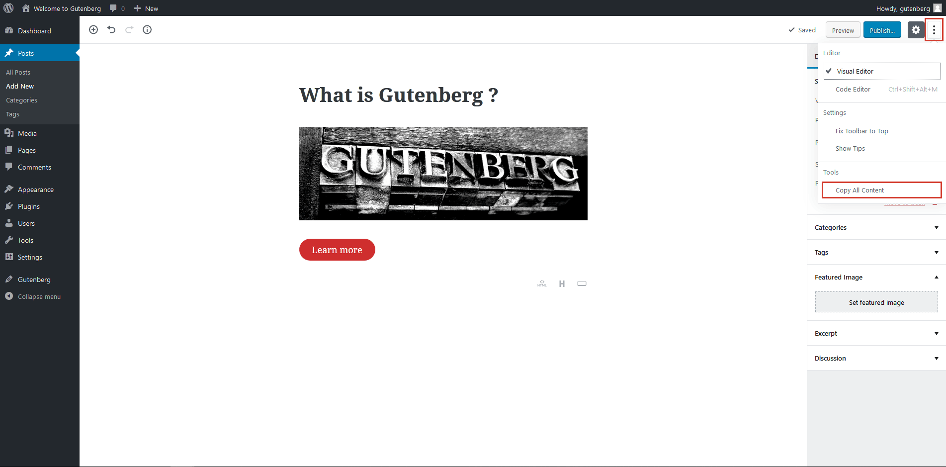
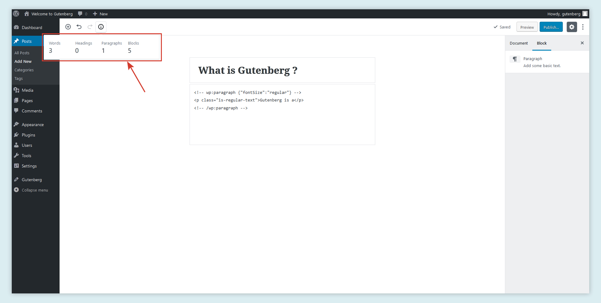


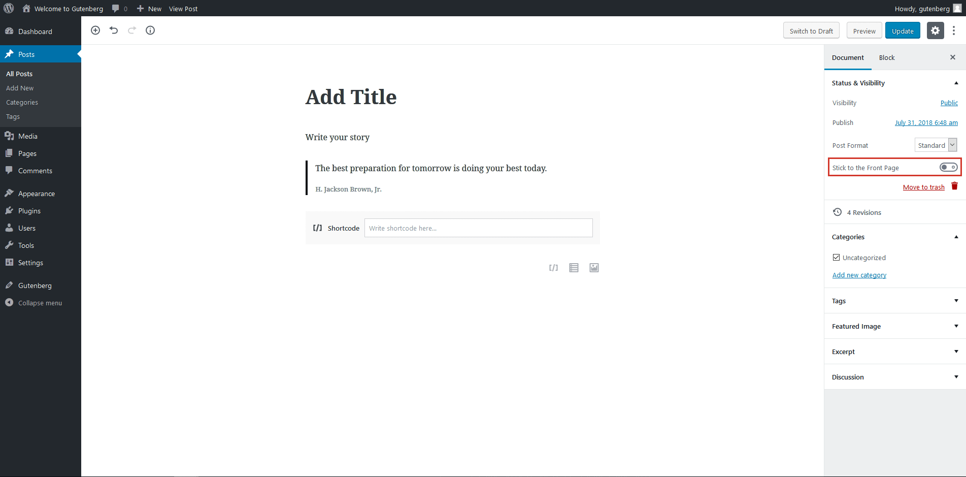


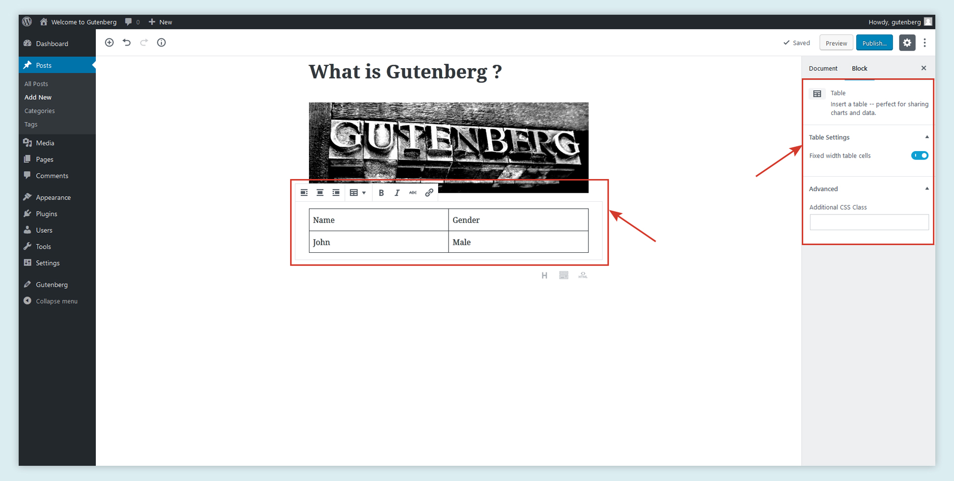
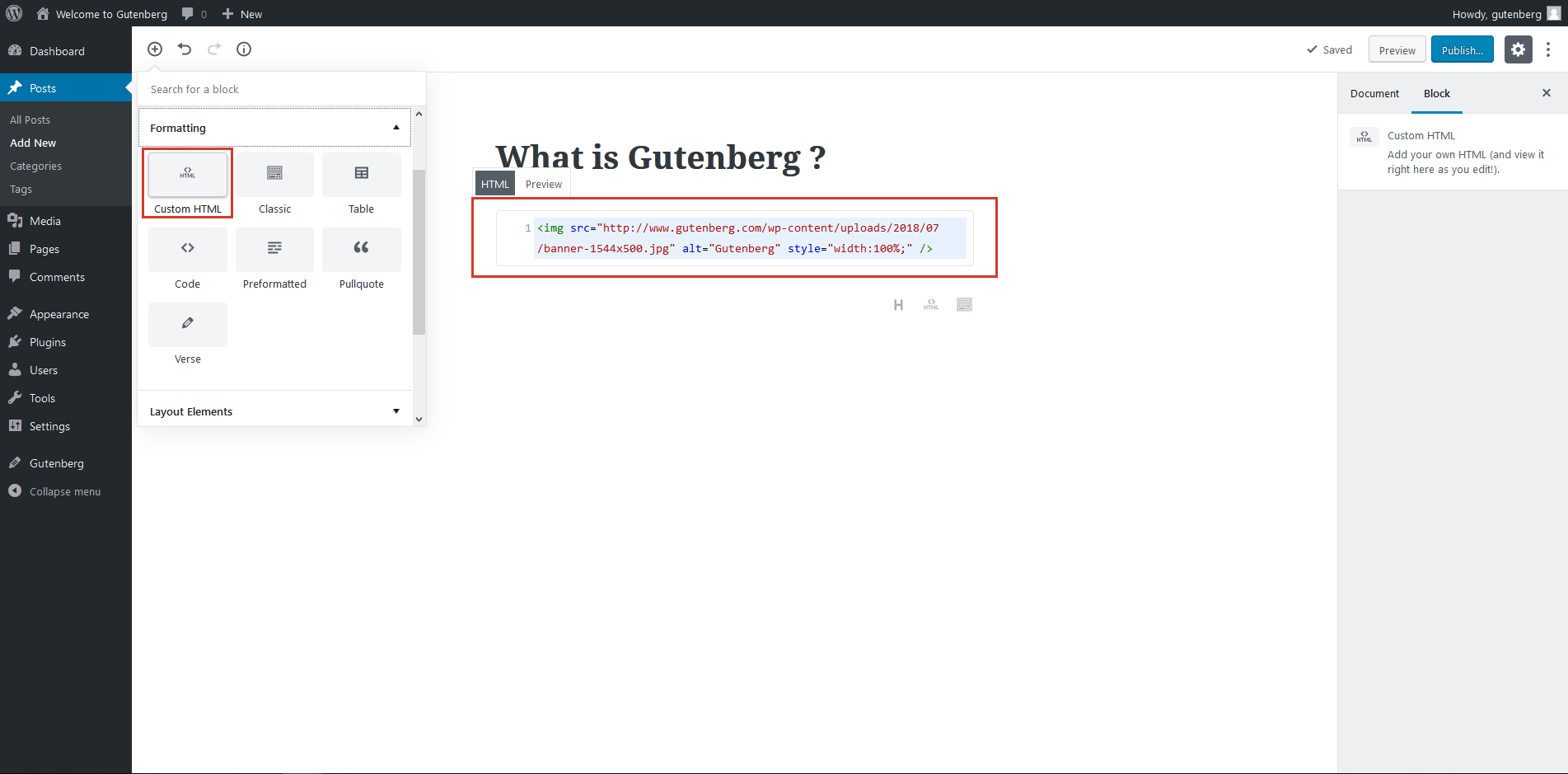

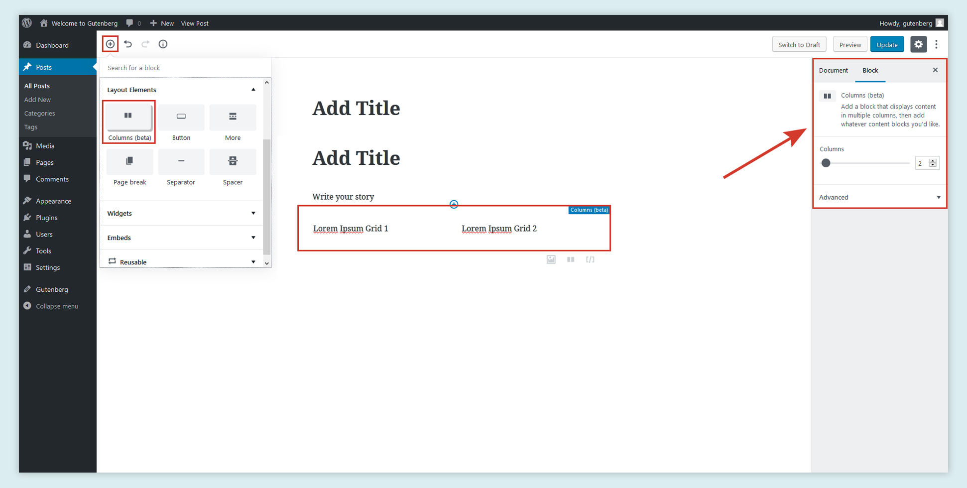

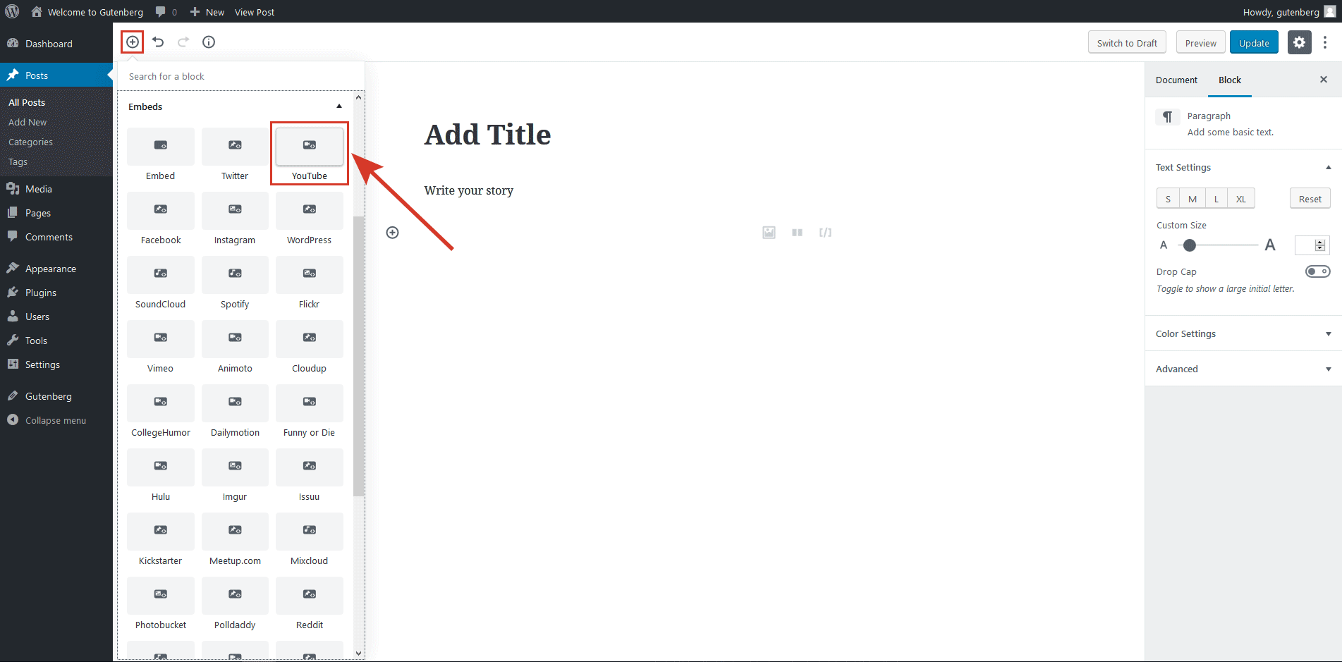
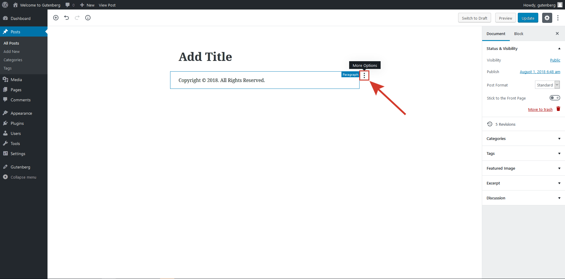
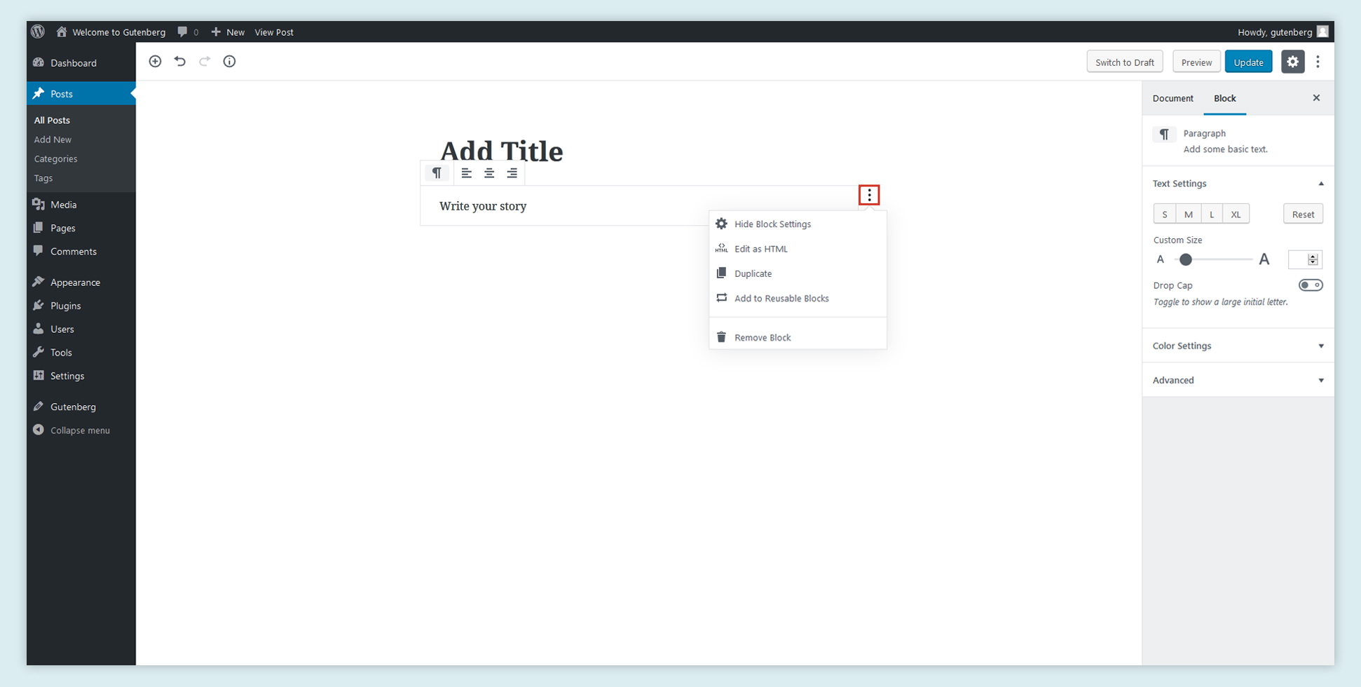

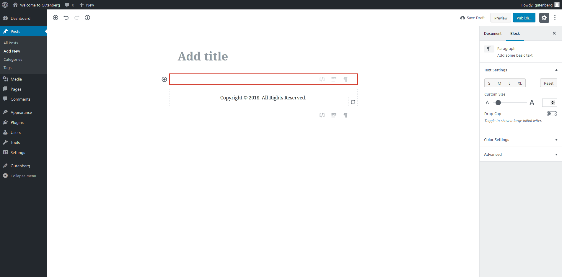


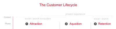


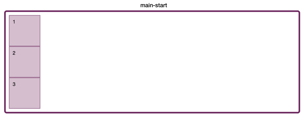
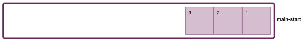
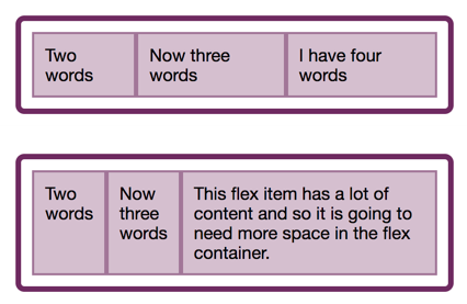
