20 Beautiful and Stylish Startup Web Designs
The number of startups during the last several years has dramatically increased. YC, Kickstarter, ProductHunt and other similar portals have created a truly fertile environment for anyone who has a big idea. There is no better time for entrepreneurs, small businesses, and companies to enter the market and show what they are capable of than today.
Maybe your idea will lead to the next “unicorn” like Facebook or Twitter. If you have something in mind you can bring it to life, the community has got you covered, providing everything you may need, and even assisting in raising money. With such great tools at your fingertips, new startups appear almost every other day.
Today we are going to examine startup websites. We have covered different examples from those that offer new online services to those that try to sell their digital and not-so-digital goods. We have included only the small players that are largely unknown.
They do not have large budgets to hire VIP studios for building mind-blowing websites, but still they pay attention to their promo sites as much as any big player like Dropbox or Trello by creating interfaces that are packed with some trendy features.
Outstanding Startup Web Designs
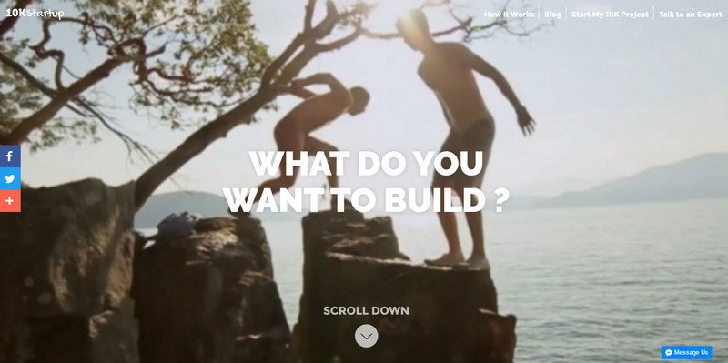
10kStartup
Specializing in giving a boost to fellow startupers, the team behind 10kStartup has created a website that elegantly combines businesslike, playful and inspirational vibes. Its scroll-controlled video-based welcome area is simply amazing.
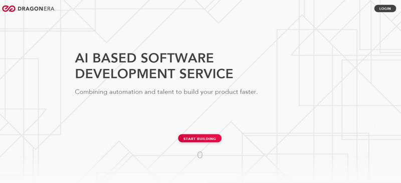
Dragonera
Dragonera deals with AI software, so quite predictably their website bets on a high-tech atmosphere to produce a good impression. It has clean aesthetics with some smooth effects that enhance the user experience.
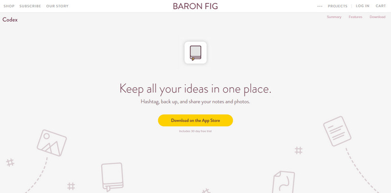
Baron Fig
The light color scheme in tandem with a ton of white space provides the illustrative approach with a safe foundation where it simply shines. Line style illustrations finish off the design making it look interesting and sleek.
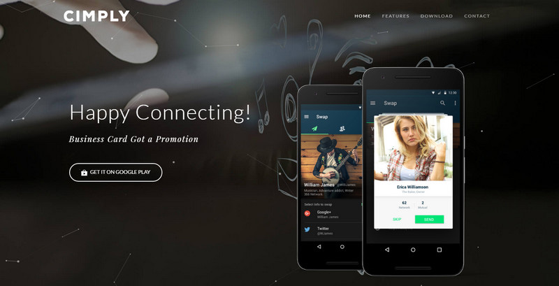
Cimply
The horizontal striped layout, neutral black-and-white color scheme, subtle ghost buttons, complementary video, and last but not least, tiny dynamic details that are used to add some life to the header section: the website is a mixture of traditional and modern features.
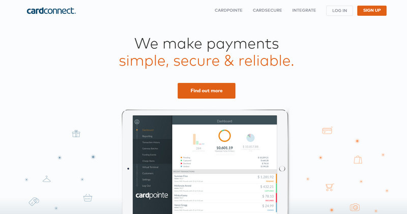
Cardconnect
Cardconnect’s homepage echoes with the product’s title. The design is simple yet refined. The neat interface based on a light coloring and high-quality graphics evokes a sense of reliability.
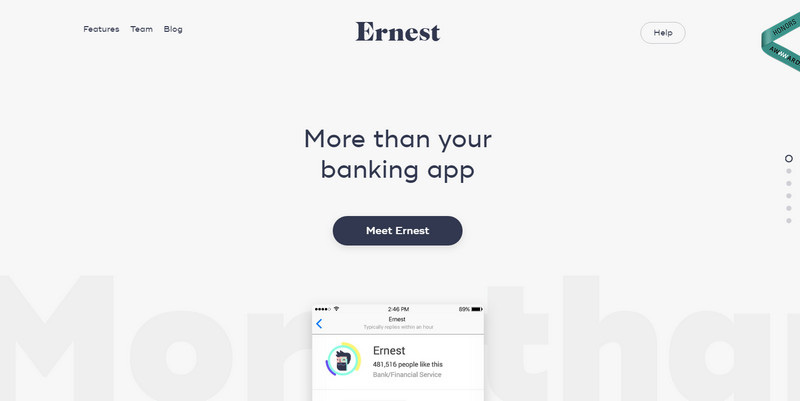
Ernest
The landing page of Ernest is one huge full-screen vertical slider. Each section sings the praises of the product demonstrating it in the best possible light. Scroll-activated effects enrich the user experience.
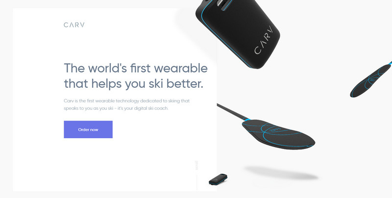
Carv
Much like the product itself, the website looks offbeat with a hint of a pioneering technique. It implements some high-end features to obtain a modern and stylish appearance.
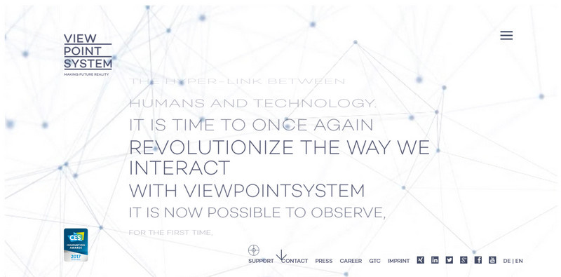
Viewpoint system
Viewpoint system goes for a high-tech vibe that is inherent to its main product. The welcome section has a nice twist that makes the content presentation an eye-catcher. Start to scroll down in order to read the message. The idea is ingenious.
The Digital Hub
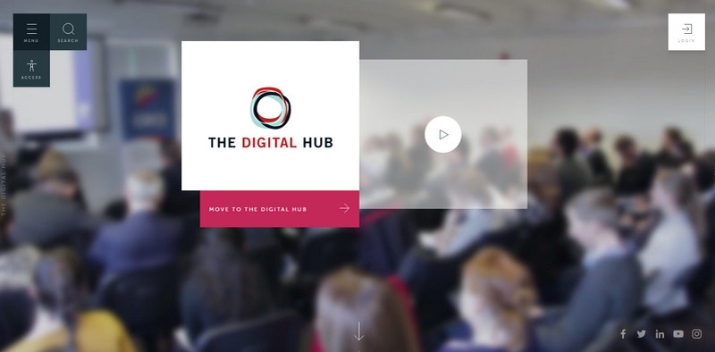
Boxy structure paired with layered aesthetics sets the tone of the official website of “The Digital Hub”. Squares and rectangles that in some cases overlap each other form an original layout placing the chunks of data into well-organized and quickly digestible pieces.
Zero
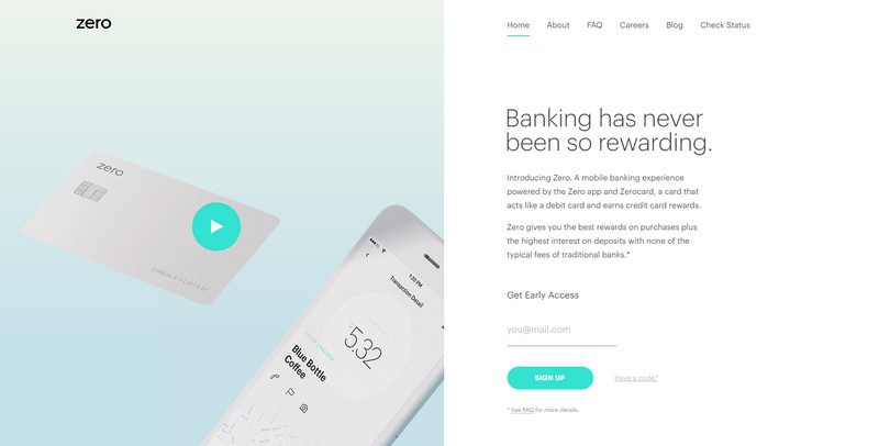
Zero opts in favor of a trendy split layout. Its hero area is carefully broken into two equal parts where the first one is reserved for an introduction video and the second one houses an “opening speech”. The website looks nifty and stylish.
F Secure
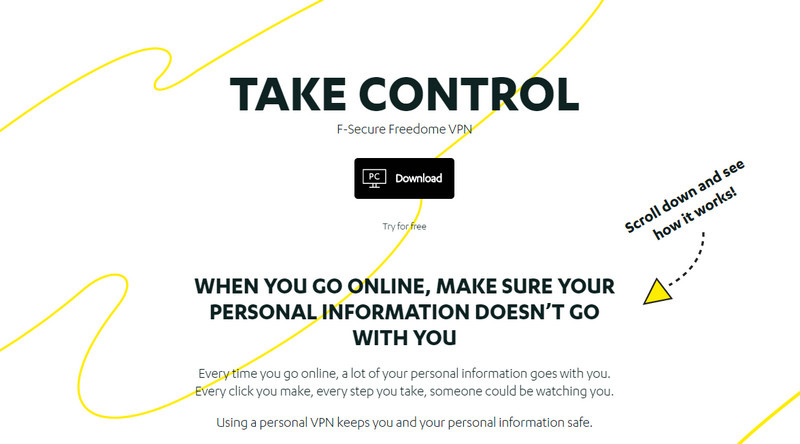
How about an illustrative approach that converts an insipid and boring landing page into a visual storytelling experience with fancy digital drawings and a bulk of decorative details? F Secure has mastered this solution. It will indulge your cravings not only with information but also artistic vibes.
Waaffle
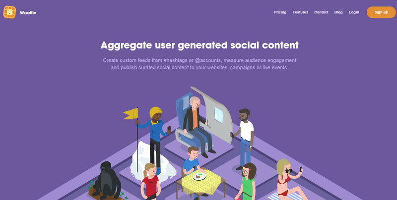
Much like the previous example, the fully illustrated environment personifies this website separating it from the crowd. Isometric illustration, colorful flat and outlined icons and accompanying dynamic effects are three main factors that help to tell the story behind this project more effectively.
Hello Mind
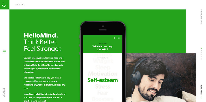
The website of “Hello Mind” looks outstanding. It follows the modern trends and feels exceptional. White edges, ultra-narrow navigation panel, boxy vibe, layered aesthetics and of course animated details skillfully promote the product.
Reward Expert
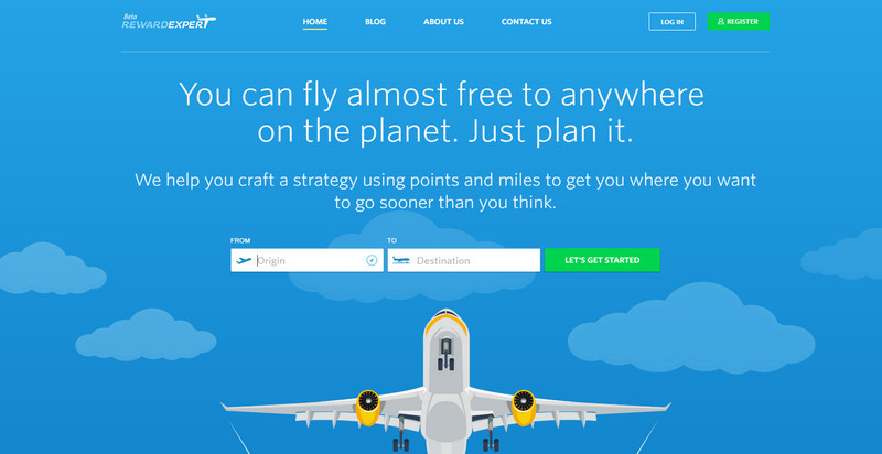
The team behind “Reward Expert” uses beautiful illustrations to make the idea behind the website clear to everyone. Interactive features enrich areas with the content making them nicely blend in.
Molekule
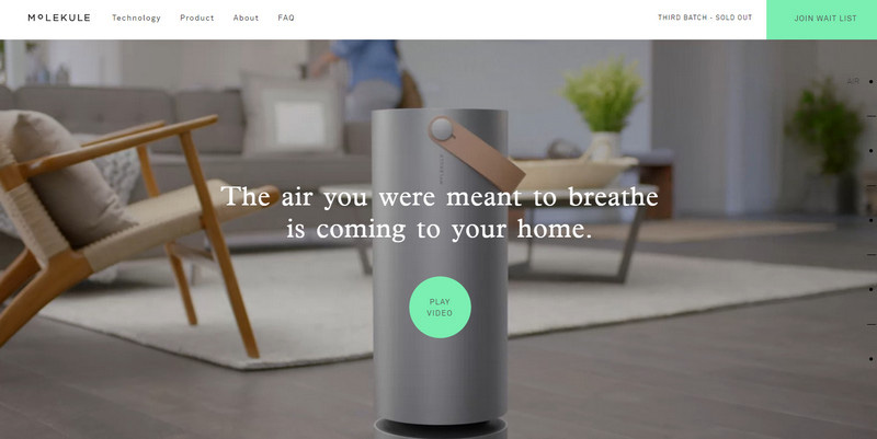
The standard striped layout helps to arrange the content into chunks that easily describe the product to the online audience. The informative side of the project is well-thought-out and excellently dished up.
AlephD
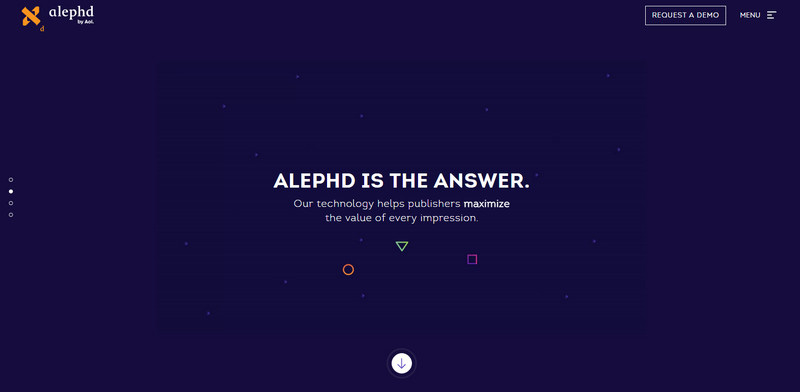
Much like example number 6, the homepage of “AlephD” is built on top of the basic vertical slider that occupies the entire screen. There are just 4 slides, but it is sufficient to show the product and intrigue users with its possibilities.
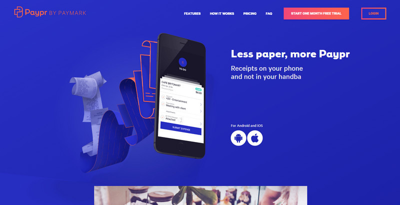
Paypr
The first thing that strikes the eye here is a dominant deep blue tone. While it inspires serenity and ensures trust, it also slightly overwhelms. Though with a bulk of tiny dynamic details like mouse parallax or hover effect that are scattered throughout the homepage it is rather engaging.
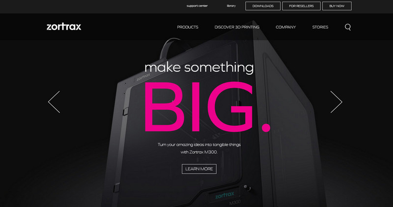
Zortrax
The dark color scheme produces a mystery fog around the product, drumming up the interest in the online visitors. Huge slider in the welcome section instantly catches the eye giving the presentation a cutting-edge feel.
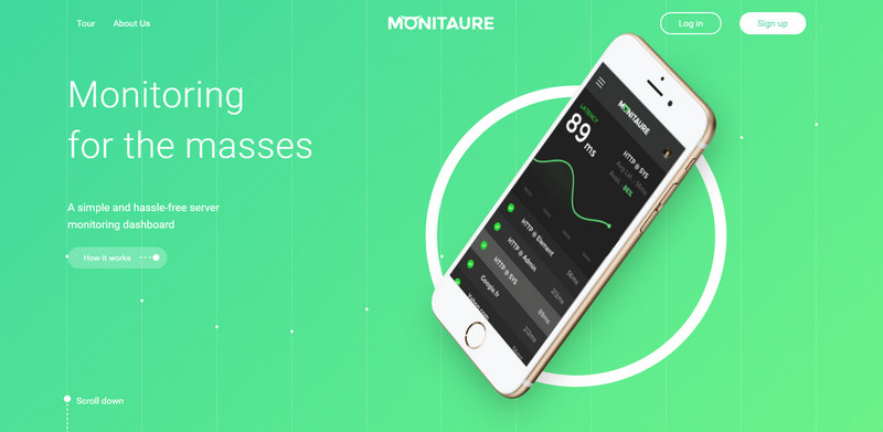
Monitaure
Monitauer plays with two-tone coloring where the green shade, which is close to Pantone’s Color of 2017, adds a sense of refinement and trust. The gradient background beautifully complements the white elements of the design.
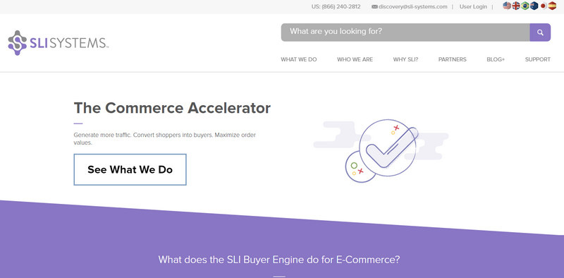
Sli Systems
Slanted layout with flat graphics and line icons surrounded by a massive amount of whitespace profitably distinguishes the content and makes the website look stylish and trendy.
Conclusion
Whatever the product is, as a rule when it comes to promo sites the teams prefer to resort to time-proven ways by choosing viable structures, reliable layouts, and of course, popular solutions such as animations, split layouts, slanted sections, scroll-activated effects, micro interactions, and much more. As a result, we contemplated interfaces that try to balance both content and visual aspect, making the product a star in our eyes.
If you had a product to sell what kind of website would you choose? Would it be a long landing page or an ordinary website? Would you use trendy features or just stick to traditional ways?

