Tag: Optimization


Deprecated: Function create_function() is deprecated in /home2/thebrand/public_html/wp-content/plugins/wp-spamshield/wp-spamshield.php on line 1884
addy-osmani-200x200-1

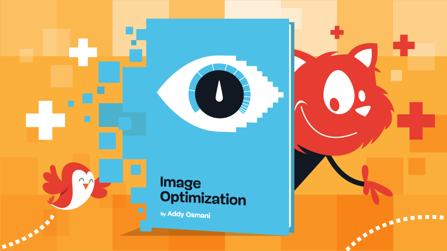
Smashing Podcast Episode 39 With Addy Osmani: Image Optimization

In today’s episode of the Smashing Podcast, we’re talking about image optimization. What steps should we follow for performant images in 2021? I spoke with expert Addy Osmani to find out.

Show Notes

Weekly Update

Transcript

Drew McLellan: He’s an engineering manager working on Google Chrome, where his team focuses on speed, helping to keep the web fast. Devoted to the open source community, his past contributions include Lighthouse, Workbox, Yeoman, Critical, and to do NVC. So we know he knows his way around optimizing for web performance. But did you know he wants won the Oscar for best actress in a supporting role due to a clerical error? My smashing friends, please welcome Addy Osmani. Hi, Addy. How are you?

Addy Osmani: I’m smashing.

Drew McLellan: That’s good to hear. I wanted to talk to you today about images on the web. It’s an area where there’s been a surprising amount of changes and innovation over the last few years, and you’ve just written a very comprehensive book all about image optimization for Smashing. What was the motivation to think at this time, “Now is the time for a book on image optimization?”

Addy Osmani: That’s a great question. I think we know that images have been a pretty key part of the web for decades and that our brains are able to interpret images much faster than they can text. But this overall topic is one that continues to get more and more interesting and more nuanced over time. And I always tell people this is probably, I think, my third or fourth book. I’ve never intentionally set out to write a book.

Addy Osmani: I began this book writing out an article about image optimization, and then over time I found that I’d accidentally written a whole book about it. We were working on this project for about two years now. And even in that time, the industry has been evolving browsers and tooling around images and image formats have been evolving.

Addy Osmani: And so I wrote this book because I found myself finding it hard to stay on top of all of these changes. And I thought, “I’m going to be a good web citizen and try to track everything that I’ve learned in one place so everybody else can take advantage of it.”

Drew McLellan: It is one of those areas, I think, with a lot of performance optimization in the browser, it’s a rapidly shifting landscape, isn’t it? Where a technique that you’ve learned as being current and being best practice, some technology shift happens, and then you find it’s actually an anti-pattern and you shouldn’t be doing it. And trying to keep your knowledge up and make sure that you’re reading the right articles and learning the right things and you’re not reading something from two years ago is quite difficult.

Drew McLellan: So to have it all collected in one well-researched book from an authoritative source is really tremendous.

Addy Osmani: Yeah. Even from an author’s perspective, one of the most interesting things and perhaps one of the most stressful things for our editorial team was I would hand in a chapter and say it was done. And then two weeks later, something would change in a browser, and I’d be like, “Oh, wait. I have to make another last minute change.”

Addy Osmani: But the image landscape has evolved quite a lot, even in the last year. We’ve seen WebP support finally get across the finishing line in most modern browsers. AVIF image support is in Chrome, coming to Firefox, JPEG XL, lazy loading. And across the board, we’ve seen enhancements in how you can use images on the web pretty concretely in browsers. But again, a lot for folks to keep on top of.

Drew McLellan: Some people might view the subject of image optimization as a pretty staid topic. We’ve all, at some point in our careers learn, how to export for web from our graphics software. And some of us that might be in the habit of taking those exported images and running them through something like ImageOptim.

Drew McLellan: So we might know that we should choose a JPEG when it’s a photographic image and a PNG when it’s a graphic based image and think that, “Okay, that’s it. I know image optimization, I’m done.” But really, those things are just table stakes, aren’t they, at this point?

Addy Osmani: Yeah, they are. I think that as our ability to display more detailed, more crisp images and images within even in a different context, depending on whether you care about art direction or not, has evolved over time. I think the need to figure out how you can get those images looking as beautiful as intended to your end users, keeping in mind their environment, their device constraints, their network constraints is a difficult problem and something that I know a lot of people still struggle with.

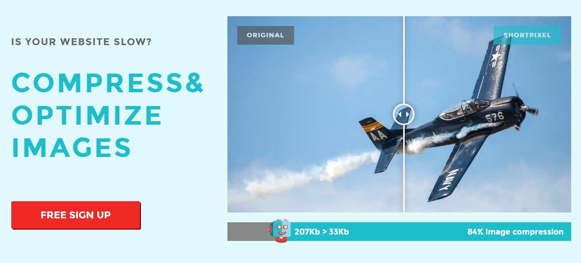
Addy Osmani: And so when it comes to thinking about images and getting a slightly more refined take on this beyond just, “Hey, let’s use a JPEG,” or “Let’s use a PNG,” I think there’s a few dimensions to this worth keeping in mind. The first is just generally compression. You mentioned ImageOptim, and a lot of us are used to just dragging an image over into a place and getting something smaller off the back of it.

Addy Osmani: Now, when it comes to compression, we’re usually talking about different codecs. And codecs are a compression technology that usually have an encoder component to them for encoding files and a decoder component for decoding them and decompressing them. And when you come to deciding whether you’re using something, you generally need to think about whether the photos or the images that you’re using are okay for you to approach using a lossy compression approach or a loss less approach.

Addy Osmani: Just in case folks are not really as familiar with those concepts, a lossless approach is one where you reproduce the exact same file at the very end upon decompression. So you’re not really losing much in the way of quality. Lossless is a lot more putting your image through a fax machine. You get a facsimile of the original, and it’s not going to be the original file. There might be some different artifacts in place there. It might look subtly different. But in general terms, the more that you compress, the more quality that you typically lose.

Addy Osmani: And so with all of these modern image codecs, they’re trying to see just how much quality you can squeeze out while still maintaining a relatively decent file size, depending on the use case.

Drew McLellan: So really, from a technology point of view, you have a source image and then you have the destination file format. But the process of turning one into the other is open for debate. As long as you have a conforming file, how you do it is down to a codec that can have lots of different implementations, and some will be better than others.

Addy Osmani: Absolutely. Absolutely. And I think that, again, going back to where we started with JPEG and PNG, folks may know the JPEG was created for a lossy compression of photos. You generally get a smaller file off the back of it, and it can sometimes have different banding artifacts. PNG was originally created for a lossless compression, does pretty well on non-photographic images.

Addy Osmani: But since then, things have evolved. Around 2010, we started to get support for WebP, which was supposed to replace JPEG and PNG and beats them in compression by a little bit. But the number of image formats and options on the table has just skyrocketed since then. I think things are headed in generally a good direction, especially with modern formats like AVIF and JPEG XL. But it’s taken a while for us to get here. Even getting WebP support across all browsers took quite some time.

Addy Osmani: And I think ultimately what swayed it is making sure that developers have been asking for it, they’ve had an appetite for being able to get better compression out of these modern formats, and the desire to just have good compatibility across browsers for these things, too.

Drew McLellan: Yeah. WebP seems really interesting to me, because as well as having lossless and lossy compression available within the format, we obviously have a much reduced file size as a result. And there’s good browser support, and we see adoption from big companies like Google and Netflix and various big companies.

Drew McLellan: But my perception in the industry is that we don’t see the same sort of uptake at the grassroots level. Is WebP still waiting for its day to come?

Addy Osmani: I think that I would say that WebP is arriving. A lot of folks have been waiting on Safari and WebKit support to materialize, and we finally have that. But when we think about new image formats, it’s very important that we understand what does support actually mean. There’s browser support for decoding those images. We also need really good tooling support so that whether you’re in a node environment, image CDN, if you’re in a CMS, you have the ability to use those image formats.

Addy Osmani: I can remember many years ago when WebP first came out. Early adopters had this problem of you’d save your WebP file to your desktop, and then suddenly, “Oh, wait. Do I need to drag this into my browser to view it?,” or, “If my users are downloading the WebP, are they going to get stuck and be wondering what’s going on?”

Addy Osmani: And so making sure that there’s pretty holistic support for the image format at both an operating system level as well as in other context is really important, I think, for an image format to take off. It’s also important for people who are serving up images to think about these use cases a little bit so that, if I am saving or downloading a file, you’re trying to put it into a portable format that people can generally share easily. And I think this is where, at least on iOS, iOS has got support for a hike and hyphen. And converting things over to JPEGs when necessary allows people to share them.

Addy Osmani: So thinking through those types of use cases where we can make sure that users aren’t losing out while we’re delivering them better compression is important, I think.

Drew McLellan: I have a slide sharing service that I run that, as you can imagine, deals with hundreds of thousands of images. And when I was looking at WebP, and this was probably maybe three years ago, I was primarily looking at a way to reduce CDN bandwidth costs, because if you’re serving a smaller file, you’re being charged less to serve it. But while I still needed a fullback image, a legacy image format as well, my calculations showed that the cost of storing a whole other image set outweighed the benefits of serving a smaller file. So here we are in 2021. Is that a decision I should be reconsidering at this point?

Addy Osmani: I think that’s a really important consideration. Sometimes, when we talk about how you should be approaching your image strategy, it’s very easy to give people a high-level answer of, “Hey, yeah. Just generate five different formats, and that will just scale infinitely.” And it’s not always the case.

Addy Osmani: I think that when you have to keep storage in mind, sometimes trying to find what is the best, most common denominator to be serving your users is worth keeping in mind. These days, I would actually say that WebP is worth considering as that common denominator. For people who have been used to using the picture tag to conditionally serve different formats down to people, typically you’d use a JPEG as your main fallback. Maybe it’s okay these days to actually be using the WebP as your fallback for most users, unless you’ve got people who are on very, very old browsers. And I think we’re seeing a lot less of that these days. But you definitely have some flexibility there.

Addy Osmani: Now, if you’re trying to be forward facing, I would say go pick one format that you feel works really well. If you can approach storage in a way that scales and is flexible to your needs, what I would say people should do is consider JPEG XL. It’s not technically shipping in a browser just yet. When it does, JPEG XL should be a pretty great option for a lot of photos in lossy or lossless use cases or for non-photo use cases as well. And it’s probably going to be much better than WebP V1. So that’s one place.

Addy Osmani: I think that AVIF is probably going to be better if you need to go to really low bit rates. Maybe you care a lot about bandwidth. Maybe you care a little bit less about image fidelity. And at those bit rates, I could imagine it looking crisper than some of the alternatives. And until we have JPEG XL, I’d try to take a look at your analytics and understand whether it’s possible for you to serve AVIF. Otherwise, I’d focus on that WebP. If you were analytics, I guess most people can be served WebP and you care a little bit less about wide-gamut or text overlays, places where chromosome sampling may not be perfect in WebP. That’s certainly something worth keeping in mind.

Addy Osmani: So I would try to keep in mind that there’s not going to be a one size fits all for everybody. I personally, these days, worry a little bit less about the storage and egress and bandwidth costs, just because I use an image CDN. And I’m happy to say I use Cloudinary personally. We use lots of different image CDNs at where I work. But I found that not having to worry as much about the maintenance costs of dealing with image pipelines, dealing with how I’m going to support like, “Oh, hey, here’s yet another image format or new types of fallbacks or new web APIs,” that has been a nice benefit to investing in something that just takes care of it for me.

Addy Osmani: And then the overall cost for my use cases have been okay. But I can totally imagine that if you’re running a slide service at that scale, that might not necessarily be an option, too.

Drew McLellan: Yeah. So I want to come back to some of these upcoming future formats. But I think that’s worth digging into, because with any sort of performance tools, Lighthouse, or WebPageTests, if any of us run our sites through it, one of the key things that it will suggest is that we use a CDN for images. And that is a very realistic thing to do for very big companies. Is it realistic and within the reach of people building smaller websites and apps, or is that actually as easy to do as it sounds?

Addy Osmani: I think the question people should ask is, “What are you using images for?” If you only have a few images, if you’re building a blog and the images you’re adding in are relatively simple, you don’t have hundreds and hundreds or thousands of thousands of images, you might be okay with just approaching this at build time, in a very static way, where you install a couple of NPM packages. Maybe you’re just using Sharp. And that takes care of you for the most part.

Addy Osmani: There are tools that can help you with generating multiple formats. It does increase your build time a little bit, but that might actually be fine for a lot of folks. And then for folks who do want to be able to leverage multiple-

Addy Osmani: And then for folks who do want to be able to leverage multiple formats, they don’t want to deal with as much of the tooling minutia and want to be able to get a really rich responsive image or story in place, I would say try out an image CDN. I was personally quite reticent about using it for personal projects for the cost concerns initially, and then over time as I took a look at my billing, I actually realized it’s saving me time that I’d otherwise be investing in addressing these problems myself. I don’t know how much you’ve had to write custom scripts for dealing with your images in the past but I realized if I can save myself at least a couple of days of debugging through these different npm packages a month, then the costs kind of take care of the time I’m saving and so it’s okay.

Addy Osmani: But it can be something where if you’re scaling to 100s of 1000s or millions of images and that’s not something that’s necessarily covered by your revenue or not something that you’re prepared to pay for, you do need to think about alternative strategies. And I think we’re lucky that we have enough flexibility with the tools that are available to us today to be able to go in either of those directions, where we do something a little bit more kind of custom, we tackle it ourselves or roll our own image CDN or we invest in something slightly more commercial. And we’re at a place where I’d say that for some use cases, yeah you can use an image CDN and it’s affordable.

Drew McLellan: I guess, one of the sort of guiding principles is always just to be agile and be prepared for change. And you might start off using an image CDN to dynamically convert your images for you as they’re requested, and if that gets to a point where it’s not sustainable cost-wise you can look at another solution and have your code base in a state where it’s going to be easy to substitute one solution for another. I think generally and anywhere you’re relying on a third-party service, that’s a good principle to have isn’t it? So these upcoming image formats, you mentioned JPEG XL. What is JPEG XL? Where’s it come from? And what does it do for us?

Addy Osmani: That’s an excellent question. So JPEG XL is a next generation image format, it’s supposed to be general purpose and it’s a codec from the JPEG committee. It started off with some roots in Google’s pic format and then Cloudinary’s FUIF format. There have been a lot of formats over the years that have kind of been subsumed by this effort, but it’s become a lot more than just the kind of sum of its individual parts and some of the benefits of JPEG XL are it’s great for high fidelity images, really good for lossless, it’s got support for progressive decoding, lossless JPEG transcoding, and it’s also kind of fuss and royalty free, which is definitely a benefit. I think that JPEG XL could potentially be a really strong candidate. We were talking earlier about, if you were to just pick one, what would you use? And I think the JPEG XL has got potential to be that one.

Addy Osmani: I also don’t want to over promise, we’re still very early on with browser support. And so I think that we should really wait and see, experiment and evaluate how well it kind of lines up in practice and meets people’s expectations but I see a lot of potential with JPEG XL for both those lossy and lossless cases. Right now, I belief that Chrome is probably the furthest along in terms of support, but I’ve also seen definitely interest from Mozilla side and other browsers in this so I’m excited about the future with JPEG XL. And if we were to say, what is even shorter term of interest to folks? There’s of course AVIF too.

Drew McLellan: Tell us about AVIF, this is another one that I’m unfamiliar with.

Addy Osmani: Okay. So we mentioned a little bit earlier about AVIF maybe being a better candidate if you need to go to low bit rates and you care about bandwidth more than image fidelity, as a general principle, AVIF really takes the lead in low fidelity high appeal compression. And JPEG XL, it should excel in medium to high fidelity, but they are slightly different formats in their own rights. We’re at a place where AVIF has got increasingly good browser support, but let me take a step back and talk a little bit more about the format. So AVIF itself is based on the AV1 video codec, which has been standardized by the Alliance for Open Media, and it tries to get people significant compression gains over JPEG, over WebP, which we were talking about earlier. And while the exact savings you can get from AVIF will depend on the content and your quality targets, we’ve seen plenty of cases where it can offer over 50% savings compared to JPEG.

Addy Osmani: It’s got lots of good features, it’s able to give you container support for new features like high dynamic range and wide color gamuts, film grain synthesis. And again, similar to talking about being forward facing, one of the nice things about the picture tag is that you could serve users AVIF files right now and it’ll still fall back to your WebP or your JPEG in cases where it’s not necessarily supported. But going back to your example about Photoshop Save For Web, you could take a JPEG that’s 500 kilobytes in size, try to shoot for a similar quality to Photoshop Save For Web and with AVIF I would say that you probably be able to get to a point where that file size is about 90 kilobytes, 100 kilobytes so quite a lot of savings with no real discernible loss in quality.

Addy Osmani: And one of the nice things about that is you’re ideally not going to be seeing as much loss of the texture in any images that have rich detail. So if you’ve got photos of forests or camping or any of those types of the things, they should still look really rich with AVIF. So I’m quite excited about the direction that AVIF has. I do think it needs a little bit more work in terms of tooling support. So I dropped a tweet out about this the other day, we’ve got a number of options for using AVIF right now, for single images we’ve got Squoosh, squoosh.app, which is written by another team in Chrome, so shout out to Surma and Jake for working on Squoosh. Avif.io has got a number of good options for folks who are trying to use AVIF today, regardless of what tech stack they’re focused on, Sharp supports AVIF too.

Addy Osmani: But then generally you think about other places where we deal with images, whether it’s in Figma or in Sketch or in Photoshop or in other places, and I would say that we still need to do a little bit of work in terms of AVIF support there, because it needs to be ubiquitous for developers and users to really feel like it’s landed and come home. And that’s one of the areas of focus for us with the teams working on AVIF in Chrome at the moment, trying to make sure that we can get tooling to a pretty good place.

Drew McLellan: So we’ve got in HTML, the picture element now, which gives us more flexibility over the traditional image tag. Although the image tag’s come a long way as well, hasn’t it? But we saw picture being added, it was around the same time as the native video tag, I think in that sort of original batch of HTML5 changes. And this gives us the ability to specify multiple sources, is that right?

Addy Osmani: Yes, that’s right.

Drew McLellan: So you can list different formats of images and the browser will pick the one it supports, and that enables us to be quite experimental straight away without needing to worry too much about breaking things for people with older browsers.

Addy Osmani: Absolutely. I think that’s one of the nicest benefits of using the picture tag outside of use cases where we’re thinking about our direction, just being able to serve people an image and have the browser go through the list of potential sources and see, okay, well, I will use the first one in that list that I understand otherwise I’ll fall back, that’s a really powerful capability for folks. I think at the same time, I’ve also heard some folks express some concern or some worry that we’re regenerating really huge blobs of markup now when we’re trying to support multiple formats and you factor in different sizes for those formats and suddenly it gets a little bit bulky.

Addy Osmani: So are there other ways that we could approach those problems? I don’t want to sell people too much on image CDNs, I want them to stand on their own. But this is one of those places where an idea called content negotiation can actually offer you an interesting path. So, we’ve talked a little bit about picture tag where you have to generate a bunch of different resources and decide on the order of preference, right, extra HTML. With content negotiation, what it says is let’s do all of that work on the server. So the clients can tell the server what formats it supports up front via list of MIME types via Accept HTTP header. Then the server can do all the heavy work of generating and managing ultimate resources and deciding which ones to send down to clients. And one of the powerful things here is if you’re using an image CDN, you can point to a single resource.

Addy Osmani: So maybe if we’ve got a puppy image like puppy.JPEG, we could give people a URL to puppy.JPEG and if their browser supports WebP or it supports a AVIF the server can get really smart about serving down the right image to those users depending on what their support looks like, but otherwise fall back without you needing to do a ton of extra work yourself. Now, I think that’s a powerful idea. There’s a lot that you can do on the server, we sometimes talk about how not everybody has got access to really strong network quality, your effective connection type can be really different depending on where you are.

Addy Osmani: Even living in Silicon Valley, I could be walking from a coffee shop to a hotel or I could be in the car and the quality of my wifi or my signal may not be that great. So this is where you’ve got access to other APIs, other ideas like the Save-Data client hint for potentially being able to serve people down even smaller sized resources, if the user has opted in to data savings. So there’s a lot of interesting stuff that we could be doing on the server side and I do think we should keep pushing on these ideas of finding a nice balance where people who are comfortable with doing the market path have got all the flexibility to do so and people who want slightly more magical solution have also got a few options.

Drew McLellan: The concept of this sort of data saver approach was something that I learned of first from your book. I mean, let’s go into that a little bit more because that’s quite interesting. So you’re talking about the browser being able to signal a preference for wanting a reduced data experience back because maybe it’s on a metered connection or has low battery or something.

Addy Osmani: Exactly. Exactly. I’ve been traveling in the normal times or the before times back when we would travel a lot more, I’ve experienced plenty of places in the world or situations where my network quality might be really poor or really spotty, and so even opening up a webpage could be a frustrating or difficult experience. I might be looking up a menu and if I can’t see pictures of the beautiful food they’ve got available I might go somewhere where I can, or I might, I don’t know, make myself some food instead. But I think that one of the interesting things about data saver is it gives you a connection back to what the user’s preferences are. So if as a user, I know that I’m having a hard time with my network connection. I can say, “Okay, well, I’m going to opt into data saver mode in my browser.”

Addy Osmani: And then you can use that as a developer as a signal to say, “Okay, well, the user’s at a bit of a constrained, maybe we will surf them down much smaller images or images of a much lower quality.” But they still get to see some images at all, which is better than them waiting a very long time for something much richer to be served down. Other benefits of these types of signals are that you can use them for conditionally serving media. So maybe there are cases where text is the most important thing in that page, maybe you can switch those images off if you discover that users are in kind of a constrained environment. I’ll only spend 30 seconds on this, but you can really push this idea to it’s extremes. Some of the interesting things you can do with Save-Data are maybe even turning off very costly features implemented in JavaScript.

Addy Osmani: If you have certain components that are considered slightly more optional, maybe those don’t necessarily need to be sent down to all users if they only enhance the experience. You can still serve everybody a very core, small, quick experience, and then just layer it on with some nice frosting for people who have a faster connection or device.

Drew McLellan: Potentially, I guess it could factor into pagination and you could return 10 results on a page rather than a 100 and those sorts of things as well. So lots of interesting, interesting capabilities there. I think we’re all sort of familiar with the frustrating process of getting a new site ready, optimizing all your images, handing it over to the client, giving them a CMS to manage the content and find that they’re just replacing everything with poorly optimized images. I mean, again, an image CDN, I guess, would be a really convenient solution to that but are there other solutions, are there things that the CMS could be doing on the server to help with that or is an image CDN just probably the way to go?

Addy Osmani: I think that what we’ve discovered after probably at least six or seven years of trying to get everybody optimizing their images is that it’s a hard problem where some folks involved in the picture might be slightly more technically savvy and maybe comfortable setting up their own tooling or going and running Lighthouse or trying out other tools to let them know whether there are opportunities to improve. I’d love to see people consistently using things like Lighthouse to catch if you’ve got opportunities to optimize further or serve down images of the right size but beyond that, sometimes we run into use cases where the people who are uploading images may not necessarily even understand the cost of the resources that they’re uploading. This is commonly something we run into, and I’ll apologize, I’m not going to call people out too much, but this is something we run into even with the Google blog.

Addy Osmani: Every couple of weeks on the Google blog, we’ll have somebody upload a very large 20 or 30 megabyte animated GIF. And I don’t expect them to know that that’s not a good idea, they’re trying to make the article look cool and very engaging and interactive, but those audiences are not necessarily going to know to go and run tools or to use ImageOptim or to use any of these other tools in place and so documenting for them, that they should check them out, is certainly one option. But being able to automate away the problem, I think is very compelling and helps us consistently get to a place where we’re hopefully balancing the needs of all of our users of CMSs, whether they’re technical or non-technical, as well as the needs of our users.

Addy Osmani: So I think the image CDNs can definitely play a role in helping out here. Ultimately, the thing that’s important is making sure you have a solution in place between people, stakeholders who might be uploading those images, and what gets served down to users. If it’s an image CDN, if it’s something you’ve rolled yourself, if it’s a built step, just needs to be something in place to make sure that you are not serving down something that’s very, very large and inefficient.

Drew McLellan: Talking about animated GIFs, they’re surprisingly popular. They’re fun, we love them, but they’re also huge. And really, it’s a case where a file format that was not designed for video is being used for video. Is there a solution to that with any of these image formats? What can we do?

Addy Osmani: Oh, gosh. The history of GIFs is fascinating. We saw a lot of the formats we know and love or have been around for a while were originated in the late ’80s to early ’90s, and the GIF is one of those. It was created in 1987. I’m about as old as the GIF.

Addy Osmani: As you mentioned, it wasn’t originally created necessarily for use case. I think it was Netscape Navigator which in mid ’90s maybe added support for looping GIFs and giving us this kind of crazy fun way to do memes and the like, but GIFs have got so many weaknesses. They’re kind of limited in many cases to a very finite color palette; 256 colors, in many cases. They’re a bitmapped raster format with pixel value stored in image files.

Addy Osmani: They’re very inefficient, for a number of reasons. And you mentioned that they’re also quite large. I think that we’ve gotten into this place of thinking that if we want a short segment of video or animation that’s going to be looping, the GIF is the thing that we have to use. And that’s just not the case.

Addy Osmani: While we do see that there are modern image formats that have support for animation, I think that the most basic thing you can do these days is make sure you’re serving a video down instead of a GIF. Muted auto-play videos combined with HD64, HD65, whatever video you’re going to use, can be really powerful, and significantly smaller for use cases where you need to be showing a sequence of images.

Addy Osmani: There are options for this. AVIF has got image sequences in there, potentially. Other formats have explored these ideas as well. But I think that one thing you can do is, if you’re using GIFs today, or you have users who are slightly less technical who are using GIFs today, try to see if you can give them tools that will allow them to export a video instead, or if your pipeline can take care of that for them, that’s even better.

Addy Osmani: I have plenty of conversations with CMS providers where you do see people uploading GIFs. They don’t know the difference between a video and a GIF file. But if you can just, whether it’s with an image CDN or via some built process, change the file over to a more efficient format, that would be great.

Drew McLellan: We talked briefly about tools like ImageOptim that manage to strip out information from the files to give us the same quality of result with a smaller file size. I’m presuming that’s because the file formats that we commonly deal with weren’t optimized for delivery over the Web in the first place, so they’re doing that step of removing anything that isn’t useful for serving on the Web. Do these new formats take that into consideration already? Is something like ImageOptim a tool that just won’t be required with these newer formats?

Addy Osmani: I’m anticipating that some of the older formats… Things that have been around for a while, take a while to phase out or to evolve into something else. And so I can see tools like ImageOptim continuing to be useful. Now, what are modern image formats doing that are much better? Well, I would say that they’re taking into account quite a few things.

Addy Osmani: They’re taking into account, are there aspects of the picture that the human eye can’t necessarily make out a difference around? When I’m playing around with different quality settings or different codecs, I’m always looking for that point where if I take the quality down low enough, I’m going to see banding artifacts. I’m going to see lots of weird looking squares around my buildings or the details of my picture.

Addy Osmani: But once those start to disappear, I really need to start zooming in to the image and making comparisons across these different formats. And if users are unlikely to do that, then I think that there are good questions around is that point of quality good enough? I think that modern image formats are pretty good at being able to help you navigate, filtering out some of those details pretty well. Keeping in mind what are the needs of color, because obviously we’ve got white gamut as a thing right now as well.

Addy Osmani: Some people might be okay with an amount of changing your color palette versus not, depending on the type of images that you have available, but definitely I see modern formats trying to be resilient against things like generational loss as well. Generational loss is this idea that… We mentioned memes earlier. A common problem on the Web today is you’ll find a meme, whether it’s on Facebook or Instagram or Reddit or wherever else, you’ll save it, and maybe you’ll share it around with a friend. Maybe they’ll upload it somewhere else. And you suddenly have this terrible kind of copy machine or fax effect of the quality of that image getting worse and worse and worse over time.

Addy Osmani: And so when I see something get reshared that I may have seen three months ago, now it might not be really, really bad quality. You can still make out some of the details, but image formats, being able to keep that in mind and work around those types of problems, I think are really interesting.

Addy Osmani: I know that JPEG XL was trying to keep this idea of generational loss in mind as well. So there’s plenty of things that modern codecs and formats are trying to do to evolve for our needs, even if they’re very meme focused.

Drew McLellan: Let’s say you’ve inherited a project that has all sorts of images on it. What would be the best way to assess the state of that project in terms of image optimization? Are there tools or anything that would help there?

Addy Osmani: I think that it depends on how much time you’ve got to sink into the problem. There are very basic things people can try doing, like obviously batch converting those images over to more modern formats at the recommended default quality and do an eyeball check on how well they’re doing compared to the original.

Addy Osmani: If you’re able to invest a little bit more time, there are plenty of tools and techniques like DSSIM and other ways of being able to compare what the perceptual quality differences are between different types of images that have been converted. And you can use that as a kind of data-driven approach to deciding, if I’m going to batch convert all of my old images to WebP, what is the quality setting that I should be relying on? If I’m going to be doing it for AVIF or JPEG XL, what is the quality setting that I should be relying on?

Addy Osmani: I think that there’s plenty of tools people have available. It really just depends on your time sink that’s possible. Other things that you can do, again, going back to the image CDN aspect, if you don’t have a lot of time and you’re comfortable with the cost of an image CDN, you can just bulk upload all of those images. And there are CDNs that support this idea of automatic quality setting. I think in Cloudinary it’s q_auto, or something like that.

Addy Osmani: But the basic idea there is they will do a scan of the image, try to get a sense of the type of content that’s in there, and automatically decide on the right level of quality that you should be using for the images that are getting served down to users. And so you do have some tooling options that are available here, for sure.

Drew McLellan: I mean, you mentioned batch processing of images. Presumably you’re into the area of that generational loss that you’re talking about, when you do that. When you take an already compressed JPEG and then convert it to a WebP, for example, you risk some loss of quality. Is batch converting a viable strategy or does that generational loss come too much into play if you care about the pristine look of the images?

Addy Osmani: I think it depends on how much you’re factoring in your levels of comfort with lossy versus lossless, and your use case. If my use case is that I’ve inherited a project where the project in question is all of my family’s photos from the last 20 years, I may not be very comfortable with there being too much quality loss in those images, and maybe I’m okay with spending a little bit more money on storage if the quality can remain mostly the same, just using a more modern format.

Addy Osmani: If those are images for a product catalog or any commerce site, I think that you do need to keep in mind what your use case is. Are users going to require being able to see these images with a certain level of detail? And if that’s the case, you need to make those trade-offs in mind when you’re choosing the right format, when you’re choosing the right quality.

Addy Osmani: So I think that batch is still okay. To give you a concrete idea of one way of seeing people approach this at scale, sometimes people will take a smaller sample of the images from that big collection that they’ve inherited, and they’ll try out a more serious set of experiments with just that set. And if they’re able to land on an approach that works well for the sample, they’ll just apply it to the whole batch. And I’ve seen that work to varying degrees of success.

Drew McLellan: So optimizing file size is just sort of one point on the overall image optimization landscape. And I’d like to get on to talking about what we can do in our browsers to optimize the way the images are used, which we’ll do after a quick word from this episode sponsor.

Drew McLellan: So we’ve optimized and compressed our large files, but now we need to think about a strategy for using those in the browser. The good old faithful image tag has gained some new powers in recent times, hasn’t it?

Addy Osmani: Yeah, it has. And maybe it’s useful for folks… I know that a lot of people that ask me about images these days also ask me to frame it in terms of metrics and the Core Web Vitals. Would it be useful for me to talk about what the Core Web Vitals are and maybe frame some of those ideas in those current terms?

Drew McLellan: Absolutely, because Core Web Vitals is a sort of initiative from Google, isn’t it, that we’ve seen more recently? We’re told that it factors into search ranking potentially at some level. What does Core Web Vitals actually mean for us in terms of images?

Addy Osmani: Great question. As you mentioned, Core Web Vitals is an initiative by Google, and it’s all about trying to share unified guidance for quality signals. That can be pretty key to delivering a great user experience on the Web. And it is part of a set of page experience signals Google Search may be evaluating for ranking purposes, but they can impact the Core Web Vitals in a number of ways.

Addy Osmani: Now, before I talk about what those ways are, I should probably say, what are the Core Web Vitals metrics? There’s currently three metrics that are in the Core Web Vitals. There’s largest contentful paint, there’s cumulative layout shift, and there’s first input delay. Now, in a lot of modern Web experiences we find that images tend to be one of the largest visible elements on the page. We see a lot of product pages where we have a big image that’s the main product item image. We see images in carousels, in stories and in banners.

Addy Osmani: Now, largest contentful paint, or LCP, is a Core Web Vitals metric that tries to measure when the largest contentful element, whether it’s an image text or something else, is in a user’s viewport, such that we’re able to tell when that image becomes visible. And that really allows a browser to determine when the main content of the page has really finished rendering.

Addy Osmani: So if I’m trying to go to a recipe site, I might care about how that recipe looks, and so we care about making sure that that big hero image of the recipe is visible to me. Now, the LCP element can change over time. It’s very possible that early on in load, the largest thing may be a heading, but as the page continues to load, it might actually end up being a much larger image or a poster of some sort.

Addy Osmani: And so when you’re trying to optimize largest contentful paint, there’s about four things that you can do. The first thing is making sure that you’re requesting your key hero image as early on as possible. Generally, we have a number of things that are important in the page. We want to make sure that we can render the main page’s content and layout.

Addy Osmani: For layout, typically we’re talking about CSS. So you may be using critical CSS, inline CSS, in your pages, want to avoid things that are render blocking, but then when it comes to your image, ideally you should be requesting that image early. Maybe that involves just making sure that the browser can discover that image as early on in the page as possible, given that a lot of us these days are relying on frameworks.

Addy Osmani: If you’re not necessarily using SSR, server-side rendering, if you are waiting on the browser to discover some of your JavaScript bundles, bundles for your components, whether you have a component for your hero image or product image, if the browser has to wait to fetch, parse, execute, compile and execute all of these different files before it can discover the image, that might mean that your largest contentful image is going to take some time before it can be discovered.

Addy Osmani: Now, if that’s the case, if you find yourself in a place where the image is being requested pretty late, you can take advantage of a browser feature called link rel preload to make sure that the browser can discover that image as early as possible. Now, preload is a really powerful capability. It’s also one that you need to take a lot of care with. These days, it’s very easy to get to a place where maybe you hear that we’re recommending preload for your key-

Addy Osmani: Maybe you hear that we’re recommending preload for your key hero image, as well as your key scripts, as well as your key fonts. And it becomes just this really big, massive trying to make sure that you’re sequencing things in the right order. So the LCP images is definitely one key place worth keeping in mind for this.

Addy Osmani: The other thing, as I mentioned four things, the other thing is make sure you’re using source set and an efficient modern image format. I think that source set is really powerful. I also see sometimes when people are using it, they’ll try to overcompensate and will maybe ship 10 different versions of images in there for each possible resolution. We tend to find, at least in some research, that beyond three by images, users have a really hard time being able to tell what the differences are for image quality and sharpness and detail. So DPR capping, device pixel ratio capping, is certainly an idea worth keeping in mind.

Addy Osmani: And then for modern image formats, we talked about formats earlier, but consider your WebP, your AVIF, your JPEG XL. Avoid wasting pixels. It’s really important to have a good strategy in place for quality. And I think that there are a lot of cases where even the default quality can sometimes be too much. So I would experiment with trying to lower your bit rate, lower your quality settings, and see just how far you can take things for your users while maintaining sharpness.

Addy Osmani: And then when we’re talking about loading, one of the other things that the image tag has kind of evolved to support over the last couple of years is the lazy loading. So with loading equals lazy, you no longer need to necessarily use a JavaScript library to add lazy loading to your images. You just drop that onto your image. And in chromium browsers and Firefox, you’ll be able to lazy load those images without needing to use any third-party dependencies. And that’s quite nice too.

Addy Osmani: So, we’ve got lazy loading in place. We’ve got support for other things like sync decoding, but I’m going to keep things going and talk very quickly about the other two core vitals metrics.

Drew McLellan: Go for it, yep.

Addy Osmani: So, get rid of layout shifts. Nobody likes things jumping around their pages. I feel like, one of my biggest frustrations is I open up a web page. I hover my finger over a button I want to click, and then suddenly a bunch of either ads or images without dimension set or other things pop in. And it causes a really unpleasant experience.

Addy Osmani: So cumulative layout shift tries to measure the instability of content. And a lot of the time, the common things that are pushing your layout shifts are images or other elements on your page that just don’t have dimension set. I think that that’s one of those places where it’s often straightforward for people to set image dimensions. Maybe it’s not something we’ve historically done quite as much of, but certainly something worth spending your time on. In tools like lighthouse will try to help you collect, like what is the list of images on your page that require dimensions? So you can go and you can set them.

Drew McLellan: I was going to say, that’s a really interesting point because when responsive web design became a thing, we all went through our sites and stripped out image dimensions because the tools we had at our disposal to make that work required that we didn’t have height and width attributes on our images. But that’s a bad idea now, is it?

Addy Osmani: What’s old is new again. I would say that it’s definitely worth setting dimensions on your images. Set dimensions on your ads, your eye frames, anything that is dynamic content that could potentially change in size is worth setting dimensions on.

Addy Osmani: And for folks who are building really fun out there experience, out there is the wrong phrase, really fun layout experiences where maybe you need to do kind of more work on responsive cards and the like; I would consider using CSS aspect ratio or aspect ratio boxes to reserve your space. And that can compliment setting dimensions on those images as well for making sure that things are as fixed as possible when you’re trying to avoid your layout shifts.

Addy Osmani: And then, finally last Core Web Vital is first input delay. This is something people don’t necessarily always think about when it comes to images. So it is in fact possible for images to block a user’s bandwidth and CPU on page load. They can get in the way of how other critical resources are loaded in, in particular on really slow connections or on lower end mobile devices that can lead to bandwidth saturation.

Addy Osmani: So first input delay is a Core Web Vital metric that captures, it users first impression of a site’s interactivity and responsiveness. And so by reducing main thread CPU usage, your first input delay can also be kind of minimized. So in general there, just avoid images that might cause network contention. They’re not render blocking. But they can still indirectly impact your rendering performance.

Drew McLellan: Is there anything we can do with images to stop them render blocking? Can we take load off the browser in that initial phase somehow to enable us to be interactive quicker?

Addy Osmani: I think it’s really important increasingly these days to have a good understanding of the right optimal image sequence for displaying something above the fold. I know that above the fold is an overloaded term, but like in the user’s first view port. Very often we can end up trying to request a whole ton of resources, some of them being images, that are not really necessary for what the user is immediately going to see. And those tends to be great candidates for loading later on in the page’s lifecycle, great things to lazy load in place. But if you’re requesting a whole slew of images, like a whole queue of things very early on, those can potentially have an impact.

Drew McLellan: Yeah. So, I mean, you mentioned lazy loading images that we’ve historically required a JavaScript library to do, which has its own setbacks, I think, because of historic ways that browsers optimize loading images, where it’s almost impossible to stop them loading images, unless you just don’t give it a source. And if you don’t give it a source and then try and correct it with JavaScript afterwards, if that JavaScript doesn’t run, you get no images. So lazy loading, native lazy loading is an answer to all that.

Addy Osmani: Yeah, absolutely. And I think that this is a place where we have tried to improve across browsers, the native lazy loading experience over the last year. As you know, this is one of those features where we shipped something early and we’re able to take advantage of conversations with thought leaders in the industry to understand like, “Oh, hey, what are the thresholds you’re actually manually setting if you’re using lazy sizes or you’re using other JavaScript’s lazy loading libraries?” And then we tuned our thresholds to try getting to a slightly closer place to what you’d expect them to be.

Addy Osmani: So in a lot of cases, you can just use native lazy loading. If you need something a lot more refined, if you need a lot more control over being able to set the intersection observer thresholds, the point of when the browser is going to request things, we generally suggest, go and use a library in those cases, just because we’re trying to solve for the 90% use case. But the 10% is still valid. There might be people who still need something a little bit more. And so, for most people, I’m hopeful that native lazy loading will be good enough for the foreseeable future.

Drew McLellan: Most of all, it’s free. A simple attribute to add, and you get all this functionality for free, which is great. If there was one thing that our listener could do, could go away and do to their site to improve their image optimization, what would it be? Where should they start?

Addy Osmani: A good place to start is understand how much of a problem this is for your site. I’d go and check out either lighthouse or pay speed insights. Go and run it on a few of your most popular pages and just see what comes out. If it looks like you’ve only got one or two small things to do, that’s fantastic. Maybe you can put some time in there.

Addy Osmani: If there’s a long list of things for you to do, maybe take a look at the highest opportunities that you have in there, things that say, “Oh, hey, you could save multiple seconds if you were to do this one thing.” And focus your energy there to begin with.

Addy Osmani: As we’ve talked about here, tooling for modern image formats has gotten better over time. Image CDNs can definitely be worth considering. But beyond that, there’s a lot of small steps you can take. Sometimes if it’s a small enough site, even just going and opening up Squoosh, putting a few of your images through there can be a great starting point.

Drew McLellan: That’s solid advice. Now I know it’s a smashing publication, but I really must congratulate you on the book. It’s just so comprehensive and really easy to digest. I think it’s a really valuable read.

Drew McLellan: So I’ve been learning all about image optimization. What have you been learning about lately, Addy?

Addy Osmani: What have I been learning about lately? Actually, on a slightly different topic that still has to do with images, so when I was doing my masters at college, I got really deep into computer vision and trying to understand, how can we detect different parts of an image and do wild and interesting things with them?

Addy Osmani: And a specific problem I’ve been digging into recently is I’ve been looking at pictures of myself when I was a baby or a kid. And back then, a lot of the food is my parents would take were not necessarily on digital cameras. They were Polaroids. They’re often somewhat low resolution images. And I wanted a way to be able to scale those up. And so I started digging into this problem again recently. And it led me to learn a lot more about what I can do in the browser.

Addy Osmani: So I’ve been building out some small tools that let you, using machine learning, using TensorFlow, using existing technologies, take a relatively low resolution image or illustration, and then upscale them to something that is much higher quality. So that it’s better than simply just like stretching the image out. It’s like actually filling in detail.

Addy Osmani: And that’s been kind of fun. I’ve been learning a lot about how stable web assembly is now across browser, how well you can use some of these ideas for desktop application use cases. And that’s been really fun. So I’ve been digging into a lot of web assembly recently. And that’s been cool.

Drew McLellan: It’s funny, isn’t it? When a technology comes along that turns everything you know on its head. We’ve always said that on the web, we can make images smaller. But if we’ve only got a small image, we can’t make it bigger. It’s just impossible. But now we have technology that, under a lot of circumstances, might make that possible. It’s really fascinating.

Drew McLellan: If you, dear listener, would like to hear more from Addie, you can find him on Twitter where he’s @AddieOsmani and find all his projects linked from AddyOsmani.com. The book “Image Optimization” is available both physically and digitally from Smashing right now at smashingmagazine.com. Thanks for joining us today, Addy. Do you have any parting words?

Addy Osmani: Any parting words? I have a little quirk from history that I will share with people. Tim Berners-Lee uploaded the very first image to the internet in 1992. I’m not sure if you can guess what it was, but you’ll probably be surprised. Drew, do you have any guesses?

Drew McLellan: I’m guessing a cat.

Addy Osmani: A cat. It’s a good guess, but no. This was at CERN. And the image was actually of a band called Les Horribles Cernettes, which was a parody pop band formed by a bunch of CERN employees. And the music they would do is like doo-wop music. And they would sing love songs about colliders and quirks and liquid nitrogen and anti-matter wearing sixties outfits, which I found just wonderful and random.

Articles on Smashing Magazine — For Web Designers And Developers

Meet Image Optimization, A New Smashing Book By Addy Osmani

Images have been a key part of the web for decades. Our brains interpret images much faster than text, which is why high-quality visuals drive conversions and user engagement. Just think about landing pages and product photos, feature panels and hero areas. To be effective, all these images need to be carefully orchestrated to appear on the screen fast — but as it turns out, loading images efficiently at scale isn’t a project for a quiet afternoon.

Image optimization, loading behavior and rendering in the browser require understanding of image formats and image compression techniques, image decoding and browser rendering, image CDNs and adaptive media loading, not to mention effective caching and preloading. Let’s figure it all out.

For a thorough guide on image optimization, we’ve teamed up with Addy Osmani, an engineer manager working on Google Chrome and focusing around performance for decades. The result is a book with everything you need to optimize your images and display them swiftly, without being slowed down along the way.

About The Book

Next to videos, images are the heaviest, most requested assets on the web. Some of the biggest size savings and performance improvements can come through a better image optimization strategy. So how do we encode, deploy, serve and maintain images over time? Our new book explores just that. Check free PDF preview (3MB).

Meet our new book “Image Optimization” with everything you need to know to get images on the web right.

Addy’s new book focuses on what matters: modern approaches to image compression and image delivery, practical tools and techniques to automate optimization, responsive images, current and emerging image formats, how browsers load, decode and render images, CDNs, lazy-loading, adaptive media loading and how to optimize for Core Web Vitals. Everything in one, single, 528-pages book.

Image Optimization will help you deliver high-quality responsive images in the best format and size, and at the moment when your users need them the most. Packed with useful tips and techniques, the book has a sharp focus on practical application and longevity of your image optimization strategies. Jump to table of contents ↓

You’ll learn:

  • image formats,
  • image compression,
  • improve image rendering,
  • prepare images for a variety of resolutions,
  • automate image optimization,
  • image maintenance,
  • lazy-loading and techniques like SQIP,
  • image CDNs, and how to set up one,
  • AVIF, JPEG XL, and HEIF, their pros and cons,
  • Core Web Vitals and how to optimize for them,
  • adaptive image delivery for network conditions.

A sneak-peek inside the book, with 528 pages on everything image optimization. Large view.

Table Of Contents

Images help us tell a story and better engage with our customers. There is no shortage of high-quality photos around us, but how to do we encode, deploy, serve and maintain them?

The 23 chapters of our shiny new book explore just that.

1. The Humble <img> Element

+

The humble <img> element has gained some superpowers over the years. Given how central it is to image optimization on the web, let’s catch up on what it can do.

2. Optimizing Image Quality

+

Most optimization tools allow you to set the level of quality you’re happy with. Lower quality reduces file size but can introduce artifacts, halos, or blocky degrading.

3. Comparing Image Formats

+

Each new image format has a range of effectiveness if you compare and align on a consistent “quality” of experience. In this chapter, we will explore the challenge of defining quality and setting expectations when converting between formats.

4. Color Management

+

Ideally, every screen and web browser in the world would display color in exactly the same way. Unfortunately, they don’t. Color management allows us to reach a compromise on displaying color through color models, spaces, and profiles.

5. Image Decoding Performance

+

How quickly an image can be decoded determines how soon browsers can show it to the user. Keeping this efficient helps ensure a good user experience. Let’s dig deeper into image decoding to understand how browsers perform behind the scenes and how you can control decoding.

6. Measuring Image Performance

+

In this chapter, we will look into how to use Lighthouse to audit for unoptimized images and how to monitor a web performance budget for images.

7. JPEG

+

The JPEG may well be the world’s most widely used image format. Let’s examine JPEG’s compression modes as these can have a significant impact on perceived performance.

8. PNG

+

From the very basics to palette modes, index and alpha transparency, and compression tips, in this chapter we’ll take an in-depth look at PNGs.

9. WebP

+

WebP is a relatively recent image format developed with the aim of offering lower file sizes for lossless and lossy compression at an acceptable visual quality. Let’s explore how to use WebP images in production today.

10. SVG

+

There are a number of ways to implement SVGs in a web page. In this chapter, we’ll take a look at different approaches and at how to keep your SVGs lean and performant.

11. Responsive Images

+

Using responsive images is a key part of delivering fully responsive web design. This chapter covers techniques for defining responsive images.

12. Progressive Rendering Techniques

+

There are many progressive image loading techniques that can shorten perceived load time. In this chapter, we’ll look at different ways of progressively loading images to improve performance and the user experience.

13. Optimizing Network Requests with Caching and Preloading

+

Downloading files such as images or videos over the network can be slow and costly. HTTP caching, service workers, image spriting, and preloading help optimize network requests. Let’s explore how they work.

14. Lazy-Loading Offscreen Images

+

Web pages often contain a large number of images, contributing to page bloat, data costs, and how fast a page can load. Let’s take a look at how lazy-loading offscreen images can help improve the situation.

15. Replacing Animated GIFs

+

If you’re aiming to improve the loading performance of your pages, animated GIFs aren’t very compatible with that goal. But this is an area of loading performance where, without a lot of work, you can get significant gains without a loss of content quality.

16. Image Content Delivery Networks

+

For sites with large traffic and a global reach, basic optimizations at build time are usually not enough. CDNs help teams to handle known static assets ahead of time as well as dynamic assets to improve load times and site reliability.

17. HEIF and HEIC

+

While other image formats may offer broader compatibility, HEIF is worth being familiar with as you may have users wishing to work with this format on iOS.

18. AVIF

+

AVIF aims to produce high-quality compressed images that lose as little quality as possible during compression. Let’s dive deeper into its features, browser support, and performance.

19. JPEG XL

+

JPEG XL is an advanced image format aiming to deliver very significant compression benefits over JPEG. In this chapter, we’ll take a closer look at what it has to offer.

20. Comparing New Image File Formats

+

While the new image formats support roughly the same sets of capabilities, the strength of each differentiates between them. The tables in this chapter aim to offer a summary of some of the more important features and how well each format handles various image types.

21. Delivering Light Media Experiences with Data Saver

+

Browsers with Data Saver features give users a chance to explicitly tell us that they want to use a site without consuming so much data. Let’s see how to make use of Data Saver to deliver light media experiences.

22. Optimize Images for Core Web Vitals

+

Which metrics should you focus on to improve the user experience? Core Web Vitals focuses on three key aspects of user experience: page loading experience, interaction readiness, and the visual stability of the page. Let’s take a look at each one of them.

23. Twitter’s Image Pipeline (Case Study)

+

Tweets are often accompanied by images to illustrate, amuse, and increase user engagement. That is why Twitter places so much emphasis on a strong image optimization process. This case study focuses on the different steps that Twitter has taken to load images faster while ensuring they are as impactful as intended.

528 pages. The eBook is available right away (PDF, ePUB, Amazon Kindle). Shipping of the printed book will start late May. Written by Addy Osmani. Designed by Espen Brunborg and Nadia Snopek.

About the Author

Addy Osmani is an engineering manager working on Google Chrome. His team focuses on speed, helping keep the web fast. Devoted to the open-source community, Addy’s past open-source contributions include Lighthouse (an auditing tool for performance and web best practices), Workbox (libraries for offline-caching files using service workers), Yeoman (the web scaffolding tool), Critical (the critical-path CSS optimization tool), and TodoMVC. Addy is the author of the book Learning JavaScript Design Patterns.

Reviews and Testimonials

“An incredibly comprehensive overview of image optimization. This book will teach you everything you need to know about delivering effective and performant images on the web.”

Katie Hempenius, Google

Optimizing image delivery is key to building high-performance web apps. This book explains everything developers should know about choosing the right image format, compressing image assets — and more!”

Mathias Bynens, Google

“Images are the heart and soul of the web; they help create that emotional connection with humans. Yet, it is really easy to ruin that experience through slow loading or worse, over quantizing the pixels and distorting images. Understanding how images work is essential for every engineer; the last thing we want is to deal with open bugs from bad creative or performance experiences.”

Colin Bendell, Shopify

Technical Details

  • ISBN: 978-3-945749-94-4 (print)
  • Quality hardcover, stitched binding, ribbon page marker.
  • Free worldwide airmail shipping from Germany starting late May. You can start reading the eBook right away.
  • eBook is already available as PDF, ePUB, and Amazon Kindle.
  • Get the book right away.

Community Matters ❤️

Producing a book takes quite a bit of time, and we couldn’t pull it off without the support of our wonderful community. A huge shout-out to Smashing Members for the kind, ongoing support. The eBook is and always will be free for Smashing Members. Plus, Members get a friendly discount when purchasing their printed copy. Just sayin’! 😉

Stay smashing, and thank you for your ongoing support, everyone!

More Smashing Books & Goodies

Promoting best practices and providing you with practical tips to master your daily coding and design challenges has always been (and will be) at the core of everything we do at Smashing.

In the past few years, we were very lucky to have worked together with some talented, caring people from the web community to publish their wealth of experience as printed books that stand the test of time. Paul and Adam are some of these people. Have you checked out their books already?

TypeScript In 50 Lessons

Everything you need to know about TypeScript, its type system, generics and its benefits.

Add to cart $ 44

Interface Design Checklists (PDF)

100 practical cards for common interface design challenges.

Add to cart $ 15

Form Design Patterns

A practical guide to designing and coding simple and inclusive forms.

Add to cart $ 39

Articles on Smashing Magazine — For Web Designers And Developers

search-engine-cartoon

A Smashing Guide To The World Of Search Engine Optimization

Search engine optimization is essential to most websites. The industry is worth more than $ 70 billion a year, and it’s only going to grow. It has specialists, sub-specialists, thought leaders, dedicated publications, fantastically complex tools, and constant uncertainty at its heart. As Bob Dylan says, it’s just a shadow we’re all chasing.

All the more reason to stay sharp, no? Every tweak to major search engine algorithms sends shockwaves throughout the web. For those who don’t follow the SEO space it can be easy to lose track of the latest trends, authorities, and resources.

That’s what this page is for. It will break down SEO’s hot topics, common questions, and the best resources for staying up to date with that world. As such, this isn’t so much a guide to SEO as it is a guide to the world of SEO. Think of it as a cliff-notes, a primer for those looking to top up their knowledge and understand the latest trends.

For those really in a rush to get back into the groove, skip ahead to the cheat sheet rounding up all the resources included in this piece. As for the rest of you, on we go. It’s quite Google-heavy, because Google currently holds 85%+ market share, but rest assured the points apply to the likes of Baidu and DuckDuckGo as well.

And remember, this is a live document. If there’s something we’ve missed, tell us. In a world as fast-changing as SEO no resources can afford to sit on their hands.

Why SEO Matters

We won’t linger on this point, but it’s useful to remind ourselves what SEO is, why it’s important, and how it has evolved over the years. Keeping the foundational principles in mind allow you to see the woods rather than the trees.

So, in a nutshell, search engine optimisation is the means by which websites appear in search engines like Google, Bing, Baidu, and DuckDuckGo. It remains one of the best ways for websites to be found. More than 90% of web traffic comes through search engines, with Google alone processing trillions of searches a year. If you want your website to be seen, you want to be appearing in relevant search results.

Although SEO isn’t controversy-free, it is in principle the great equalizer. Positions can’t be bought; they’re based on relevance and quality. It is in the interest of search engines to deliver the best results possible, so SEO is the process by which a site becomes the best results possible.

In a word, the appeal of SEO is traffic. It’s getting people to drop by and hopefully stick around. More traffic means more readers, more viewers, more customers, more attention.

Whatever your motivation is, the game is fundamentally the same. From content to site design, implementing makes websites better. Design is clearer and content is more focused, with visitors’ needs always front and centre. In a sense it gives you a 3D vision of the web, seeing web experiences from both human and computer perspectives.

Despite quick-fix guides to the contrary, SEO is best not retrofitted. As Suzanne Scacca writes, SEO belongs at the heart of the web design process. It can’t — and shouldn’t — be pushed off to writers or SEO executives. It is a sitewide concern, requiring sitewide attention.

Hot Topics

If you’re not comfortable with the basics of SEO — meta tags, alt text, link building, etc. — this page is not for you. This piece assumes a certain amount of foundational knowledge. Don’t panic, though, we won’t leave you hanging. Here are several terrific resources for getting started from scratch:

As for the rest of you, what follows are some of the SEO space’s slightly more technical hot topics, complete with conventional wisdom and resources for keeping up with their evolutions.

Great Content

I had to put this first. The sheer amount of data involved in SEO makes it easy to lose sight of an important fact: you’re making websites for people, not search engines. As corny as it sounds, in the long term the best way to perform well in organic search is to be the best you possible.

Search engines value good content above all else. However much the intricacies of SEO change, this remains true. It’s a rock solid foundation for SEO. Optimising a brilliant website is easy; optimising a bad one is hard, and often leads to black hat behaviour. (More on that below.) Yes, there are poorly optimised websites that perform well in search, for a variety of reasons, but grumbling about will get you nowhere.

What does ‘good content’ mean in concrete terms? It’s not as arbitrary as you might think. Search engines generally keep their cards close to their chest, but where content quality is concerned they’re as transparent as you could hope.

For those out of the SEO loop there are few better ways of getting up to speed than reading through Google’s latest Search Quality Evaluator Guidelines. Why guess what search engines want when they’ve written a book’s worth of documentation on the subject? Topics covered in the latest edition include:

  • Expertise, Authoritativeness, and Trustworthiness (E-A-T),
  • Your Money or Your Life (YMYL) Pages,
  • The reputation of websites and creators,
  • Mobile user needs,
  • Auto-generated content,
  • Deceptive page design,
  • What low quality pages look like.

Whether you’re a designer or a copywriter, this is all valuable information.

Say what you like about Google’s more nefarious practices, but where organic search is concerned they want websites to be goodie two shoes. Write brilliant articles; build fast, practical sites; use beautiful visuals; design ethically; be transparent about who you are and what you do; and never, ever let SEO be the tail that wags the dog. Quality will win out in the end.

Accessibility

Happily, the web development space seems to be warming up to talk of accessibility. There is plenty of natural overlap between SEO and accessibility, though sadly there is currently little evidence that super accessible websites get a boost in search. Accessibility barely features in Google’s mammoth Search Quality Guidelines document.

There is, however, a huge amount of overlap between accessibility best practice and SEO best practice. These include:

  • Image alt text,
  • Descriptive title and header tags,
  • Video transcriptions,
  • Content sections,
  • Clear, logical sitemaps,
  • Colour contrast,

Almost everything worth doing for its own sake becomes SEO best practice eventually, so I’m inclined to endorse accessibility on both counts. The Web Content Accessibility Guidelines are a great place to start, especially the Four Principles of Accessibility.

WebAIM publishes annual reports on web accessibility, and Global Accessibility Awareness Day is a fantastic hub for events and campaigns. Also, to get a Smashing plug in, Steven Lambert’s piece on designing for accessibility and inclusion breaks the topic down splendidly.

The Curious Case Of JavaScript

JavaScript has grown into the third pillar of web design — joining HTML and CSS. The language allows for all manner of fancy interactive features that aren’t possible on static sites. That sophistication has brought with it some confusion where SEO is concerned.

Can JavaScript-heavy websites perform well in search? Yes, they can and do. When issues arise it’s almost always in the indexing process, when search engines crawl and render web pages for their databases.

Google has a finite crawl budget. If your page takes ages to load, there’s a decent chance search engines will skip over it. Render-blocking JavaScript is also frowned upon, especially for above the fold content. If possible, execute scripts after the page is loaded.

In short, let search engines see pages the way people see them. Google Search Console has a URL Inspection Tool that will show you what it retrieves, what it renders, and any glaring issues.

Developers should not shy away from JavaScript for fear of angering the SEO gods. Yes, bloated, slow, gratuitous JavaScript will hurt your website’s search performance, but applied properly the language can also improve it. Indeed, formats like JSON are a staple of more sophisticated SEO markup, like Schema.

Here are some resources for getting into the weeds of JavaScript and SEO:

Remember also that the more solid your SEO foundations are, the less pressure there is on JavaScript to perform. Think of it as something that enhances the browsing experience rather than carries the water.

Structured Data

Metadata has come a long way since the early days of SEO. Meta titles and descriptions remain important, but there’s a whole other level becoming increasingly difficult to ignore — structured data.

Structured data, more specifically Schema, has been adopted by all the major search engines. Part of the Semantic Web push to make online data machine-readable, it allows you to label content with specificity that simply wasn’t possible before. Structured data is how search engines display rich results like recipes, reviews excerpts, event details, and more.

Schema vocabulary works alongside Microdata, RDFa, and JSON-LD formats, and there are plenty of free tools to help you learn the language and how to implement it. These include:

Search engines are ominously clever, but they’re not that clever. Structured data removes much of the guesswork from the crawling process, making it easier to understand and index content for relevant searches.

For a more in-depth introduction to the topic I humbly point you towards my article on Baking Structured Data Into the Design Process.

Site Speed

Search engines like fast websites. They’re easier to crawl, and they’re easier for users to browse. It doesn’t matter how wonderful your site is, if it takes ages to load people aren’t going to stick around to find out. Search engines are similarly impatient.

Like most things SEO, site speed best practice covers a spectrum all the way from common sense to highly technical tinkering. On the common sense side, don’t upload 12MB images when 200KB ones look exactly the same. If you absolutely must have massive high resolution images, link away to them instead. Images are the most popular resource type on the web, so don’t skimp on the compression. Most people will be browsing on their phones anyway.

Beyond that you get into more technical waters, though the goal remains the same: load quickly and smoothly. Streamline your code, cut out superfluous HTML, CSS, and JavaScript. Most importantly, as always, test what you’ve done. Site speed isn’t a theoretical concern; it’s a practical one.

Typically, Google has a dedicated tool for that purpose:

It will tell you exactly what’s wrong with a URL’s content and what you can do to improve it. Site speed is no great mystery; more often than not it’s simply a case of trimming the fat.

Mobile First

Most web browsing now takes place on mobile devices, not desktops. It is for this reason that Google will move to mobile-first indexing for all websites in September 2020. What that means is mobile renders of a page are what will be indexed, not desktop. That’s where you need to bring your A-game.

People are understandably drawn to the broad canvas offered by desktop-first design, but it’s not where our skills are most useful. If your website is a work of art on desktop but a mess on mobile your SEO will suffer — and that’s to say nothing of user experience.

More Articles On Mobile Usability

Think with your mobile cap on. Are ads monopolising above the fold space? Google dedicates 20 pages of its Search Quality Guidelines to understanding mobile user needs, covering everything from search engine result pages (SERPs) to location-specific search queries. Again, what search engines want needn’t be a mystery.

The Dark Side Of SEO

It would be remiss not to address the seedier side of SEO. There’s a lot of money to be made from ranking well for popular search terms. One of the main reasons search engines are so secretive about how they work is they know a number of websites will try to game the system in the name of Quick Wins™.

Black Hat SEO is quite a vibrant world in its own mustache-twirling way. From cramming keywords out of sight to purchasing backlinks from reputable websites, there’s an almost cartoonish instinct among some to avoid the hard work and self-improvement that good SEO entails.

Has black hat SEO worked in the past? Sometimes, yes. Sometimes very well indeed. However, search engines are always on the watch for bad behaviour, and they will punish it when they find it. The damage can be irreparable and besides, nobody likes a sleazeball.

There’s no substitute for quality long-term SEO strategies. Which brings us to…

Playing The Long Game

SEO is a marathon, not a sprint. Implementing best practice can produce immediate results, but long-term performance requires long-term maintenance. Besides, the journey is more important than the destination, isn’t it?

This article does not presume to give you a comprehensive guide to SEO. This is a resource for those who want to stay up to date with the industry as part of long-term self-improvement. In that spirit, the cheat sheet below is one of documentation, tools, journalists, thought leaders, podcasts, and other resources.

A reminder also that this is a live document, so don’t be shy about suggesting adjustments and additions as the SEO world continues to change.

Happy searching.

A Smashing SEO Cheat Sheet

This is not an exhaustive list, but hopefully there is enough for you to fall down the SEO rabbit hole. Please note that this cheat sheet will be updated occasionally, so if something/someone is missing, feel free to let us know! We’ll consider it for inclusion the next time we update the sheet.

Documentation

Authorities And Journalists

Publications, Blogs, & Forums

Tools

Free
Freemium/Paid

Podcasts And Video Series

Conferences

Articles on Smashing Magazine — For Web Designers And Developers

1-smashing-guide-search-engine-optimization

A Smashing Guide To The World Of Search Engine Optimization

A Smashing Guide To The World Of Search Engine Optimization

Frederick O’Brien

Search engine optimization is essential to most websites. The industry is worth more than $ 70 billion a year, and it’s only going to grow. It has specialists, sub-specialists, thought leaders, dedicated publications, fantastically complex tools, and constant uncertainty at its heart. As Bob Dylan says, it’s just a shadow we’re all chasing.

All the more reason to stay sharp, no? Every tweak to major search engine algorithms sends shockwaves throughout the web. For those who don’t follow the SEO space it can be easy to lose track of the latest trends, authorities, and resources.

That’s what this page is for. It will break down SEO’s hot topics, common questions, and the best resources for staying up to date with that world. As such, this isn’t so much a guide to SEO as it is a guide to the world of SEO. Think of it as a cliff-notes, a primer for those looking to top up their knowledge and understand the latest trends.

For those really in a rush to get back into the groove, skip ahead to the cheat sheet rounding up all the resources included in this piece. As for the rest of you, on we go. It’s quite Google-heavy, because Google currently holds 85%+ market share, but rest assured the points apply to the likes of Baidu and DuckDuckGo as well.

And remember, this is a live document. If there’s something we’ve missed, tell us. In a world as fast-changing as SEO no resources can afford to sit on their hands.

Why SEO Matters

We won’t linger on this point, but it’s useful to remind ourselves what SEO is, why it’s important, and how it has evolved over the years. Keeping the foundational principles in mind allow you to see the woods rather than the trees.

So, in a nutshell, search engine optimisation is the means by which websites appear in search engines like Google, Bing, Baidu, and DuckDuckGo. It remains one of the best ways for websites to be found. More than 90% of web traffic comes through search engines, with Google alone processing trillions of searches a year. If you want your website to be seen, you want to be appearing in relevant search results.

Although SEO isn’t controversy-free, it is in principle the great equalizer. Positions can’t be bought; they’re based on relevance and quality. It is in the interest of search engines to deliver the best results possible, so SEO is the process by which a site becomes the best results possible.

The New Yorker's image
Image by John Caldwell of The New Yorker. (Large preview)

In a word, the appeal of SEO is traffic. It’s getting people to drop by and hopefully stick around. More traffic means more readers, more viewers, more customers, more attention.

Whatever your motivation is, the game is fundamentally the same. From content to site design, implementing makes websites better. Design is clearer and content is more focused, with visitors’ needs always front and centre. In a sense it gives you a 3D vision of the web, seeing web experiences from both human and computer perspectives.

Despite quick-fix guides to the contrary, SEO is best not retrofitted. As Suzanne Scacca writes, SEO belongs at the heart of the web design process. It can’t — and shouldn’t — be pushed off to writers or SEO executives. It is a sitewide concern, requiring sitewide attention.

Hot Topics

If you’re not comfortable with the basics of SEO — meta tags, alt text, link building, etc. — this page is not for you. This piece assumes a certain amount of foundational knowledge. Don’t panic, though, we won’t leave you hanging. Here are several terrific resources for getting started from scratch:

As for the rest of you, what follows are some of the SEO space’s slightly more technical hot topics, complete with conventional wisdom and resources for keeping up with their evolutions.

Great Content

I had to put this first. The sheer amount of data involved in SEO makes it easy to lose sight of an important fact: you’re making websites for people, not search engines. As corny as it sounds, in the long term the best way to perform well in organic search is to be the best you possible.

Search engines value good content above all else. However much the intricacies of SEO change, this remains true. It’s a rock solid foundation for SEO. Optimising a brilliant website is easy; optimising a bad one is hard, and often leads to black hat behaviour. (More on that below.) Yes, there are poorly optimised websites that perform well in search, for a variety of reasons, but grumbling about will get you nowhere.

What does ‘good content’ mean in concrete terms? It’s not as arbitrary as you might think. Search engines generally keep their cards close to their chest, but where content quality is concerned they’re as transparent as you could hope.

For those out of the SEO loop there are few better ways of getting up to speed than reading through Google’s latest Search Quality Evaluator Guidelines. Why guess what search engines want when they’ve written a book’s worth of documentation on the subject? Topics covered in the latest edition include:

  • Expertise, Authoritativeness, and Trustworthiness (E-A-T),
  • Your Money or Your Life (YMYL) Pages,
  • The reputation of websites and creators,
  • Mobile user needs,
  • Auto-generated content,
  • Deceptive page design,
  • What low quality pages look like.

Whether you’re a designer or a copywriter, this is all valuable information.

Say what you like about Google’s more nefarious practices, but where organic search is concerned they want websites to be goodie two shoes. Write brilliant articles; build fast, practical sites; use beautiful visuals; design ethically; be transparent about who you are and what you do; and never, ever let SEO be the tail that wags the dog. Quality will win out in the end.

Accessibility

Happily, the web development space seems to be warming up to talk of accessibility. There is plenty of natural overlap between SEO and accessibility, though sadly there is currently little evidence that super accessible websites get a boost in search. Accessibility barely features in Google’s mammoth Search Quality Guidelines document.

There is, however, a huge amount of overlap between accessibility best practice and SEO best practice. These include:

  • Image alt text,
  • Descriptive title and header tags,
  • Video transcriptions,
  • Content sections,
  • Clear, logical sitemaps,
  • Colour contrast,

Almost everything worth doing for its own sake becomes SEO best practice eventually, so I’m inclined to endorse accessibility on both counts. The Web Content Accessibility Guidelines are a great place to start, especially the Four Principles of Accessibility.

WebAIM publishes annual reports on web accessibility, and Global Accessibility Awareness Day is a fantastic hub for events and campaigns. Also, to get a Smashing plug in, Steven Lambert’s piece on designing for accessibility and inclusion breaks the topic down splendidly.

The Curious Case Of JavaScript

JavaScript has grown into the third pillar of web design — joining HTML and CSS. The language allows for all manner of fancy interactive features that aren’t possible on static sites. That sophistication has brought with it some confusion where SEO is concerned.

Can JavaScript-heavy websites perform well in search? Yes, they can and do. When issues arise it’s almost always in the indexing process, when search engines crawl and render web pages for their databases.

Google has a finite crawl budget. If your page takes ages to load, there’s a decent chance search engines will skip over it. Render-blocking JavaScript is also frowned upon, especially for above the fold content. If possible, execute scripts after the page is loaded.

URL Inspection Tool
(Large preview)

In short, let search engines see pages the way people see them. Google Search Console has a URL Inspection Tool that will show you what it retrieves, what it renders, and any glaring issues.

Developers should not shy away from JavaScript for fear of angering the SEO gods. Yes, bloated, slow, gratuitous JavaScript will hurt your website’s search performance, but applied properly the language can also improve it. Indeed, formats like JSON are a staple of more sophisticated SEO markup, like Schema.

Here are some resources for getting into the weeds of JavaScript and SEO:

Remember also that the more solid your SEO foundations are, the less pressure there is on JavaScript to perform. Think of it as something that enhances the browsing experience rather than carries the water.

Structured Data

Metadata has come a long way since the early days of SEO. Meta titles and descriptions remain important, but there’s a whole other level becoming increasingly difficult to ignore — structured data.

Structured data, more specifically Schema, has been adopted by all the major search engines. Part of the Semantic Web push to make online data machine-readable, it allows you to label content with specificity that simply wasn’t possible before. Structured data is how search engines display rich results like recipes, reviews excerpts, event details, and more.

Schema vocabulary works alongside Microdata, RDFa, and JSON-LD formats, and there are plenty of free tools to help you learn the language and how to implement it. These include:

Search engines are ominously clever, but they’re not that clever. Structured data removes much of the guesswork from the crawling process, making it easier to understand and index content for relevant searches.

For a more in-depth introduction to the topic I humbly point you towards my article on Baking Structured Data Into the Design Process.

Site Speed

Search engines like fast websites. They’re easier to crawl, and they’re easier for users to browse. It doesn’t matter how wonderful your site is, if it takes ages to load people aren’t going to stick around to find out. Search engines are similarly impatient.

Like most things SEO, site speed best practice covers a spectrum all the way from common sense to highly technical tinkering. On the common sense side, don’t upload 12MB images when 200KB ones look exactly the same. If you absolutely must have massive high resolution images, link away to them instead. Images are the most popular resource type on the web, so don’t skimp on the compression. Most people will be browsing on their phones anyway.

Beyond that you get into more technical waters, though the goal remains the same: load quickly and smoothly. Streamline your code, cut out superfluous HTML, CSS, and JavaScript. Most importantly, as always, test what you’ve done. Site speed isn’t a theoretical concern; it’s a practical one.

Typically, Google has a dedicated tool for that purpose:

It will tell you exactly what’s wrong with a URL’s content and what you can do to improve it. Site speed is no great mystery; more often than not it’s simply a case of trimming the fat.

Mobile First

Most web browsing now takes place on mobile devices, not desktops. It is for this reason that Google will move to mobile-first indexing for all websites in September 2020. What that means is mobile renders of a page are what will be indexed, not desktop. That’s where you need to bring your A-game.

People are understandably drawn to the broad canvas offered by desktop-first design, but it’s not where our skills are most useful. If your website is a work of art on desktop but a mess on mobile your SEO will suffer — and that’s to say nothing of user experience.

Think with your mobile cap on. Are ads monopolising above the fold space? Google dedicates 20 pages of its Search Quality Guidelines to understanding mobile user needs, covering everything from search engine result pages (SERPs) to location-specific search queries. Again, what search engines want needn’t be a mystery.

The Dark Side Of SEO

It would be remiss not to address the seedier side of SEO. There’s a lot of money to be made from ranking well for popular search terms. One of the main reasons search engines are so secretive about how they work is they know a number of websites will try to game the system in the name of Quick Wins™.

Black Hat SEO is quite a vibrant world in its own mustache-twirling way. From cramming keywords out of sight to purchasing backlinks from reputable websites, there’s an almost cartoonish instinct among some to avoid the hard work and self-improvement that good SEO entails.

Has black hat SEO worked in the past? Sometimes, yes. Sometimes very well indeed. However, search engines are always on the watch for bad behaviour, and they will punish it when they find it. The damage can be irreparable and besides, nobody likes a sleazeball.

There’s no substitute for quality long-term SEO strategies. Which brings us to…

Playing The Long Game

SEO is a marathon, not a sprint. Implementing best practice can produce immediate results, but long-term performance requires long-term maintenance. Besides, the journey is more important than the destination, isn’t it?

This article does not presume to give you a comprehensive guide to SEO. This is a resource for those who want to stay up to date with the industry as part of long-term self-improvement. In that spirit, the cheat sheet below is one of documentation, tools, journalists, thought leaders, podcasts, and other resources.

A reminder also that this is a live document, so don’t be shy about suggesting adjustments and additions as the SEO world continues to change.

Happy searching.

A Smashing SEO Cheat Sheet

This is not an exhaustive list, but hopefully there is enough for you to fall down the SEO rabbit hole. Please note that this cheat sheet will be updated occasionally, so if something/someone is missing, feel free to let us know! We’ll consider it for inclusion the next time we update the sheet.

Documentation

Authorities And Journalists

Publications, Blogs, & Forums

Tools

Free
Freemium/Paid

Podcasts And Video Series

Conferences

Smashing Editorial (ra, yk, il)


Articles on Smashing Magazine — For Web Designers And Developers

pingdom-3

Image Optimization In WordPress

Image Optimization In WordPress

Adelina Țucă

A slow website is everyone’s concern. Not only that it chases visitors away but it also affects your SEO. So trying to keep it ‘in shape’ is definitely one of the main items to tick when you run a business or even a personal site.

There are many ways to speed up your WordPress site, each one complementing the other. There is not a universal method. Improving your site speed is actually the sum of more of these methods combined. One of them is image optimization, which we will tackle extensively in this post.

So read further to learn how to manually and automatically optimize all the images on your WordPress site. This is a step-by-step guide on image optimization that will make your site lightweight and faster.

The Importance Of Image Optimization

According to Snipcart, the three main reasons why images are affecting your WordPress site are:

  • They are too large. Use smaller sizes. I will talk about this later in the article.
  • They are too many, which demands as many HTTP requests. Using a CDN will help.
  • They contribute to a synchronous loading of elements, together with HTML, CSS, and JavaScript. This ends up with an increase of the render time. Displaying your images progressively (via lazy loading) will stop your images from loading at the same time with the other elements, which will make the page load quicker.

So yes, optimizing your images is an essential practice to make your site lighter. But first, you need to discover what makes your site load slowly. This is where speed tests intervene.

How To Test Your WordPress Site Speed

There are many tools that test your website’s speed. The simplest method is Pingdom.

Pingdom is a popular tool used by both casual users and developers. All you need to do is to open Pingdom and insert your WordPress site URL, choose the location that’s closest to the data center location of your hosting (based on your hosting’s servers), and start the test. If you have a CDN installed on your site, the location matters a great deal. But more on that later.

What’s nice about this tool is that, regardless of how simple its interface is, it displays advanced information about how a website performs, which is pure music to developers’ ears.

From these statistics, you will find out whether your site is doing well or it needs to be improved (or both). It’s nice because it gives you plenty of data and advice on pages, requests, and other sorts of issues and performance analysis.

pingdom website speed test
(Large preview)
pingdom website speed test for image optimization
(Large preview)
pingdom website speed test performance example
(Large preview)

On the same page, GTmetrix is another cool tool that’s similar to Pingdom and which will analyze your site’s speed and performance in depth.

gtmetrix website performance test
(Large preview)

Note: GTmetrix usually displays a rather slower WordPress website than Pingdom; this is how the tool calculates the metrics. There are no discrepancies, it’s just that GTmetrix measures the fully loaded time, unlike Pingdom which only counts the onload time.

The onload time calculates the speed after a page has been processed completely and all the files on that page have finished downloading. That’s why the onload time will always be faster than the fully loaded time.

The fully loaded time happens after the onload process when a page starts transferring data over again, which means that GTmetrix includes the onload times when it calculates the speed of a page. It basically measures the whole cycle of responses and transfers it gets from the page in question. Hence the slower times.

Google PageSpeed Insights is yet another popular tool for testing your site speed. Unlike the first two tools that only display your site performance on desktops, Google’s official testing tool is good at measuring the speed of your website’s mobile version, too.

Apart from that, Google will also give you its best recommendations on what needs to be improved on your site for getting faster loading times.

Usually, with either of these three tools, you can detect how heavily your images are affecting your site speed.

How To Speed Up Your WordPress Website

Of course, since this article is about image optimization, you guessed right that this is one of the methods. But before getting into the depths of the image optimization per se, let’s briefly talk about other ways that will help you if you have loads of images uploaded on your site.

Caching

Caching is the action of temporarily storing data in a cache so that, if a user accesses your site frequently, the data will be automatically delivered without going through the initial loading process again (which takes place when the site files are requested for the first time). A cache is a sort of memory that collects data that’s being requested many times from the same viewport and is used to increase the speed of serving this data.

Caching is in fact really simple. No matter if you do it manually or by installing a plugin, it can be implemented on your site pretty quickly. Some of the best plugins are W3 Total Cache and WP Super Cache — they are both free and best rated on WordPress.org official repository.

Content Delivery Networks

A CDN will request your site content from the nearest server location to your readers’ accessing point. It means that it keeps a copy of your site in many data centers located in different places around the world. Once a visitor accesses your site via their home location, the nearest server will request your content, which translates into faster loading times. Cloudflare and MaxCDN (now StackPath) are the most popular solutions for WordPress.

GZIP compression

Through this method, you can compress your site’s files by making them smaller. This will reduce your site bandwidth and will transfer the respective files to the browser faster.

Both WP Super Cache and W3 Total Cache come with GZIP compression feature that you can enable after installation. Also, many of the popular WordPress hosting providers have this feature already enabled via their standard packages. To find out if GZIP compression is enabled on your site, use this tool for a quick inspection.

wordpress site test gzip compression enabled
(Large preview)

You can also add GZIP compression to your WordPress site manually by modifying the .htaccess file.

Other simple and common (sometimes omitted, though) tricks would be to use a lightweight WordPress theme, deactivate unnecessary plugins (those that you don’t use anymore or those that you don’t need temporarily), and clean your WordPress database regularly.

Paying attention to these details also contributes to reducing the time that WordPress needs to build and display a page. Sometimes, a feature-heavy theme or plugin can be a major factor in slowing down your site. Caching plugins can intervene in this situation but keeping your WordPress site as light and clean as possible might be a better approach.

Image Optimization

This is a very efficient and simple technique that contributes to speeding up your WordPress site. And this is today’s topic, so let’s break it down into pieces.

Why Image Optimization?

Nowadays, websites are using more visuals than ever in their quest to catch the user’s attention. Multimedia (images, videos, podcasts) grew in popularity so much over the last five years, which led site owners to use pages that are increasingly graphical and image-heavy.

At this very moment, we are surrounded by billions of high-resolution images, videos, and graphics. They are the key to better-converting sites, hence to better marketing and business cards.

Sometimes, people tend to forget or simply do not pay enough attention to the fact that uploading images on a regular basis affects their WordPress site speed gradually.

Especially if you have an image-heavy site and your content relies mostly on images and visuals, this should be your main concern.

How To Optimize Your Website Images

This can be done either manually or with plugins. Let’s start with the manual method. (This is mostly for those of you who are very keen on having control over your site and doing everything on your own.) Optimizing images manually will also help you understand to a great extent how plugins (the automated method that we’ll talk about a bit later) work.

If you want to automate the process of image optimization, you have a backup. There are lots of great WordPress plugins out there that can save you a lot of time and also deliver great results. We’ll talk more about that and test a few tools later on.

Optimize Your Website Images Manually

Optimizing might mean a lot of stuff. Here, we can talk about compression, resizing, using the right formats, cropping and so on.

Use The Right Image Format

How can you tell what format is the best for your site images and which one has a higher resistance when it comes to editing and compression? The answer is, there is no general best format, but there are recommended formats based on the content that each image has.

PNG is mostly used for graphics, logos, illustrations, icons, design sketches or text because it can be easily edited in photo editors and still keep a great quality after compression. That’s because the PNGs are lossless — they don’t lose any significant data during compression.

JPG is more popular among photographers, casual users, or bloggers. It is lossy and can be compressed to smaller sizes while still preserving a good quality as seen with the naked eye. JPG is the format that supports millions of colors, that’s why people use it mostly for photos. It also supports high-compression levels.

An alternative to JPG and PNG could be WebP, a web image format introduced by Google, which has the role of providing even smaller sizes than JPG (or any other formats) while keeping the image quality similar to the latter. WebP format allows both lossy and lossless compression options. According to Google, a WebP image can get up to 34% smaller than a JPG image and up to 26% smaller than PNG images.

But WebP image format has its cons, such as not being supported by all browsers yet or by WordPress by default (you need tools for that). Learn more about how to integrate WebP images with WordPress.

The conclusion regarding the image formats is that there is no such thing as a universally right format. It really depends on the type of images that you need on your site. If you’re using photos with a large variety of colors, JPG might be the right format because it’s good at compressing color-heavy photos, which can be reduced to a considerable extent. It does not suit images with only a few color data like graphics or screenshots.

Let’s do a quick test. I saved a JPG image containing a multitude of colors, then converted it to PNG. After conversion, the photo became much bigger in size. Then, I used ImageResize.org tool to compress both images (I chose this tool because it allowed me to compress both formats and use files larger than 1MB).

This is the uncompressed image (via MyStock.photos):

testing jpg compression original image
(Large preview)

And these are the results:

results after testing JPG image compression
(Large preview)

On the other hand, PNG is the right format if you’re using many screenshots, graphics, logos, or transparent images — in general, images with very few colors or images that contain block colors (for instance, transitions between light and dark backgrounds). PNG is lossless and can often result in very small sizes after compression, which could otherwise be bigger as JPG. Saving this kind of images as JPG can make them low-quality and blurry.

Let’s do another test. I saved a screenshot of my WordPress dashboard both as JPG and PNG. Then I used the same ImageResize.org for compressing each format. It’s worth mentioning that the PNG file was saved in a significantly smaller size than the JPG to begin with.

This is the image:

testing png compression original image
(Large preview)

The results after compression:

results after testing PNG image compression
(Large preview)
Find Out The Maximum Display Size Of Your Images

If you’re into optimizing images by yourself, you should first find out what’s their maximum display size. Since your site is responsive, all the images you upload will be served at different resolutions based on the user viewport (the device they’re browsing your site from).

The maximum display size is the largest resolution the image can take counting all the potential viewports and screens that can access it.

How can you check the maximum display size of an image?

First, open a page or a post that contains the image you want to check. You need to resize your browser manually (make it gradually smaller by dragging its edges) to the point where the image jumps to the largest dimension. This point is called a “breakpoint” — because the image size suddenly breaks.

After the image jumped to the large dimension, press right click -> Inspect (if your browser is Chrome). Hover over the URL of the image in the top-right of the screen and you’ll see both the dimensions it is served at and its original dimensions (intrinsic). The latter is what the users will be downloading, while the former ones represent the maximum display size of the image on that page.

find maximum display size of an image Chrome
(Large preview)

With this information in mind, you can now resize and crop your image so it can correspond to the given dimensions. This way, you’ll make sure you will optimize it efficiently so it can still look great on the screen and, at the same time, not weigh much on your site.

For instance, if you want your images to be Retina-friendly, edit them using twice the maximum display size for better quality. The image in the screenshot has 428×321 pixels, so make it 856×642 pixels for a better Retina quality.

Resize And Crop Images

When you’re dealing with files that have dimensions a lot bigger than you normally need to showcase on your site, you can simply resize or crop them and only then upload them on your site. You will save disk space and keep your site lighter.

Of course, if you have a photography portfolio and it’s important for you that the visitors see your works in their original form, then yes, you have a real motive for presenting them at their best.

You can also crop your images anytime if there’s only one single detail that you want to show to the people and there’s no reason to upload the broad, full image if the rest of the content is redundant.

Compress Images

All the photo editors have this option where they ask you at what quality you want to save your edited image. You usually go with a quality of 100% (for obvious reasons), but you can lower it a bit to, say, 70-80%. You won’t notice a big difference if the image already has a huge resolution. Its size will be smaller in this case.

After you’ve set a lower quality percentage and saved the image, you can go deeper with another round of optimization of the same image by using an online tool to reduce its size even more.

JPEG Optimizer and JPEG.io have a reduction percentage of around 60%, while TinyPNG (if you choose to work with PNGs) of around 70%. Kraken is good for both formats, returning files of around 70% smaller via lossy compression.

Mac users can try ImageOptim, which compresses both JPG and PNG formats up to 50%.

Set Image Optimization On Autopilot

In order to automate the image optimization process on your site, you need tools (aka WordPress plugins). It means that they will do all the things that we talked about earlier but on autopilot.

There are several automatic WordPress solutions for image optimization but, in this post, I will only present to you those that come with solid features that can put on the table the full set for complete image optimization.

I’ll also show you the tests I conducted with each of the next three tools so you can observe everything in detail.

We are going to compare Optimole, ShortPixel, and Smush.

Optimole

optimole best image optimization wordpress plugins
(Large preview)

Optimole is probably the most complex of them all because it encapsulates all the features one might need for efficient image optimization. So if you’re looking for smart image optimization in its all aspects, then you might like Optimole.

Optimole transfers your images to a cloud where they are being optimized. Then, the optimized images are sifted through a CDN that makes them load fast. The plugin replaces each image’s URL with a custom one.

Adapting the images to each user’s screen size is another key feature of Optimole. It means that it automatically optimizes your images to the right dimension based on the user viewport, so if you’re seeing the image from a tablet, it will deliver the perfect size and quality for a tablet standard. These transformations are being made fast, without consuming any extra space on your site.

Another smart approach that you will enjoy about Optimole is its wit for detecting when a user has a slower connection. When it recognizes a slow connection, the plugin compresses the images on your site on a higher rate so that your visitors’ page loading time won’t be affected.

If you want lazy loading, the plugin also allows you to use it on your site. You just tick one box and Optimole does the work for you.

Another interesting thing about Optimole is that it won’t optimize all the images in your WordPress media library automatically. It only optimizes the images that people request by entering a page on your site. So don’t panic if you install the plugin and nothing happens. Once an image is requested by a user, the plugin will do what I already explained above. This is very space-saving since this plugin only uses one image, which it transforms in the cloud based on the users’ requests and devices.

What I love about this plugin is that it is smart and efficient and it’s never doing unnecessary work or conversions. We are using it on three of our sites: ThemeIsle, CodeinWP, and JustFreeThemes. You can check them out as demos.

ShortPixel

shortpixel best image optimization wordpress plugins
(Large preview)

ShortPixel is a popular WordPress plugin that’s great at optimizing your images in bulk. The plugin works on autopilot and optimizes by default every image that you upload to your media library. You can deactivate this option if you don’t need it, though.

The plugin offers lossy, glossy, and lossless compression, which you can apply even to thumbnails. All the modified images are saved in a separate folder on your site where you can always go back and forth to undo/redo an optimization. For example, convert back from lossless to lossy and vice-versa, or simply restore to the original files.

Moreover, if you go to the WordPress media library and select the list view instead of the grid view that comes by default, you will notice that the last column keeps you up to date regarding the compression status. This way, you can manually skim through all the images and compress/decompress those that you need. For every image, you will see by what percentage it was compressed.

If you want to optimize them all at once, just select Bulk Actions -> Optimize with ShortPixel (or any of its sub-items), and click Apply. Your images will be compressed in just a few moments.

Moreover, ShortPixel lets you convert PNG to JPG automatically, create WebP versions of your images, and optimize PDF files. It also provides CMYK to RGB conversion. It works with Cloudflare CDN service to upload the optimized images on a cloud server.

Smush

smush best image optimization wordpress plugins
(Large preview)

Another big name in the WordPress plugin space, Smush is a friendly tool that optimizes your images on the run. Smush comes with a beautiful tracking dashboard where it keeps you up to date on your website’s total savings, how many items were not optimized yet, how many were optimized already, and what methods it used for that.

It also has bulk compression, lazy loading, automatic PNG to JPG, and CDN integration. Same as ShortPixel, Smush also adds the compression status to each image in your media library, so you can either manage them individually or in bulk.

Smush uses lossless compression by default, focusing on keeping the images as close to their original version as possible. The downside of this plugin is that it doesn’t offer the same amount of features in the free version, like the aforementioned plugins do. You need to pay for some of the basic functionality.

Testing The Three Image Optimization Plugins

I took the next image of 904 KB from MyStock.photos and ran it through a series of tests with the three plugins I presented above.

image optimization wordpress plugins test - original image
(Large preview)

This is how the plugins performed:

  • Optimole: 555 KB (312 KB if you pick the High compression level)
  • ShortPixel: 197.87 KB
  • Smush: 894 KB

*Optimole and ShortPixel are using lossy compression, while Smush is using lossless compression.

The next approach is even more interesting.

I uploaded this very image on my WordPress site and used it in a blog post afterwards. Both Optimole and ShortPixel automatically reduced its size to make it match my screen resolution and post layout. So instead of using an almost 1 MB image, shrunk to fit the post, I am now using the same image reduced to its maximum display size. The plugins found the right size and dimensions needed in my blog post and modified the image accordingly.

And these are the reduced dimensions per each plugin:

  • Optimole: 158 KB, 524×394 pixels
  • ShortPixel: 71.7 KB, 768×577 pixels
  • Smush: didn’t optimize for this specific request

That being said, it’s important to note down two things:

  1. ShortPixel returned the best compression size but in larger dimensions; overall, a good result only it lost a bit of the image’s original quality.
  2. shortpixel image optimization test result desktop
    (Large preview)
  3. Optimole (which I set on Auto compression this time) returned a higher size but with smaller dimensions and with better quality as seen with the naked eye. Optimole somehow found a great mix between size and dimensions so that the quality won’t lose much ground here.
optimole image optimization test result desktop
(Large preview)

This is how it’s supposed to look on the live website:

wordpress blog post demo image optimization display
(Large preview)

If you ask me, Optimole adapted better to this specific request and the user’s viewport (in this case, my laptop screen).

Now, let’s have a quick peek at how these plugins adapt to mobile screens:

I followed the same routine. I activated one plugin at once and requested the same website page via my mobile (Android). The results:

optimole image optimization test result mobile
Optimole: 96 KB, 389×292 pixels.
shortpixel image optimization test result mobile
ShortPixel: 19 KB, 300×225 pixels.

Smush: didn’t optimize the image for mobile.

My mobile demo screen:

wordpress blog post demo image optimization mobile display
(Large preview)

As it happened in the first example, Optimole returned a bigger, more quality-focused version, while ShortPixel converted the image to a better size but with a slight loss in quality.

I initially used an image of 6 MB for the main desktop test but, since Smush doesn’t allow files larger than 1 MB in its free version (the others do allow), I had to pick an image under 1 MB.

I’ll do this test anyway with Optimole and ShortPixel only.

So, let’s do the fourth test, this time on a larger image.

The original image has 6.23 MB.

image optimization wordpress plugins test - original image
(Large preview)

The optimized sizes are:

  • Optimole: 798 KB with Auto compression level, 480 KB with High compression level
  • ShortPixel: 400.58 KB

There’s also EWWW Image Optimizer plugin that, similarly to Smush, only uses lossless compression and only reduces images by a fairly small percentage.

The conclusions after the four tests:

  • ShortPixel is delivering the best optimization rates (around 70-80%), while Optimole is somewhere at 40% on Auto compression level and at 70% on High compression level.
  • Optimole is adapting the content better to the users’ viewport and internet connection. If you set it on Auto, it will know how to both reduce size consistently and preserve a great quality. I like that it knows how to juggle with all these variables so it both helps to improve your site’s loading time and display high-quality images to your visitors.

If I had to put together not only the results of the tests but also the other features of the plugins (aka simplicity and user-friendliness), I would go with Optimole. But ShortPixel is also a great contender that I warmly recommend. Smush is a decent option too if you are willing to pay for it or you are a photographer that wants to keep their images as little processed as possible.

Wrapping Up

Do not underestimate the impact of image optimization. Images are always one of the main reasons for a slow website. Google doesn’t like slow websites and nor do your visitors and clients. Especially if you’re seeking monetization via your WordPress site. An unoptimized site will influence your SEO, drag you down in SERPs, increase your bounce rates, and will lose you money.

No matter if you prefer doing the image optimization manually or choosing a plugin to automate it for you, you will see the good results sooner rather than later.

What other methods are you using to hold the images in check on your WordPress site?

Smashing Editorial (dm, yk, il)


Articles on Smashing Magazine — For Web Designers And Developers

mobile-first-optimization-img-1

Measuring Websites With Mobile-First Optimization Tools

Measuring Websites With Mobile-First Optimization Tools

Jon Raasch

Performance on mobile can be particularly challenging: underpowered devices, slow networks, and poor connections are some of those challenges. With more and more users migrating to mobile, the rewards for mobile optimization are great. Most workflows have already adopted mobile-first design and development strategies, and it’s time to apply a similar mindset to performance.

In this article, we’ll take a look at studies linking page speed to real-world metrics, and discuss the specific ways mobile performance impacts your site. Then we’ll explore benchmarking tools you can use to measure your website’s mobile performance. Finally, we’ll work with tools to help identify and remove the code debt that bloats and weighs down your site.

Responsive Configurators

How would you design a responsive car configurator? How would you deal with accessibility, navigation, real-time previews, interaction and performance? Let’s figure it out. Read article →

Why Performance Matters

The benefits of performance optimization are well-documented. In short, performance matters because users prefer faster websites. But it’s more than a qualitative assumption about user experience. There are a variety of studies that directly link reduced load times to increased conversion and revenue, such as the now decade-old Amazon study that showed each 100ms of latency led to a 1% drop in sales.

Page Speed, Bounce Rate & Conversion

In the data world, poor performance leads to an increased bounce rate. And in the mobile world that bounce rate may occur sooner than you think. A recent study shows that 53% of mobile users abandon a site that takes more than 3 seconds to load.

That means if your site loads in 3.5 seconds, over half of your potential users are leaving (and most likely visiting a competitor). That may be tough to swallow, but it is as much a problem as it is an opportunity. If you can get your site to load more quickly, you are potentially doubling your conversion. And if your conversion is even indirectly linked to profits, you’re doubling your revenue.

SEO And Social Media

Beyond reduced conversion, slow load times create secondary effects that diminish your inbound traffic. Search engines already use page speed in their ranking algorithms, bubbling faster sites to the top. Additionally, Google is specifically factoring mobile speed for mobile searches as of July 2018.

Social media outlets have begun factoring page speed in their algorithms as well. In August 2017, Facebook announced that it would roll out specific changes to the newsfeed algorithm for mobile devices. These changes include page speed as a factor, which means that slow websites will see a decline in Facebook impressions, and in turn a decline in visitors from that source.

Search engines and social media companies aren’t punishing slow websites on a whim, they’ve made a calculated decision to improve the experience for their users. If two websites have effectively the same content, wouldn’t you rather visit one that loads faster?

Many websites depend on search engines and social media for a large portion of their traffic. The slowest of these will have an exacerbated problem, with a reduced number of visitors coming to their site, and over half of those visitors subsequently abandoning.

If the prognosis sounds alarming, that’s because it is! But the good news is that there are a few concrete steps you can take to improve your page speeds. Even the slowest sites can get “sub three seconds” with a good strategy and some work.

Profiling And Benchmarking Tools

Before you begin optimizing, it’s a good idea to take a snapshot of your website’s performance. With profiling, you can determine how much progress you will need to make. Later, you can compare against this benchmark to quantify the speed improvements you make.

There are a number of tools that assess a website’s performance. But before you get started, it’s important to understand that no tool provides a perfect measurement of client-side performance. Devices, connection speeds, and web browsers all impact performance, and it is impossible to analyze all combinations. Additionally, any tool that runs on your personal device can only approximate the experience on a different device or connection.

In one sense, whichever tool you use can provide meaningful insights. As long as you use the same tool before and after, the comparison of each should provide a decent snapshot of performance changes. But certain tools are better than others.

In this section, we’ll walk through two tools that provide a profile of how well your website performs in a mobile environment.

Note: If can be difficult to benchmark an entire site, so I recommend that you choose one or two of your most important pages for benchmarking.

Lighthouse

One of the more useful tools for profiling mobile performance is Google’s Lighthouse. It’s a nice starting point for optimization since it not only analyzes page performance but also provides insights into specific performance issues. Additionally, Lighthouse provides high-level suggestions for speed improvements.

Lighthouse audit tab
Lighthouse in the Google’s Web Developer Tools. (Large preview)

Lighthouse is available in the Audits tab of the Chrome Developer Tools. To get started, open the page you want to optimize in Chrome Dev Tools and perform an audit. I typically perform all the audits, but for our purposes, you only need to check the ‘Performance’ checkbox:

Lighthouse audit selection
All the audits are useful, but we’ll only need the Performance audit. (Large preview)

Lighthouse focuses on mobile, so when you run the audit, Lighthouse will pop your page into the inspector’s responsive viewer and throttle the connection to simulate a mobile experience.

Lighthouse Reports

When the audit finishes, you’ll see an overall performance score, a timeline view of how the page rendered over time, as well as a variety of metrics:

Lighthouse performance audit results
In the performance audit, pay attention to the first meaningful paint. (Large preview)

It’s a lot of information, but one report to emphasize is the first meaningful paint, since that directly influences user bounce rates. You may notice that the tool doesn’t even list the total load time, and that’s because it rarely matters for user experience.

Mobile users expect a first view of the page very quickly, and it may be some time before they scroll to the lower content. In the timeline above, the first paint occurs quickly at 1.3 seconds, then a full above-the-fold content paint occurs at 3.9 seconds. The user can now engage with the above-the-fold content, and anything below-the-fold can take a few seconds longer to load.

Lighthouse’s first meaningful paint is a great metric for benchmarking, but also take a look at the opportunities section. This list helps to identify the key problem areas of your site. Keep these recommendations on your radar, since they may provide your biggest improvements.

Lighthouse Caveats

While Lighthouse provides great insights, it is important to bear in mind that it only simulates a mobile experience. The device is simulated in Chrome, and a mobile connection is simulated with throttling. Actual experiences will vary.

Additionally, you may notice that if you run the audit multiple times, you will get different reports. That’s again because it is simulating the experience, and variances in your device, connection, and the server will impact the results. That said, you can still use Lighthouse for benchmarking, but it is important that you run it several times. It is more relevant as a range of values than a single report.

WebPageTest

In order to get an idea of how quickly your page loads in an actual mobile device, use WebPageTest. One of the nice things about WebPageTest is that it tests on a variety of real devices. Additionally, it will perform the test a number of times and take the average to provide a more accurate benchmark.

To get started, navigate to WebPageTest.org, enter the URL for the page you want to test and then select the mobile device you’d like to use for testing. Also, open up the advanced settings and change the connection speed. I like testing at Fast 3G, because even when users are connected to LTE the connection speed is rarely LTE (#sad):

WebPageTest advanced settings form
WebPageTest provides actual mobile devices for profiling. (Large preview)

After submitting the test (and waiting for any queue), you’ll get a report on the speed of the page:

WebPageTest profiling results
In WebPageTest’s results, pay attention to the start render and first byte. (Large preview)

The summary view consists of a short list of metrics and links to timelines. Again, the value of the start render is more important than the load time. The first byte is useful for analyzing the server response speed. You can also dig into the more in-depth reports for additional insights.

Benchmarking

Now that you’ve profiled your page in Lighthouse and WebPageTest, it’s time to record the values. These benchmarks will provide a useful comparison as you optimize your page. If the metrics improve, your changes are worthwhile. If they stay static (or worse decline), you’ll need to rethink your strategy.

Lighthouse results are simulated which makes it less useful for benchmarking and more useful for in-depth reports and optimization suggestions. However, Lighthouse’s performance score and first meaningful paint are nice benchmarks so run it a few times and take the median for each.

WebPageTest’s values are more reliable for benchmarking since it tests on real devices, so these will be your primary benchmarks. Record the value for the first byte, start to render, and overall load time.

Bloat Reduction

Now that you’ve assessed the performance of your site, let’s take a look at a tool that can help reduce the size of your files. This tool can identify extra, unnecessary pieces of code that bloat your files and cause resources to be larger than they should.

In a perfect world, users would only download the code that they actually need. But the production and maintenance process can lead to unused artifacts in the codebase. Even the most diligent developers can forget to remove pieces of old CSS and JavaScript while making changes. Over time these bits of dead code accumulate and become unnecessary bloat.

Additionally, certain resources are intended to be cached and then used throughout multiple pages, such as a site-wide stylesheet. Site-wide resources often make sense, but how can you tell when a stylesheet is mostly underused?

The Coverage Tab

Fortunately, Chrome Developer Tools has a tool that helps assess the bloat in files: The Coverage tab. The Coverage tab analyzes code coverage as you navigate your site. It provides an interface that shows how much code in a given CSS or JS file is actually being used.

To access the Coverage tab, open up Chrome Developer Tools, and click on the three dots in the top right. Navigate to ‘More Tools’ → ‘Coverage’.

Access the Coverage tab by clicking on More tools and then Coverage
The Coverage tab is a bit hidden in the web developer tools console. (Large preview)

Next, start instrumenting coverage by clicking the reload button on the right. That will reload the page and begin the code coverage analysis. It brings up a report similar to this:

The Coverage report identifies unused code
An example of a Coverage report. (Large preview)

Here, pay attention to the unused bytes:

The coverage report UI shows a breakdown of used and unused bytes
The unused bytes are represented by red lines. (Large preview)

This UI shows the amount of code that is currently unused, colored red. In this particular page, the first file shown is 73% bloat. You may see significant bloat at first, but it only represents the current render. Change your screen size and you should see the CSS coverage go up as media queries get applied. Open any interactive elements like modals and toggles, and it should go up further.

Once you’ve activated every view, you will have an idea of how much code you are actually using. Next, you can dig into the report further to find out just which pieces of code are unused, simply click on one of the resources and look in the main window:

Detail view of a file in the Coverage report, showing which pieces of code aren’t being used
Click on a file in the Coverage report to see the specific portions of unused code. (Large preview)

In this CSS file, look at the highlights to the left of each ruleset; green indicates used code and red indicates bloat. If you are building a single page app or using specialized resources for this particular page, you may be inclined to go in and remove this garbage. But don’t be too hasty. You should definitely remove dead code, but be careful to make sure that you haven’t missed a breakpoint or interactive element.

Next Steps

In this article, we’ve shown the quantitative benefits of optimizing page speed. I hope you’re convinced, and that you have the tools you need to convince others. We’ve also set a minimum goal for mobile page speed: sub three seconds.

To hit this goal, it’s important that you prioritize the highest impact optimizations first. There are a lot of resources online that can help define this roadmap, such as this checklist. Lighthouse can also be a great tool for identifying specific issues in your codebase, so I encourage you to tackle those bottlenecks first. Sometimes the smallest optimizations can have the biggest impact.

Smashing Editorial (da, lf, ra, yk, il)


Articles on Smashing Magazine — For Web Designers And Developers

advertisement

Monthly Web Development Update 10/2017: CSS Grid, CAA Pitfalls, And Image Optimization


Editor’s Note: Welcome to this month’s web development update. Anselm has summarized the most important happenings in the web community that have taken place over the past few weeks in one handy list for you. Enjoy!

Web Development Update October 2017

As web developers, we’re working in a very diverse environment: We have countless options to specialize in, but it’s impossible to keep up with everything. This week I read an article from a developer who realized that even though he has been building stuff for the web for over seven years, sometimes he just doesn’t understand what’s going on: “I’m slamming my keyboard in frustration as another mysterious error appears in my build script,” he writes.

The post Monthly Web Development Update 10/2017: CSS Grid, CAA Pitfalls, And Image Optimization appeared first on Smashing Magazine.

Smashing Magazine

×

Powered by WhatsApp Chat

× Chat with Us