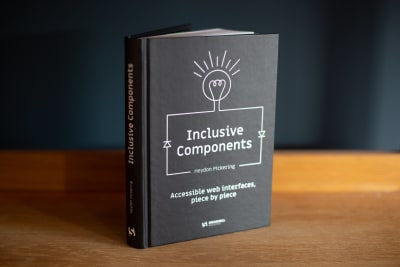
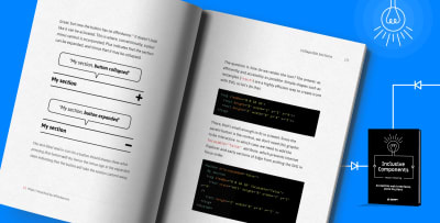
 In this episode of the Smashing Podcast, Drew McLellan talks to Heydon Pickering about his new book, Inclusive Components. Heydon is known for his work and writing on Accessibility, so what is Inclusive Design, and where do components come into play? Heydon eplains all this and more in this episode. You can listen below, or subscribe wherever you get your podcasts.
Show Notes
Transcript
Drew McLellan: He’s a freelance web accessibility consultant, interface designer and writer. His work focuses on accessible user experience design, as well as writing and editing for Smashing Magazine. He’s the author of the acclaimed book about accessible web application design, Apps For All, and has just released a new book, Inclusive Components, all about how to build accessible web interfaces, again, with Smashing Magazine. So he’s clearly an expert on the subject of accessible design, but did you know he was the first male human to jump the Sydney Harbor Bridge in a speedboat? My Smashing friends, please welcome Heydon Pickering. Hi, Heydon. How are you?
Heydon Pickering: I’m smashing. I’m on brand.
Drew: I wanted to talk to you today about the subject of your new book, Inclusive Components.
Heydon: Yes.
Drew: Obviously just a two word title, but I feel like each of those words does a lot of heavy lifting. Starting at the end, as is obviously logical to do, components, is this about sort of component-based design? What is that?
Heydon: Yeah, so I suppose it’s been a while now since people, front end developers, designers and everyone who collaborates on making interfaces, started to think about things in terms of components and dividing things up into digestible and reusable morsels. And I suppose if you’re not familiar with that way of working for whatever reason, it really is a bit like electronic components. My father is an electronic engineer. He works in the sort of analog world of circuit boards and solder and all that kind of thing.
Heydon: In fact, he’s made some components, very small components, which have been used to regulate the current going into electromagnets at CERN. And he had a lot of faith in me as a kid, because he got me to actually solder some of the bits for them. I think that batch has now been retired, so don’t worry about my poor soldering, my poor teenage soldering, being involved in CERN anymore. But yeah, I think it is analogous to … Oh, there’s too many analogs in there.
Heydon: It’s analogous to analog circuit boards in that the idea is you have single responsibilities for individual parts or components and, together, they make the circuit and, together, they augment the current in the case of a circuit or the, I guess, the interface or the outcome in whatever way, in a design system or in an interface as manifested through a design system. And so, Inclusive Components because I wanted to address the fact that, while, I mean, accessibility does tend to get left behind generally when we advance what we’re doing in different arenas, and I wanted to bring accessibility and, in the broader sense, inclusive design to bear on this kind of new way of thinking and making things using components or modules or whatever you want to call them.
Heydon: So the idea was to both bring accessibility to design systems, but by the same token, think systemically when it comes to trying to address accessibility. Think about solving kind of one problem in one place in terms of accessibility and making sure that simply propagates around the pattern [inaudible 00:03:16] the design system at large.
Drew: In a sort of a practical sense, what does it actually look like to work in a component based way? What might an example of a component be?
Heydon: So, there’s different ways of conceiving and coding components. I tend to get straight into the sort of nitty gritty of it, past the conceptual stuff and think about how I might organize the code. I’ve actually come to focus a lot on custom elements, or if not custom elements, then normal elements but with kind of JavaScript behavior attached to them in a kind of isolated, componentized way. I really like the idea of components which are interoperable. And by that, I mean that they can be used across different frameworks and systems and approaches and technical stacks. And custom elements are nice in that because they’re native. You can define them in one place and then they could be used, say, in a react application or they could be used in a view application or they could be used in an angular application, or whatever sort of larger state management technology you’re using.
Heydon: So for me, usually a component will probably be a custom element. I’ve worked on a project recently which isn’t so much focused on accessibility, although I’ve tried to make it as accessible as possible, called Every Layout, and it’s all about kind of trying to isolate very specific kind of algorithms for CSS layout. And they’re defined as custom elements and kind of they sort of deploy themselves and run their own CSS and work as kind of like primitives within the larger system.
Drew: I mean, in actual practical terms, we’re talking a component might be something like a form field?
Heydon: Yeah, so it could be something as simple as an input. Say, like a text input or it could be something complex like a tab interface. And so, the idea with Inclusive Components was to take the concept of one component with its, hopefully, single purpose, like a text input, and then think about all of the different things that could trip up different kinds of people and try and avoid them. Not avoid the people, avoid the problems. It’s not so much about including people, it’s about trying not to arbitrarily exclude people.
Heydon: That seems to be the easiest way of approaching an inclusive design process for me, is to kind of identify the potential exclusionary elements of something and try and step around them. So with a text input, with a label, you’ve got a number of different things there that you might want to worry about. So, you’d have whether or not it’s actually labeled correctly for a start. So are you using a label element and is that label element pointing to the text field using a for attribute so that the two things are programmatically associated so that when a screen reader user focuses the input, they actually hear the label being announced? So that’s one thing to get right.
Heydon: Then, on a sort of more visual level, making sure that the label is clearly associated with that field and not a different fields, and that’s a question of white space and that kind of stuff. Also, making sure that the label is not, you’re not doing something fancy like putting the label underneath their form input because then when you, for instance, when a virtual keyboard comes up, that might become obscured. So, it’s taking into consideration those sorts of things.
Heydon: Making sure that the input itself has a focus style, so when you focus it with a keyboard, whether you’re a habitual keyboard user who uses keyboards to navigate or otherwise, making sure that it’s clear from the focus style that that’s the input that you’re focused on. Making sure that, I mean, things like autocomplete, worrying about that, whether autocomplete is appropriate and helpful in the context or whether it’s not. And a lot of these things address disability directly, but a lot of them are sort of broader in terms of usability and just making things as understandable as possible.
Heydon: Quite often, there’s a very sort of fine line or perhaps a blurred line between what addresses sort of usability for everyone and what addresses disability. And then, to make it even more kind of difficult to pin down, cognitive disabilities. So if something is not very usable for someone who does not have cognitive disabilities, then it’s going to be even more difficult to work out and be able to use for someone who does have those kinds of challenges.
Heydon: So it’s just trying to think about all of those things in one place. And really, the book is just my, it’s my thought process as I’m approaching each of those. So I did it as a blog to begin with. And each pattern or each component is a blog post and the text is just me going, “So, let’s now address this potential issue. How do we go about that? Okay, we’ve checked that one off. I think we’re okay there.” And, by no means am I trying to say that these are perfect and that I’ve thought of everything, because that’s not possible.
Drew: So does taking a component based approach to how you work on individual parts of an interface, I guess, it allows you to go really deep on that particular item and make sure that you’ve really heavily optimized it in the best way you can so that it’s accessible to everyone. Is there a danger in doing that and doing that on lots of different components and then putting them all together on a page? Is there a danger that you can create issues that you weren’t aware of because you’re testing them individually and not together?
Heydon: That’s a really good point, and I was going to bring that up earlier actually. I’m glad you said that. So, in lots of ways, I think we have, philosophically, we’ve decided that we need to separate things into these individual components. And there’s virtue to doing that, because if it’s isolated then it’s easier to kind of test and sort of treat as a single thing. And you can kind of, in terms of the way we work, it makes things easier to manage. We do have to consider, as well, the fact that these things ultimately have to share the same space and join together into a larger system.
Heydon: And I don’t think, actually, enough of our effort and thought goes into that, funnily enough. I think we componentize things more to make our lives as engineers easier, so that we know what we’re working on at what time. And, but then, we often do neglect the fact that these things will be living in dynamic systems and they have to be …
Heydon: I mean, the Every Layout project, although it’s more about visual design and about layout, is all about trying to make these little CSS primitives, these little layout primitives, in such a way that they can sort of self-manage algorithmically. It’s so that you can take them out of a narrow column and put them then a wide column and then it will be, the code itself will determine how many items abreast there should be or whether it should reconfigure itself in some other way. Because we can’t afford to constantly be intervening, and it has to be a system which is sort of self-knowing and intelligent, I think.
Heydon: There’s always things which you can forget about. So maybe you make a tab interface, you’ve got a row of tabs, you choose between the tab and the tab corresponds to a tab panel, that opens something up. And then, someone will come along and they’ll say, “Well, what if I want to put a tab interface inside a tab interface, or some other component inside a tap interface?”
Heydon: And of course, I mean, it’s partially a technical concern as to whether that would be possible, but yeah, you’ve got to make the choice about whether you’re going to make things as flexible as you can so that it’s possible to sort of imbricate things in a complex way, or simply write hard rules which say, “You can’t put something inside here because the level of complexity in terms of the code would probably be too high, but also possibly in terms of how the user can perceive and use the thing.” I’m all for writing rules which say, “Don’t nest loads of complex functionality inside itself,” because it’s just not likely that people are going to be able to get their head around it, really.
Drew: Is it possible to take a fully algorithmic or automated approach to designing for accessibility?
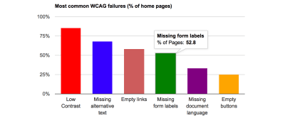
Heydon: I don’t believe so. No. So we have automated tools and I don’t want to disparage automated tools in any way. I think they are very useful, but I use them as kind of like an early warning system to try and kind of get an impression of where the problem areas are. So, if I was doing an audit for an organization who wanted some advice on how to make their products more accessible. So it’s a good way of kind of funding where the problem areas are, but I mean, you can have an interface which is technically 100% accessible, perhaps, according to some tool, even a good tool for judging it, say, against WCAG, the web content accessibility guidelines, or some other acceptance specification. And, even though it’s a 100% sort of all the boxes checked, it can still be entirely unusable for various reasons.
Heydon: For instance, going back to what we were saying before, it can just be entirely too complex. You can just overwhelm someone with links and there’s just no way that they’d be able to get through it and then that becomes, it’s a very sort of tacit thing and difficult thing to pin down, but it’s bound to just alienate people. But there’s also, you can get, it’s very easy to get false positives and things like that. I had a thing the other day, I said the other day, it was the other month, I was working for an organization and of course they wanted to have a 100% accessibility lighthouse school and there was an iframe which was dropped in there dynamically by a analytic script or something. You know the kind of thing where it’s some sort of slightly gross code, which is just sort of chucked in the page to do some task like that.
Heydon: Now I would recommend not using analytics at all, and I recommended to them to at least support the do not track protocol so that people could opt out. Unfortunately, that protocol is kind of, doesn’t really work anymore because it was never really supported properly. But this iframe, it was saying it doesn’t have a title on it. So the idea is that if you have an iframe, it should have a title attribute because that’s the best sort of longstanding way of identifying what the iframe is for to a screen reader user. But this was an iframe that also was set to display none, so it wasn’t even perceivable to a screen reader in the first place because display none, just as it hides things visually in a screen reader, it will essentially remove it from the interface, so it won’t be encountered or announced in any way.
Heydon: So it was a false positive. I mean, it was asking me to identify an iframe that was not there to be perceived in the first place. So, there’s always going to be those kinds of errors and problems in automated testing. But ultimately, it is about knowing, although it’s just sort of a thing that programmers, I guess, don’t really like to think that they’re involved in and they find it a bit icky, but it is about human behavior and about how people understand things and that’s a very difficult thing to just have a set of kind of binary sort of, or boolean sort of rules about.
Heydon: So, I mean, I spoke to a developer when I was consulting sometime ago about this and they kept saying, “Well, as long as we’ve got automated testing, we’re fine, aren’t we? It’s just, then we can just move forward.” And I said, “You still have to test manually. There’s no automated test which can really tell you if using the interface by keyboard is impossible in one way or another.” There are sort of discrete things you can look for, but the overall experience is still something that needs to be judged by human being. Yeah.
Drew: Sometimes the danger with automated tools is they look at items in isolation or they look at one interface in isolation and not see the wider context.
Heydon: Yes.
Drew: Certainly with using lighthouse for performance audits, sometimes I might make a decision as a developer to include, there may be a lot more CSS than is used on that one page and strictly speaking, I’m downloading too much CSS, but actually, I know that once that file is loaded, by the time the user browses to the next page, they’ve already got the CSS. So it’s an an optimization that’s being made across multiple pages the tool, looking at one page in isolation, sees as an error.
Heydon: Yes, absolutely. You’re thinking ahead and you’re making a judgment call, and until we get to advanced AI to anticipate that, then yeah, you really need human beings looking at it and going through it and going … I mean, so automated testing should be in place, as I say, a sort of early warning system, diagnostic system, but there should also be, if you’re interested in your organization really caring and making things more inclusive and more accessible, there needs to be training as well. There needs to be Q & A.
Heydon: So I would write scripts for, “This is how it should work when you interact with this component with a keyboard,” or, “This is how it should work when you interact with it with a screen reader and not actually step through it. So, when you do this, this should happen. When you do this, this should happen. When you do this, this should appear,” or that kind of stuff. So, and the kind of journey stuff, as you say, automated tools aren’t aware of that. They only just see, “Oh, this doesn’t have alt text here.” And actually, in a lot of cases, maybe it shouldn’t have alt text. And also, it can’t judge whether you’ve written the alt text well or not. So I think an image without all alternative text is probably better than an image with misleading or just bad alternative text. And that’s a judgment call again, isn’t it?
Drew: One of the things that I’ve struggled with, historically, in building things in an accessible way is keeping my knowledge of the best practice up to date because it’s, each time I refer to any documentation or any sort of recommendations, it seems like what I was doing and thought I was doing the right thing, the recommendations have moved on and now I should be doing something else. And that’s a familiar story with all areas of working on the web. But I think the danger is, of course, with accessibility issues, is that, if you’re not following the best practice, if you leave something in your interface that is now not good practice, that could be affecting your users in a negative way. Does a component based approach to building an interface or a site, does it help with that at all in any way?
Heydon: I think purely in the sense that, because you have one component which then, the idea of course in all cases and not just in terms of accessibility, is that you have this component defined in one place which will then be used in different places, at least when aspects or browser support or whatever it is changes and you want to update the component, you only then have to do it in one place and then wherever it’s used, that enhancement or that change will be felt. So from that regard, I think it’s certainly more useful to have things divided into components.
Heydon: But then, yeah, as I say, that doesn’t just affect accessibility, that can affect anything that changes. But then, I’m not sure really how much changes in its … I mean, there’ll be few sort of breaking changes in terms of sort of HTML accessibility, which is, obviously, a very narrow area. But in terms of the code quality or how the code works, things are introduced into the HTML spec, obviously, very slowly and not quite as slowly but fairly slowly into the ARIA spec as well. And then, much of ARIA just mirrors what’s in the underlying baseline HTML anyway.
Heydon: I think, more so than the technology, the perception and understanding of these things tends to change over time. I mean, there was recent, in the WebAIM survey recently, they identified the sites were using ARIA were more inaccessible than sites that didn’t use it. So this technology specifically conceived in order to help people make websites more accessible, was making it worse. So it’s really, it’s just a knowledge gap, not a technology gap or a technology shortcoming. It’s people just taking the technology and misusing it because they didn’t really actually understand how it’s intended to work, unfortunately. Hopefully, some of my writing might be able to help with that. In some areas, anyway.
Drew: But a sort of well structured component-based system would enable you, once you realize that something is out of date or you’ve made a poor decision and you now know better, would enable you to more easily go in and fix that across your application.
Heydon: Yeah, exactly. Yeah, yeah, absolutely. I mean, it’s all about efficiency isn’t it, really? And this dry principle or what have you, and see, that’s why I guess I was originally very excited about this opportunity, because people always complain that making things accessible is extra work and it’s hard and it’s upsetting and all of that. And so, it was kind of an opportunity to say, “Well, you know how you’re making this stuff really, efficiently building these component systems? Get your accessibility in there for that one component that you’re making, and then you didn’t have to worry about the accessibility anymore apart from the occasional spec change or update or what have you.”
Heydon: Or just, I mean, probably most of the time, the iteration will simply be based on user feedback and ongoing research, which, obviously, you should be, as much as possible, conducting with a diverse group of people. So, you should be getting people who use different devices and have different browsing habits and use different assistive technologies and that kind of thing. And you know, things are bound to come up all the time. I think I’ve really pinned down a component, think it’s really rock solid, and then I do a bit of research and I find that I’ve made some pretty bad assumptions. But yeah, with a component system you only have to fix it in one place.
Drew: Can a component ever be fully inclusive or is it a spectrum where you’re just working ever more towards inclusivity?
Heydon: Yeah, it would be possible for a component to be, in terms of let’s say WCAC error free, it meets all of the WCAC criteria, but as I said, that only takes you so far and it could still be entirely unusable or impossible to understand even with those technical criteria met. So yeah, this is something that I talk about a lot. I try to convince people that accessibility is like any other area of design, it’s just a part of the design process and nothing can be perfectly designed just like nothing can be perfectly accessible. I think, unfortunately, a lot of folks think of it just in terms of just making sure that it is compatible with screen readers, which is obviously a very narrow scope in terms of accessibility and inclusion in general.
Heydon: So then, there will be people who, some good folks I’ve worked with like at the Paciello Group, who would say, “Well actually, I want to be known as a accessible UX person.” So it’s not just about this box ticking exercise, it’s more about actually trying to make the experience better and more valuable for the greater number of people and move more towards sort of broader principles and things which are less binary. But ultimately, it’s all that, and WCAC and other such criteria can only really identify the real hard and fast, “This is wrong,” stuff, I suppose.
Drew: So if I’m a developer, what should I be doing differently as I approach how I design and plan and build a component? Is there anything that I should be considering in my work to make sure that that component is going to end up being as inclusive as possible?
Heydon: So, I mean, depending on what you’re building, there’s going to be different criteria which need to be met. So, for instance, not every component is going to have the to have accessible imagery with alternative text, because it might not use imagery at all. It might just be text-based or what have you. Some might not be interactive. So, in terms of the specific requirements, then, it would change between component, but hopefully what some of my writing and what the Inclusive Components book helps you to do is to fall into or kind of adopt a discipline of just thinking inclusively.
Heydon: So, when you’re approaching this stuff, not just thinking, well, basically just getting out of the mindset of, “If it works for me, it probably works for everyone else,” because it’s simply not the case that the way that you or I browse things, I mean, we’ll probably do things completely differently, just us two, right?
Drew: Right.
Heydon: And we’re Western, white, English as first language people. And so, yeah, the amount of diversity in terms of the people consuming this, I mean performance people always talk about this as well, people who are interested in advocating for better performance. You’re used to using a high spec set up on a good network and a lot of your users or a lot of your potential users will certainly not be, and same with accessibility. It’s just a question of, basically, just getting out of thinking about yourself, really. Literally just that. And trying, obviously, to reach out beyond just your immediate colleagues and people in your same social group as well.
Heydon: So hopefully, it’s really just, “Here’s what I solved for this stuff,” and what I was thinking about at the time. You can reuse some of those ideas and apply precisely what I’ve applied, if that’s useful or relevant to you. Hopefully, the book is more about just, “Here is a case study of a person who tries to think inclusively. See, the kind of things they were thinking about, when you’re designing something completely different, perhaps just employ the same kind of thinking and try and open your mind up to the diversity of of users and how they go about things.”
Drew: So the book itself, how did you decide how to structure it? It seems very fiercely practical, which I like in a book, but how have you structured it?
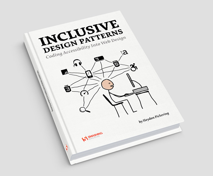
Heydon: Very much like the previous book, actually was Inclusive Design Patterns and I had a lot of trouble that book, to begin with, because I tried to organize it in terms of kind of abstract criteria. So I started out doing a chapter which was all about keyboard accessibility, but that was very hard because then I had to kind of, every time I talked about a different type of keyboard accessibility or the thing that you have to think about, then I had to conjure some sort of component and then ditch that component and then move onto something else.
Heydon: And so, it just made more sense for me to organize things in terms of components themselves. So, Inclusive Design Patterns does this and now Inclusive Components is really just a continuation, which just covers different components. It’s different in that, in terms of features, it’s a bit different because it also includes live code examples and stuff, which I didn’t do so much for the previous books. But yeah, it is literally just, “We’re going to do this component,” whether it’s a tap interface or a collapsible section or a theme switcher or a notification flash card or toaster or whatever they’re called, and then just everything is then organized around that component.
Heydon: So it’s, “This is what we’re doing and these are the things we should consider while we’re doing it to be more inclusive,” because that’s how I work and that’s how other folks work. And as soon as I started doing it like that, it was really just me working and writing notes as I worked. And so, the thing kind of wrote itself, and then all of the effort was really in actually just making sure that I was doing a decent job of making those things not inaccessible, I guess.
Drew: Yes, I mean the table of contents really reads almost like documentation or like a self-help manual or something. Straight in with chapter one, toggle buttons. If you want to implement some toggle buttons, go to this chapter, read it and you’ll get everything you need to know about how to do that, which is an approach I really like. I see things like collapsible sections, tabbed interface, theme switches, data tables, loads of actual, real practical stuff that we’re all building every day and I think we all, probably, could be building better.
Heydon: Yeah, that was totally the idea because it wasn’t just about me making my components, it was a case, and you’ve touched on it there, which I’m glad you did, which is it was of identifying common patterns that we all use. So I mean, there’s tab interfaces everywhere and they’re all implemented differently and they’re all implemented, variously, very badly. I mean, I’ve implemented terrible tab interfaces and that I’ve learned a little about how bad they were for people, and then I’ve tried to make them a bit better and a bit better and a bit better. I’ve probably made 15 or 16 different versions of tab interfaces in my time, having been doing this kind of thing for years now.
Heydon: And you know, they’re getting a bit better, hopefully, every time. But it is just a common thing. It was a common thing that I would use quite often between different websites, I use and everyone uses. So, part of the idea was to say, “Well, actually, let’s do a design system, kind of an accessible design system for the web.” Now, people are going to branch out and they’re going to do their own versions of these things, but to kind of get the core stuff down and the accessibility is a core thing that should be in things. It shouldn’t be an add on, it shouldn’t be an either/or, it shouldn’t be a feature. It should be a core thing. And if you get that core stuff paired down, then yeah, hopefully people would look at the chapters and go, “Oh, okay, I’ve made those. I’ve seen those. Let’s see how to do it as inclusively as possible,” and then hopefully they get some value from that.
Drew: Well, what I like about it is, certainly I know I’ve, in the past, I’ve had some interface features I’ve needed to implement and I know that it’s going to be tricky from an accessibility point of view, say some sort of a fly out menu, drop down menu, something like that. I think, “Okay, here be dragons in terms of accessibility. I need to make sure I do this right.” And so, I Google for how to do it, I find a reputable source saying, “Use this method,” I use that method, I implement it and I move on, but I actually haven’t learnt anything. I haven’t learnt why the solution was that. And what I really like about the way you go into it in the book is I can do two things at once. I can figure out how I should be doing it and I can figure out why I should be doing it like that because it’s all very carefully explained. So, I think it’s really successful from that point of view.
Heydon: Oh, great. That was what I was going for. So that’s good. But yeah, that seems to be my thing. I mean, I’ve been working with the BBC for some months and we’ve kind of made a thing a bit like Inclusive Components but for the BBC, so we’ve done this sort of technical implementation with a through the lens of accessibility version of their design language called GEL. And yeah, it explains the why as well as the how and it’s not a pattern, really. The idea is that the individual departments at the BBC, because there’s so many of them, because it’s such a large organization, so there’ll be BBC Sport, BBC Weather, BBC News, they’re the ones who would be taking care of the kind of technical stack and making their pattern library. And what we’ve really provided is just, we’ve just tried to exemplify the best practices. So it was really much more of a learning resource than a simple plug and play pattern library. Yeah.
Drew: Was it difficult deciding what patterns to include in the book? Was there anything that you left out?
Heydon: The only ones I really had problems with or second thoughts about were the ones where, the tab interface, for instance, I wasn’t going to include, because I really hate tab interfaces, but then I had folks saying, “Could you please do a tab interface? Could you include a chapter of that?” Because I get asked to put them in my interface all the time by clients or whoever. So, I ended up doing one. But it’s full of caveats. And the main caveat is, probably don’t use a tab interface. Use maybe an accordion, it’s a simpler interaction paradigm. It’s easier to make responsive, it’s easier to make compatible with screen readers, et cetera, et cetera.
Heydon: So I put all those caveats in. But yeah, and some of them were ones where I just thought, “Oh, I haven’t written about this before and I could do with having sort of thought about it so that I could actually use it in my design work.” And others were people requesting, saying, “I know this is a gnarly one, I just don’t know how to go about it. Could you give it a go?” And so I gave it a go as best as I could. That is going to be the last time I write a book about accessibility because I’ve done three now.
Heydon: So if anyone wants to know any more and if they think of any other components that they might want doing, just DM me on Twitter or something and I’ll try and deal with it in that way rather than writing a whole article, because those articles are quite long and they take up quite a lot of time and I’m kind of doing other things at the moment. But I’m always happy to chat with anyone who has any questions about this stuff. They might be working on something similar to what I’ve covered and there was just something that they were unsure about or which I, for whatever reason, I hadn’t made as clear as they’d liked it. Yeah, then just contact me because I’m always happy to talk about the stuff because it helps me to sort of ruminate over things and try to, it might challenge my assumptions and help me to do a better job as well.
Drew: So, the book, Inclusive Components, is available right now from Smashing Magazine, smashingmagazine.com/books, and I’d recommend everybody check it out.
Heydon: Thank you.
Drew: So I always like to ask people, I mean, Smashing is all about learning, right, with the books, the conferences, the magazine, we’re all about learning. What is it that you’ve been learning lately?
Heydon: So, recently, well, a couple of years ago I made something, I made a drum machine using the web audio API called Beads and it’s still available as a PWA, it’s a progressive web app. If you Google search Beads GitHub or something like that, you should get the GitHub page which has it on there. But that was a alpha version and I’m now working on doing a much more advanced version of this. And it’s a different kind of drum machine because it’s polymetric, it has different, you can have different tracks of different lengths. So you can have a track which has seven beats and a track which has nine beats, a track which has four beats. And then, the rhythm evolves over time because of the changing syncopation. You’ve got these, it’s multi-threaded.
Heydon: That was the main reason that I wanted to build it, because, as someone who’s interested in kind of experimental music, that’s something I wanted to play with. Obviously, I’m trying to make this drum machine as accessible as possible. And that’s been interesting from the point of view now that I’m working with, I’m turning it into an Electron app. So, for those of you that know Electron allows you to kind of wrap a sandbox version of Chromium browser and create a desktop application but using web technology, which was really great because it makes things, for this projects anyways, because it gets around a lot of performance problems.
Heydon: But also, although I’ve been doing cross browser testing for 12 years now, it’s really nice to have a break and just to design stuff for one browser. And it’s got some, so there’s a flag in Chromium. It’s a, what’s it called, an experimental web platform feature for focus visible. So I’ve been able to make this drum machine completely keyboard accessible with these really nice, big focus outlines without those appearing for mouse users, because focus visible uses this heuristic where it detects whether or not you’re using a keyboard. So that’s been nice, to be able to incorporate that.
Heydon: But the thing recently that I’ve been learning about, just I’ve, I guess, been learning about some of the more advanced things you can do with the web audio API itself. So I had this problem where I have, you can put multiple sounds on one track so you can load in an array of audio files and it places them one after the other, and by default they overlap, so they’ll always play out out, the audio buffer will play until it finishes. So if the next sounds comes before the end of that, it just overlaps, which is fine. It’s kind of like a reverb or something. But sometimes if you’re doing an arpeggio, like a baseline or something, you don’t want them to open up. That’s not how a bass guitar works, right? If you’re on the same string, you press the next note, the first one has to finish.
Heydon: So, I was stopping a note as the next one started and there was always an audible popping sound and it’s not the web audio API having a problem or anything like that. It’s just the human ear will hear a kind of a nasty popping sound where you kind of sever away from. You just cut it, stop it dead, it’s going to sound nasty. And then, so I found that there’s a function as part of the web audio API, which allows you to choose a point where you can taper off the sound. And so I was able to detect where the sounds should end because the other sound is beginning, then taper it off very quickly, but it is a taper, like a fade out, rather than a hard cut off thing.
Heydon: So I solved that problem after it annoying me for ages. So it’s basically been web audio API stuff and messing around with sounds because I’ve always been into, as I say, into experimental music and messing about with that sort of stuff. And I’m trying to write a talk about this. And in the talk, I’m using Billy Jean by Michael Jackson because it’s a very straight, fall to the floor rhythm and I’m going to kind of warp it in various different ways. So I’ve actually had to learn the parts for Billy Jean to kind of sequence that and stuff. So, weirdly enough, that was what I was doing before doing this podcast.
Drew: That sounds like a lot of fun. So if you, dear listener, would like to learn more about Heydon or hire him to consult on your projects, you can follow him on Twitter, where he’s @heydonworks, or visit his website at heydonworks.com. Thanks for joining us, Heydon. Do you have any parting words?
Heydon: Goodbye.
 (dm, ra, il)


 We also have some videos that you may like watching and listening to: Sara Soueidan held a talk on Applied Accessibility and Marcy Sutton once spoke about Garbage Components recorded live at SmashingConf in New York this past October. We’re sure you’ll find them useful!
 (ra, il)









 In this episode of the Smashing Podcast, Drew McLellan talks to Heydon Pickering about his new book, Inclusive Components. Heydon is known for his work and writing on Accessibility, so what is Inclusive Design, and where do components come into play? Heydon eplains all this and more in this episode. You can listen below, or subscribe wherever you get your podcasts.


 Heydon Pickering